
Junaed Dar
Motion Designer & Video Marketing for SaaS Founders/Startups
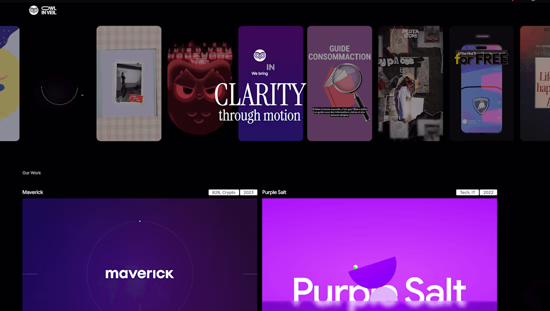
New to Contra
Junaed is ready for their next project!
bts of a recent project
2
36
psychedelic branding, motion exploration. which one's the best? drop your thoughts below 👇
1
53
Athletica 👟 A fitness digital product brand, personal project
1
2
210
The most expensive thing in your startup right now isn't your dev team, it's the 3 seconds a visitor spends on your landing page before your animations tell them you're not serious
You can't A/B test your way out of looking cheap
1
60
B2B stuff does not need to be boring, if you cant explain it while looking cool, thats a skill issue 🤷
open to work next month 📩 DM
1
1
69
saas promo video for topa.io (http://topa.io) ✨
i usually don't like this style, it looks too generic, but the branding requirements 🤷 turned out pretty well
what do you think?
..
interested in working together? dm ✨
1
1
91
(video 2/2) for Bayt.com (http://Bayt.com), after the first one exploded on socials!🚀
the video 1 was a huge success:
delivering the message to audience while showing that they already know what they are signing up to and the complete sign up process for the employer side
3x the sign up rate after the first week of launch! so had to double down there
the next video was a guaranteed success, the goal being the same, with different script but the same approach!
the result was a video that just made employers' understanding of the platform easier and made them click the sign up button without a doubt on what is going to be the next step
----
interested in getting similar results? shoot me a DM to get started!
1
83
Athletica Launch Video Creation
2
5
Black Berry Revival challenge for my social media post. A personal project with a lot of freedom 🤞
1
2
225
logo stinger concept for teamworks 🤲
1
1
133
one of my favourite projects from back in 2021 (video 1/2) for Bayt.com (http://Bayt.com), needed more than just a good-looking video
the problem they came with:
their platform handles job discovery, candidate matching, and employer branding all at once. but none of these flows were being communicated in a way users could actually follow.
static screens. no motion. no guided journey. users were landing on a powerful product and leaving without understanding what it could do for them.
what was delivered:
> full explainer video built around their actual user flow
> motion-driven visual system with structured transitions
> messaging sequenced to match how a new user thinks
the result was a video that didn't just explain the platform. it made users feel like they already knew how to use it before they ever signed up. that's the difference between a video that looks good in a deck and one that actually moves people through a funnel.
----
interested in getting a video that closes that gap for your platform? shoot me a DM to get started!
2
4
135
Dark Mode V/S Light Mode 🔥 my personal fav is dark mode ▪️ which one do you think is better? 👇
7
5
201
logo animation concept done for renae homestead🚀 lmk your thoughts 👇
1
3
172
logo animation concept done for nbc 🚀 for personal social media post, lmk your thoughts 👇
1
2
137
logo animation concept done for android 🚀 for personal social media post, lmk your thoughts 👇
1
2
124
A personal project just playing around inside after effects 🤞
1
2
154