
pro
Julia Łuczak
Graphic designer | Visual creator
New to Contra
Julia is ready for their next project!
Zero Point | Branding & Packaging
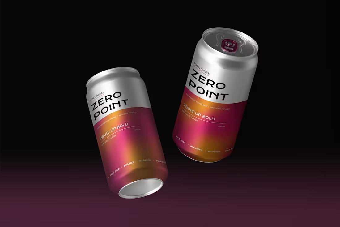
Zero Point is a conceptual cold brew nitro coffee brand built around a bold, modern, and expressive visual identity. The project was created to capture the distinctive character of the product – smooth, energizing, and elevated by the unique experience of nitrogen infusion.
A key element of the branding is the cascading gradient, which references the visual effect of rising nitrogen and reflects the dynamic, refreshing nature of the drink. This detail brings movement and depth to the identity, helping the brand feel vibrant, contemporary, and instantly recognizable.
The visual system combines strong design choices with a clean, modern structure, creating a brand that feels both premium and energetic. The packaging was designed to stand out while clearly communicating the product’s innovative and refreshing qualities.
Overall, Zero Point presents a cohesive brand world that blends bold aesthetics with product storytelling, turning the sensory experience of nitro cold brew into a distinctive visual language.
1
30
Set of icons | Home & Chores
1
35
Delusional | Poster Design
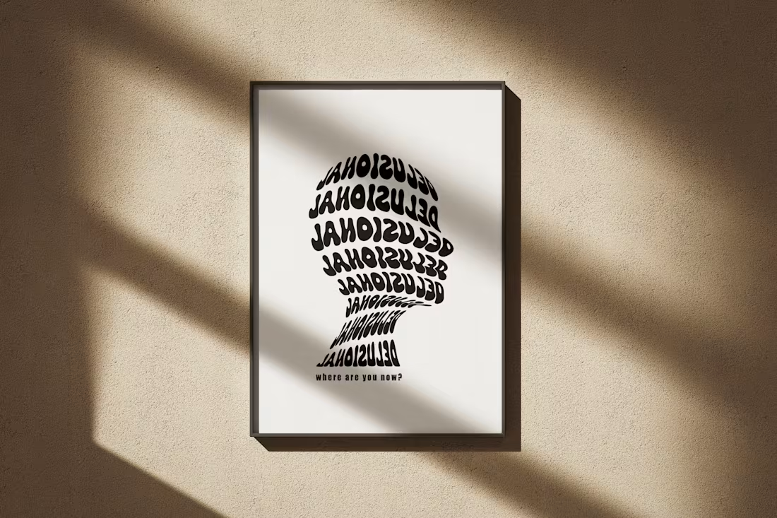
“Delusional” is a personal poster project inspired by one of my favorite artists, The Weeknd, and the atmosphere of his song “After Hours.” The design explores a dark, emotional and cinematic mood, reflecting themes of intensity, loneliness, obsession and late-night introspection.
The goal was to translate the feeling of the song into a visual form – creating a poster that feels dramatic, mysterious and slightly surreal. Through bold contrast, atmospheric composition, and expressive visual details, the design captures the tension between glamour and chaos, reality and illusion.
The final poster is a visual interpretation of the emotional world behind “After Hours,” reimagined through my own design style.
1
37
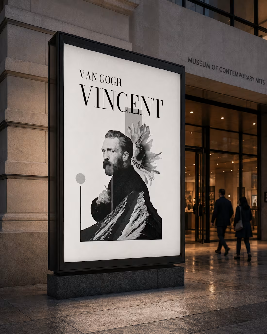
Vincent, Reimagined | Event Poster
“Vincent, Reimagined” is an event poster created for Fundacja Kultura do Końca Świata. The design was prepared for an event dedicated to commemorating Vincent van Gogh and reinterpreting his artistic legacy through a contemporary visual language.
The goal was to create a poster that feels expressive, memorable and emotionally connected to the spirit of Van Gogh’s work, while still maintaining a fresh and modern aesthetic. The composition combines an artistic atmosphere with a strong event-focused layout, making the poster both visually engaging and clear in communication.
The final design pays tribute to Van Gogh’s sensitivity, creativity, and timeless influence, presenting them in a reimagined form suited for a contemporary cultural event.
0
38
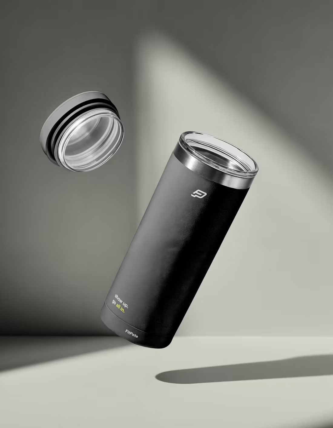
FIT PETE | Branding
FitPete is a branding project for a personal training and calisthenics brand. The goal was to capture the energy, motivation and constant movement behind the brand through a dynamic visual identity, bold typography and a strong black, white and neon green color palette.
The final direction reflects strength, discipline, and momentum – creating a look that feels modern, athletic and instantly recognizable.
0
43
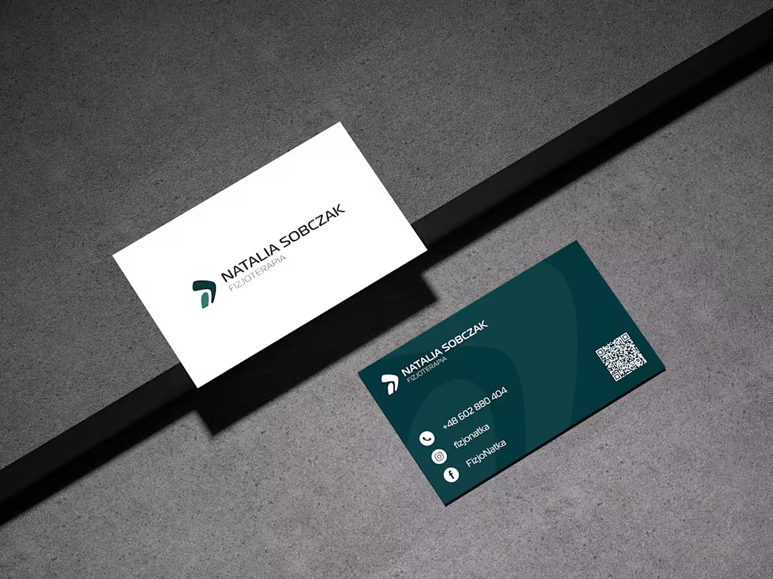
Physiotherapy Brand | Business Card
This business card was designed for a personal brand in the physiotherapy field. The goal was to create a modern, professional, and easy-to-read printed material that strengthens trust in the specialist and makes it simple for clients to get in touch.
The design follows a clean and minimal visual direction, keeping the focus on clarity, contact information, and brand consistency. Soft details and balanced typography help create a calm, approachable and professional impression.
The final result is a functional and elegant business card that supports the brand’s identity while presenting the physiotherapist as reliable, caring and easy to contact.
0
58
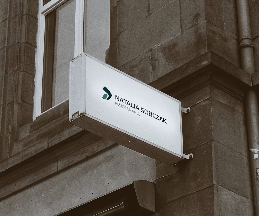
Physiotherapy Brand | Branding
This branding project was created for a personal physiotherapy brand with the goal of building a professional, calm and trustworthy visual identity. The design direction focuses on simplicity, balance and a sense of care – values that are essential in a brand connected to health, movement and working with the body.
The identity is based on a minimalist logo and soft, organic forms that subtly reference movement, harmony, and physical recovery. The visual language was designed to feel gentle yet confident, creating a brand image that feels approachable, reliable, and modern.
Through a calm color palette, clean typography and delicate graphic elements, the branding communicates trust, professionalism,and a holistic approach to wellbeing. The final identity reflects a space where the client can feel supported, understood and guided toward better movement and balance.
0
63