
Julia Gomez
Brand & Web Designer helping businesses grow with strategy
New to Contra
Julia is ready for their next project!
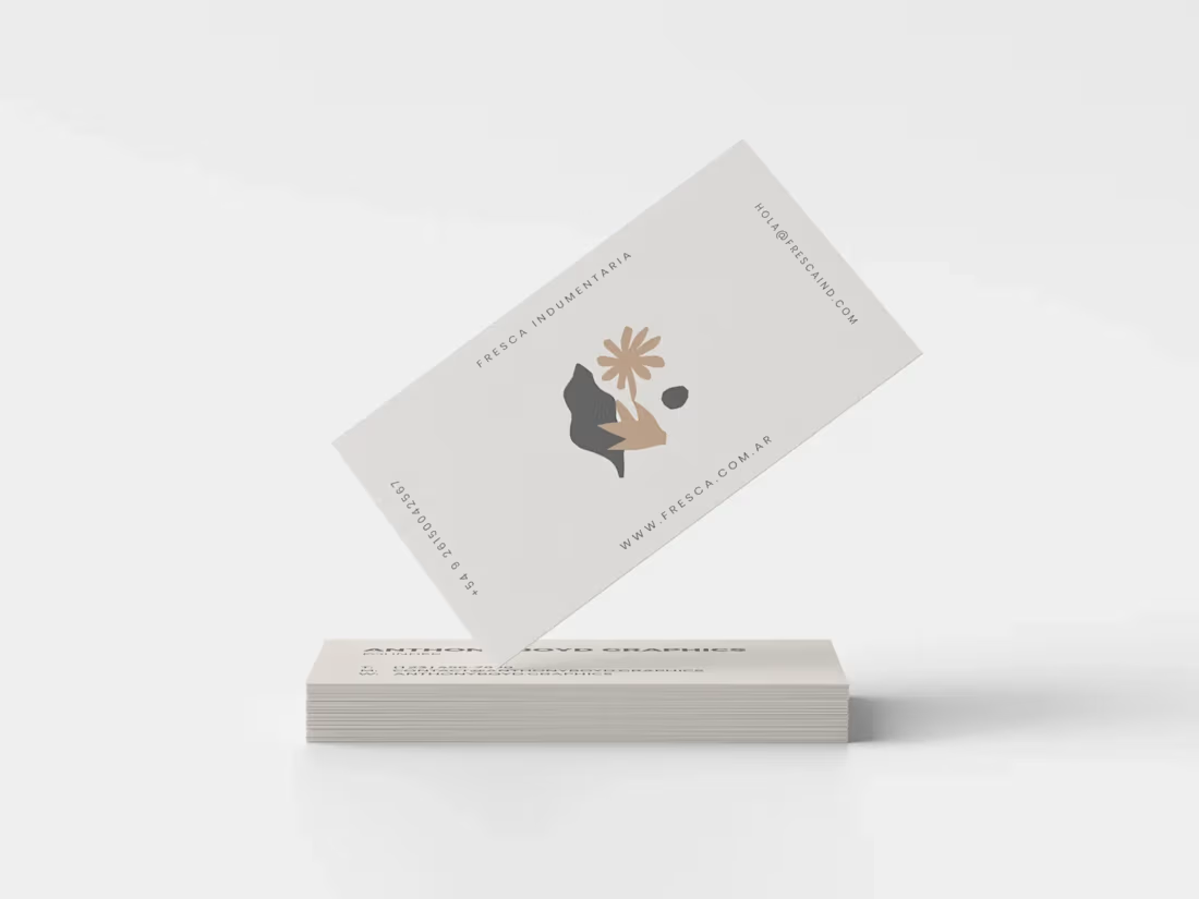
"Fresca" is a high-quality, timeless, and avant-garde clothing brand founded by Josefina and Azul.
They were looking for an identity that represented the union between the transgressive and the minimalist, with a fresh and modern image at the same time.
They remarked on their love for nature and desolate landscapes, which would be included in the brand's photoshoots.
When designing the logo and the other graphic pieces, I kept in mind the concepts of elegance, timeless fashion, and natural elements.
To give the logo an elegant and timeless look, I used a serif typeface with thin and stylized lines.
I was inspired by the art of "Matisse" and his collages, which added an avant-garde touch to the logo.
The brand's colors represent landscapes of wild and raw nature.
1
17
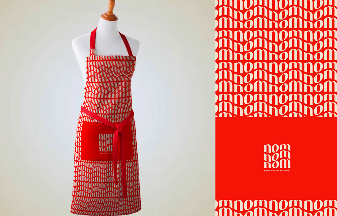
NOM NOM NOM is a healthy recipe online service founded in 2022 by Nataly, a certified dietitian, and Oscar Martinez, a generalist doctor, both independent professionals and parents of 3 boys.
The idea of the project was born from their necessity to feed their kids with a healthy diet that would cover all their nutritional needs in every stage of their lives while being able to work full time.
NOM NOM NOM aims to support time-strapped parents by inspiring them to make healthy changes in their family’s diet in a pleasant-effortless manner.
They contacted me because they needed a brand strategy, brand identity and a mobile app template design
1
21
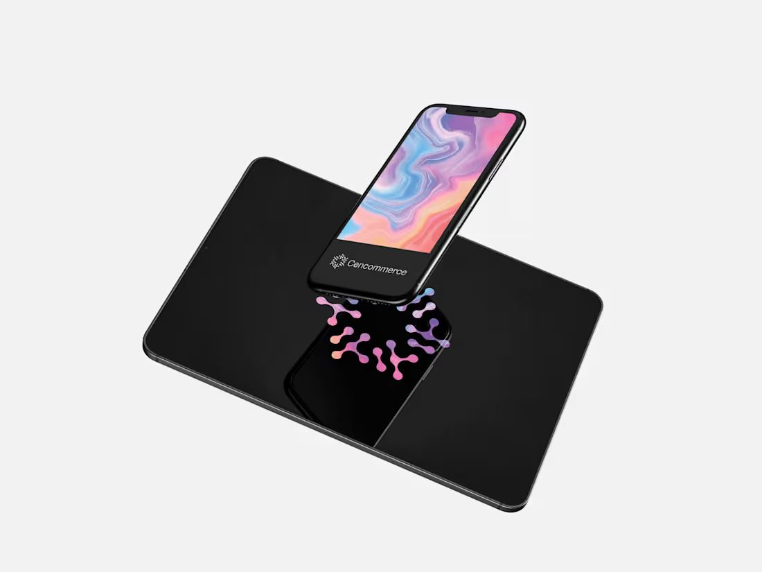
ABOUT CENCOMMERCE
Cencommerce is a business unit of Cencosud, created in 2020, which focuses on improving the regional digital capabilities of various business units and generating synergies between them. The unit seeks to unify processes to promote growth in the digital sphere.
PROJECT BRIEF & REBRANDING GOALS
Cencommerce's identity looked outdated and didn’t reflect the brand's values, vision, and personality. The team was also confused about the uses of the graphic design elements and didn’t feel represented by the current logo.
The project's main goal was to redesign the visuals to reflect the new leaders' vision, give the business unit a more professional look, and improve the team's quality of work and sense of belonging.
1
22

OVERVIEW
Galáctica is a fashion designer, stylist, and costume designer. She works both in audiovisual productions, video clips, and advertisements as well as with private clients who wish to translate their energy into a character that represents them in a particular way. She uses design as a psycho-magical act to transmute emotions and transmit a message. She is attracted to the universe of movies and series, creating imaginary worlds and realities. In her unique pieces, she uses unconventional elements such as industrial materials and unusual accessories mixed together.
PROJECT BRIEF
When I designed her logo, my purpose was to combine the magical and mystical essence of her universe with refined avant-garde elements that would allow the brand to be positioned in the fashion and film industry at the same time.
1
26
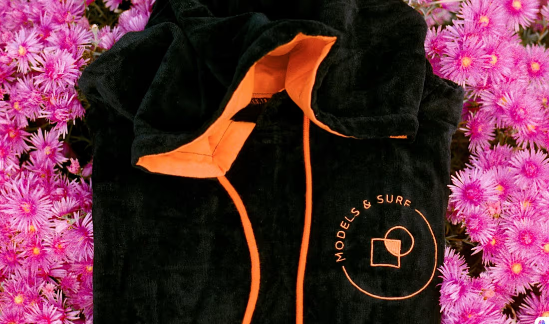
“Models and surf” is an online surf shop based in Whale Beach, Australia founded in 2020 by Agostina from Argentina and Alberto from Italy.
Its mission is to be Australia’s best customer-centric surf shop.
They are spontaneous, fun, and friendly, they want to make their customers feel the same way: welcome and cherished.
PROJECT BRIEF
They needed a logo that was easy to apply on various types of surfaces such as fabric, wood, paper and plastic.
When designing the logo, I used a typeface with refined lines and I designed a minimalist geometric symbol that would make the logo recognizable, easy to apply to any surface and it and long-lasting.
I used a bright, high-contrast color palette to reflect their fun and innovative side and to differenciate the brand from the competition.
1
26
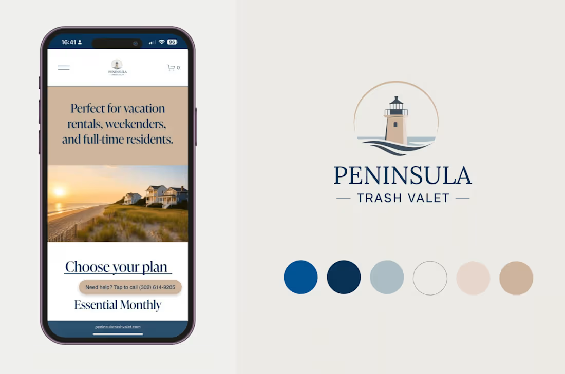
PENINSULA TRASH VALET
Peninsula Trash Valet is a residential waste management service operating in Delaware’s coastal communities.
https://www.peninsulatrashvalet.com
(https://www.peninsulatrashvalet.com)
PROJECT BRIEF
The client required a comprehensive brand kit, including logo design, color palette, font pairing, and imagery guidelines.
The visual identity had to reflect Delaware’s upscale, coastal lifestyle, combining cleanliness, safety, and reliability with an understated sense of elegance and a sense of belonging. The goal was to create a brand that felt both professional and approachable, appealing to homeowners who value service and professionalism.
1
31
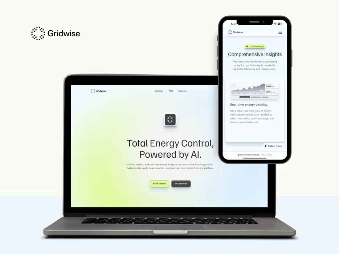
PROJECT OVERVIEW
GridWise required a brand identity and website to communicate its AI-driven energy optimization platform. The goal was to express technological expertise while avoiding a cold or overly robotic aesthetic, creating a brand that feels both innovative and approachable.
DESIGN APPROACH
The visual identity connects technology with nature, positioning AI as a tool for more sustainable energy use. A fresh palette inspired by trees and clouds reinforces ideas of balance and sustainability, while the logo combines movement with pixel-based references to data and AI. The website was designed and built in Framer, applying UX/UI principles to ensure clarity, usability, and structure. Clean layouts, generous spacing, subtle gradients, and restrained motion create a modern, human-centered digital experience.
1
36
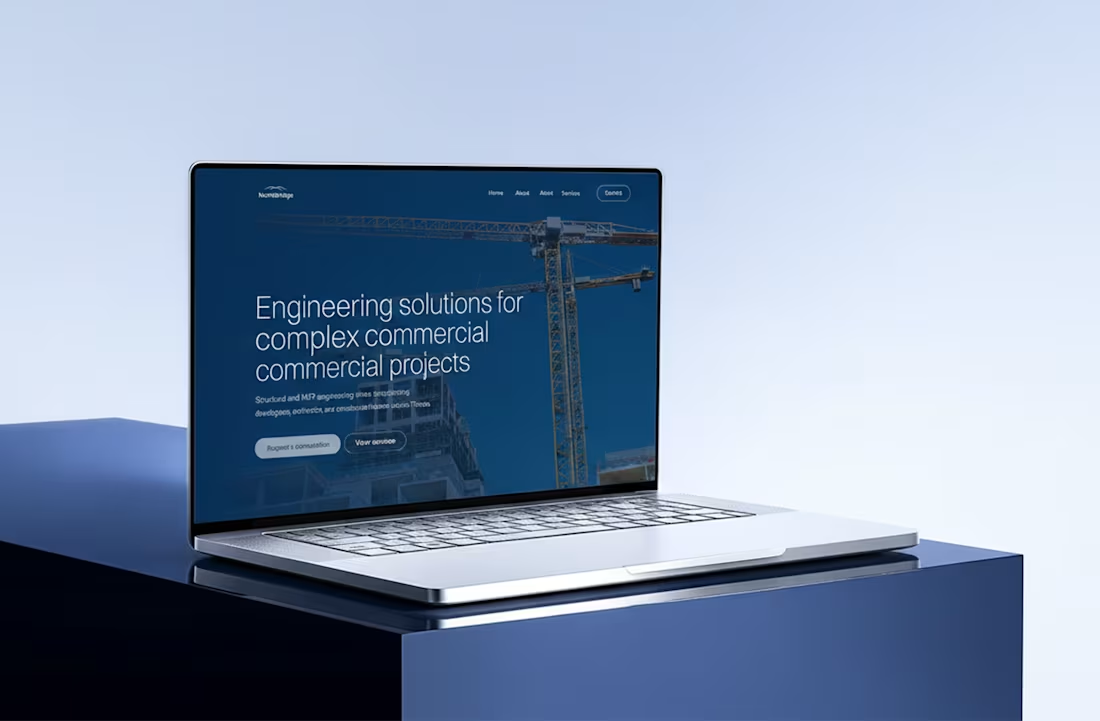
PROJECT OVERVIEW
NorthBridge needed a website that communicated trust, technical expertise, and reliability while positioning the brand as a modern engineering and consulting partner. The goal was to present complex services in a clear, structured way for developers, architects, and institutional clients, while maintaining a professional yet approachable tone.
DESIGN APPROACH
The website was designed and built in Framer, applying UX/UI principles to ensure clarity, usability, and structure. A clean grid-based layout and strong typography organize technical information and improve readability. A restrained palette of deep blues reinforces trust and stability, while high-quality photography adds a human dimension. Subtle motion enhances the experience without distracting from the content.
1
41
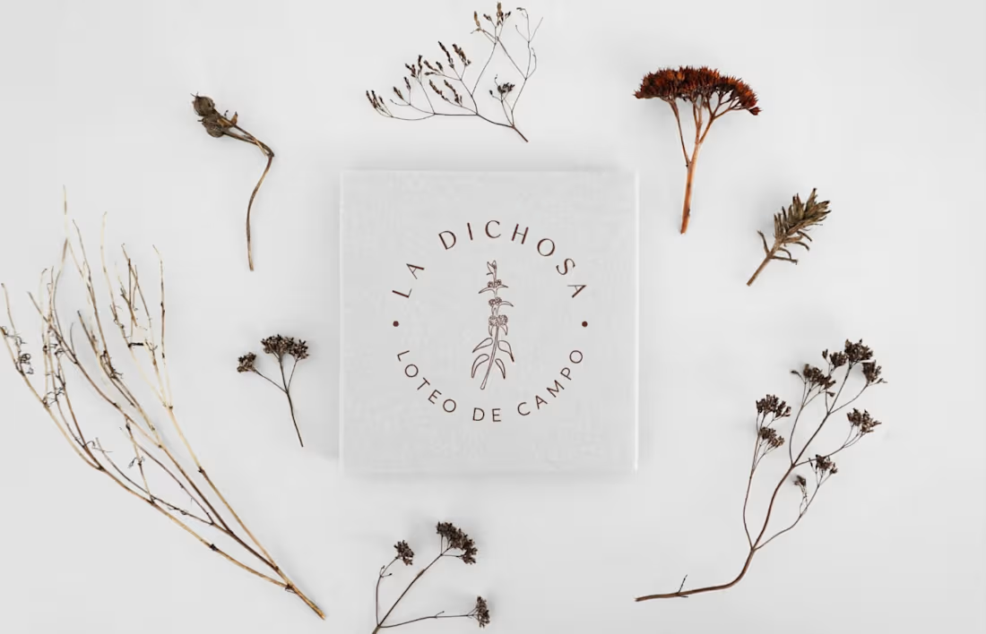
“La Dichosa Loteo de Campo” is a real estate development founded by five friends who love nature and outdoor life, with the desire to face a new challenge and change the routine of the city for the harmonious rhythm of Las Sierras.
They contacted me because they wanted to develop a project that would have a professional image and would stand out for its values and identity.
In addition to logo design, brand assets and branding strategy, I developed an inbound marketing strategy for social media positioning and customer acquisition.
1
44
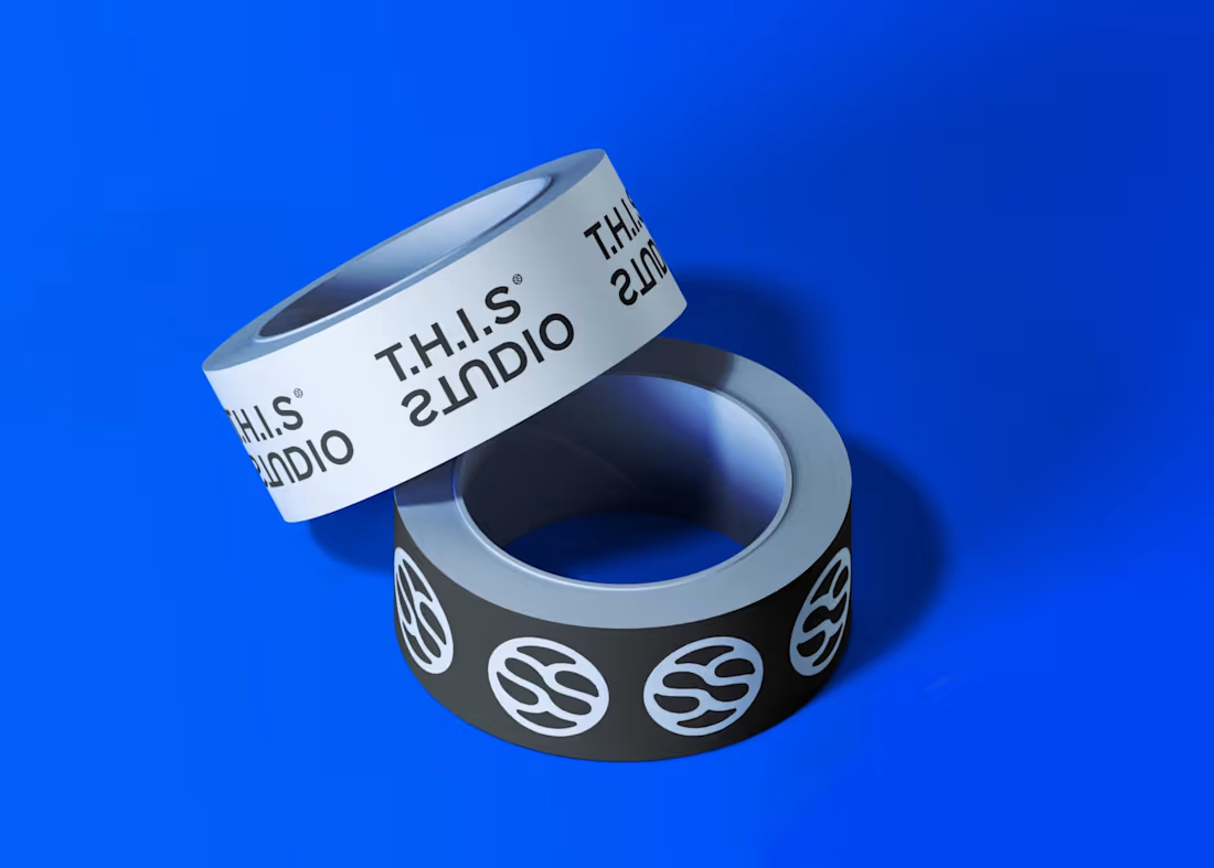
Emi Japaz is an architect and artist. She designs innovative spaces with the aim of generating a positive visual and emotional impact on those who inhabit them.
A lover of the avant-garde trends and visual arts, her challenge was to find the common thread that integrates all the elements that inspire her: experimentation with materials, light, color, decomposition of pure geometric figures and the absence of elements.
I WORKED ON
+ Background research and branding questionnaire
+ Market research and benchmarking
+ Defining the brand core, storytelling, and brand archetype
+ Primary logo, secondary logo, and submark
+ Brand guidelines
+ Creative direction for social media
1
47
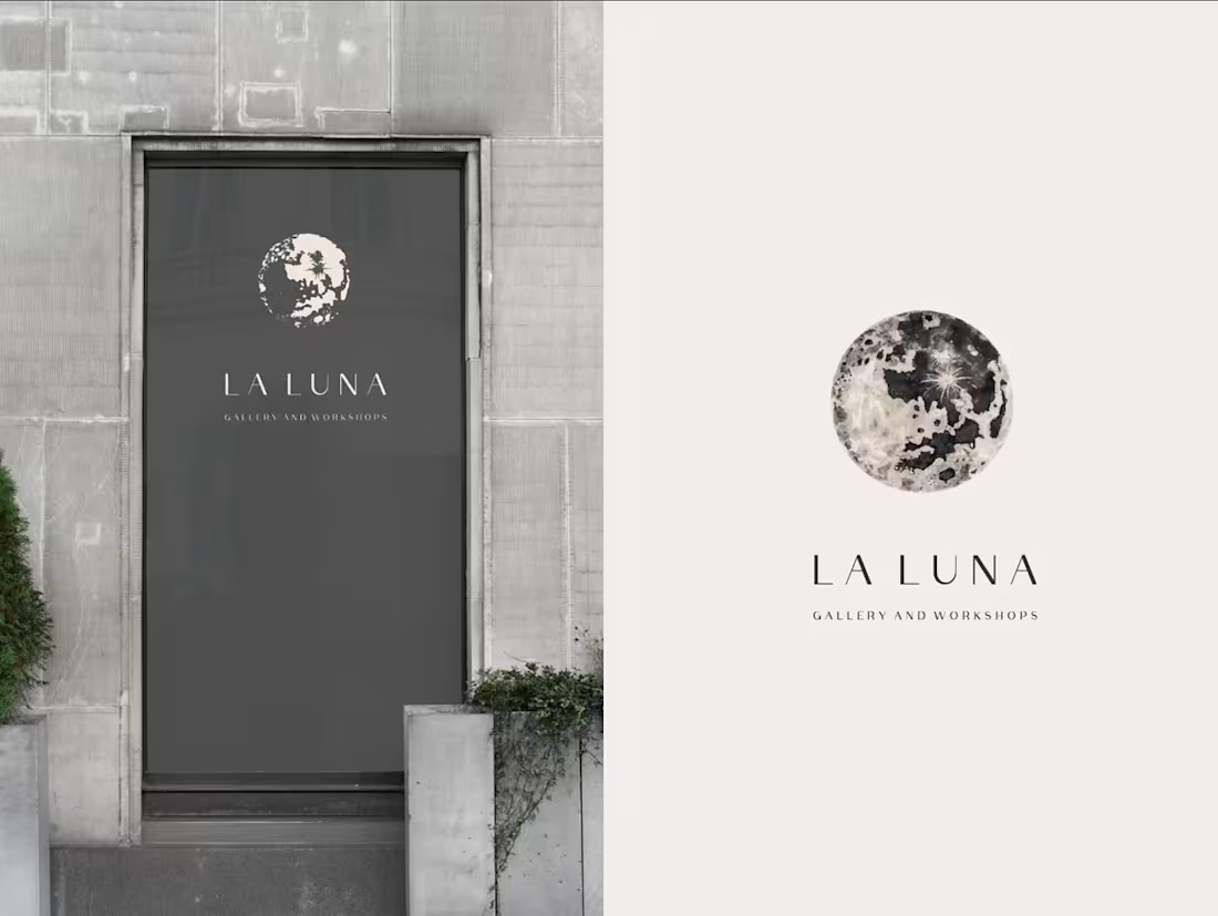
La Luna Gallery and Workshops it's an independent ran business by Marie Su Loher: an artist and creative coach living in Ibiza.
A space of consciousness, creativity, and awareness, where deep creative processes take place.
PROJECT BRIEF
Design the brand identity including a logo that adapts to a large variety of media.
Keywords: “Wabi-Sabi” philosophy, Ibiza’s landscapes, and Marie Su Loher’s artwork.
Design window stickers, invitations, and an art catalog for the Gallery.
Craft a social media strategy.
1
54
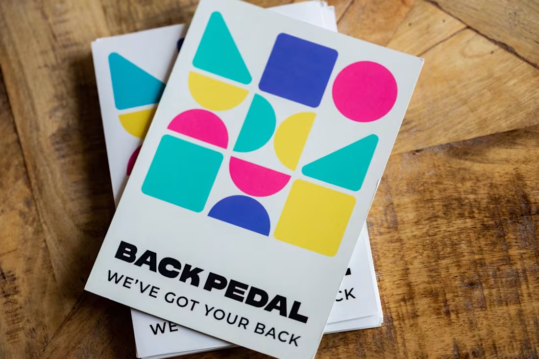
Brand & Web Designer – Bike Smart Tech Startup
Overview
BackPedal is a startup developing smart technology to protect e-bikes from theft, combining advanced tracking with a 24/7 recovery team that helps retrieve stolen bikes quickly and safely.
Project Brief
The client was looking for a designer with a strong visual sense to support multiple areas of the brand, including brand identity, pitch deck design, sales materials, and a website redesign.
My Role
I led the design of the brand identity, pitch deck, and B2B sales website, creating a cohesive visual system for the brand.
1
47