
Josiah Dezin
Performance Designer for B2B and SaaS
New to Contra
Josiah is building their profile!

This is how I made a simple move that shifts a product from looking like a $20 tool, to one that can sell for $199/mo.
Users form trust in seconds. My approach is to Show proof and key metrics upfront, or before they scroll past the hero section.
1
6
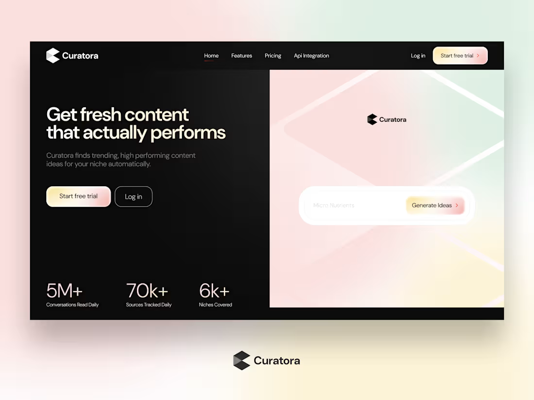
I made a simple move that shifts a product from looking like a $20 tool, to one that can sell for $199/mo.
Curatora.io is a content discovery and publishing tool for marketers. I love the product idea, but the site wasn’t showing it off like it should. Thought I’d play around and see how it could feel premium.
3 Takeaways from this project.
1. Users form trust in seconds; show proof upfront.
2. Hero and above-the-fold content must make the product instantly clear.
3. Clear messaging, visuals, and proof help users understand and decide fast.
That’s it. What grabs your attention first on this landing page?
1
7