
Joshua Akomolafe
Certified Website Development & Google Ads Marketing Expert
New to Contra
Joshua is building their profile!
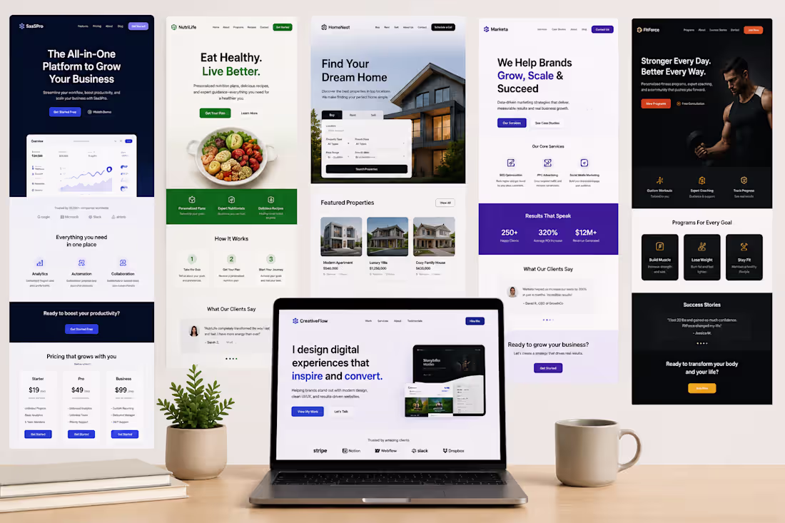
Landing Page Design Portfolio — CreativeFlow | Web Design & UI/UX
Overview
CreativeFlow is a web design studio focused on building modern, clean, and results-driven digital experiences for brands across multiple industries. The portfolio showcases five distinct landing page projects — spanning SaaS, nutrition, real estate, digital marketing, and fitness — each crafted with a unique visual identity while staying true to one core mission: helping brands stand out online and convert visitors into customers.
The Goal
Demonstrate range, versatility, and strategic design thinking by delivering high-converting landing pages across five different niches. Each project required a deep understanding of its target audience, unique value proposition, and conversion goals — proving that great design isn't one-size-fits-all, but always purposeful.
Challenges
The biggest challenge across all five projects was designing for completely different audiences simultaneously — from SaaS founders and health-conscious consumers to homebuyers, business owners, and fitness enthusiasts. Each niche demands its own visual language, tone, and trust signals. Avoiding a templated look while maintaining professional consistency across the portfolio required deliberate creative decisions at every turn.
Solution / Outcome
Each landing page was treated as its own standalone brand experience:
1. SaaSPro — Dark navy theme with dashboard UI mockups to appeal to productivity-focused business owners
2. NutriLife — Fresh greens and warm tones with a clear 3-step "How It Works" flow to reduce friction for health seekers
3. HomeNest — Clean and minimal real estate search UI that puts property discovery front and center
4. Marketa — Bold purple and data-driven social proof (250+ clients, 320% ROI) to build instant agency credibility
5. FitForce — High-energy dark theme with strong imagery and goal-based program tiers to motivate action
The result is a portfolio that speaks for itself — showing clients exactly what's possible when design strategy meets conversion thinking. Every page tells a different story, but they all share the same goal: turn visitors into buyers.
0
20
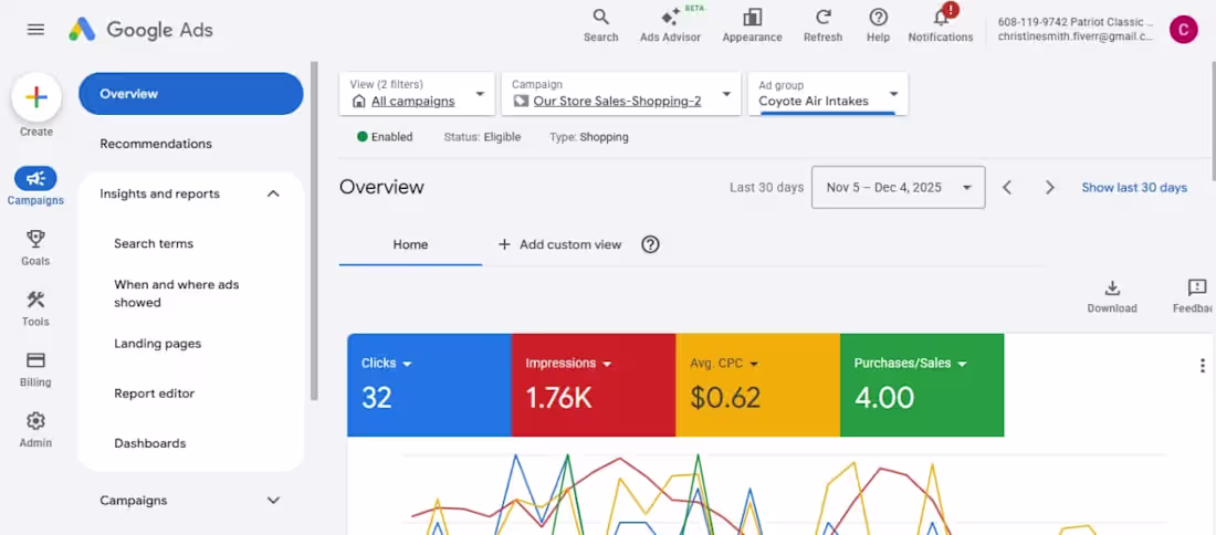
Google Shopping Ads Campaign — Patriot Classic (Coyote Air Intakes)
Overview
Patriot Classic is an automotive parts store selling performance upgrade components, including Coyote Air Intakes. The brand targets car enthusiasts and performance vehicle owners looking for quality aftermarket parts online. This project involved setting up and managing a Google Shopping campaign to drive product visibility and generate direct sales through paid search.
The Goal
Launch and optimize a Google Shopping campaign that would put the client's products in front of high-intent buyers, generate measurable purchases, and keep the cost-per-click efficient enough to deliver a strong return on ad spend (ROAS) — all within a modest budget.
Challenges
The main challenge was competing in a niche but competitive automotive parts market where bigger retailers dominate ad placements. Getting meaningful impressions and clicks without burning through budget quickly required precise product feed optimization, smart bidding strategy, and tight audience targeting. Keeping the average CPC low while still winning enough auctions to generate real purchases was a constant balancing act.
Solution / Outcome
Through careful campaign structuring, product feed refinement, and continuous bid optimization, the campaign delivered strong results within 30 days:
Overall Campaign: 1.94K clicks across 102K impressions at an average CPC of just $0.50, spending $971 total
Coyote Air Intakes Ad Group: 32 clicks, 1.76K impressions at $0.62 CPC, resulting in 4 confirmed purchases
The campaign proved that with the right structure and optimization, even a lean budget can generate real sales in a competitive product category. The key takeaway: in Google Shopping, winning isn't about spending the most — it's about targeting smarter and optimizing relentlessly.
0
27
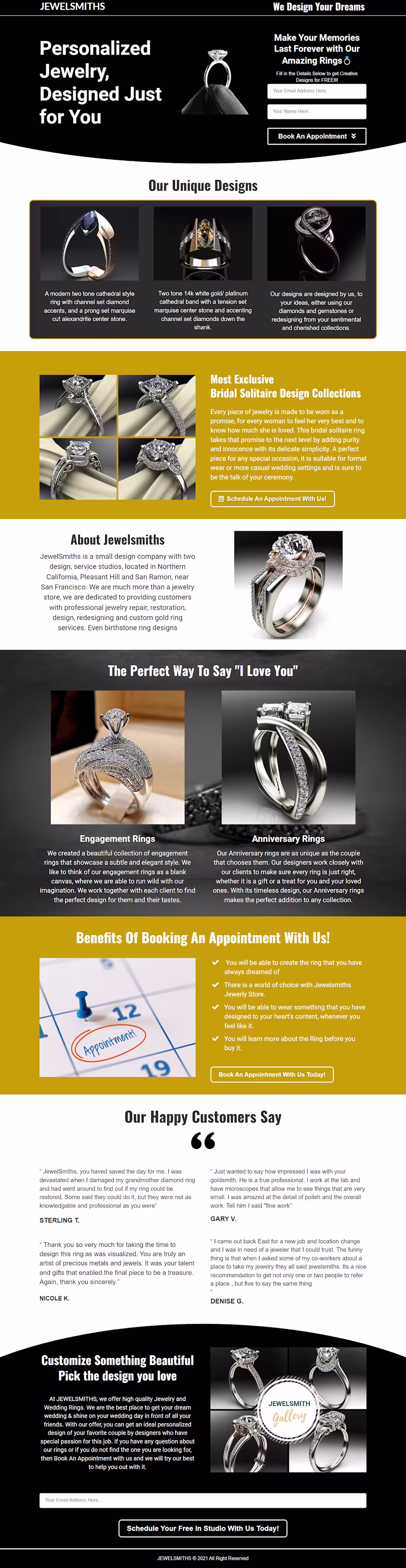
Personalized Jewelry Landing Page — JewelSmiths
Overview
JewelSmiths is a small but premium jewelry design company based in Northern California, with studios in Pleasant Hill and San Ramon near San Francisco. They go beyond a typical jewelry store — offering professional repair, restoration, custom ring design, and even birthstone ring services. Their brand is built on craftsmanship, personalization, and emotional connection, catering to clients who want jewelry that tells their unique story.
The Goal
Design a conversion-focused landing page that positions JewelSmiths as the go-to destination for personalized, high-quality jewelry while driving visitors to one clear action — booking a free in-studio appointment. The page also needed to showcase their design collections, build trust through social proof, and communicate the full range of their services in a visually compelling way.
Challenges
The core challenge was communicating luxury and personalization without alienating everyday buyers. Jewelry purchases are deeply emotional and high-consideration — visitors needed to feel both inspired and confident before taking action. Another challenge was organizing multiple offerings (engagement rings, anniversary rings, bridal collections, custom designs) into a clean, digestible flow that didn't feel overwhelming or scattered.
Solution / Outcome
A bold dark-themed design with gold accents was chosen to immediately signal premium quality. The hero led with an emotional headline and a low-friction lead capture form to pull visitors in from the first scroll. Collections were showcased with rich product imagery, followed by an "About" section to humanize the brand and build trust. Real customer testimonials were placed strategically before the final CTA to handle last-minute hesitation.
The result was a full-funnel landing page that moves visitors from curiosity to confidence to conversion — a page that sells not just jewelry, but the emotion and memory behind every piece.
0
31
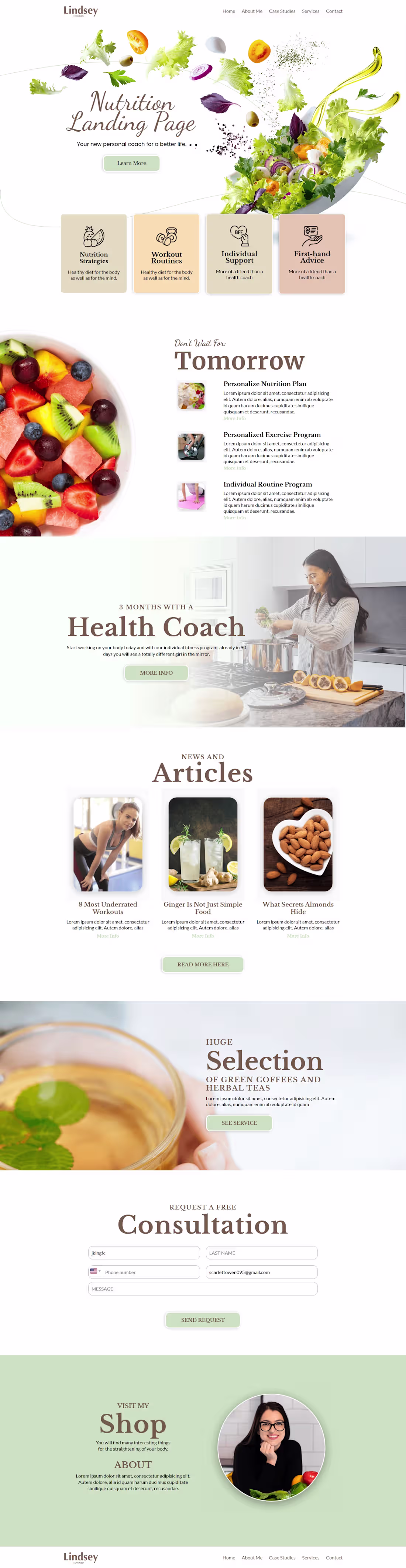
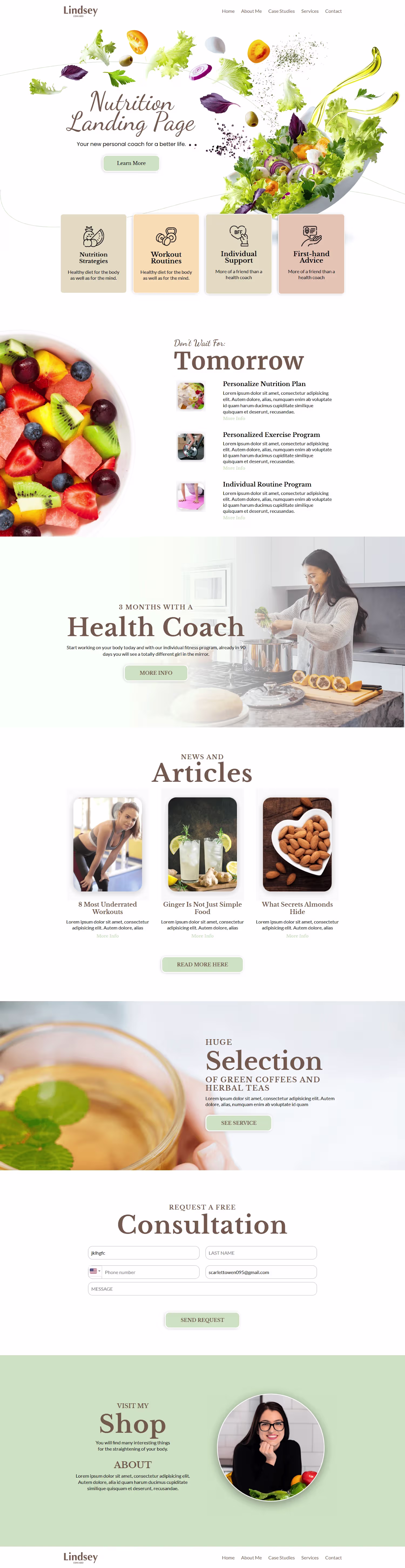
Nutrition Landing Page — Lindsey | Personal Health Coach
Overview
Lindsey is a personal health and wellness coach helping clients transform their well-being through tailored nutrition strategies, workout routines, and one-on-one support. Her brand blends warmth with credibility — positioned as a trusted friend with expert-level knowledge. The visual identity reflects this through an earthy palette of sage greens, warm creams, and muted golds that feel natural and approachable.
The Goal
Design a high-converting landing page that establishes Lindsey's authority, clearly communicates her services, and drives visitors toward one key action — booking a free consultation. Every section was structured to guide visitors through a trust-building journey, from the hero all the way to the consultation form.
Challenges
The biggest challenge was balancing personality with professionalism. Health coaching is a saturated space where most pages feel either too clinical or too casual. The second challenge was information hierarchy — Lindsey offers multiple services, and presenting them without overwhelming visitors required careful layout decisions to avoid decision fatigue.
Solution / Outcome
A scroll-based storytelling structure that reveals value progressively. The hero led with an emotional hook, feature cards gave a quick service snapshot, and a dedicated section handled commitment objections by showing what 3 months of coaching looks like. Educational articles built authority, while a low-friction free consultation form closed the funnel.
The result was a landing page that functions as a complete sales funnel in a single scroll — attract, educate, trust, convert. The key lesson: people don't buy services, they buy the version of themselves they believe that service will help them become.
0
35