Brandkind Global
Branding & Packaging Design Studio for FMCG Brands
New to Contra
Brandkind is ready for their next project!
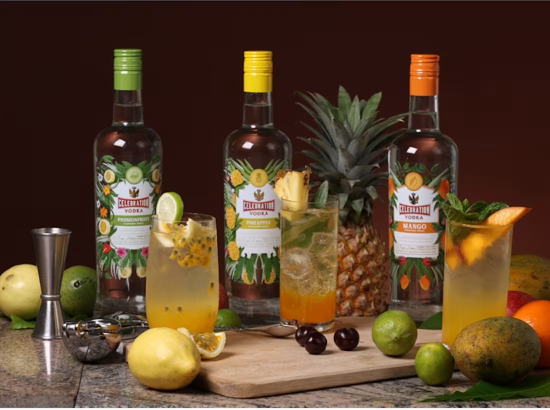
We developed a botanic-inspired illustration system for Celebration Botanica, ensuring that each flavor variant followed a cohesive and standardized design language. The illustrations were crafted with intricate botanical details that highlighted the natural ingredients of each flavor, such as mango, passion fruit, and pineapple.
These botanical elements gracefully surrounded the label, creating a refined and visually harmonious look and feel. The result was a consistent shelf presence where every bottle stood out individually yet contributed to a unified and premium brand experience.
0
11
We created the brand name Ceylonbury, a name that feels timeless and luxurious while carrying a subtle nod to global fashion sensibilities. The goal was to merge Sri Lankan heritage with a modern, editorial edge, blending culture and couture in one refined identity.
The logo was designed with a clean, contemporary aesthetic, setting the tone for the brand’s minimal direction. Every detail, from the black and white photography to the lookbooks and website, was art directed to feel sleek, understated, and fashion forward. Ceylonbury embodies modern Sri Lankan fashion through simplicity, elegance, and quiet confidence.
0
16
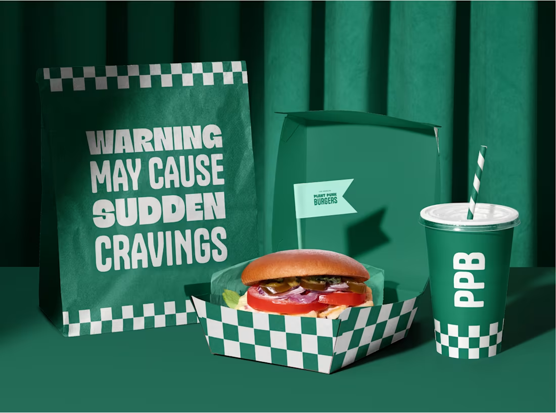
We planted PlantPunk Burgers with the idea of making vegan food feel fun, loud, and full of attitude. The name itself is bold and rebellious, setting the tone for a brand that doesn’t play by the rules. We built a strong identity using vibrant whites and greens that bring freshness and punch, while a cheeky burger character adds humor and personality.
With playful illustrations, contemporary typography, and a design system that ties it all together, the brand takes inspiration from the retro streets of Los Angeles mixing nostalgia with modern edge to show that vegan can be bold, exciting, and unapologetically fun.
0
19
We took a holistic approach to reimagining Ride Energy’s presence. To amplify shelf impact, we created a striking can illustration system with high-contrast colors, layered graphics, and bold compositions that conveyed energy and movement.
This look extended across communications, marketing, and point-of-sale, resulting in a powerful, cohesive brand that drove a 10x increase in sales.
0
28
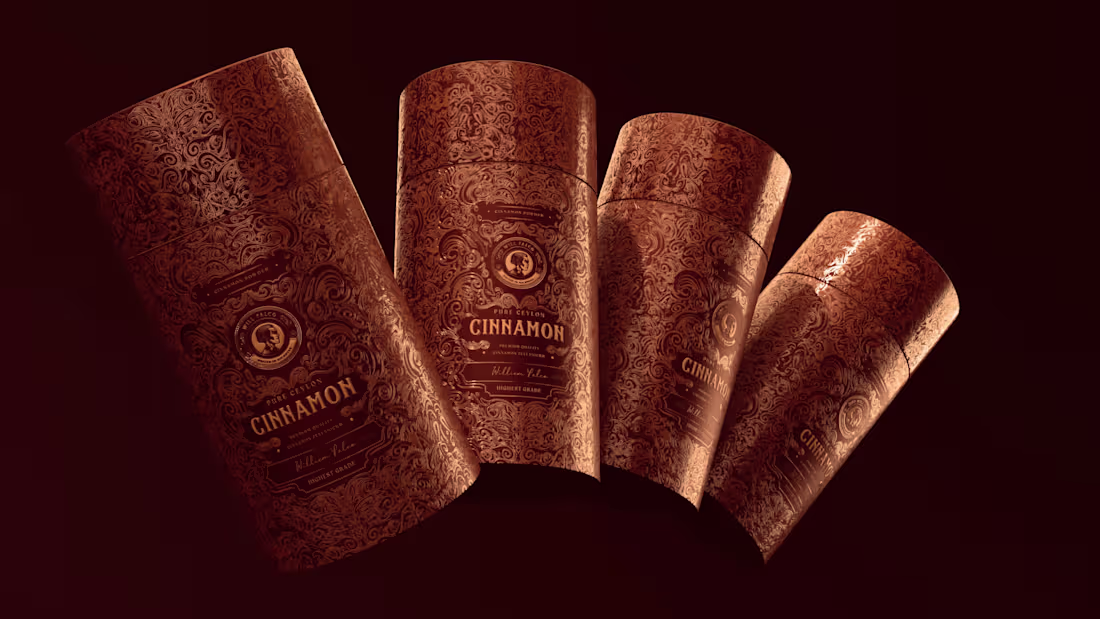
We created a brand identity that pays homage to Ceylon’s colonial heritage through refined design and storytelling. The logo was inspired by historic Ceylon coins, capturing a sense of legacy and craftsmanship associated with the William Falck name.
The packaging was developed with an ornate colonial-inspired pattern that wraps seamlessly around the box, complemented by spot UV finishes to enhance its premium appeal. Using a combination of elegant serif typography, a coin-inspired emblem, and a palette of rich, luxurious tones, Will Falco was designed to embody sophistication and authenticity for the European mark.
0
33