
Jan Nisar
Data Analyst | Power Bi and Excel Expert
New to Contra
Jan is building their profile!

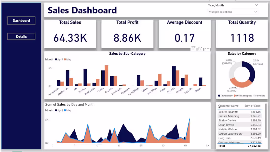
Interactive Power BI Sales Dashboard analyzing sales, profit, discounts, and quantity trends across categories and sub-categories. Features KPI cards, monthly sales comparison, category-wise insights, customer sales table, and dynamic filtering for better business decision-making and performance tracking.
Features
Total Sales KPI
Profit Analysis
Sales by Category
Monthly Trend Analysis
Customer Sales Insights
Tools Used
Power BI
Microsoft Excel
0
26
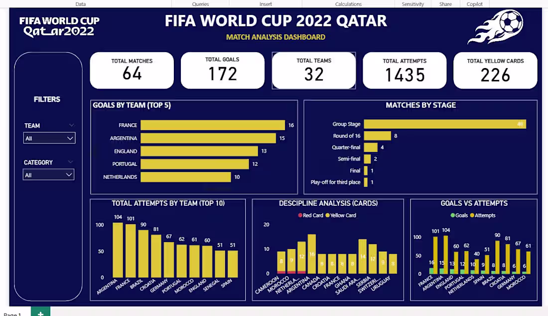
This Power BI dashboard provides an interactive analysis of the FIFA World Cup 2022 held in Qatar. The project transforms raw match data into meaningful insights through dynamic visualizations, helping users explore team performance, goal statistics, match stages, disciplinary records, and attacking efficiency.
Features
KPI cards displaying:
Total Matches
Total Goals
Total Teams
Total Attempts
Total Yellow Cards
Interactive Filters:
Team Selection
Category Selection
Visual Analysis:
Top 5 Teams by Goals Scored
Matches Distribution by Tournament Stage
Top 10 Teams by Total Attempts
Discipline Analysis (Yellow Cards vs Red Cards)
Goals vs Attempts Comparison
Dashboard Insights
France and Argentina were among the highest-scoring teams.
The Group Stage accounted for the majority of matches played.
Argentina and France recorded the highest number of goal-scoring attempts.
Card analysis highlights the disciplinary trends across participating teams.
Tools Used
Power BI
Power Query
DAX
Data Modeling
Data Visualization
0
37
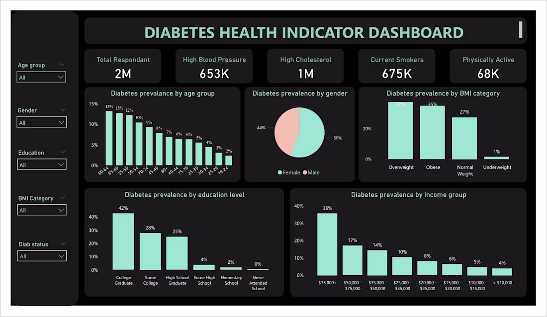
Diabetes Health Indicator Dashboard built in Power BI using 28k+ health survey records. The dashboard analyzes diabetes prevalence across age groups, gender, BMI categories, education levels, and income groups. Interactive filters and KPI cards provide actionable insights into key diabetes-related health indicators and risk factors.
0
41
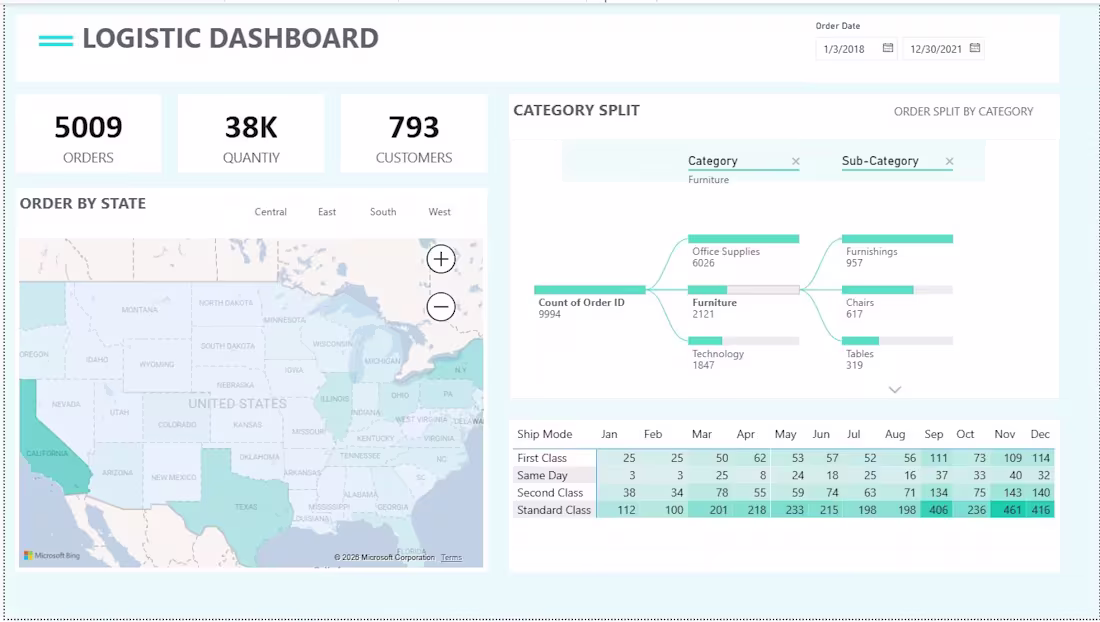
Logistics Dashboard – Power BI
Designed and developed an interactive Logistics Dashboard in Power BI to provide real-time insights into order performance, customer activity, and shipping operations. The dashboard features key performance indicators (KPIs) such as total orders, quantity sold, and customer count, along with geographic analysis through state-wise order distribution maps.
Key features include:
KPI cards for quick business performance monitoring
Interactive map visualization for regional order analysis
Category and sub-category breakdown using hierarchical visualizations
Shipping mode performance analysis with monthly trends
Date filtering and cross-filtering for dynamic data exploration
Clean, professional, and user-friendly dashboard design
This project demonstrates skills in data modeling, data visualization, dashboard design, and business intelligence reporting using Power BI to transform raw logistics data into actionable insights.
Tools Used: Power BI, Excel, Data Modeling, DAX, Data Visualization
Role: Data Analyst / Power BI Developer
0
45