


@Figma Designed hero section
0
26
Mino Works
0
37

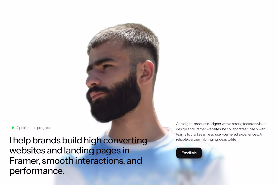
Jamyl - Portfolio
1
110
While showing the work to client
0
62
Portfolio
1
60
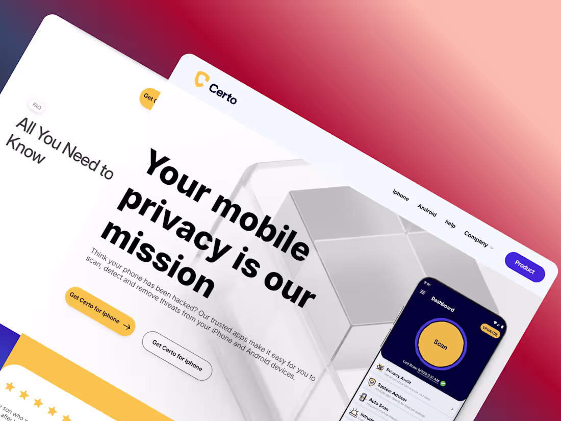
Privacy Site for a phone
0
51
Hero Section
0
51
Testimonials
0
55
Framer Canvas
0
74

Bento design is trending nowadays, and it looks great when it comes to component-based design.”
Bento-style layouts allow content to be organized into clean, structured blocks, making interfaces easier to scan and visually engaging. This design approach enhances clarity, improves user experience, and works perfectly for modern SaaS websites and landing pages. Each component feels purposeful, flexible, and reusable, which makes the overall design both functional and aesthetically pleasing. Bento design also adapts beautifully across screen sizes, helping create responsive layouts that feel consistent and polished on all devices.
3
142

Pricing Section for a Saas site
3
184
When creating a simple animation, not every element needs to be designed with complexity; instead, they should be built simply but with creativity. I believe that when a developer works on more complex designs, they must focus heavily on the smoothness of the transitions and the overall visual appearance.
2
203
Dreelio
https://dreelio.framer.website/#features
0
245
Any thoughts?
0
251
CTA
0
216
Complex designs are impressive, but it’s often the simplest little animation that makes people go “wow” and brings the whole experience to life.
2
181

What do you think?
8
4
243

A smooth parallax hero that feels alive with depth and gentle motion.
As you scroll, the background shifts subtly, pulling you into the design.
Clean, modern, and thoughtfully optimized for a fast, effortless experience.
0
151

A well-crafted footer isn’t just the end it’s a strategic touchpoint that guides users even after the scroll.
In expert hands, it becomes a place where branding, navigation, and trust quietly converge.
2
2
191

Great design isn’t just about how something looks it’s about how it feels to use. UX ensures every interaction is smooth, intuitive, and meaningful, turning a good-looking interface into an experience people actually enjoy. When users can navigate effortlessly, find what they need, and feel confident while using your product, that’s when design truly works. UX is the backbone that transforms visuals into real value.
3
189

Designing an agency website isn’t that complicated—most of them follow a predictable structure with hero sections, service grids, testimonials, and clean layouts. What truly challenges designers are projects where the design system is deeper, the interactions are heavier, or the product itself demands complex user flows.
Agency websites are straightforward because they focus on presentation.
Product, SaaS, or app-level designs are more complicated because they focus on logic, states, data, and deep interaction patterns.
3
211

Some of the best designs have something special hidden in their consistency.
It’s the harmony of colors, spacing, and rhythm that makes a website feel effortless and alive.
True beauty in design isn’t loud it’s quietly intentional.
2
173

In your opinion, what is the intended purpose of this section?
1
223

Why Lovable Became My Go-To Dev Companion
I built this project on Lovable.dev (http://Lovable.dev) using just a 10-line prompt without spending a single hour manually coding. As a developer, I did face a few limitations, such as needing the premium version to add more content, but that’s completely understandable. Great tools require time, effort, and investment to stay amazing.
What I can say is this: Lovable is something I genuinely love using.
As a developer, I use it often, and it consistently delivers beautiful designs and functional sites with ease.
AI should be our assistant not something we fully depend onand Lovable fits perfectly into that idea. It boosts creativity, saves time, and helps turn ideas into live products effortlessly.
Amazing work to the Lovable team. Keep building! 💛🚀
3
154

🏙️ Framer Component Drop Modern Hero Section
Built this sleek, professional hero section in Framer designed for AI, SaaS, or agency websites. It features a bold background image, clean typography, and dual CTAs “I’m Looking for Work” and “I’m Looking to Hire” to instantly engage visitors. The layout combines minimal design, rounded corners, and smooth animations to create a premium first impression while staying lightweight and responsive across all devices. Perfect for anyone aiming to make their Framer site look polished and business-ready. 💼
2
241

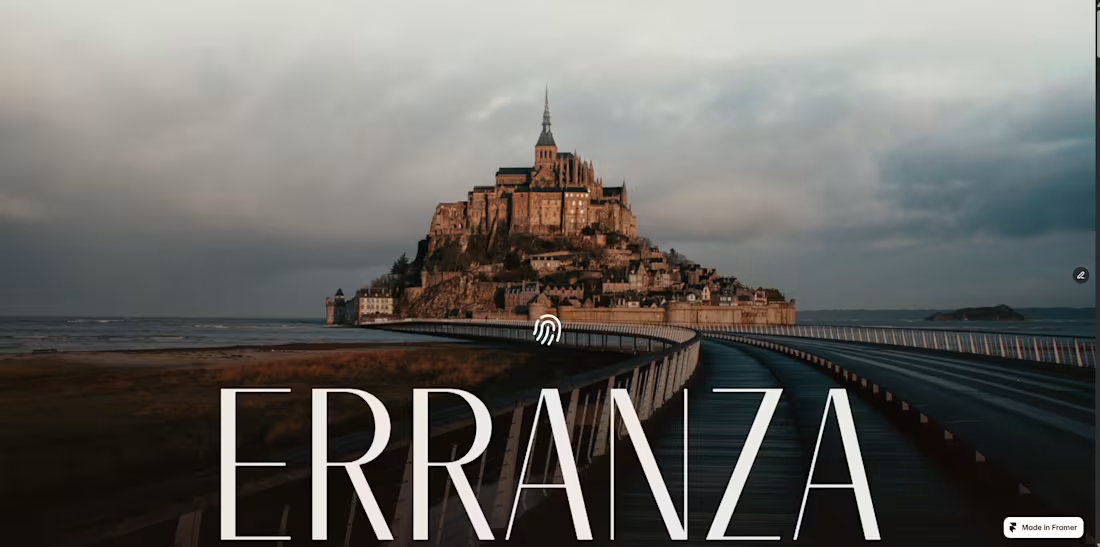
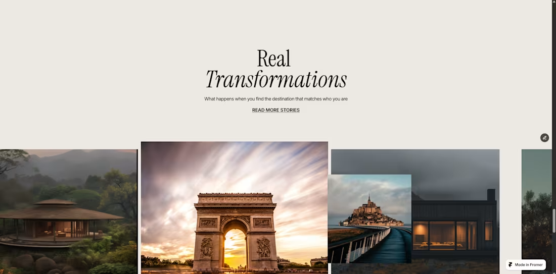
A clean, modern Framer website showcasing a creative media brand through cinematic visuals and smooth scroll-driven storytelling. The design features full-screen hero sections, intuitive navigation, and elegant micro-animations that elevate user engagement. Built with a strong visual hierarchy, responsive layout, and a minimalist black-and-white aesthetic to deliver a premium, polished user experience.
2
140

Design consistency matters. No matter what content the client provides long-form copy, minimal text, heavy imagery, or complex layouts I ensure every element fits seamlessly into the visual system. I focus on maintaining a unified rhythm across spacing, typography, hierarchy, and interactions, so each section feels intentional and cohesive. Whether it’s adjusting layouts to support different content lengths, refining components for clarity, or balancing visual weight across the page, I make sure the final design stays consistent, flexible, and aligned with the original direction. My approach is simple: respect the design, elevate the details, and create a Webflow build that feels polished, structured, and professionally cohesive from top to bottom.
3
148

Framer Component Drop
Minimal About Section
Crafted this clean, lightweight About Us section in Framer, designed for agency and business websites that value clarity and elegance. It features a four-card layout with smooth hover interactions, bright colors, and a modern minimal aesthetic. Perfect for showcasing key achievements like Years of Experience, Client Satisfaction, and Successful Hiring.
Built with scalability in mind fully responsive, easy to customize, and optimized for fast loading. A perfect blend of simplicity and interactivity, ideal for any modern landing page.
2
164

A truly best-in-class website is more than visuals it’s a perfectly crafted experience. It combines a hero section that instantly captures attention, bold typography, clean layouts, and a clear value message. It includes smooth interactions, smart animations, and modular components like service cards, testimonial sliders, pricing tables, feature grids, case-study sections, and a magnetic CTA that drives action. An ideal site feels effortless: ultra-fast performance, flawless responsiveness, intuitive navigation, modern UI patterns, and a consistent brand language woven through every section. Every component works together like a story engaging, guiding, and converting visitors into clients with ease.
4
4
157
🎯 Just finished creating custom cursors in Framer, and they turned out awesome! 🖱️✨
I experimented with smooth animations, hover effects, and seamless transitions — and the result is a super interactive, modern cursor experience that really elevates the overall feel of the website.
Framer’s flexibility with motion and interactions makes it so easy to bring creative ideas like this to life. 🔥
If you’re into UI motion or micro-interactions, this one’s definitely worth trying!
#Framer #UIDesign #MicroInteractions #CreativeDevelopment #WebDesign #NoCode
2
5
199

🚀 Framer Component Drop Interactive Tabs Section
Built this sleek tab-based component in Framer, perfect for modern SaaS, agency, or portfolio websites. Each button dynamically updates content with smooth transitions ideal for showcasing services, team roles, or product features. Designed with a minimal dark-on-light aesthetic for a clean and professional feel.
It’s fully customizable and built to deliver clarity, interactivity, and that “Framer-level polish” your site deserves. 💡
2
185