
Jakaria Mahmud
Your Creative Growth Partner
Ready for work
Jakaria is ready for their next project!
What would branding and animation by WolfPixel look like for your business? 🚀
If you have an idea, feel free to claim your free consultation, normally valued at $879.
Let's explore how strategic branding, motion design, and creative storytelling can help your business stand out, attract attention, and drive growth.
0
8
Klasio LMS System – Modern Learning Management Dashboard
0
14
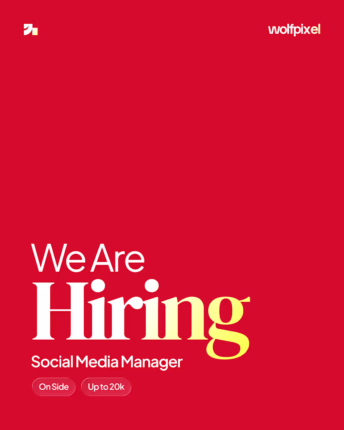
🚨 WE ARE HIRING 🚨
Join the Wolfpixel team as a
✨ Social Media Manager ✨
We’re looking for someone creative, strategic, and passionate about building brands through content, storytelling, and community engagement. If you know how to create impact online and turn ideas into attention, we’d love to hear from you.
📍 On-site
💰 Salary: Up to 20K
To apply, send your CV & portfolio to:
hello@wolfpixel.agency
(mailto:hello@wolfpixel.agency)Let’s create something amazing together. 🔥
1
11
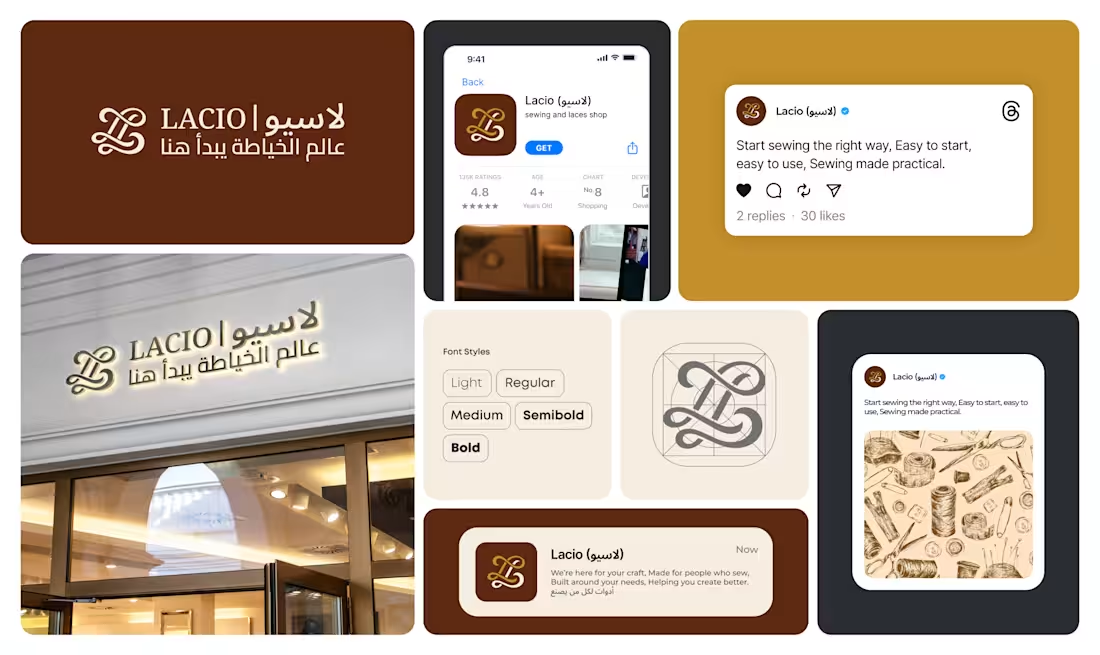
Modern branding for a sewing & tailoring business. Clean, memorable, and built to help the brand stand out in a competitive market.
#Branding #LogoDesign #BrandIdentity #BusinessGrowth #GraphicDesign #Startup
1
3
31
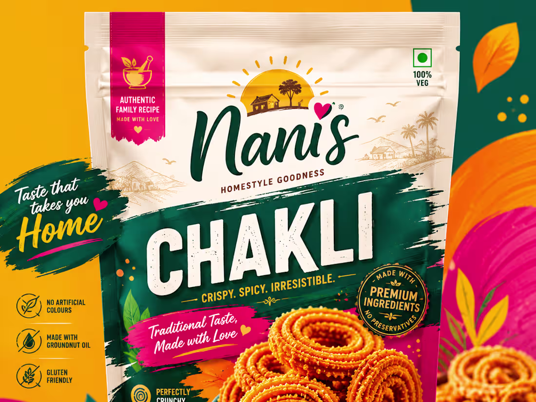
Modern Packaging Design
2
23
এই ঈদে গরু হোক বা কেরু, আপনার বিজনেসের ক্রিয়েটিভ যাত্রা হোক আমাদের হাত ধরে শুরু। ✨
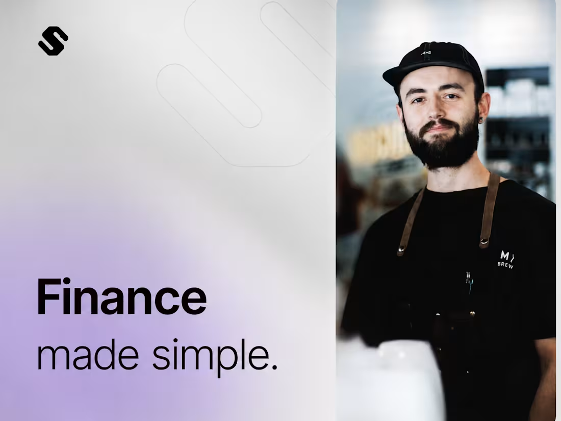
Introducing " Spensibly" smart finance management app built to make money management simple, modern & stress free.
Clean UI, smooth experience, and powerful motion crafted for modern digital brands
আর যদি ব্র্যান্ডিং, প্রোডাক্ট ডিজাইন বা স্টার্টআপ নিয়ে কোনো আইডিয়া মাথায় ঘুরতে থাকে, ক্রিয়েটিভ আড্ডার জন্য ইনবক্স সবসময় খোলা। 👀
2
22
Modern 3D Landing Page Experience 🚀✨
#3DLandingPage #LandingPageDesign #3DWebsite
2
22
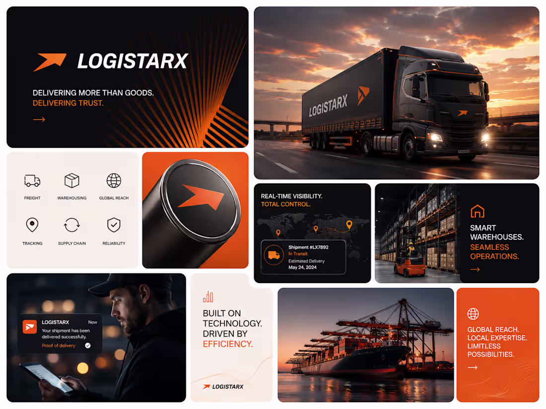
LogistarX — Modern Logistics Brand Identity 🚛⚡
0
22
Curely - Clinic Management System
#UIUX #HealthcareDesign #HealthTech #Figma #Telemedicine
0
20
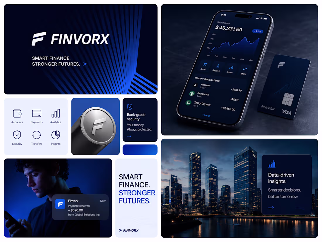
Building a finance brand that feels modern, secure, and future-ready.
For Finvorx, the goal was simple: create a visual identity that combines trust, technology, and premium digital banking aesthetics into one cohesive experience.
From the bold blue visual system to the sleek app interface and brand assets, every detail was designed to communicate confidence, clarity, and innovation.
Smart finance. Stronger futures. ⚡
#BrandIdentity #FintechDesign #UIUX #Branding #VisualIdentity #FinanceBranding #CreativeDirection #LogoDesign #DigitalBranding #Finvorx
3
4
84
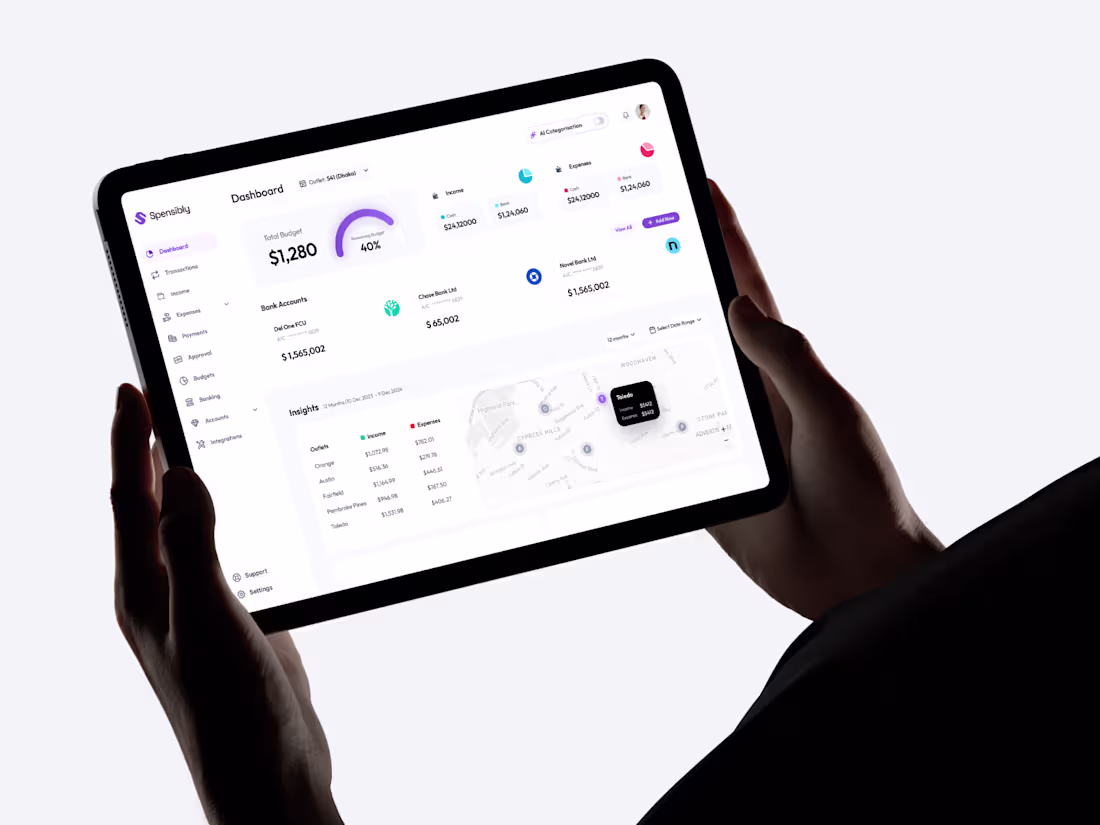
A modern and intuitive finance dashboard designed for seamless money management and real-time insights. Spensibly focuses on clarity and usability, combining clean data visualization with a soft, minimal interface. The layout highlights key metrics like income, expenses, and budget tracking while ensuring smooth navigation across accounts and transactions. Designed with scalability in mind, it delivers a premium experience across tablet devices with a strong emphasis on accessibility and visual hierarchy.
0
36
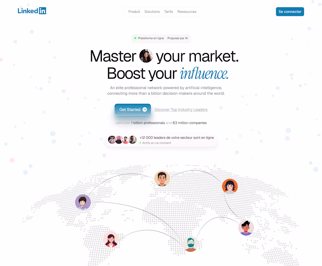
What if LinkedIn’s first screen felt more powerful, modern, and human?
Here’s our take on a next-gen hero experience.
1
7
78
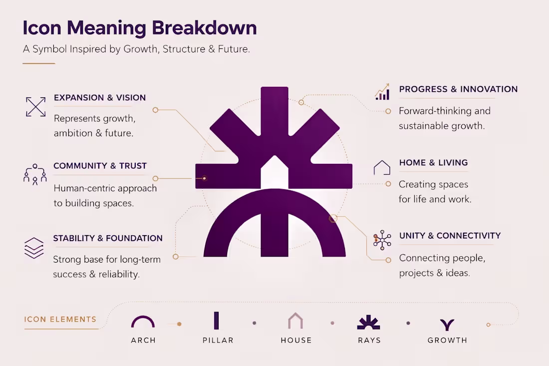
Most construction brands struggle with one thing, they look the same.
No story, no meaning, no differentiation.
That’s where design should step in, not just to look good, but to communicate value.
This identity for Bellevue Construction is built with intention:
Every element of the icon represents what clients actually care about,
• Growth & long-term vision
• Trust & human connection
• Stability & strong foundation
• Innovation & future-ready thinking
• Spaces that feel like home
• Unity between people, ideas, and projects
A logo isn’t just a symbol — it’s a business tool that builds perception, trust, and positioning in a competitive market.
If your brand isn’t telling a story, you’re already losing attention.
Designed to mean something. Built to last.
2
34
Logistic Branding Design
1
42
AI-Powered Property & Tenant Management Dashboard
0
32
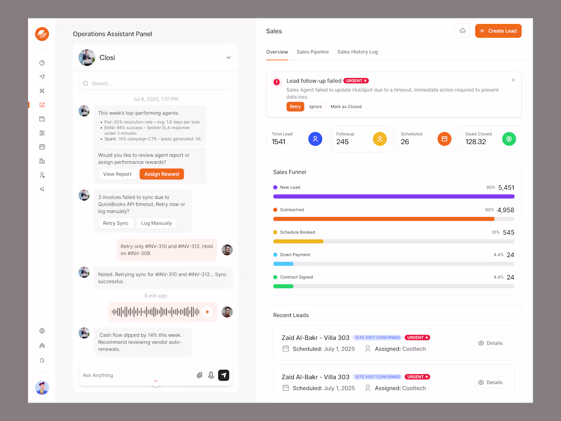
New Case Study Alert : https://www.behance.net/.../AI-Finance-Dashboard-Experience
1
2
44
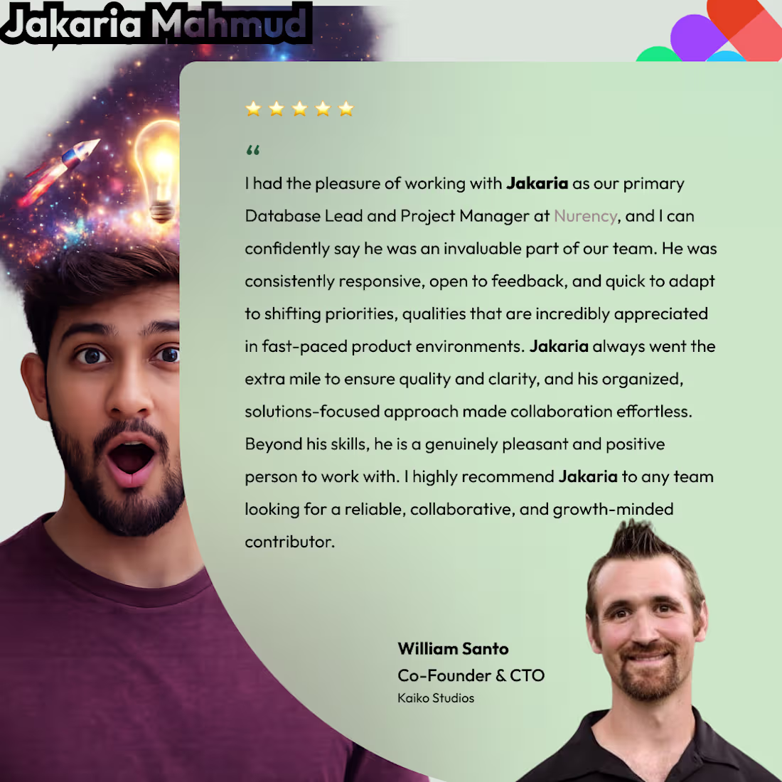
Grateful for moments like this.
Working in fast-paced environments means adapting quickly, staying organized, and always keeping quality at the center of everything you do.
I’ve always believed that real impact comes from clarity, collaboration, and being genuinely invested in the success of the team, not just the task.
Feedback like this is a reminder that consistency, openness to feedback, and a solutions-first mindset truly matter. Proud of the work done, the challenges overcome, and the relationships built along the way.
On to building more, learning more, and creating meaningful results with great people.
1
48
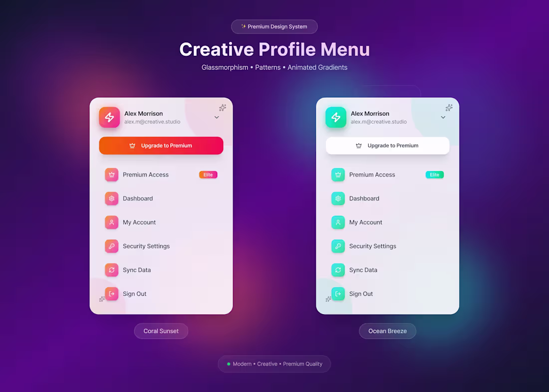
Modern User Profile Menu – SaaS Dashboard UI
0
30
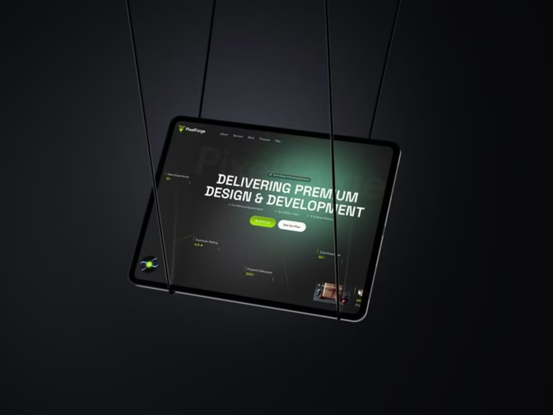
Premium Design & Development Agency – Hero Section UI
1
40
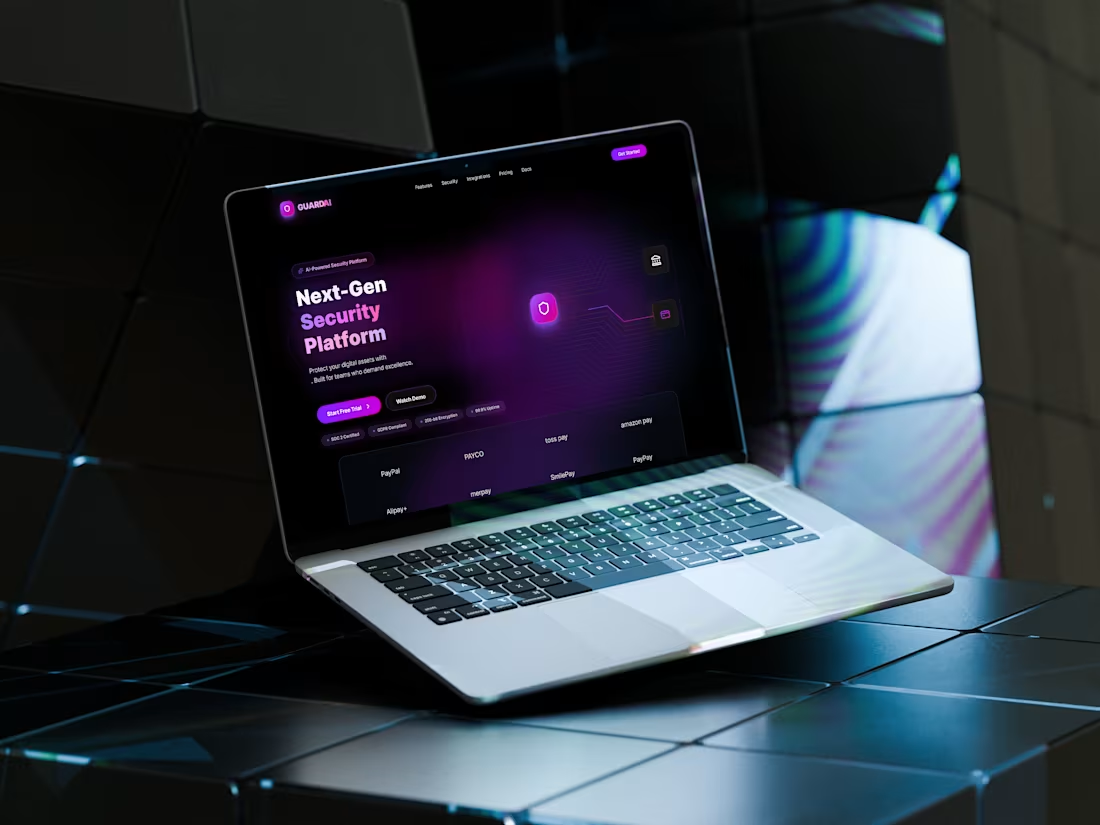
Next-Gen Security Platform – SaaS Hero Section UI
A dark-mode hero section designed for a next-generation cybersecurity SaaS platform.
Focused on trust, performance, and clarity using bold typography, neon accents, and a modern tech aesthetic.
✨ Dark UI • SaaS • Cybersecurity
#UIDesign #SaaSDesign #CyberSecurity #DarkUI #WebDesign #HeroSection #ProductDesign
1
1
44
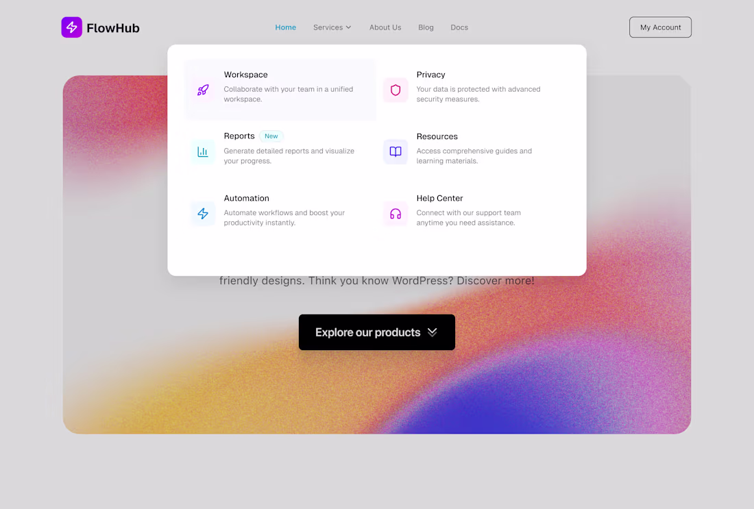
SaaS Website Mega Menu & Navigation UI
1
37
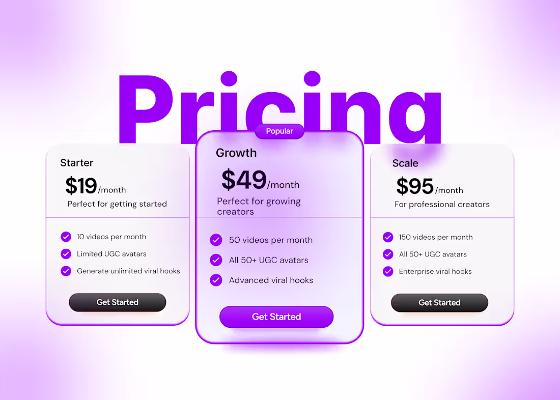
A well-designed pricing page can make or break conversions.
This SaaS pricing UI is built with decision psychology, clear value comparison, and a strong visual hierarchy, helping users choose faster and businesses convert better.
Design that sells, not just looks good.
This pricing page design demonstrates how thoughtful UX can directly impact revenue. From plan differentiation to CTA placement, every element is crafted to reduce friction and increase confidence. Perfect for SaaS, creator tools, and subscription-based platforms looking to scale.
1
3
36
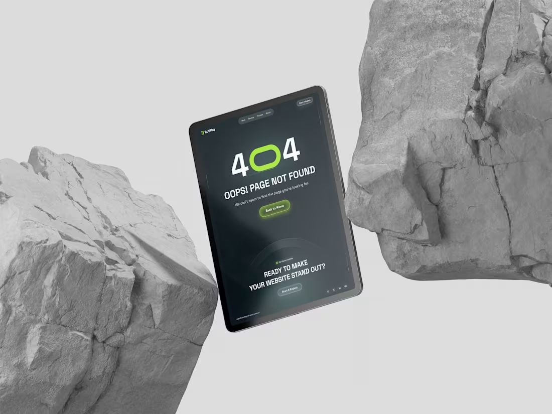
Even error pages can drive engagement and trust.
This 404 Page UI design focuses on guiding users, reinforcing brand identity, and keeping the experience smooth, because good UX doesn’t stop when something goes wrong.
Thoughtful design = better retention, even in edge cases.
A thoughtfully designed 404 error page that transforms a broken link into a brand opportunity. Built with a user-first mindset, clear messaging, and strong visual hierarchy to reduce frustration and improve navigation. Great UX is about handling every scenario, especially the unexpected ones.
#UIDesign #UXDesign #WebDesign #SaaSDesign #ProductDesign #UserExperience #404Page #DesignThinking
0
26
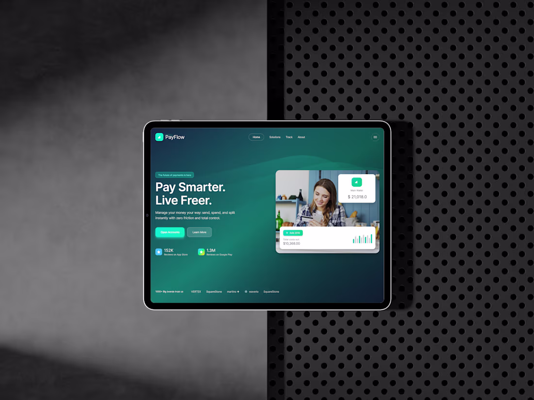
Designing a Better Financial Experience - Solving Cluttered, Confusing FinTech Interfaces
Most financial platforms still struggle with cluttered layouts, unclear data visibility, and low user trust.
This PayFlow UI concept is designed to solve those core problems by introducing:
– A clean, high-contrast hero section for instant clarity
– Smart card components that simplify wallet tracking
– Data visualization that reduces cognitive load
– A user-friendly onboarding structure that improves conversions
A design approach focused on solving real business challenges: better engagement, faster decision-making, and a more intuitive financial experience.
0
30
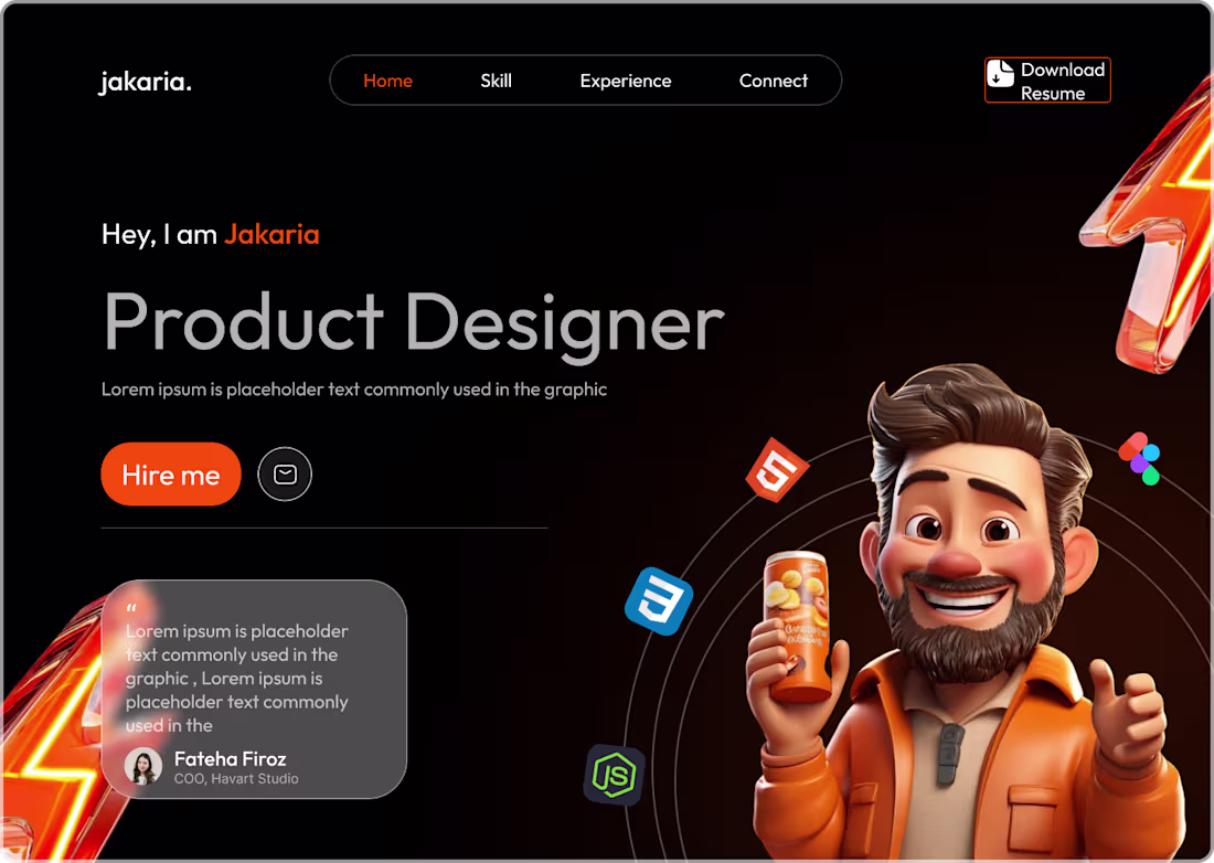
Built to highlight personal branding, strong visual hierarchy, and a clean UX for recruiters and founders.
A blend of modern UI, storytelling, and playful graphics to represent creativity and confidence.
#ProductDesign #UIUXDesign #Portfolio #WebDesign #BrandIdentity #DesignerShowcase
1
25
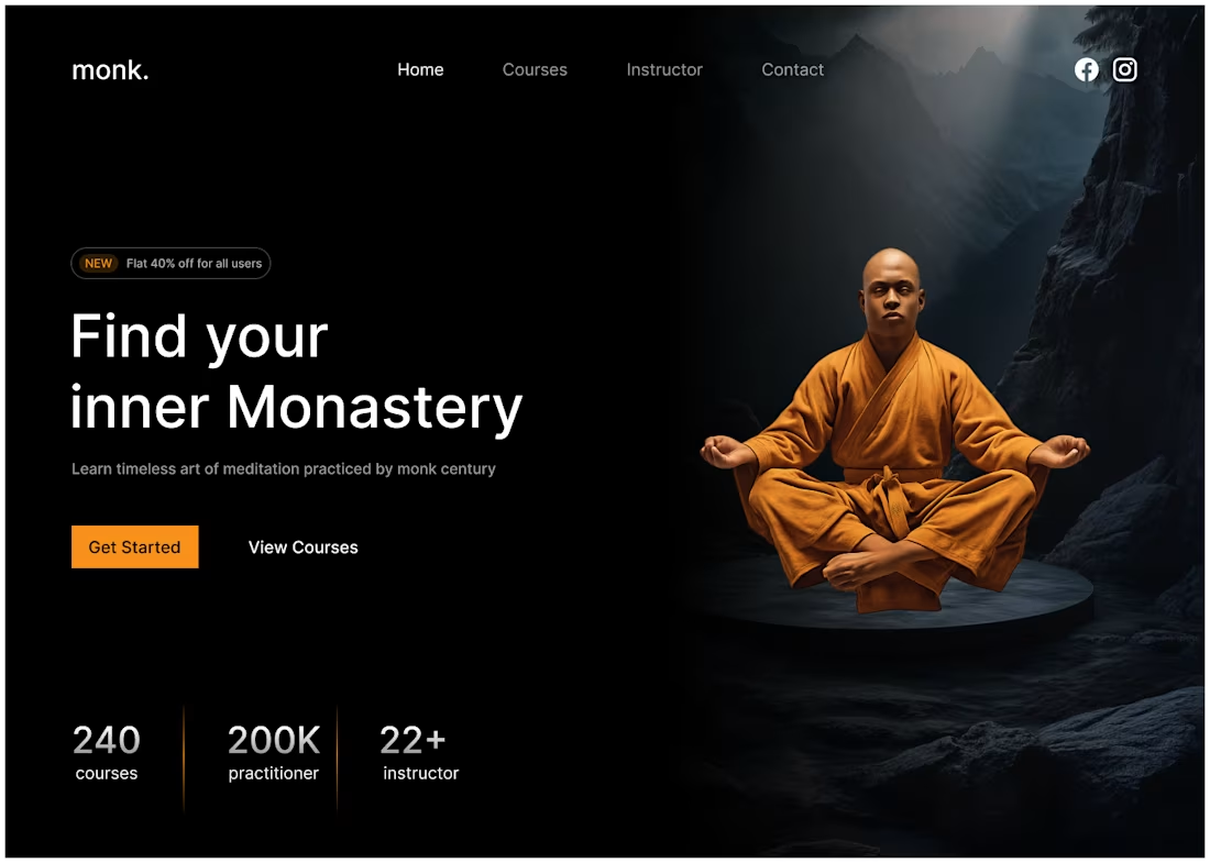
Sharing a new hero section concept for a meditation learning platform.
The goal was to create a peaceful, high-impact first impression that resonates with users seeking mindfulness and structured learning.
A blend of clean UI, storytelling, and visual balance.
#UIUXDesign #ProductDesign #WebDesign #Mindfulness #SaaS #DesignShowcase
1
1
38
Designed a modern, conversion-focused Crypto Website UI/UX, enhanced trust, simplified onboarding, and optimized user flow for Web3 users.
Pushing digital finance forward with intentional design.
2
2
35
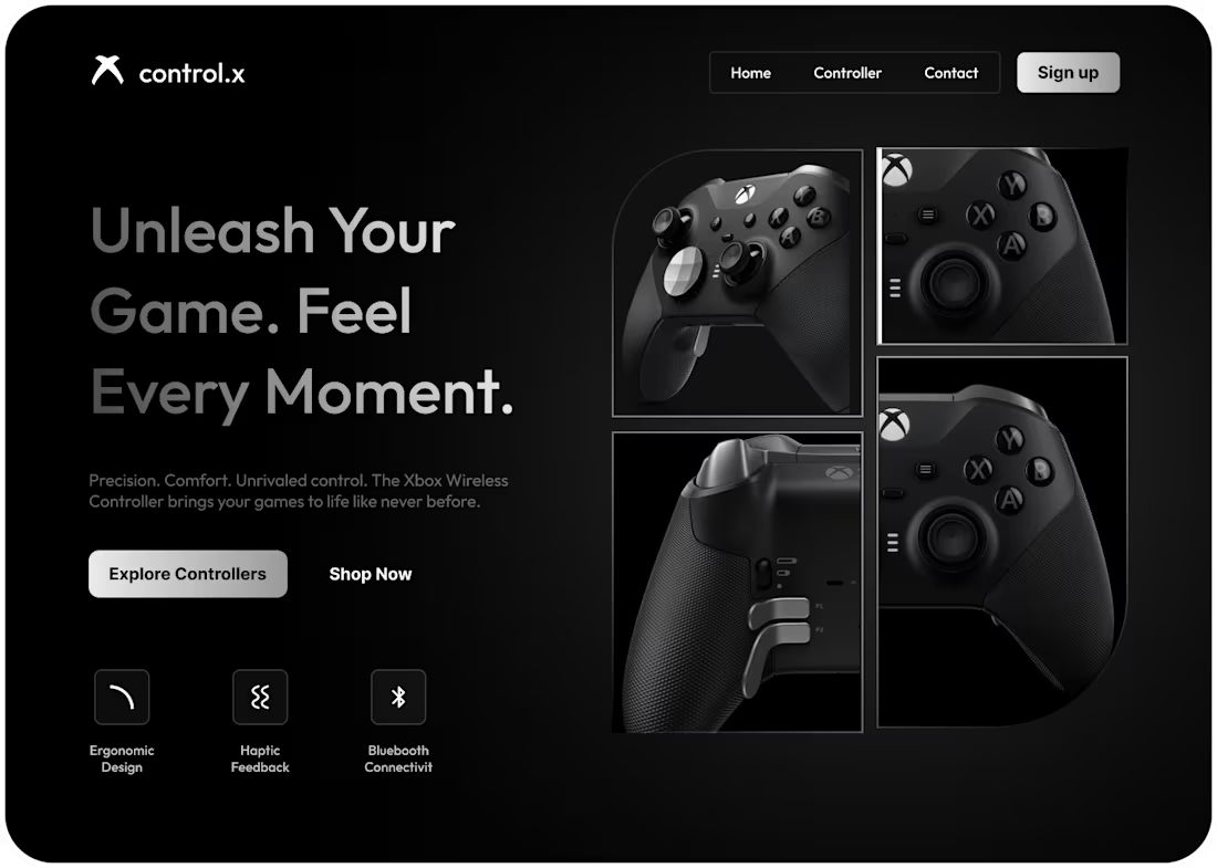
Premium Gaming Controller Landing Page – Control.X
This landing page concept is built for gaming brands looking to increase sales, create stronger digital identities, and highlight hardware features visually.
1
36
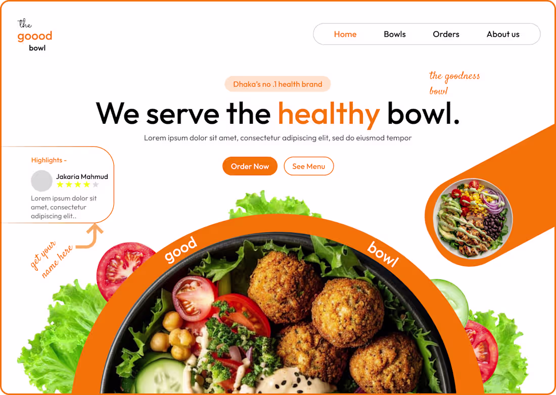
Healthy food landing page design for “The Goood Bowl.”
Crafted with a bright identity and clean layout to showcase freshness, trust, and brand personality.
Available for freelance UI/UX projects → Let’s work together!
4
5
40
4 Must-Haves for a Great Health Dashboard
Habit-centred design
Soft cards, calm visuals
Insights that make sense fast
Screens that keep users moving forward Good UX builds repeat habits.
2
36
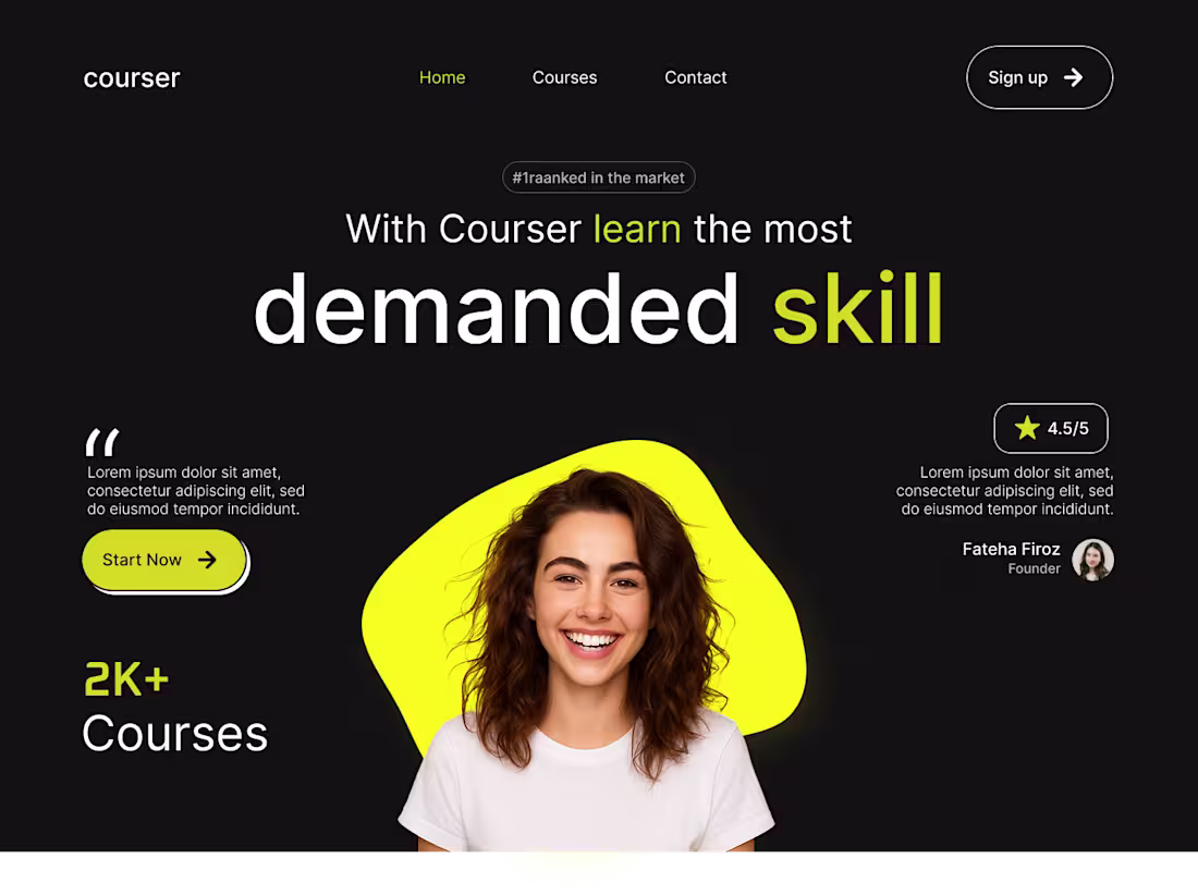
Courser – Learn the Most Demanded Skills
Designed a clean and bold learning platform landing page. High-contrast dark theme, yellow accents, hero spotlight, and powerful typography. Ideal for online courses & skill-based education.
2
44
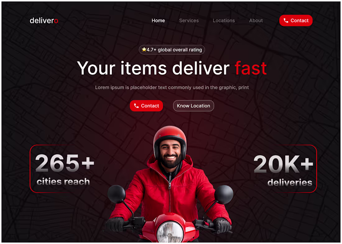
Delivero – Modern Delivery Landing Page
Designed a fast and clean delivery service homepage. Dark map layout, strong typography, bold red visuals, and real courier imagery. Perfect for logistics, courier, and on-demand service brands.
1
41
Modern Catering Service App UI - designed for easy meal planning, smooth ordering & a delightful browsing experience.
1
36
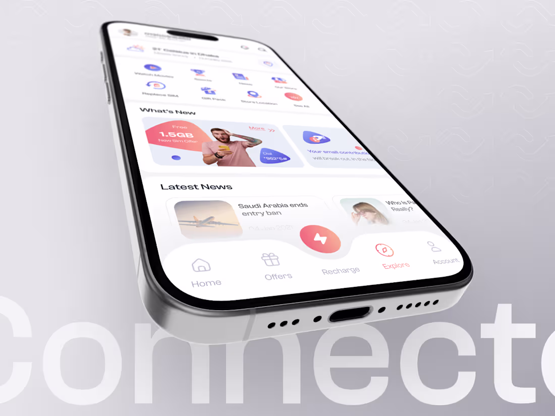
Designed a modern 5G eSIM data app with smooth onboarding and global connectivity.
0
34