Disha Nevare
Cyber Security Expert | UI/UX Designer
New to Contra
Disha is ready for their next project!

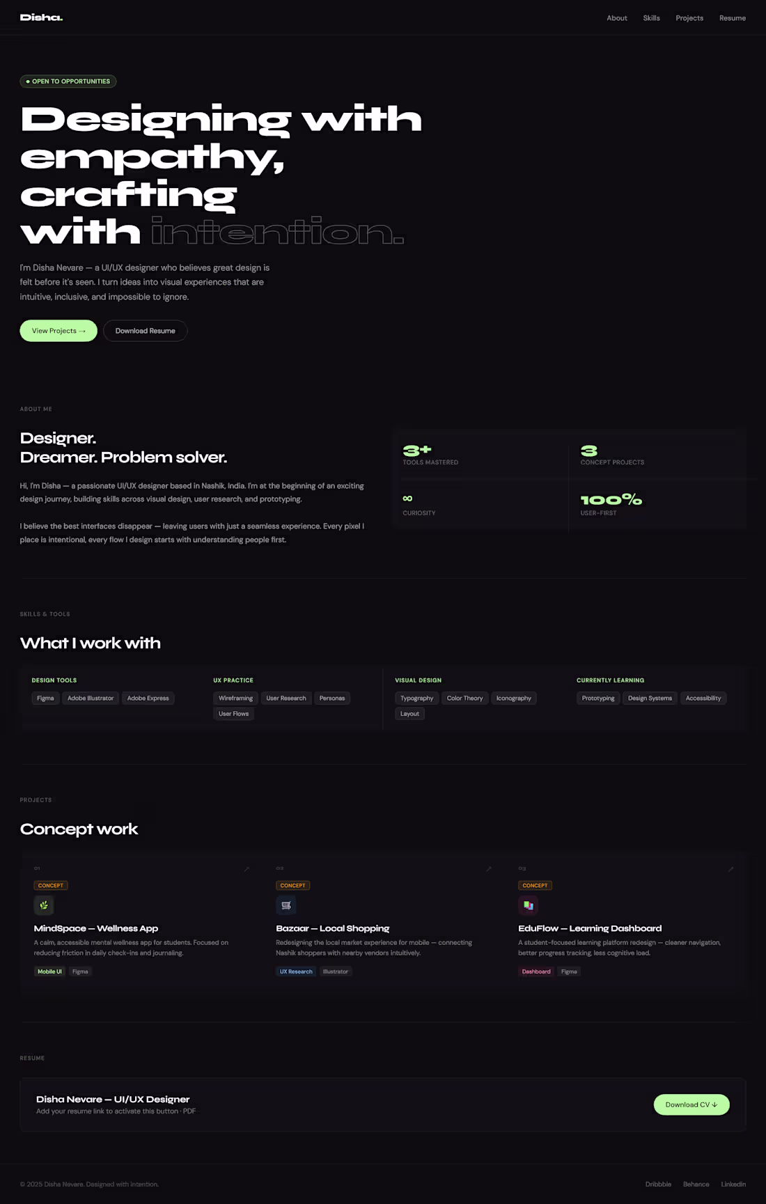
I designed this personal portfolio to serve as a high impact digital introduction to my work and design philosophy. The core challenge was to create a space that felt professional yet deeply personal, moving away from standard templates to something more intentional.
0
33
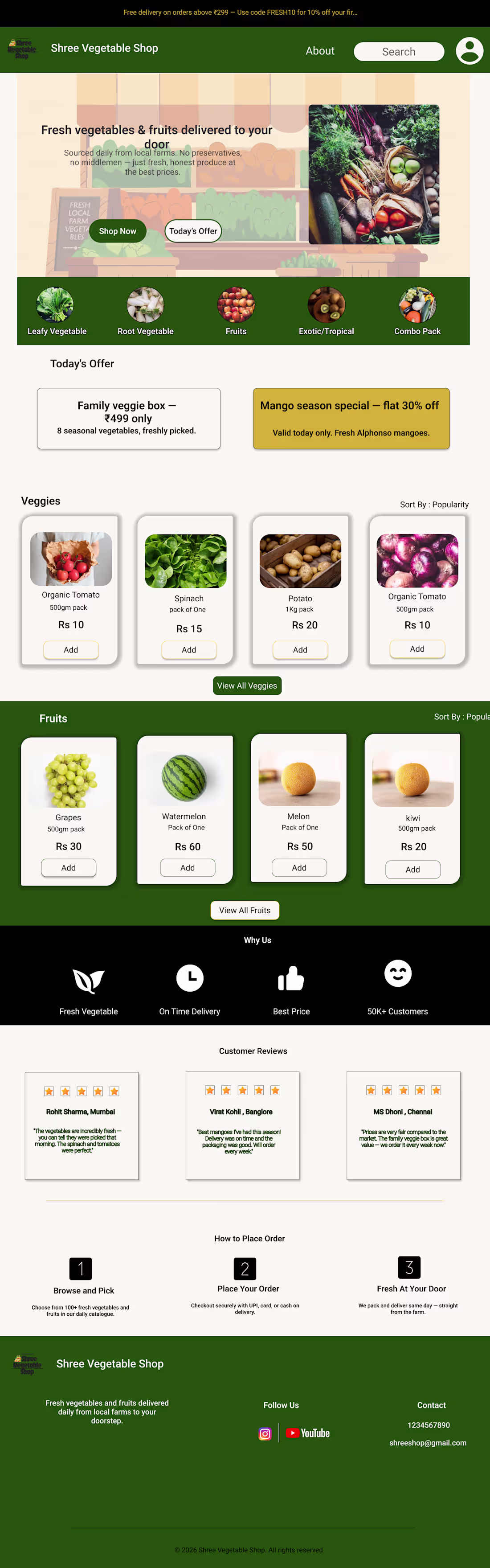
For this project, I designed a clean, high-conversion landing page for a local grocery service. The goal was to bridge the gap between the 'earthy' feel of a physical vegetable market and the efficiency of a modern app.
I chose a 'Growth and Flow' color palette, utilizing deep greens to establish trust and freshness, paired with vibrant lime and orange accents to draw attention to special deals like the 'Mango Season Special.' I focused heavily on a card-based layout for the product sections to ensure that the interface felt organized and easy to navigate, even with a high volume of items.
To build immediate user confidence, I integrated a 'Why Us' section and a customer testimonial block right on the home page. This project demonstrates my ability to create a functional e-commerce flow from the initial hero offer down to the step-by-step 'How to Order' guide while maintaining a consistent, inviting brand aesthetic.
0
34

For this brand identity, I wanted to capture the intricate beauty of Indian traditional wear through a digital lens. The goal was to create a logo that felt as layered and detailed as the garments themselves.
I spent a lot of time refining the AI prompts for the central figure to ensure it wasn't just a generic illustration, but one that captured the specific flow, jewelry, and embroidery styles essential to the brand’s identity. I then framed this detailed artwork within a series of overlapping geometric lines to represent a modern, structured retail environment. The soft gradient background shifting from a sun-drenched yellow to a regal violet mimics the play of light on silk and chiffon, giving the whole piece a sense of luxury and warmth.
0
56
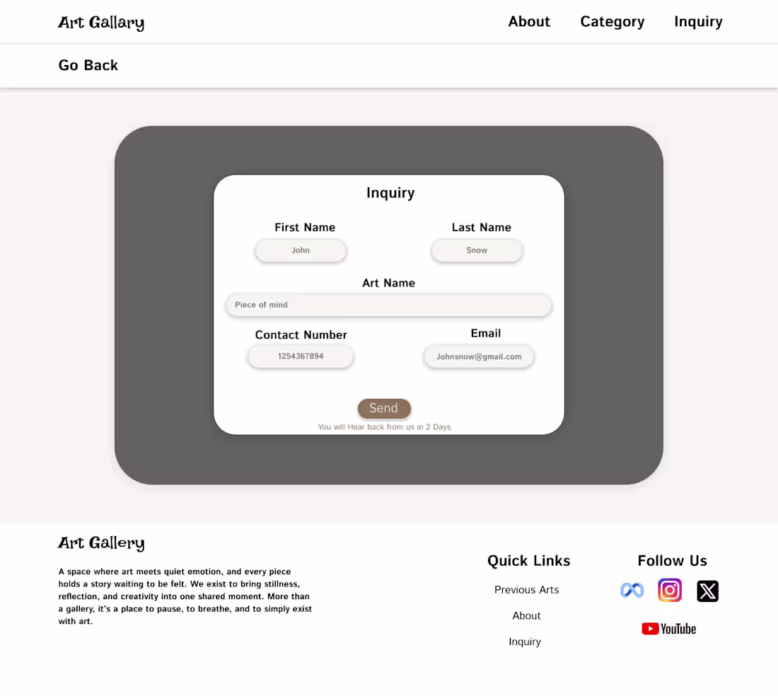
I wanted to design a digital space for an art gallery that felt as quiet and intentional as a physical one. Most websites are built to grab your attention immediately, but for this project, I went the opposite way. I focused on 'negative space' and a soft, muted palette to make sure the user felt like they could actually breathe while looking at the art.
The 'Inquiry' flow was a big part of it. I kept the form simple and floating to make the transition from 'looking' to 'asking' feel seamless. I even added a small touch at the end to let people know they’d hear back in two days, which manages expectations without breaking that calm vibe. It’s less about being a flashy website and more about being a quiet background for the artwork.
0
58