
Irfan Asif
I help creators scale through conversion-focused websites
New to Contra
Irfan is ready for their next project!
𝐁𝐞𝐡𝐢𝐧𝐝 𝐭𝐡𝐞 𝐁𝐮𝐢𝐥𝐝 | 𝐏𝐫𝐨𝐣𝐞𝐜𝐭 𝟏𝟎 :
knife_fork_plate:
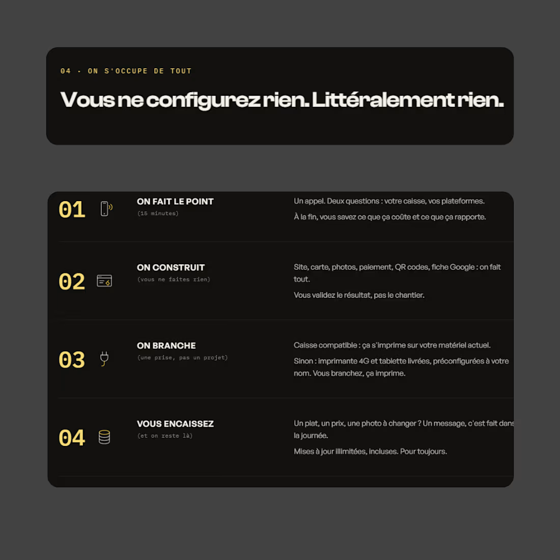
Built this one in WordPress around a single idea: every section had to answer one question a restaurant owner would actually ask, not just look good.
So instead of a generic homepage, I structured it like a conversation.
The problem first three tablets buzzing, commission chaos.
Then the fix.
Then pricing shown upfront instead of hidden behind a quote.
Then real proof from an actual client.
No filler sections just to fill space.
Kept the build lightweight too custom sections, no bloated page-builder plugins stacked on top of each other. Since the whole pitch is "zero technical hassle," a slow site would've undercut that instantly.
Simple concept in the end: match the site's build quality to the promise the business is actually making.
1
20

Behind the Build | Project 09
Every referral-based business I've built a site for teaches me the same thing: people don't need convincing, they need confirming.
That's the mindset I went into this one with.
No hard sell anywhere on the site, just clear answers, a real person behind it, and enough detail that someone already leaning toward "yes" doesn't second-guess it.
I used to design every site to persuade.
Lately I'm designing more of them to just get out of the way.
Curious how others approach sites for referral-only or trust-heavy businesses, sell harder, or step back?
1
17
𝐁𝐞𝐡𝐢𝐧𝐝 𝐭𝐡𝐞 𝐁𝐮𝐢𝐥𝐝 | 𝐏𝐫𝐨𝐣𝐞𝐜𝐭 𝟎𝟕
A jewelry store owner in Mount Pleasant told me something that stuck with me:
"People don't walk into a jewelry store not knowing what they want. They walk in undecided about whether they trust you yet."
That one sentence changed how I approached this build.
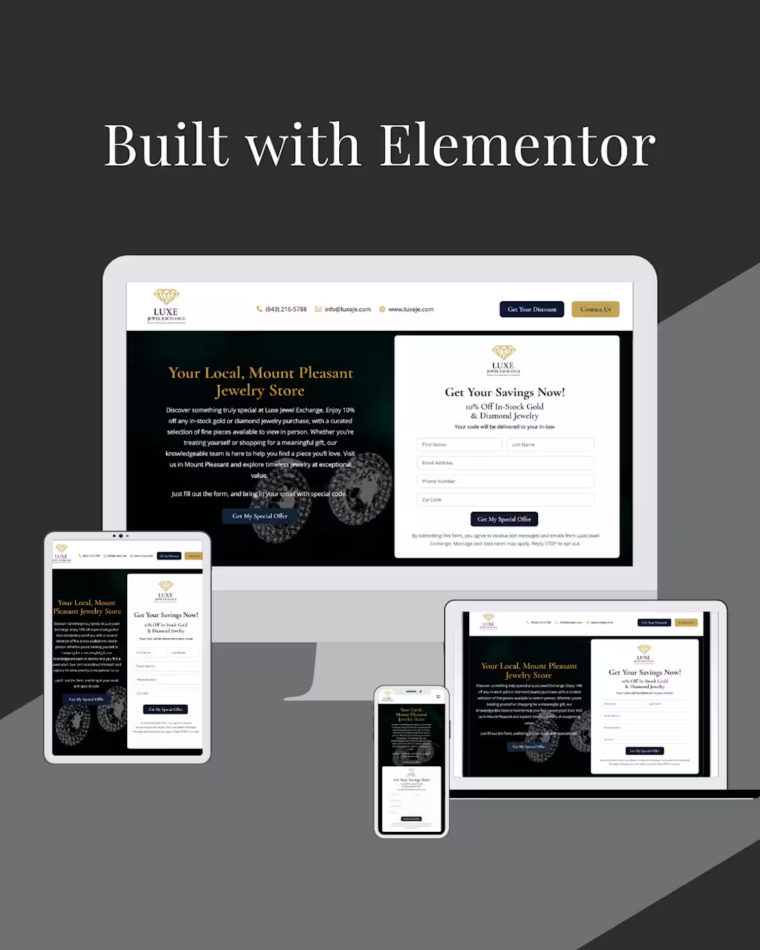
Instead of leading with products, I built the homepage around trust signals first, real reviews above the fold, a clear "here's exactly how selling your gold works" breakdown, and a lead capture offer that didn't feel like a pop-up trap.
The goal wasn't to look luxurious.
It was to make someone who's never sold gold before feel safe doing it here.
Every jewelry site looks elegant.
Not every jewelry site makes a nervous first-time seller feel like they're in good hands before they've even walked in the door.
That's the actual design brief nobody writes down, but it's the one that matters.
What do you think matters more for a jewelry website: luxury or trust?
1
38
𝐁𝐞𝐡𝐢𝐧𝐝 𝐭𝐡𝐞 𝐁𝐮𝐢𝐥𝐝 | 𝐏𝐫𝐨𝐣𝐞𝐜𝐭 06 👇
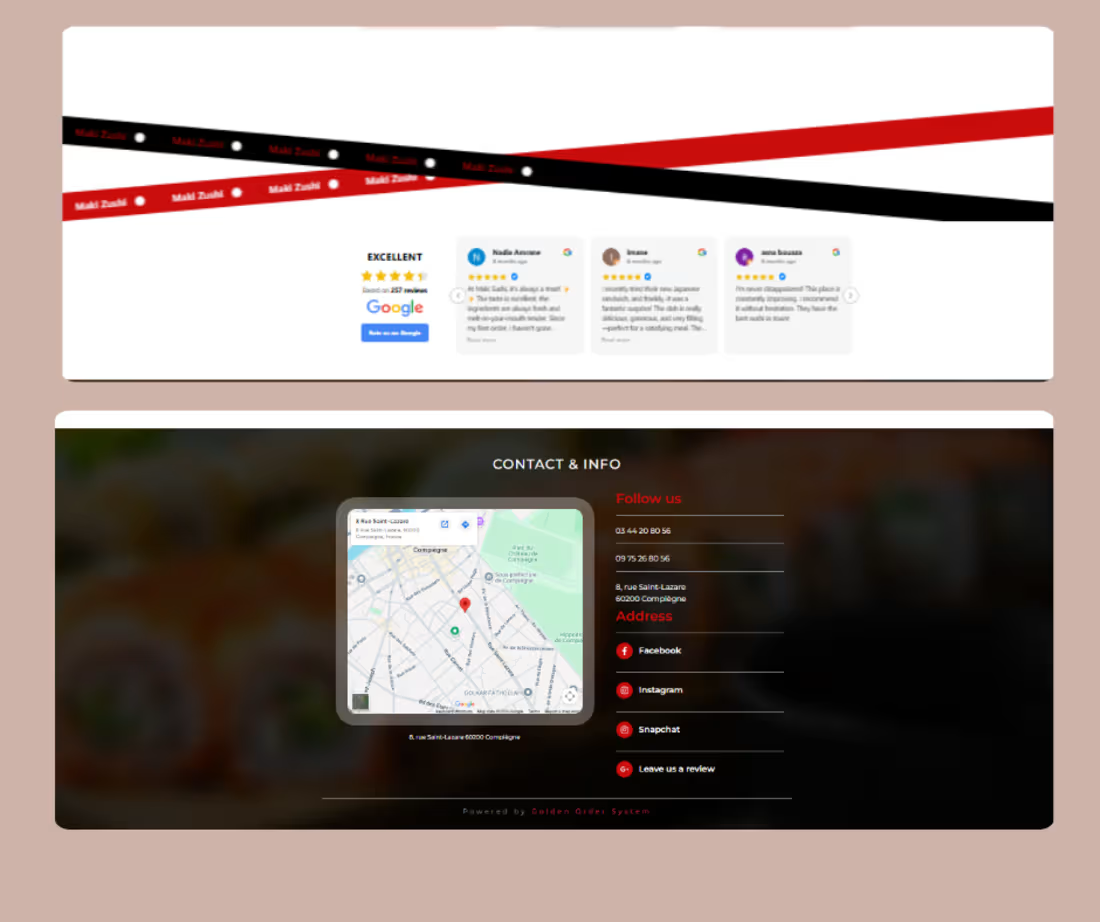
This one was designed for a Japanese restaurant with a modern and premium feel.
The idea was to create a website that not only reflects the dining experience but also makes browsing the menu and ordering online feel effortless.
Sharing a few previews today.
Full website walkthrough coming nex
1
42