
Ibrahim Hafiz
Graphic Design Expert | Branding, Social Media Design
Profile in progress
Ibrahim is building their profile!

Designing for the education sector is never just about aesthetics; it’s about engineering trust.
I’m thrilled to share my latest Case Study: The comprehensive Visual Identity for Firm Fundation Academy.
The Symbolism: Merging the 'open book' of knowledge with a rising figure and digital elements to represent forward-thinking growth.
Color Strategy: Utilizing a commanding gradient of Navy and Sky Blue to communicate authority, trust, and creative energy.
Typography: Employing 'League Spartan' for structural clarity across all physical and digital touchpoints.
A brand is a promise. See how we built this promise from the ground up on Behance: https://www.behance.net/gallery/245389695/Firm-Fundation-Academy-Educational-Visual-Identity?share=1
1
24

Tech Ads Collection – 9 Social Media Posts
1
0

Microsoft Course Ads – Social Media Design Series
1
0

Football Academy Brochure Design
1
0
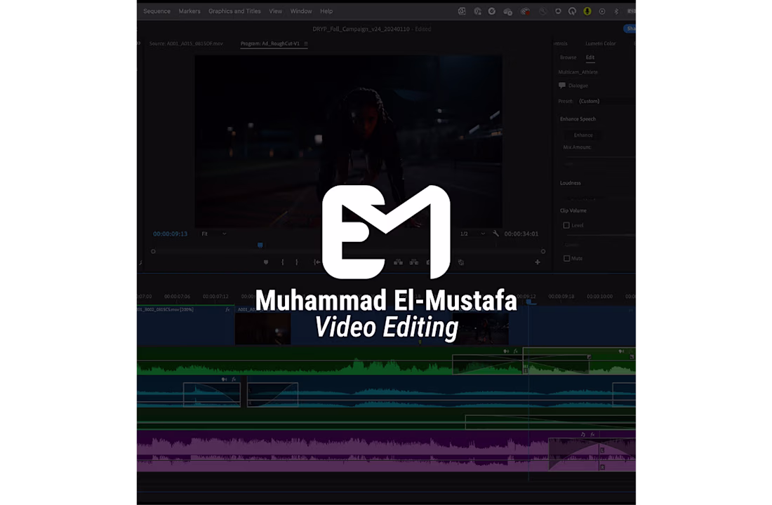
Logo Design & Brand Guidelines – Muhammad El-Mustafa
1
0