
Zensei Studio
Graphic Designer
New to Contra
Zensei Studio is building their profile!

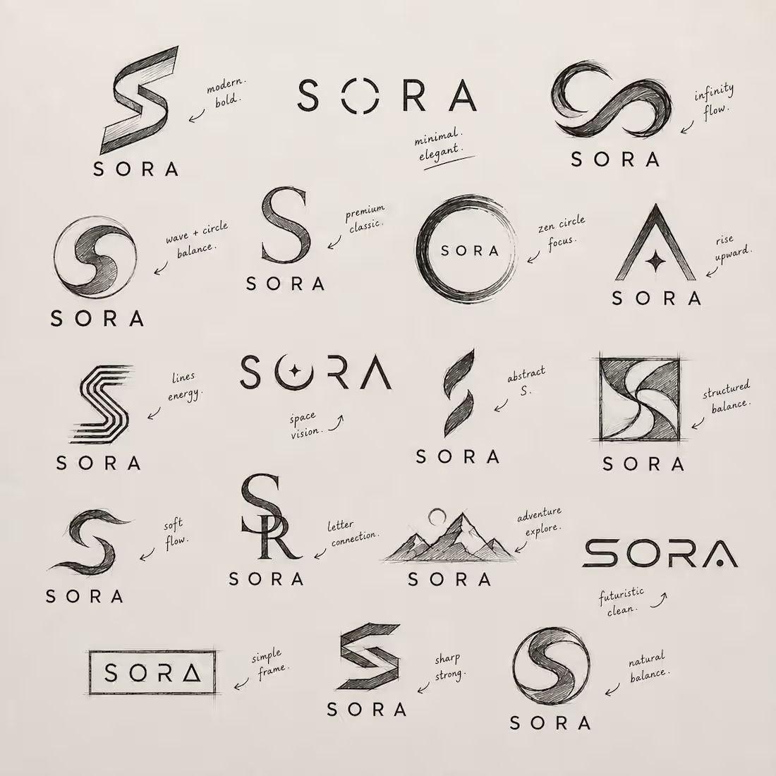
A logo is never “just a logo.”
You see one symbol.
A designer sees dozens of ideas, decisions, failures, and possibilities behind it.
For this SORA logo, the final mark looks simple — but getting to “simple” wasn’t simple.
I explored questions like:
→ How can movement be represented with a single shape?
→ How can the logo communicate growth and aspiration without being too obvious?
→ Can a simple dot represent focus and purpose?
→ How can the same identity work on a screen, packaging, clothing, signage, and print?
→ And most importantly: does it feel like the brand?
The final concept may look minimal.
But behind that minimalism are many concepts, sketches, adjustments, rejections, and countless small decisions.
That’s something people often don’t see about graphic design.
The more effortless the final result looks, the more work may have gone into making it feel effortless.
One logo.
Many concepts.
Countless decisions.
One final identity.
What do you think — should designers show the concepts behind the final logo? 👇
#GraphicDesign (https://www.instagram.com/explore/tags/graphicdesign/) #LogoDesign (https://www.instagram.com/explore/tags/logodesign/) #BrandIdentity (https://www.instagram.com/explore/tags/brandidentity/) #Branding (https://www.instagram.com/explore/tags/branding/) #zenseistudio (https://www.instagram.com/explore/tags/zenseistudio/)
2
2
37
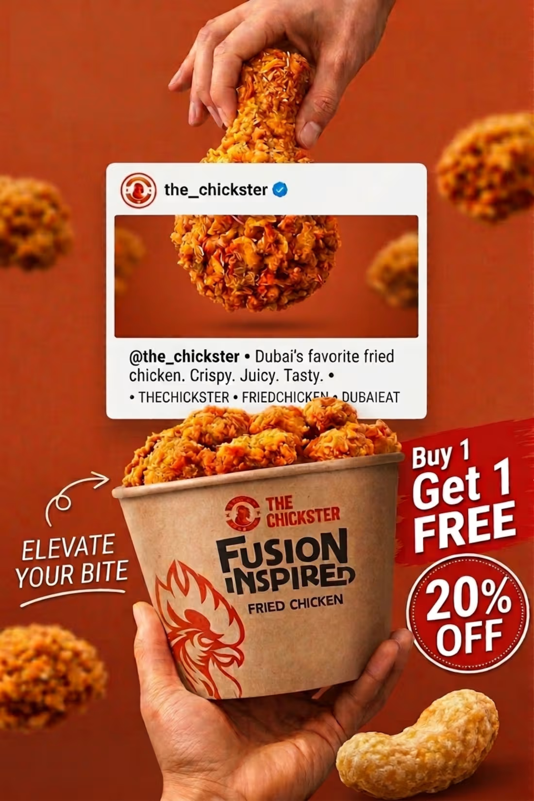
Turning food into a visual experience. 🍔🔥
A promotional food poster designed to make the product look as irresistible as it tastes.
Clean visuals. Bold composition. Appetite-driven design. 🎨
Designed by me.
Hashtags
#GraphicDesign #FoodPoster #PosterDesign #FoodAdvertising #AdDesign #SocialMediaDesign #GraphicDesigner #CreativeDesign #VisualDesi
0
15
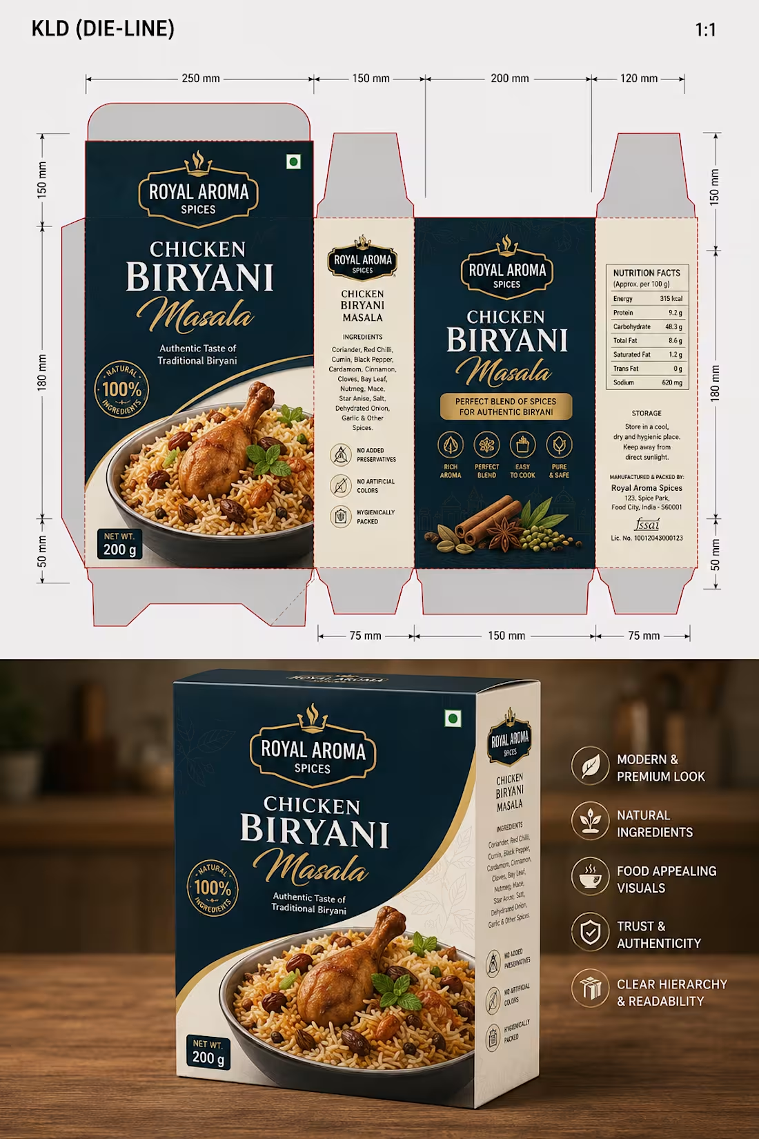
A premium packaging design concept created for Royal Aroma Spices, combining elegant branding with practical packaging structure. This project showcases the complete design workflow—from a production-ready die-line to a realistic 3D product mockup—highlighting how thoughtful packaging can elevate a food brand.
The design focuses on creating a luxurious shelf presence through a refined color palette, premium typography, appetizing food photography, and a clean information hierarchy. Every panel is carefully planned to balance branding, product information, and manufacturing requirements while maintaining a modern and professional look.#PackagingDesign (https://www.instagram.com/explore/tags/packagingdesign/) #PackageDesigner (https://www.instagram.com/explore/tags/packagedesigner/) #FoodPackaging (https://www.instagram.com/explore/tags/foodpackaging/) #PackagingMockup (https://www.instagram.com/explore/tags/packagingmockup/) #DieLine (https://www.instagram.com/explore/tags/dieline/)
0
33