
Hellen Leal
Product Design | UX Research & Data-Driven Design
New to Contra
Hellen is building their profile!
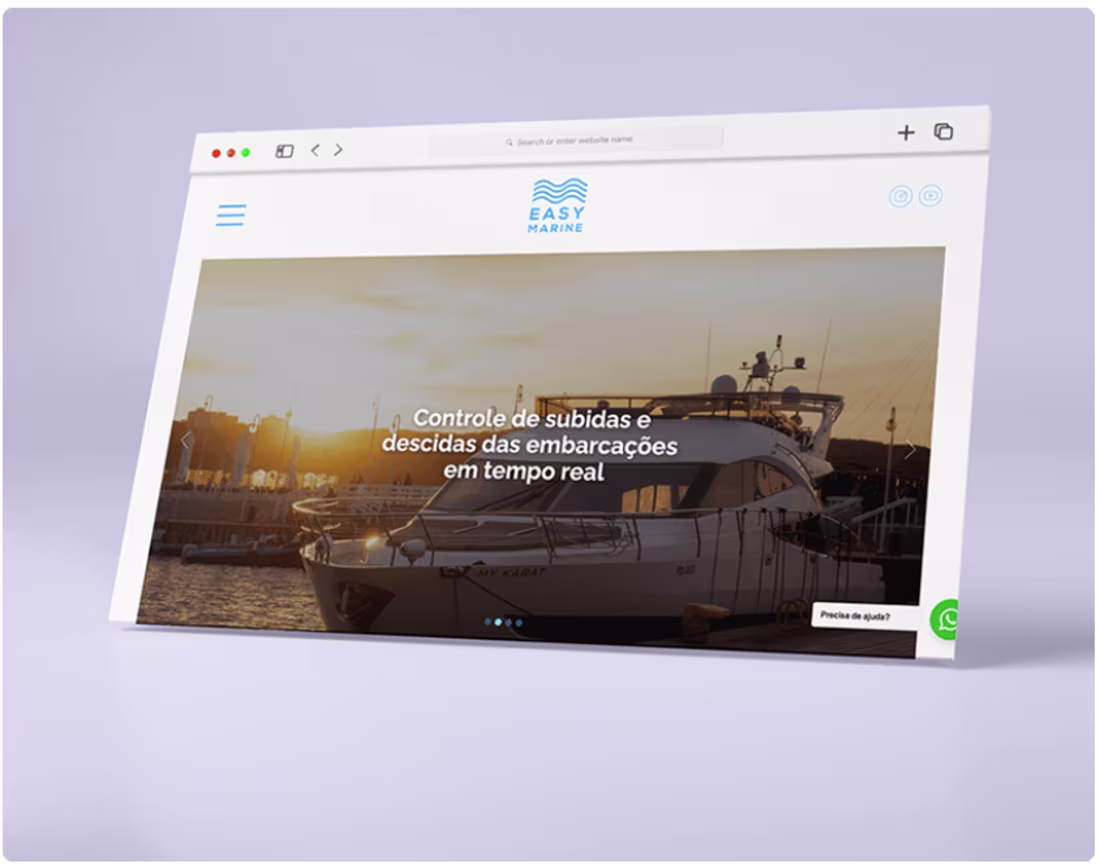
UI/UX Design: Nautical & Logistics Application
Designing an app for marinas means designing for a world with its own vocabulary, workflows, and expectations. The challenge isn't just making something functional — it's making it feel native to that context.
This project was developed as part of a full Flutter-based development team, working in close collaboration with front-end and back-end engineers from the start. The process moved through research and stakeholder mapping, careful information architecture, data collection, and then through low-fidelity wireframes all the way to validated high-fidelity designs — each phase tested and refined before moving forward.
The result is an app that makes customer interaction with marinas genuinely easier, handling the complexity of the nautical sector without surfacing it to the user.
Tools: Figma.
1
18
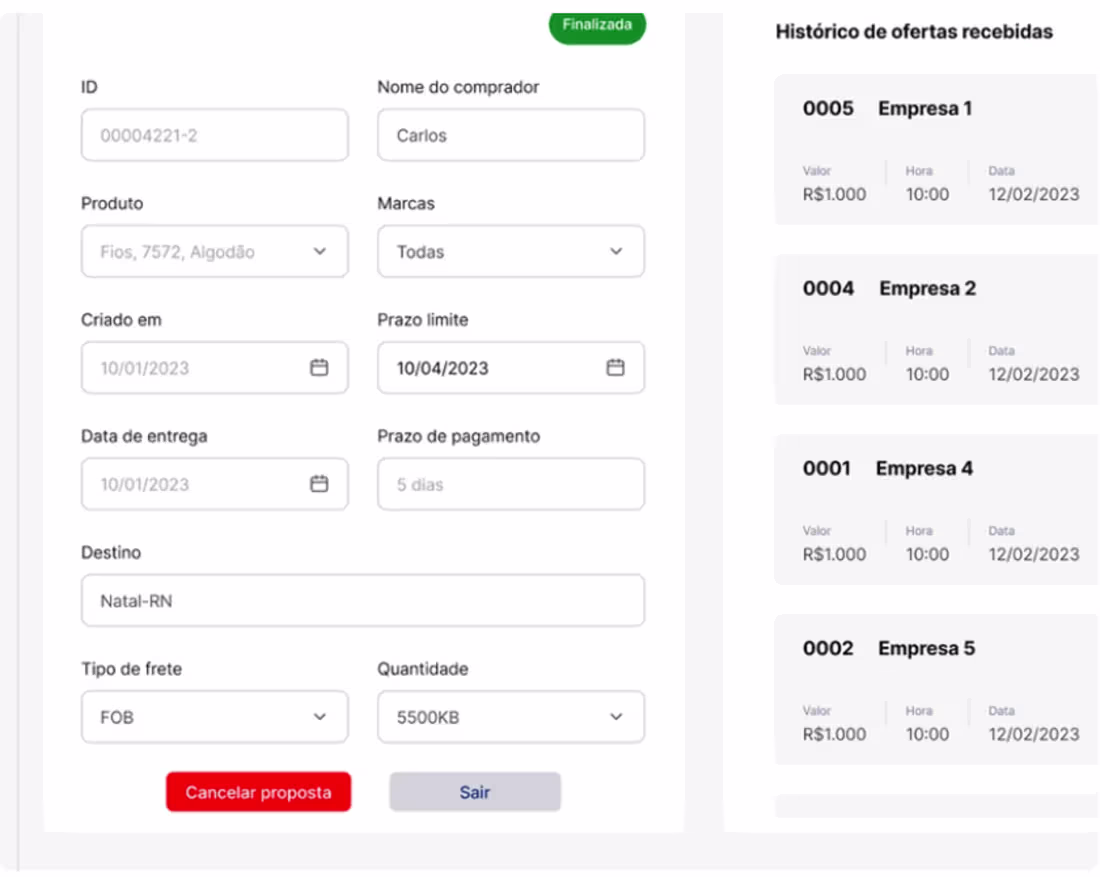
Netfios — B2B Platform: From UX Strategy to Working MVP
Most design projects stop at handoff. This one didn't.
Netfios is a B2B SaaS platform built to digitize and streamline the proposal and negotiation process between companies — and the scope went all the way from zero to a functional, market-ready MVP.
The work covered three distinct layers:
UX Strategy first. Before any screen existed, the full user journey was mapped: registration, proposal browsing, offer creation, negotiation via chat, and finalization. Information architecture was structured to reduce friction at every decision point — dashboards, proposal lists, negotiation flows, status history.
UI built for business clarity. The interface was designed around visual hierarchy, well-defined status states (won, lost, canceled), reusable components, and a clean layout that keeps primary actions front and center without visual noise.
AI-assisted implementation. The MVP wasn't just designed — it was built. AI was used as a strategic tool throughout: generating base component structure, suggesting flow optimizations, supporting refactoring, and compressing delivery time without cutting corners on quality.
The result is a product with complete navigation flows, an integrated negotiation chat, a management panel, structured componentization, and functional code — ready for real-world validation and built with a scalable architecture that supports future features.
The differentiator here isn't any single discipline. It's the combination: strategic UX + structured UI + AI-assisted implementation delivered as one coherent thing.
→ Full case on Behance: behance.net/gallery/245067175
1
20
Orizon: Visual Identity
A brand's visual identity does its work silently — in the moment someone recognizes something before they even read the name. This project for Orizon covers that full system: logo design, brand identity, color, typography, and social media applications working together to build something coherent and recognizable.
The goal was an identity that travels — across digital touchpoints, marketing materials, and advertising — while staying unmistakably itself.
Tools: Adobe Illustrator, Adobe Photoshop, Figma.
1
34
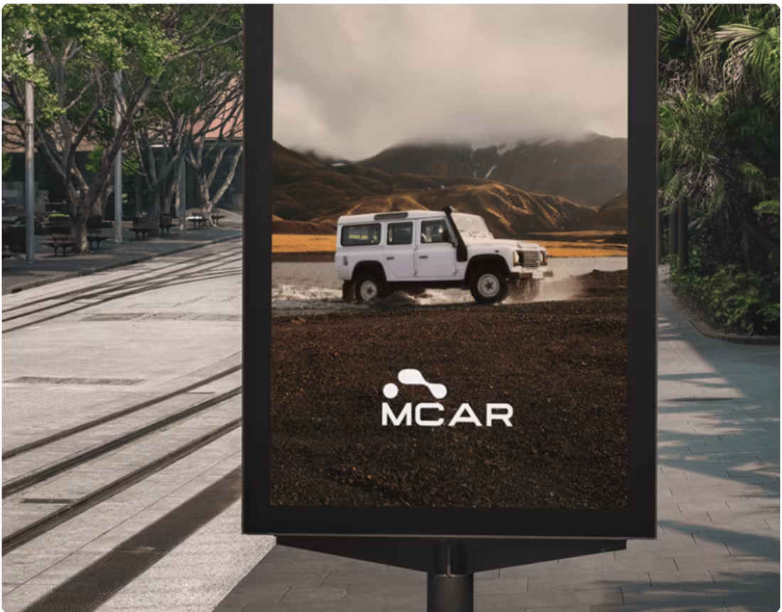
Visual Identity: Automotive Industry (MCAR)
The positioning for MCAR is precise: authentic, flexible, modern, and serene. Not just a place to buy a car, but an experience where each vehicle is an extension of the customer's personality — where minimalism and elegance meet the security of an intelligent choice.
That kind of positioning demands a visual identity that can carry it. This project builds the brand system to do exactly that: logo design, color strategy, typography, and brand applications that live consistently across digital and physical touchpoints, balancing modernity with tradition throughout.
Tools: Adobe Illustrator, Adobe Photoshop, Figma.
1
14
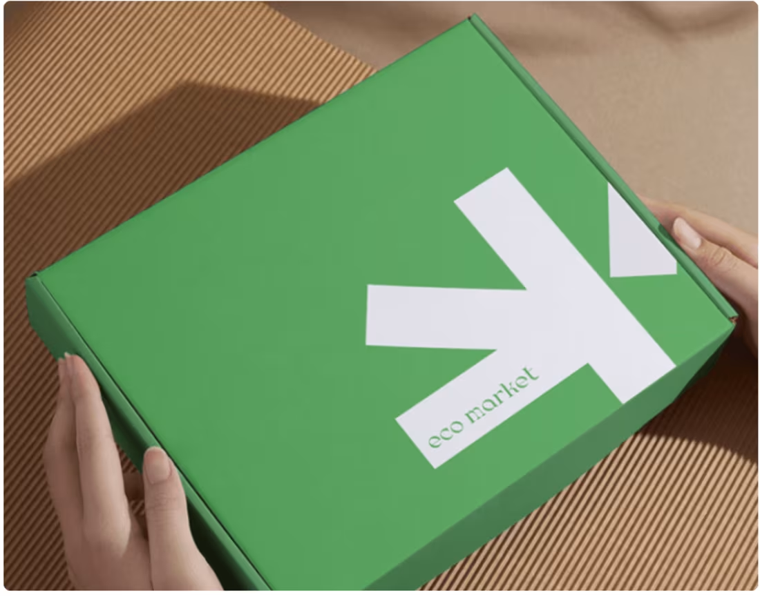
Visual Identity: EcoMarket — Ecommerce
EcoMarket isn't just a shopping platform — it's a commitment to a sustainable lifestyle, built around the mission of connecting consumers to products that respect the planet.
That mission had to come through in every brand decision. The visual identity for this e-commerce project was designed to make the positioning legible at a glance: brand strategy, color palette, typography, logo, and social media applications all working together to communicate ecological commitment without sacrificing the clarity and trust a shopping experience requires.
Tools: Adobe Illustrator, Adobe Photoshop, Figma.
1
6
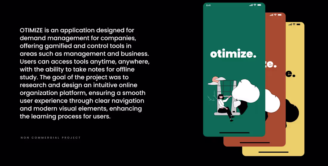
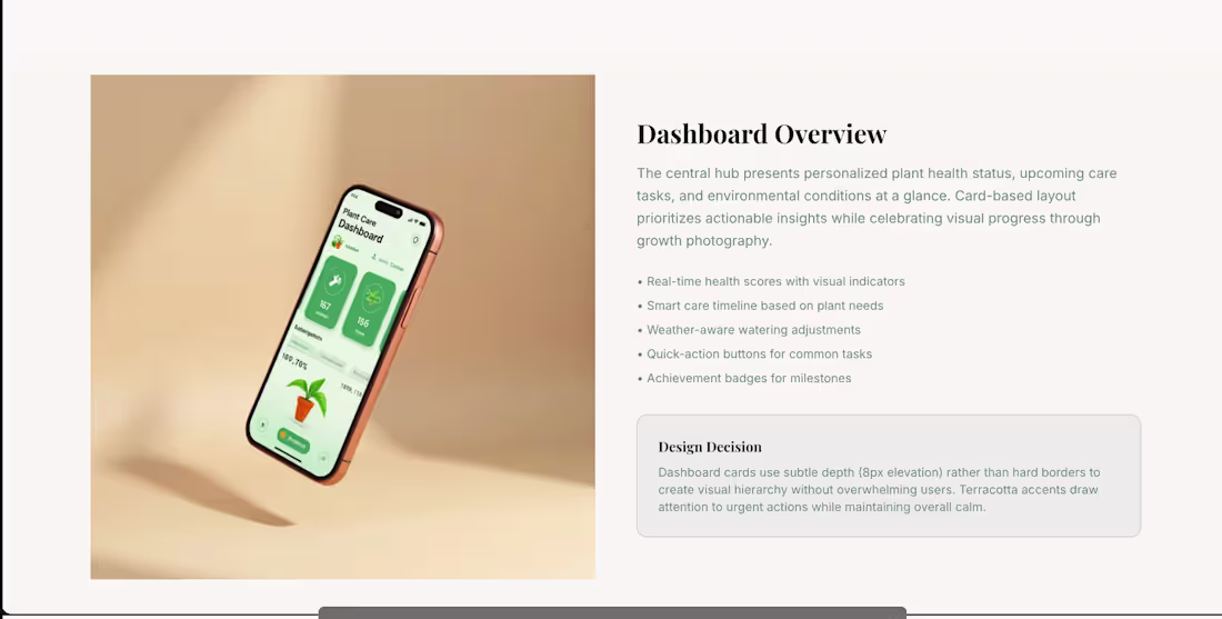
UX/UI Design: Otimize — Organization App
The research behind this project surfaced something honest: the daily life of a digital entrepreneur is characterized by frustration, information overload, and a persistent inability to keep up with demand. The problem wasn't a lack of effort — it was a lack of structure that felt light enough to actually use.
Otimize was designed around that insight. The goal was an app that makes task management and time organization genuinely accessible for microentrepreneurs — not by hiding complexity behind empty simplicity, but by building an interface so clear and motivating that using it feels like a relief rather than a chore.
The design moves from problem definition through user research and persona mapping, into ideation, validation, and final solution — a clean, modern interface that helps people run their businesses with more calm and clarity.
Tools: Figma, Adobe Photoshop, Adobe Illustrator.
1
10
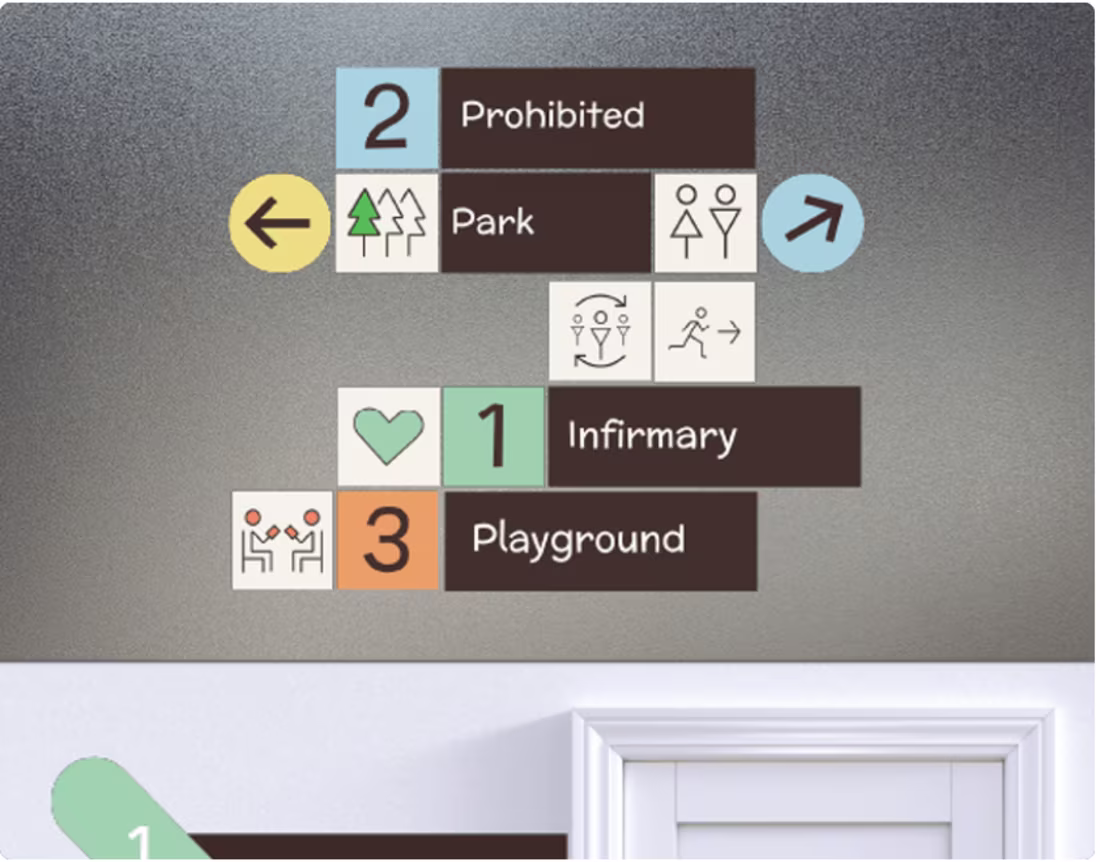
Wayfinding & Signage: Health
Getting lost in a healthcare facility isn't just inconvenient — it adds stress to an already stressful experience. Good wayfinding design removes that layer of friction before the person even notices it.
This project developed a complete visual identity system for healthcare wayfinding: colors, icons, and typography designed to provide intuitive navigation while reflecting the approachable, human-centered atmosphere of the facility. The system covers environmental graphics, communication materials, and internal signage — every touchpoint that shapes how a visitor moves through and experiences the space.
Tools: Adobe Illustrator, Adobe Photoshop.
1
22
Marketing Agency Website
A marketing agency's website has an inherent credibility test built into it: if you're selling marketing, the marketing has to work. The site is the pitch and the proof at the same time.
This project approaches that challenge directly — a website and landing page designed to convert, with UX and UI decisions made around clarity of message and reduction of friction. Clean layout, clear hierarchy, and interaction design that moves visitors through the right sequence without forcing it.
Tools: Figma, Adobe Photoshop.
→ behance.net/gallery/226040397
1
34
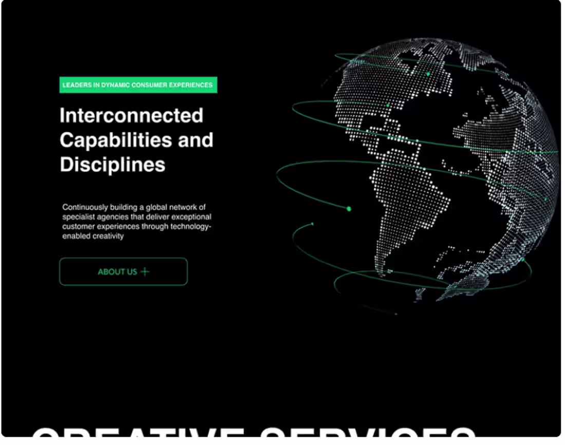
Verdanta — From Brand Strategy to AI-Powered Product
This project started with a name and ended with a fully realized product ecosystem. Verdanta is a complete end-to-end design case: naming, brand identity, UX research, UI design, and a scalable design system — all woven together under one coherent vision rooted in science and sustainability.
The brand strategy was built around the idea of "Rooted in Science, Grown with Care" — a positioning that informed every visual and interaction decision down the line.
From there, the work expanded into a user-centered growth framework grounded in UX research, high-fidelity key screens, and a full component library designed for consistency at scale. The tech stack — React Native, TypeScript, Tailwind CSS, Node.js, PostgreSQL — was part of the design thinking from day one, not bolted on at the end.
What I find most interesting about this project is how the brand layer and the product layer reinforce each other. The identity doesn't sit in a deck — it lives inside the UI, the motion, the system.
Tools: Figma, Principle, Blender 3D, and a full-stack development environment.
→ Full case on Behance: behance.net/gallery/236032095
1
21
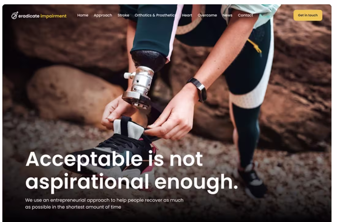
Acceptable Is Not Aspirational Enough
The title is the brief.
"Acceptable is not aspirational enough" is a design philosophy stated plainly — and it shapes every decision in this project. A website that merely functions isn't the goal. A landing page that technically works isn't enough. The bar is set at something that reaches further: interfaces that don't just meet expectations, but create them.
This is a web design project built under that constraint — UX, UI, product design, and interaction design all held to a higher standard than "good enough."
Tools: Figma, Adobe Photoshop.
1
35
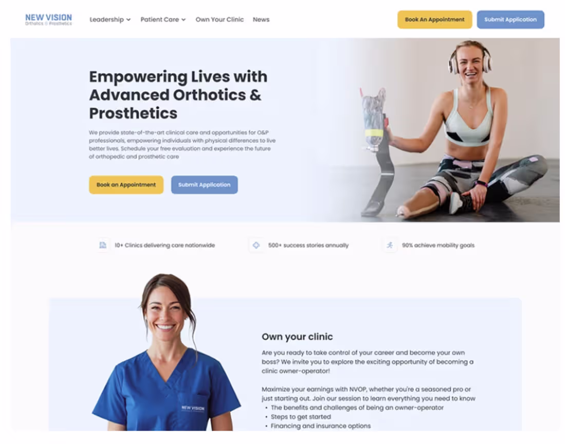
Advanced Orthotics & Prosthetics — Website Design
Healthcare UX has a specific challenge: the people using the interface are often navigating something difficult in their lives. The design can't afford to be confusing, cold, or overly clinical — but it also can't be soft in a way that undermines trust.
This website project for Advanced Orthotics & Prosthetics was built around that tension. The goal was to create a web presence that feels both medically credible and genuinely human — a space where patients and families can find what they need without friction, and where the clinic's expertise comes through in the structure as much as in the content.
The work covered UX, UI, and interaction design — translating a specialized healthcare service into a clear, accessible digital experience. Visual hierarchy was used to surface the right information at the right moment, with a layout that guides rather than overwhelms.
Tools: Figma, Adobe Photoshop.
→ Full case on Behance: behance.net/gallery/226040683
1
20
Website — United State
Web design for a destination or place-based project carries a specific responsibility: the interface has to do some of the imaginative work. People arrive with a question — what is this, and does it matter to me? — and the homepage has about three seconds to answer it.
This project tackles that challenge with a clean, structured web presence built around strong visual hierarchy, purposeful layout, and interaction design that guides without getting in the way.
Tools: Figma, Adobe Photoshop.
1
35
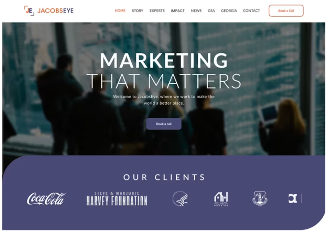
Marketing that Matters: Website Design
"Marketing that Matters" is a positioning statement, and the design has to live up to it.
When a brand leads with that kind of declaration — not just what they do, but why it counts — the website can't just be visually polished. It has to be convincing. The layout, hierarchy, and interaction design all have to work together to make the case that this is a company with something real to say.
This project is a website and landing page built around exactly that tension: credibility through clarity, persuasion through structure. UX and UI working not just to look good, but to land the message.
Tools: Figma, Adobe Photoshop.
1
27
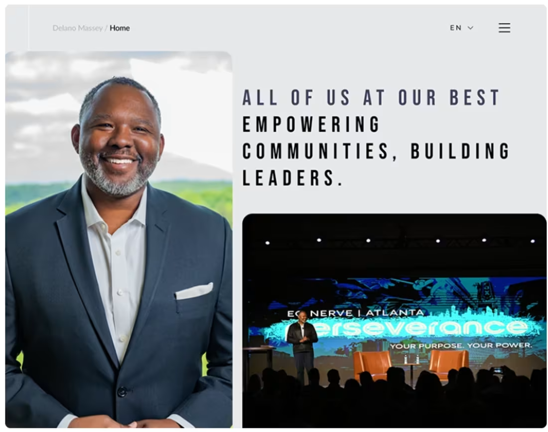
All of Us at Our Best — Empowering: Website Design
Some projects have a mission baked into the name. "All of Us at Our Best — Empowering" is one of them.
Designing for an organization built around human potential means the interface itself has to carry some of that intention. The visual language can't just be functional — it has to feel like it believes in something. Warmth, clarity, and forward motion have to be present in the layout choices, the hierarchy, the way information unfolds.
This website project translates that kind of mission-driven positioning into a coherent digital experience. UX, UI, and interaction design working together to make the message land — not just visually, but in how the site behaves and guides people through it.
Tools: Figma, Adobe Photoshop.
→ Full case on Behance: behance.net/gallery/226041089
1
23
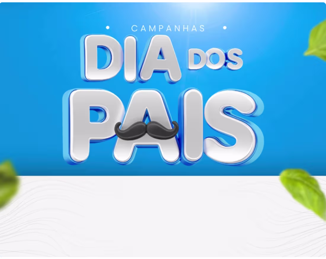
Father's Day Campaigns — Multi-Brand
A seasonal campaign brief has a specific pressure to it: the date is fixed, the emotional territory is shared by everyone in the market, and the only way to stand out is through how well you understand each brand's particular voice.
This project delivered complete Father's Day social media campaigns across multiple segments — retail, health, furniture, food, services, and lifestyle — each one built from its own strategic foundation. The process started with research: mapping each brand's personas, positioning, and competitive context. From there, concept and storytelling, then copywriting and art direction tailored to each identity, then production across multiple formats (feed posts, carousels, stories, reels) optimized for Instagram, Facebook, and LinkedIn.
The through-line across all of them: balancing emotional connection with commercial intent, without letting one undermine the other.
Tools: Figma, Adobe Photoshop, Canva.
1
31
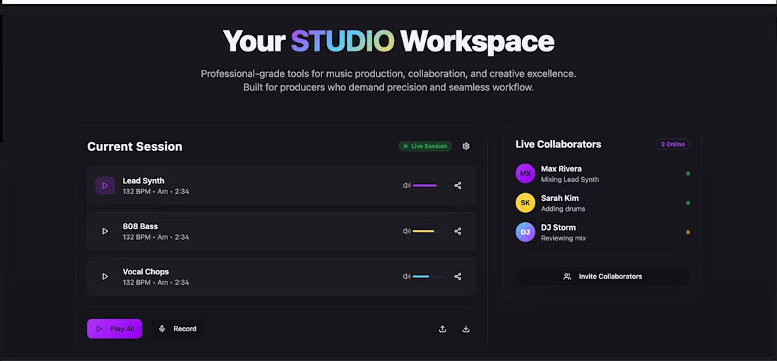
BEATFORGE: Collab. Music Production, Supercharged
Most music production tools are built for one person working alone. BEATFORGE was built for what happens when producers work together.
This is a full end-to-end case: naming, brand strategy, visual identity, product UX/UI, design system, motion, and automation architecture — all for a real-time collaborative music production platform. The brand direction is cinematic: electric gradients, kinetic typography, a logo system that feels as much like a stage as a wordmark. The design system covers 47+ tokens, components, accessibility rules (WCAG 2.2 AA), and a motion scale built around beat-pulse rhythms and purposeful micro-interactions.
The product flows cover everything from session creation and stem sharing to AI stem separation, smart versioning, expert matchmaking, and multi-user session management — five automation workflows in total. Analytics planning and A/B test hypotheses for onboarding round out the handoff.
This is what it looks like when brand, product, and operational architecture are designed together rather than in sequence.
Tools: Figma (no additional tools listed).
1
26
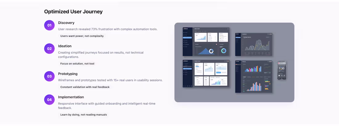
AutoFlow: Branding, UX & Automation
There's a version of automation that feels cold — processes replacing people, complexity hiding behind dashboards. AutoFlow was built to be the opposite of that.
The project covers the full stack: brand identity, UX design, and intelligent automation as one integrated ecosystem. The visual identity centers on a minimalist symbol representing continuous flow and movement — automation as a strategic ally, not a threat. The logo system is flexible enough to live across digital and physical touchpoints, supported by an icon library and graphic patterns that reinforce the language consistently.
On the UX side, the challenge was making complex automation genuinely accessible — designing interactions that turn technical processes into intuitive experiences. The goal wasn't to simplify things into meaninglessness, but to reduce friction without hiding how the system actually works.
The result is a brand and product that prove something worth proving: that strategic integration of identity, experience, and automation can fundamentally change how a small business operates.
Tools: Figma, Adobe Photoshop.
1
35
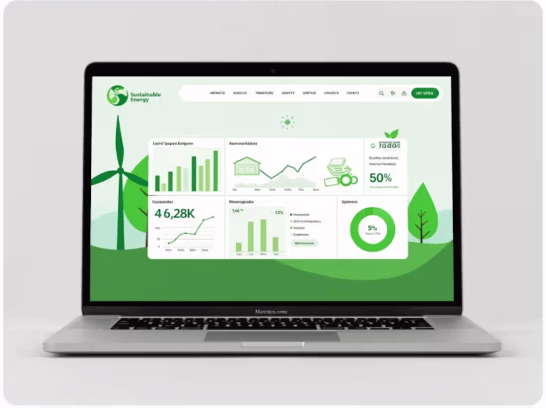
Rebranding: EcoFlow
A fragmented identity was holding EcoFlow back from competing at the level their technology deserved. The key insight driving this rebranding was simple but consequential: buyers of renewable energy products need to trust their technology partners, and trust is partly built through the brand.
The rebrand addressed that gap head-on — a premium, consistent visual identity built to scale with EcoFlow's expanding market presence. The brand system covers logo, palette, typography, graphic elements, and social media applications, all designed around the idea that automation and clean energy should feel like strategic allies, not just products on a shelf.
The result: measurable growth across all key metrics and a position as a genuine market leader.
Tools: Figma, Adobe Photoshop, Adobe Illustrator.
1
33