
George Railean
AI Interface designer and developer.
Ready for work
George is ready for their next project!
This project explores what operational intelligence looks like when infrastructure spans the planet, and beyond it.
The motion you see isn’t decorative. It represents live relationships between satellites, ground stations, data centers, and anomaly signals. Every trajectory, every fluctuation, every pulse of light reflects system behavior translated into something readable, actionable, and calm.
Instead of overwhelming operators with fragmented alerts and dense telemetry, the interface creates continuity. Risk becomes visible as a wave before it becomes a failure. Dependencies between locations become tangible through flowing connections. Probability isn’t buried in logs, it’s surfaced through movement, hierarchy, and spatial context.
This is where UX stops being interface design and becomes strategic infrastructure.
3
79
One of the most relevant and forward-thinking projects I’ve worked on.
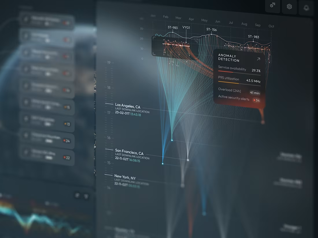
In a world where cyber threats evolve faster than systems can react, I wanted to design something different, not just another dashboard, but a platform that turns complexity into clarity.
This project pushes the boundaries of cybersecurity UX.
I focused on transforming dense, real-time threat data into an experience that feels structured, intelligent, and actionable. Instead of overwhelming users with alerts and raw logs, I designed a system that helps operators instantly understand what matters, why it matters, and what to do next.
This project explores how strategic UX thinking can turn high-density data environments into powerful decision-support systems.
And this is just the beginning.
1
92
For this project, I had the chance to design a VR training system for soldiers, simulating real-world mission scenarios. My focus was on creating an interactive, efficient, and accessible experience, ensuring both learning effectiveness and user engagement.
Each screen was crafted to deliver essential information clearly and intuitively - from risk zone symbols to interactive mission progress charts. The integration of real-time feedback empowers soldiers to make swift tactical adjustments, ensuring quick decision-making during training.
This project blends cutting-edge VR technology with human-centered design, allowing soldiers to interact confidently with the system while preparing for any situation, all without the risks of traditional field training.
1
3
149
As a designer, I focused on crafting an experience that brings clarity to complexity. This project embodies the future of intelligent stadium management and sets a new standard in how we interact with data at scale.
This bird’s-eye view gives an effortless preview of how data flows across the venue, highlighting availability, network performance, and traffic patterns, helping managers ensure smooth operations for thousands of spectators.
Through motion-driven design, complex data is turned into meaningful insights. Dynamic, color-coded charts and intuitive visuals reduce cognitive load, offering clear, actionable information, like network status, crowd accessibility, and engagement - at a glance.
The real power of this animation lies in its ability to provide contextual insights at scale, enabling proactive decision-making.
2
2
146
In high-pressure military environments, real-time decisions are crucial. Traditional training can’t fully replicate real-world scenarios.
The Solution:
Omnis uses immersive VR to simulate mission scenarios. Soldiers use VR headsets to navigate workflows, track performance, and adapt dynamically, without risks.
Key Features:
Immersive VR Training: Realistic missions enhance decision-making.
Real-Time Feedback: Instant data allows for quick adjustments.
Geospatial Mapping: Visuals guide soldiers in real-time.
Timeline Comparison: Track progress across multiple days.
The Challenge Ahead:
Omnis continues evolving, offering even more realistic scenarios to prepare soldiers for real-world missions.
1
118
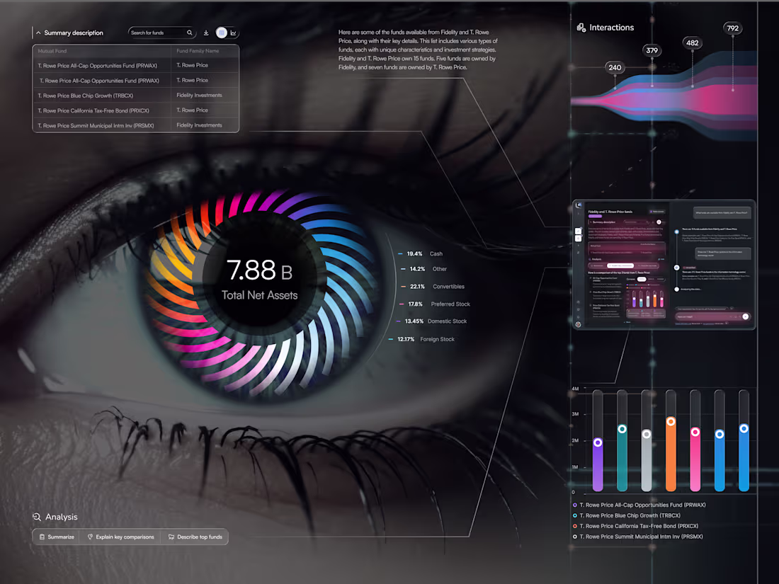
I’m excited to share EyeViz - a data-driven dashboard suite for exploring mutual funds through an artistic, human lens. ✨
👁️ Data You Can See (Eye Chart)
Meet the hero screen: a living iris where each colored blade maps an asset class, orbiting a bold KPI. It’s data-as-vision - instant clarity on allocation, balance, and momentum - with a slim Interactions stream and a built-in AI sidekick for quick explanations.
💡 Research Workspace
Search, compare, and understand — fast. Clean tables, smart chips, and a compact chart show stability, income focus, diversification, and risk side-by-side. The chat panel flags Unverified insights so trust stays front and center.
📱 Personal Workspace
Your everyday hub: activity tiles, pinned studies, and ongoing team chats - so you can jump back into work in seconds and keep insights reusable.
1
122
This concept explores how an AI assistant can evolve from a simple tool into an active partner in creativity and decision-making. The focus was on designing a fluid, minimal, and intelligent visual experience that feels natural for designers and developers working alongside AI.
🔍 Design Analysis
Cinematic flow to create rhythm and continuity between ideas
Calm, refined color palette with energetic accents to reflect intelligence and approachability
Clear typography that balances professionalism and accessibility
Subtle microinteractions that guide attention and enhance usability
🚀 What makes it special?
More than just an interface, this is a vision of intuitive, human-AI collaboration and the future of digital interaction.
#AIInterface #HumanAI #AIDesign #ConversationalAI
1
151
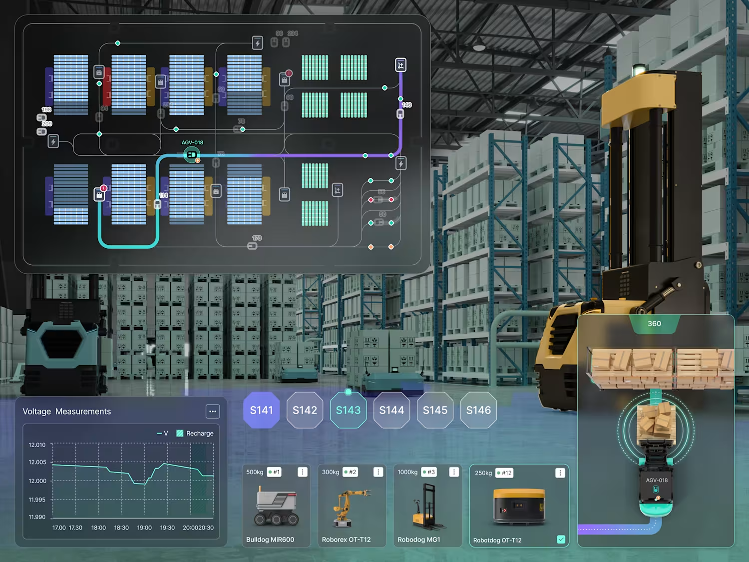
An animated interface designed to reflect the precision of industrial intelligence - a sleek, high-level dashboard built to orchestrate robotics, production analytics, and system-wide monitoring. From robot status indicators to real-time task flow and factory zone mapping, every visual layer is crafted for engineers who demand clarity at a glance and precision at scale.
Instant visibility across all production zones
Seamless integration of robotic systems
Performance insights delivered live
Designed for decisions - not just data
Welcome to the new standard in industrial UX: fast, focused, and fully connected.
22
315
That’s where intelligent health data visualization comes in:
Through design, we turn numbers into meaning.
Heart rate becomes a living line.
Cardiovascular risk turns into a color cue that signals when it’s time to act.
Biomarkers, microbiome, inflammation - all aligned into one coherent story about your real health.
1
26
270
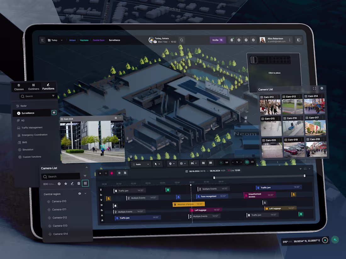
Integrated City Dashboard Development
1
1
Camera Analysis
1
1
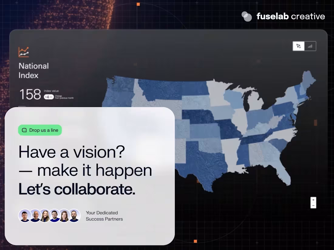
Dashboard Design UI - Let's Collaborate
1
1
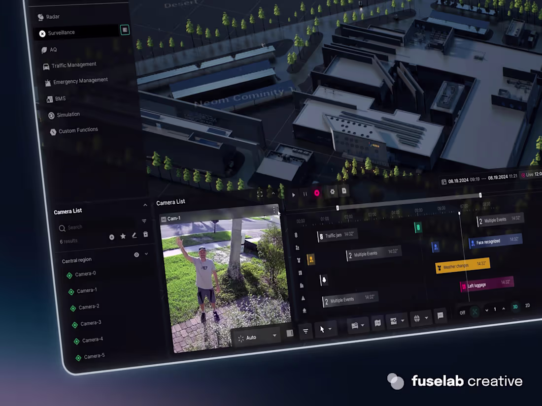
AI Generated Camera View Dashboard
2
4
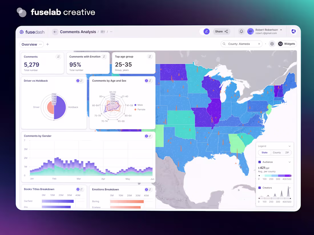
Dashboard Design Overview Analysis
1
4