
George Ramsdell
Power BI | Analytics Engineer | Microsoft, Disney, Chase
New to Contra
George is ready for their next project!
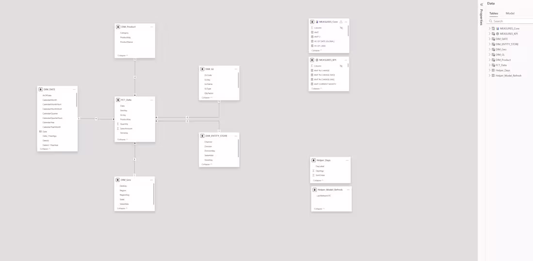
Dimensional Model: PBI Starter Template
This star schema is the foundational dimensional model for my Power BI Starter Template. It is engineered to ensure that once you understand this core structure, you can navigate any dashboard I develop.
Model Components
Central Fact (FCT_Data): Houses quantitative metrics like sales and quantity.
Dimensions: Dedicated tables for Date, Product, Geo, Entity/Store, and GL provide consistent filtering attributes.
Measures: Logic is isolated into MEASURES_Core and MEASURES_KPI folders for easier maintenance and cross-training.
Helpers: Tables like Helper_Model_Refresh track data currency and system logic.
Why It Works
Efficiency: Standardized table relationships shorten development time.
Scalability: The design remains fast and simple, whether for deep-dives or executive reporting.
0
9
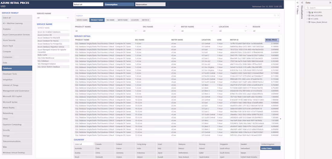
Azure Price List Dashboard – REST API Integration with Power BI
Project description:
This Power BI dashboard connects directly to the Azure Retail Prices REST API to retrieve cloud pricing data. It uses a single flat table structure for rapid development and performance.
The layout is built on my Power BI Starter Template, ensuring a consistent and clean visualization experience across projects. Interactive tables act as slicers, allowing users to drill into services, meters, and regions with a single click.
0
14
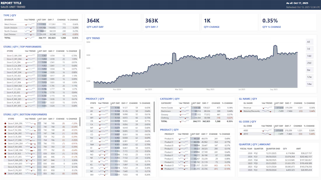
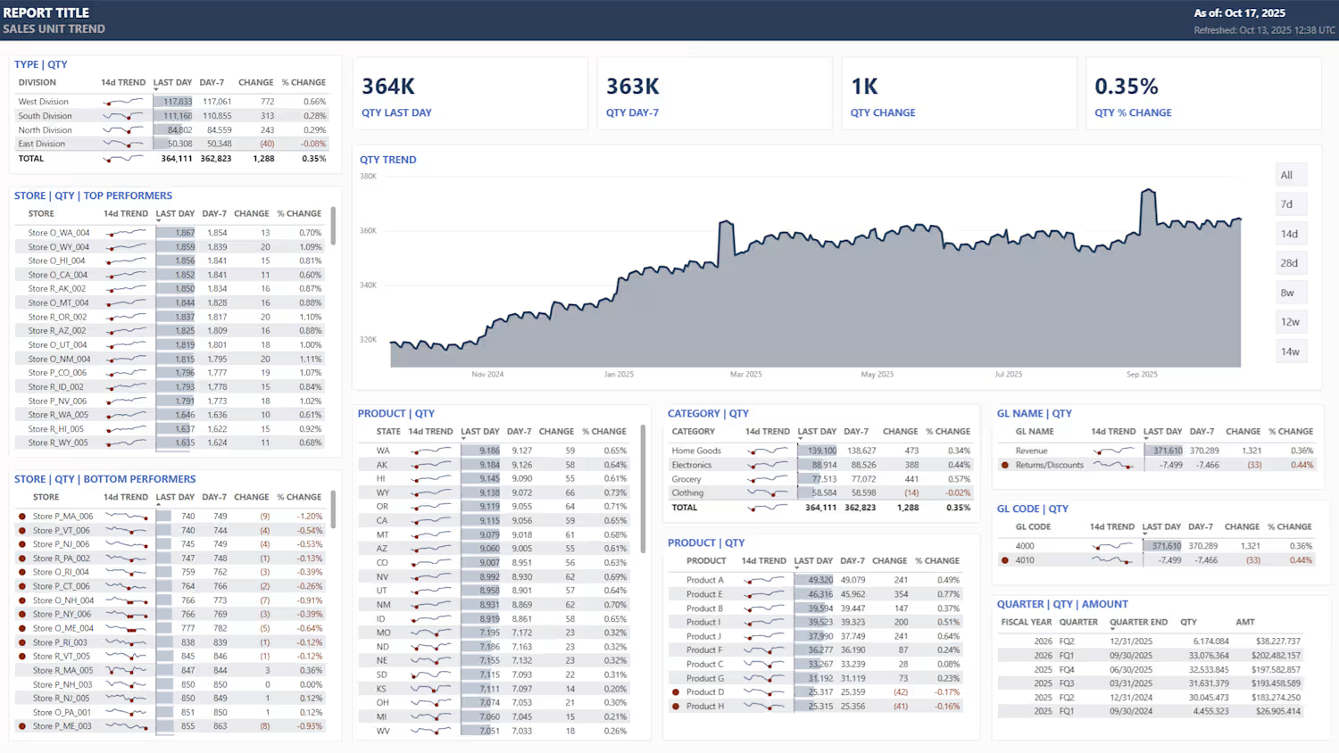
Power BI Starter Template
All my Power BIs begin with a consistent starter template. By maintaining these development standards, once you understand the first dashboard, you understand all of them! This approach shortens build time and simplifys maintenance and cross-training.
The Architecture:
Data Model: A clean star schema utilizing dedicated fact and dimension tables.
KPI Logic: All KPIs are built with structured DAX measures, organized into daily, weekly, and monthly folders for easy navigation.
UX Design: Highly interactive layout where every table acts as a slicer, allowing users to drill down simply by clicking values.
The Value:
This design keeps reporting simple, fast, and highly scalable for both deep-dive analysis and executive-level overviews.
0
18
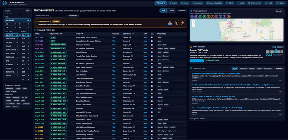
For the first time ever, I built a site for myself instead of for clients or employers! For years I maintained a giant spreadsheet of Pacific Northwest triathlon events for the Seattle Triathlon Group. I finally ditched the spreadsheet and built tri-northwest.com (http://tri-northwest.com)If you know my Analytics Dashboards, you'll probably recognize the vibe: information-packed single page design that gets you what you need fast!
What I Built
Interactive map showing every triathlon in the PNW (color-coded by month)
Smart filters for race types, locations, and dates
Live RSS feed pulling latest news from Slowtwitch, Triathlete, and Triathlon Magazine
Mobile-first design that actually works on your phone
The Stack using Vibe coding!
TanStack, Tailwind CSS, Pigeon Maps for OpenStreetMap
Hosted: Vercel's hobby tier!
2
64