pro
Gabriela Pranjić
Creative Optimist Looking For Some Fun Work
- $1k+
- Earned
- 1x
- Hired
- 88
- Followers


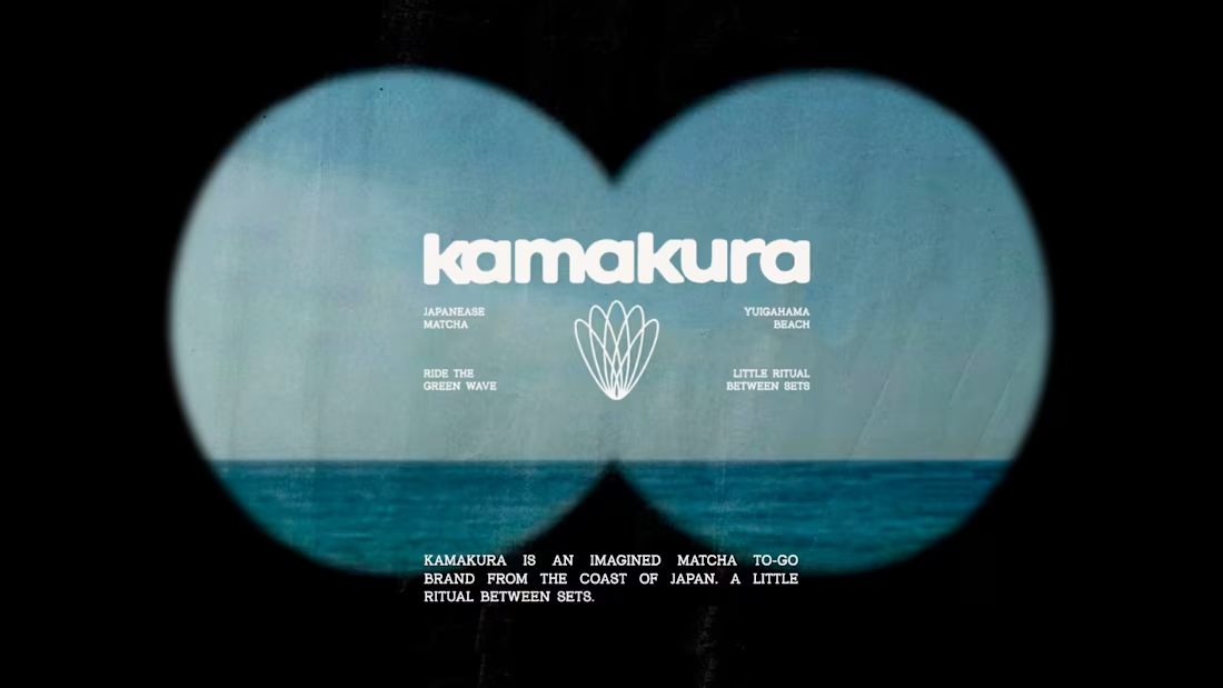
Somewhere between Japan, surf culture, and a very unnecessary amount of matcha. 🍵🌊
This passion project was created for @designerbriefs (https://www.instagram.com/designerbriefs/) , but the direction became a little personal.
I visited Kamakura earlier this year, and fell in love with the whole vibe. It’s Japan, but with a slower, more relaxed energy. Surf culture, cozy streets, friendly people, and that easygoing coastal feeling where nobody seems to be in too much of a rush. Basically, my kind of place. 🫶
So when I saw the brief for a Japanese matcha brand, I knew I wanted to take it in that direction. Not just traditional Japanese tea culture, but the meeting point between ritual and relaxation, structure and spontaneity, matcha and surfboards.
And that’s how KAMAKURA came to life.
A Matcha To-Go Kit designed for your post-surf pause, with ceremonial matcha, oat milk, a bamboo whisk, a reusable cup, and packaging you can plant after use. 🌱
The icon brings both worlds together, with surfboards arranged into the shape of a matcha whisk. Because, naturally, even the logo had to catch a wave.
Ride the green wave. 🌊
#Kamakura (https://www.instagram.com/explore/tags/kamakura/) #MatchaBranding (https://www.instagram.com/explore/tags/matchabranding/) #BrandIdentity (https://www.instagram.com/explore/tags/brandidentity/) #PassionProject (https://www.instagram.com/explore/tags/passionproject/) #dbckamakura (https://www.instagram.com/explore/tags/dbckamakura/)
19
19
524
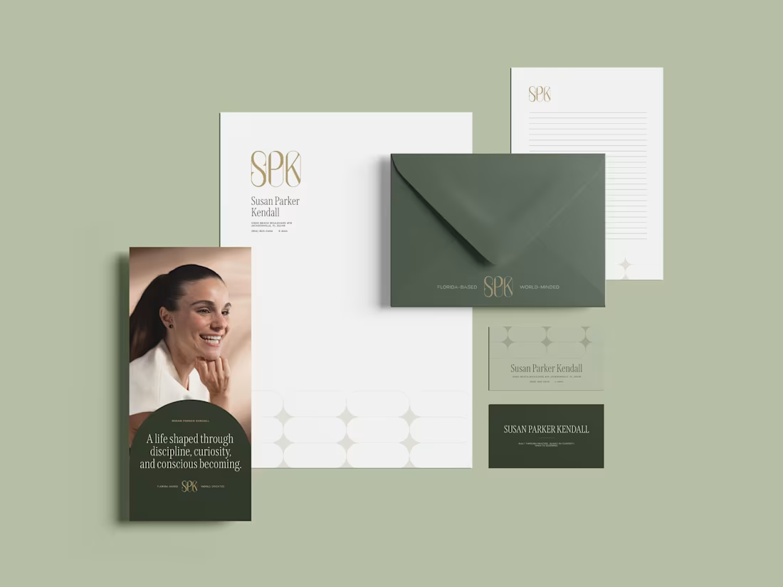
Susan Parker Kendall | Brand Identity
0
7
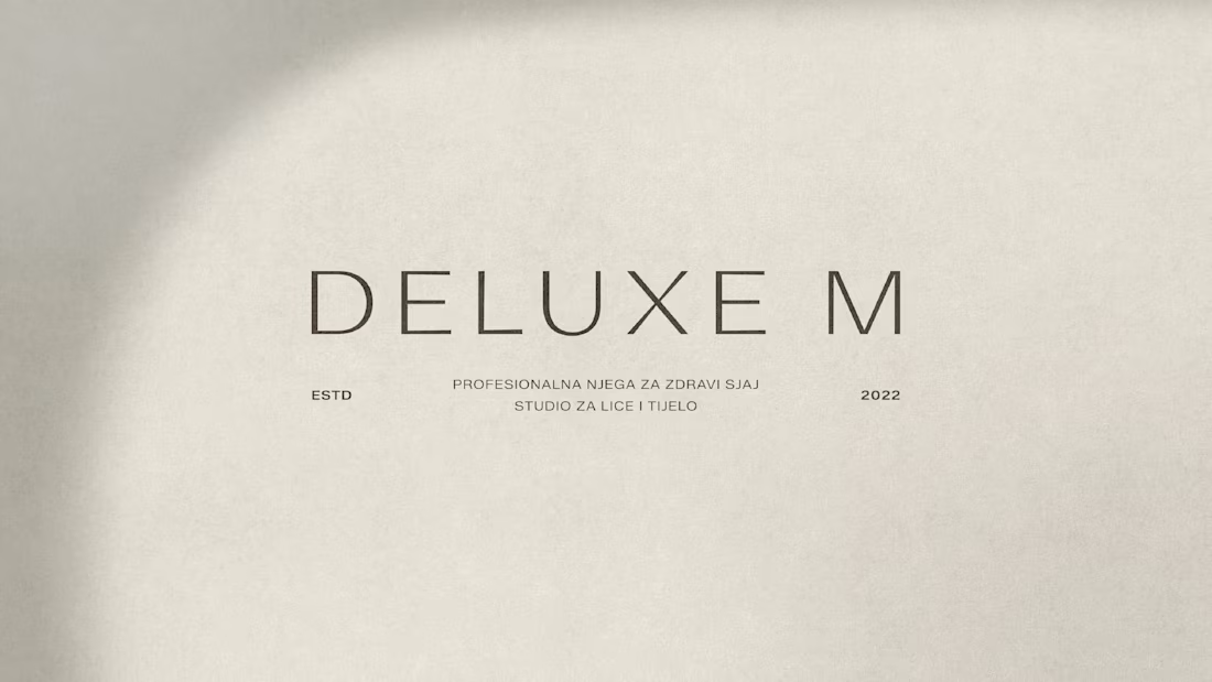
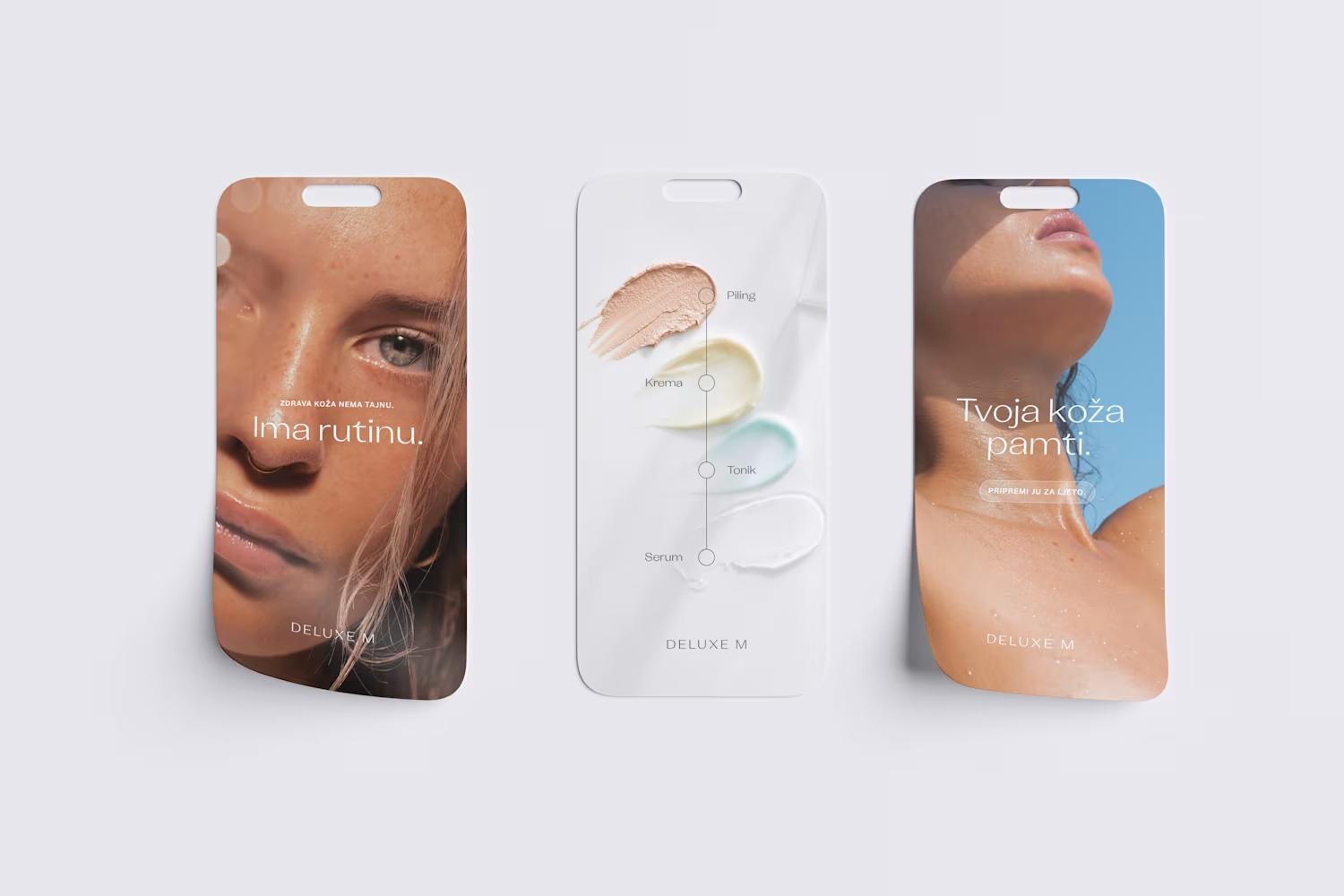
Deluxe M Brand Rebranding Project
0
6
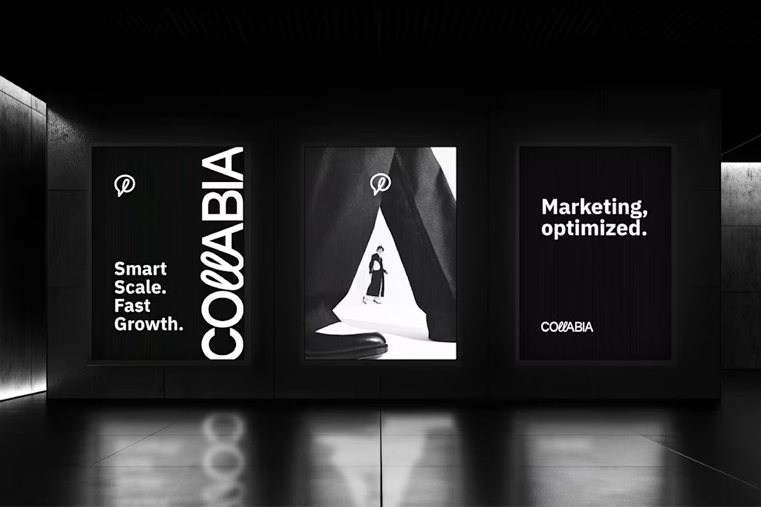
Collabia - logo design
One of my favorite parts of branding is finding the idea that makes everything click. For Collabia, an influencer marketing platform, that idea was collaboration itself.
Instead of relying on an obvious symbol, I integrated the concept directly into the wordmark. The distinctive double "L" flows into a speech bubble, creating a visual connection between the brand name and its purpose: bringing brands and creators together through communication.
From there, every design decision followed the same logic. Bold typography communicates confidence and authority, while the fine outline details introduce balance and flexibility. A monochrome palette keeps the identity timeless and adaptable across digital products, marketing materials, and social platforms.
I also designed a complete logo system, including primary and secondary lockups, icon variations, and usage guidelines, ensuring the brand stays recognizable no matter where it appears.
I believe the strongest identities aren't the loudest ones—they're the ones where every detail has a reason to exist. This project is a great example of that philosophy.
6
8
476