Fatima Khan
Turning ideas into scroll-stopping designs.



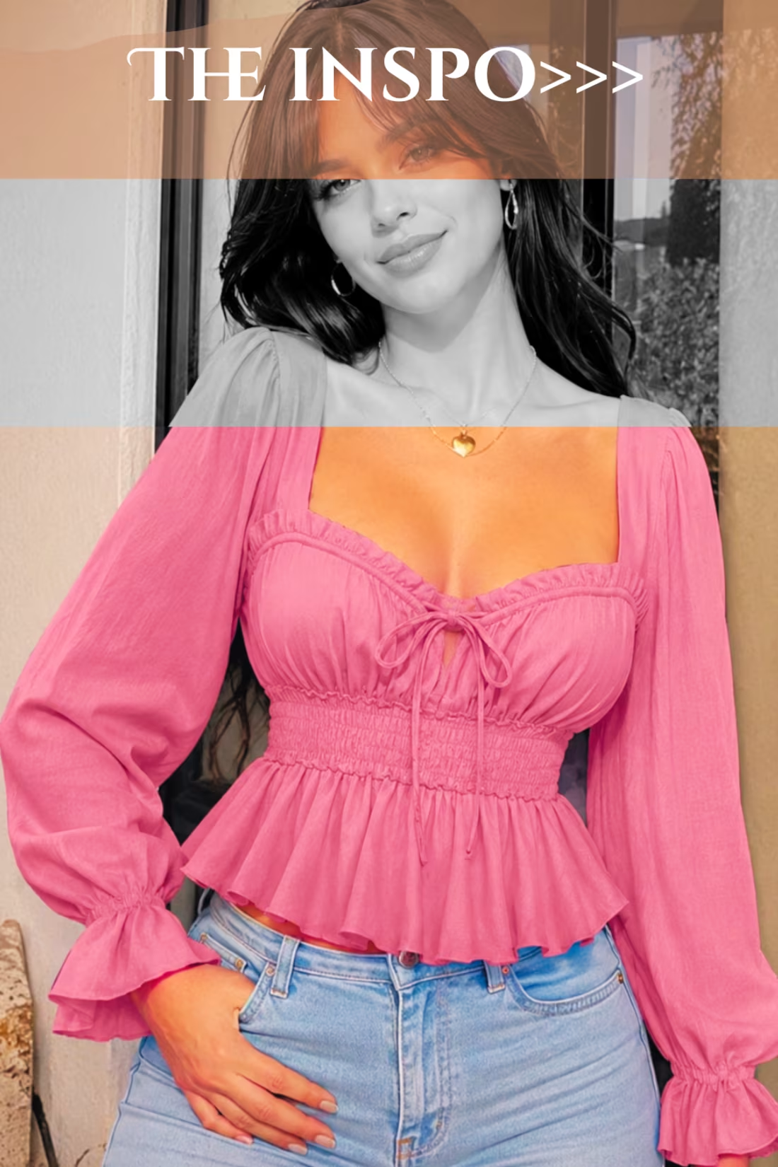
Fashion Top Design Inspiration
A fashion design concept inspired by modern elegance, feminine silhouettes, and contemporary trends. This piece explores how colors, shapes, and styling details can create a visually appealing and confident look.
The goal was to create a design that feels stylish, wearable, and aligned with current fashion aesthetics while maintaining a clean and premium visual identity. Through careful attention to composition, textures, and presentation, this concept highlights the connection between fashion, creativity, and visual storytelling.
Skills showcased: Fashion design inspiration, visual direction, creative styling, branding aesthetics, and product presentation.
0
23
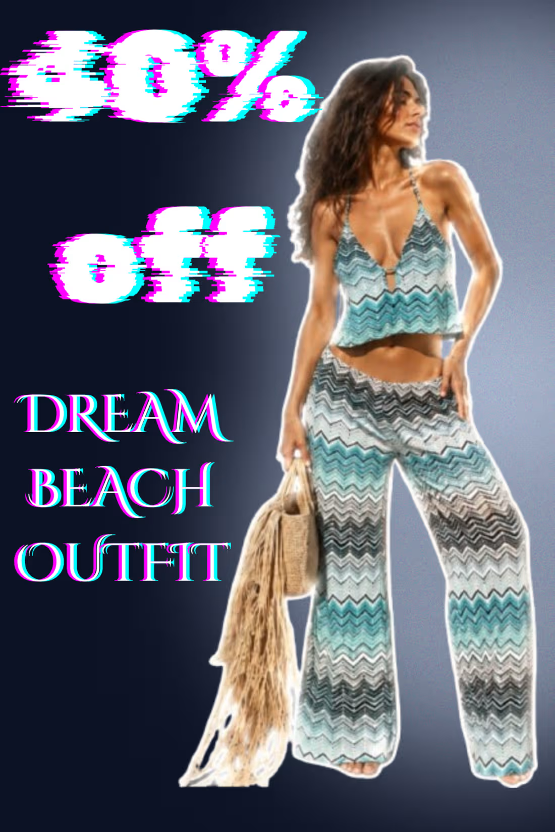
Created a high-fashion promotional visual for a women's beachwear co-ord set inspired by modern Gen Z fashion trends. I enhanced the product with a glowing white outline effect to make the outfit instantly eye-catching while maintaining a clean, premium aesthetic. The composition focuses on highlighting the garment's silhouette, texture, and vacation-ready vibe, making it suitable for social media campaigns, Pinterest marketing, fashion lookbooks, and e-commerce promotions.
0
15
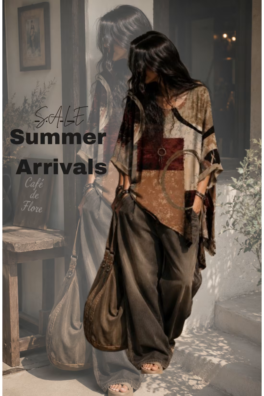
Turned a simple product image into a Pinterest-worthy lifestyle mockup. Loving the cozy boho aesthetic on this one. 🌿
3
190
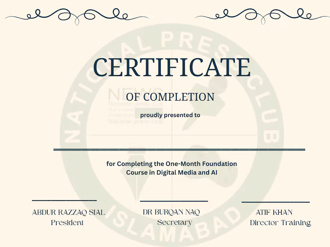
Certificate Design for a Media & AI Foundation Course
Designed a formal certificate for a local training organization. Created multiple color concepts and layouts to help the client choose the final design. Focused on typography, readability, branding, and print-ready composition.
0
34