
Erik Hudec
I build fast, accessible, and search-optimized Webflow sites
- $1k+
- Earned
- 1x
- Hired
- 5.00
- Rating
- 5
- Followers
Audio testimonial
1
174
Animated icons for each feature
1
161
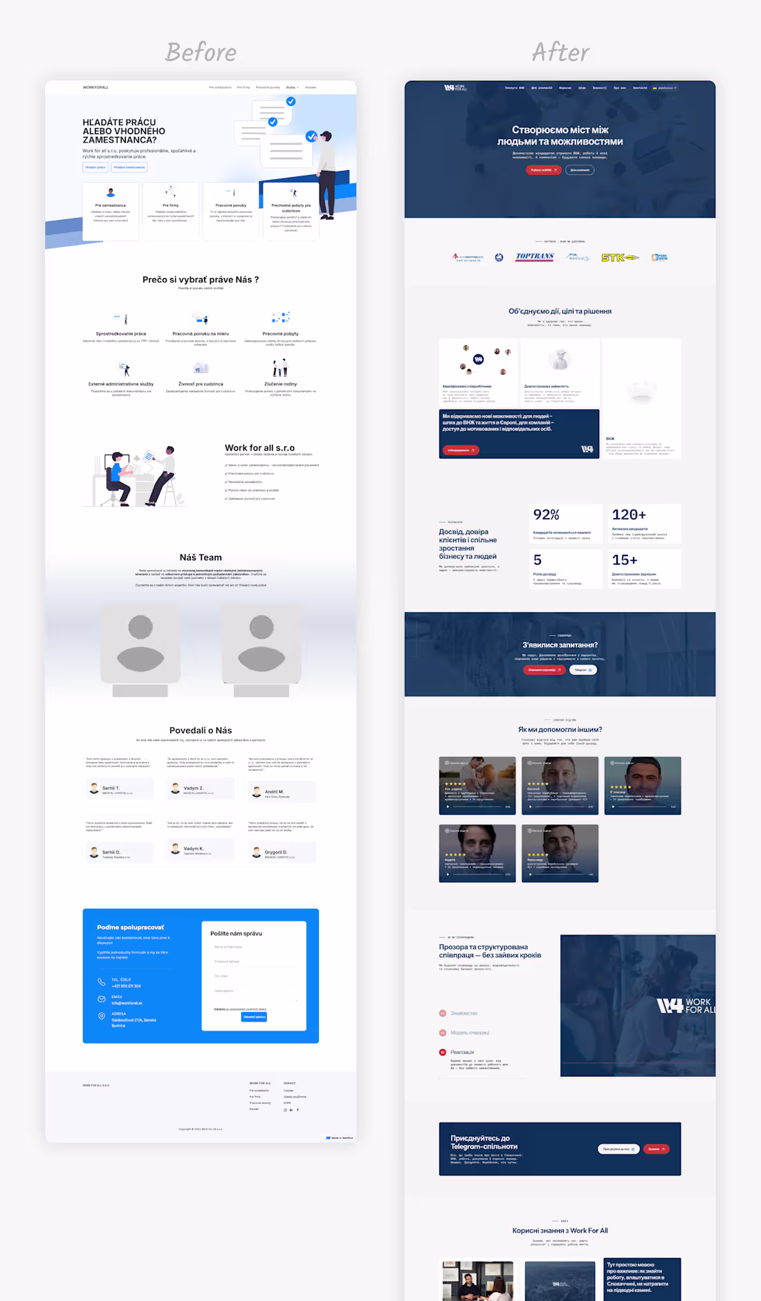
Before and After. Redesign for a Company Providing Employment Mediation and Temporary Accommodation
1
149
Last year, I reached out to my very first client. What started as an offer to help evolved into a complete website redesign with new branding.
2
1
142
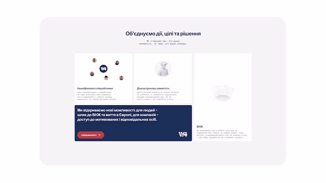
For this migration services platform, we designed a prominent call-to-action that breaks through the content flow – impossible to miss, clear on value, and action-oriented.
The contrast between the service cards and the bold CTA banner creates a natural reading flow: understand the benefits → take the next step.
In service-based businesses, especially where decisions are complex (like relocation/residency), reducing friction at the decision point is everything.
Shoutout to Viktor Vrečič (https://www.linkedin.com/in/viktor-vre%C4%8Di%C4%8D-9478b4aa/) for branding work on this project! 🎨
See it live on https://www.workforall.sk/
11
204
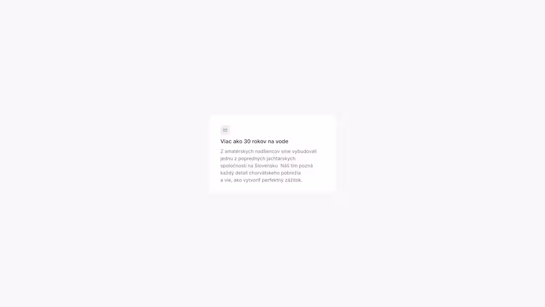
A well-designed feature section can make or break your conversion rate.
For First Yachting, we created a clean, scannable layout that immediately communicates their key differentiators – 30+ years of experience, professional fleet, and flexible scheduling.
Clear visual hierarchy + concise messaging = visitors understand your value in seconds, not minutes.
This is especially critical for service-based businesses where trust and credibility drive decisions.
18
229
TeslaServices Webflow Build
0
5