
pro
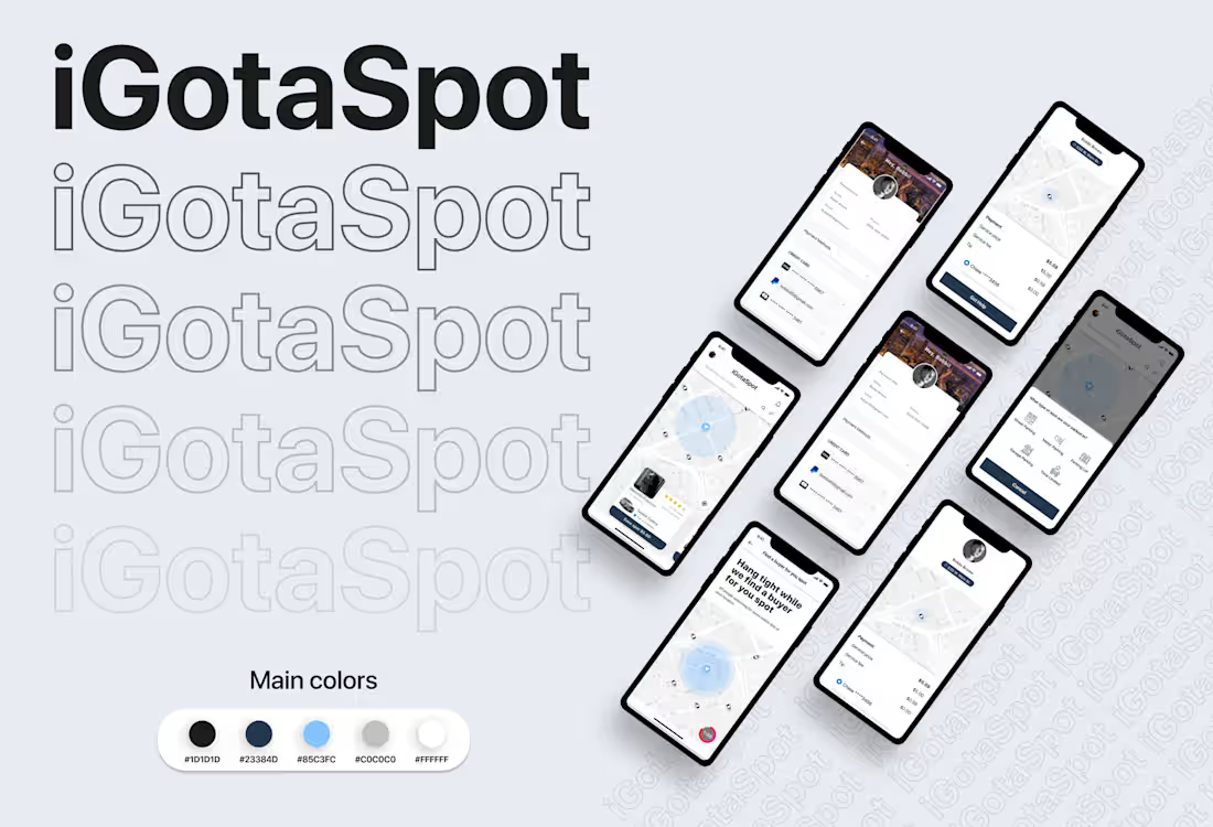
iGotaSpot is a real-time peer-to-peer (P2P) parking marketplace app engineered to solve one of the biggest headaches in dense metropolitan areas: finding and reserving street or garage parking in seconds.
The platform connects drivers who are vacating a parking spot with drivers searching for one nearby, facilitating seamless live spot handoffs, automated micro-transactions, and verified spot listings.
0
45
🌍 BMW Motorrad Travel Tours — Nordkapp Expedition Guide & Information Architecture
📌 Overview
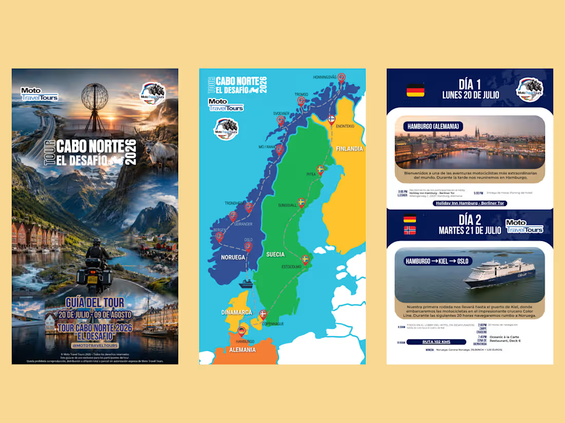
Design and comprehensive information architecture for the Nordkapp 2026 ("Cabo Norte: El Desafío") Official Tour Guide by Moto Travel Tours, certified partner of BMW Motorrad.
Nordkapp (North Cape, Norway) is universally known as the "holy grail" of European adventure motorcycling. This project required designing an exhaustive, multi-week Arctic expedition guide that balances breathtaking visual storytelling with ultra-clear logistical clarity for riders traversing Germany, Denmark, Sweden, Finland, and Norway.
🎯 The Challenge
High-stakes expedition travel involves intense cognitive load: riders navigate complex daily mileage, ferry schedules, border crossings, hotel check-ins, and unpredictable Arctic weather conditions.
Key Objectives:
Zero-Confusion Information Architecture: Structure complex multi-country logistics into bite-sized, glanceable daily road sheets accessible on mobile screens and tank-bag printouts.
Custom Expedition Cartography: Build a clean, accurate vector map clearly communicating waypoints, ferry transit channels, and national borders without visual clutter.
Evocative Brand Storytelling: Create an epic, high-production cover and layout that matches the premium adventurous prestige of BMW Motorrad.
💡 Design Execution & Visual Strategy
1. Epic Arctic Photomontage (Hero Cover)
Seamless photo-manipulation blending the signature landmarks of the expedition: the iconic Nordkapp globe monument, midnight sun lighting, the Atlantic Ocean Road bridges, Lofoten fjords, Arctic wildlife, and a rider aboard an adventure touring motorcycle.
Typographic hierarchy featuring custom tour branding ("El Desafío 2026") with high-contrast dates and official travel club credentials.
2. Custom Route Cartography & Waypoint Mapping
Designed a clean, color-coded geographical vector map across Scandinavia.
Clear visual differentiation for maritime ferry routes (Kiel → Oslo) vs. terrestrial alpine highways.
Strategic pinpoints marking key rest stops, base camps, and extreme northern latitudes (Hamburg, Stockholm, Rovaniemi/Enontekiö, Tromsø, Honningsvåg/Nordkapp).
3. Modular "Daily Stage" Card Architecture (Rider UX)
Designed a scannable, standardized card layout for every single tour day:
National Flag & Date Header: Instant orientation for international borders.
Route Banner & Imagery: Visual preview of the destination (e.g., Hamburg skyline, Color Line ocean cruise).
Crucial Metrics Strip: Route distance highlighted in bold contrast (RUTA 102 KMS), exact muster times, ferry embarkation windows, and hotel address badges.
🚀 Deliverables & Impact
Complete Multi-Page Tour Book: Interactive PDF optimized for offline smartphone/tablet viewing during the ride, plus print-ready CMYK assets for field notebooks.
Vector Map Kit: Standalone vector maps utilized across pre-trip briefings, digital itineraries, and social media announcements.
Impact: Delivered an indispensable travel companion that eliminated logistical friction for tour participants, solidifying Moto Travel Tours’ position as a top-tier BMW Motorrad travel organizer.
0
52
QJMOTOR — High-Performance Automotive Web & Brand Experience
Role: Lead UI/UX & Web Designer
Tools: Figma, Automotive UI Design, Dark Mode UI, Lead Generation UX, Design Systems
Platform: Web (Desktop & Mobile Responsive)
Industry: Automotive / Powersports & Motorcycles
Overview
Comprehensive digital experience designed for QJMOTOR, one of the world’s fastest-growing motorcycle manufacturers. The project translated the brand's racing heritage, raw horsepower, and precision engineering into an immersive Dark Mode web platform engineered to drive showroom visits via a dedicated Find a Dealer portal.
The Challenge
Automotive digital design requires balancing raw emotional excitement with granular mechanical specifications:
Communicating Premium Engineering: QJMOTOR builds bikes using world-class OEM components (Brembo, Bosch, Pirelli, Marzocchi). The visual identity needed to match and exceed established legacy competitors.
Diverse Riding Demographics: The site needed to seamlessly guide distinct riders through vastly different motorcycle lineups (Adventure, Naked, Custom, Supersport).
From Screen to Showroom (Conversion): The ultimate business metric was driving test rides and directing prospective buyers to authorized physical dealerships.
Design Strategy & Visual Architecture
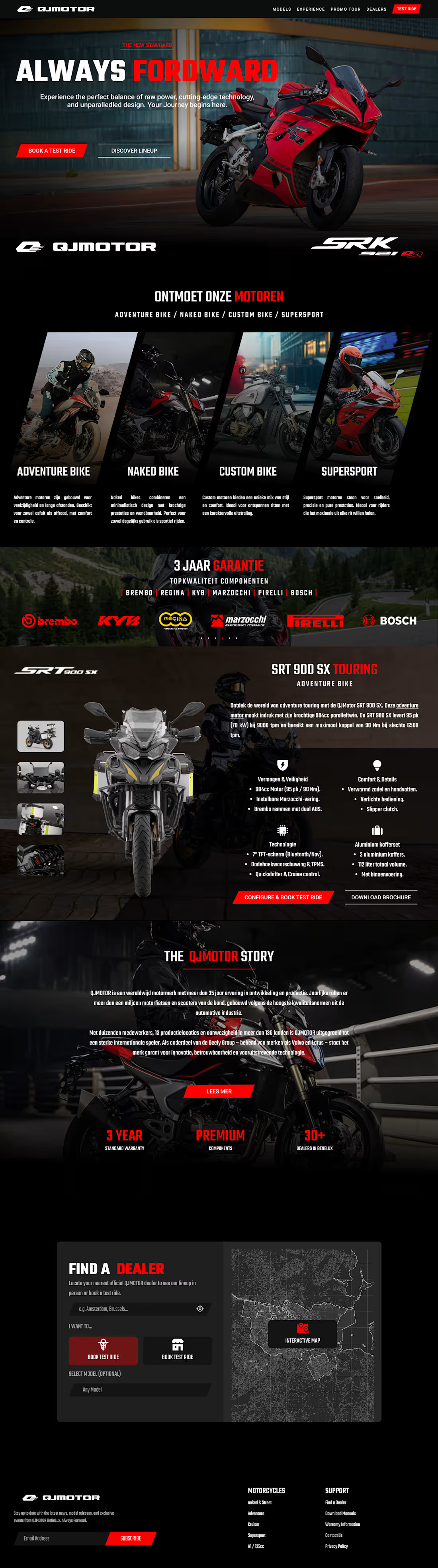
High-Octane Dark Aesthetic: Deep black background paired with aggressive Racing Red accents, accentuating the metallic curves and aerodynamic details of the motorcycles.
Dynamic Category Showcase: Angled cuts and dynamic category cards to evoke speed, cornering agility, and adrenaline.
Component Authority & 3-Year Warranty: Prominent OEM showcase highlighting verified engineering partnerships (Brembo, KYB, DID, Marzocchi, Pirelli, Bosch) alongside official 3-year warranty badges to eliminate reliability doubts.
Flagship Deep-Dive (SRT 900 SX Touring): Multi-angle product showcase accompanied by structured technical breakdowns:
Power & Safety (Brembo ABS, horsepower specs)
Comfort & Details (Ergonomics, heated seats)
Technology & Connectivity (TFT multi-function display)
Lead-Generating "Find a Dealer" Portal: Integrated dark-themed interactive map with location lookup and quick-toggles between Showrooms and Certified Service Centers.
Deliverables & Business Impact
Immersive, production-ready automotive web layouts tailored for European/international markets.
Component library featuring dark-mode UI states, specification tabs, and dealer map widgets.
Clear visual hierarchy optimized for B2C conversion and dealership lead generation.
1
74
Frutland — E-Commerce Redesign & Interactive Web Prototype
Frutland es una marca de distribución de frutas frescas y alimentos 100% orgánicos. El proyecto consistió en el rediseño completo de su tienda web y experiencia de usuario, transformando una interfaz tradicional en una plataforma moderna, apetecible y orientada a la conversión, respaldada por un prototipo 100% navegable e interactivo en Figma.
🎯 El Desafío:
En el sector de alimentos frescos y orgánicos por internet, la compra entra por los ojos y por la confianza:
Falta de impacto visual: El sitio anterior no transmitía la frescura ni la calidad premium del producto del campo.
Fricción en la decisión de compra: Los usuarios dudaban de la procedencia y calidad antes de agregar productos al carrito.
Poco engagement: No existía contenido de valor que motivara al cliente a regresar o explorar nuevos productos.
Solución de Diseño y Arquitectura de Conversión
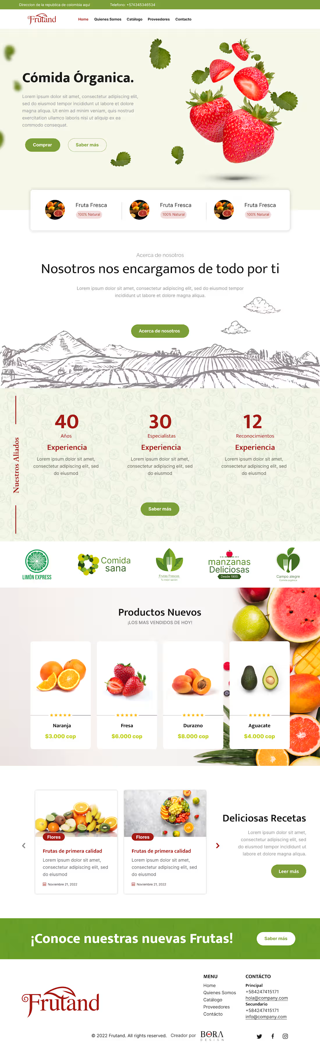
1. Hero Section con "Appetite Appeal" Inmediato
Composición visual dinámica con elementos en suspensión (fresas y hojas flotantes) que transmiten frescura natural y dinamismo visual en el primer scroll.
Llamados a la acción (CTAs) contrastados ("Comprar", "Saber más") con acceso directo a categorías populares de fruta fresca.
2. Storytelling y Construcción de Confianza (Social Proof)
De la granja a la mesa: Ilustración grabada artesanal que conecta la marca con la tierra y el trabajo de campo ("Nosotros nos encargamos de todo por ti").
Métricas de autoridad: Bloque numérico destacado (40 años de experiencia, 30 especialistas, 12 reconocimientos) junto a los sellos de aliados comerciales para eliminar cualquier objeción de compra.
3. Vitrina de Productos (E-Commerce Grid)
Tarjetas de producto limpias con fotografía real en alta resolución, valoraciones por estrellas y precios claros.
Microinteracciones pensadas para compra rápida sin saturar de información al usuario.
4. Fidelización mediante Contenido: Sección de Recetas
Carrusel interactivo de "Deliciosas Recetas" para inspirar el uso de los productos comprados, aumentando el ticket promedio y la recurrencia de los clientes.
5. Prototipado Interactivo Avanzado en Figma
Simulación real del comportamiento de la web: efectos hover en botones y tarjetas, transiciones suaves en el carrusel de recetas, estados activos del menú y flujo de suscripción al newsletter.
🚀 Entregables y Resultados
Auditoría UI/UX: Análisis y reestructuración completa del funnel de compra.
Prototipo Interactivo en Figma: Simulación navegable completa para validación del cliente y guía exacta para el equipo de desarrollo front-end.
Design System Web: Paleta de colores orgánicos (verdes naturales, blancos y toques cítricos), tipografías legibles y componentes reutilizables con Auto-layout.
Impacto: Una presencia digital fresca, confiable y optimizada tanto para venta directa como para retención de clientes.
1
83