
Efosa Igharosa
Designs Prioritizing Client & User Satisfaction
Ready for work
Efosa is ready for their next project!
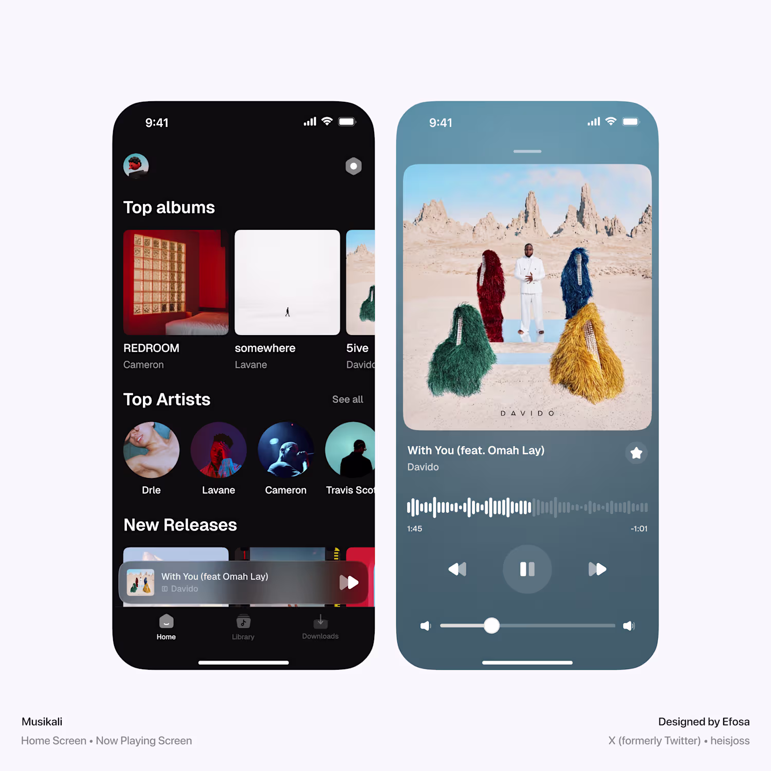
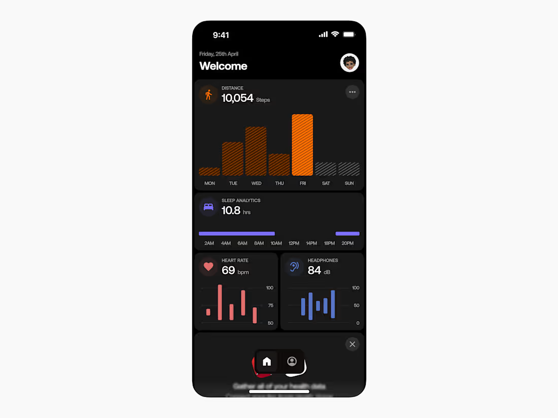
Health Tracker app design - Dashboard
2
11
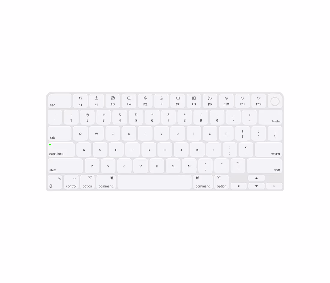
So I designed a Keyboard!!
This wasn't a client brief — it was a standard I set for myself. An exploration of how the principles we apply to great digital products translate beyond the screen. Grid systems, visual hierarchy, spacing, rhythm. It's all the same language, just a different surface.
Most people design for screens. I design for the spaces in between.
Available for product design projects. DM or book through Contra. 👇
1
8
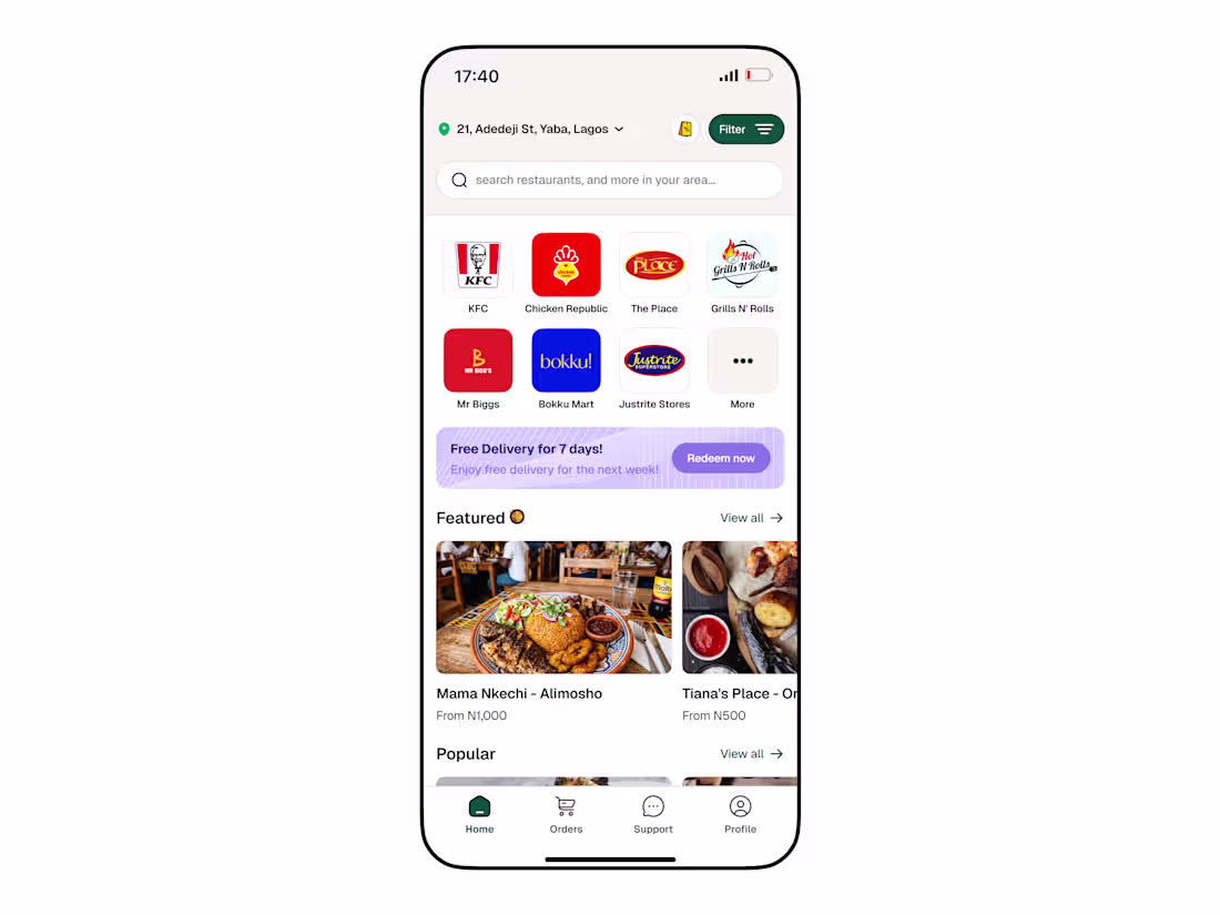
I redesigned @Chowdeck (https://x.com/Chowdeck)'s home screen
Key improvements:
→ Prominent search bar for faster discovery
→ Real brand logos over abstract icons (KFC, Chicken Republic etc.) — users recognize, not decode
→ Food-first layout with rich photography
→ Cleaner nav — 4 tabs, zero clutter
→ Better visual hierarchy top to bottom
Same app. Better experience.
#UIDesign (https://x.com/hashtag/UIDesign?src=hashtag_click) #UXDesign (https://x.com/hashtag/UXDesign?src=hashtag_click) #ProductDesign (https://x.com/hashtag/ProductDesign?src=hashtag_click) #MadeInNigeria (https://x.com/hashtag/MadeInNigeria?src=hashtag_click) #Chowdeck (https://x.com/hashtag/Chowdeck?src=hashtag_click)
1
15
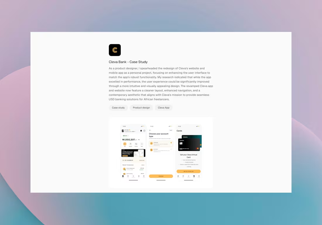
A quick case study on Cleva – USD Banking App 💵
Link: https://lnkd.in/dfJJK5S2
(https://lnkd.in/dfJJK5S2)Focused on UI improvements to make the app cleaner, more intuitive, and trustworthy for freelancers receiving and managing USD. Key updates include virtual cards, currency switching, fund deposits via bank & USDC, referrals, and onboarding.
Small changes, big impact on usability
0
15
User-Centric WebDesign
0
0