
Ebuka Okosa
Strategic Brand Designer & Builder Helping businesses build
New to Contra
Ebuka is building their profile!

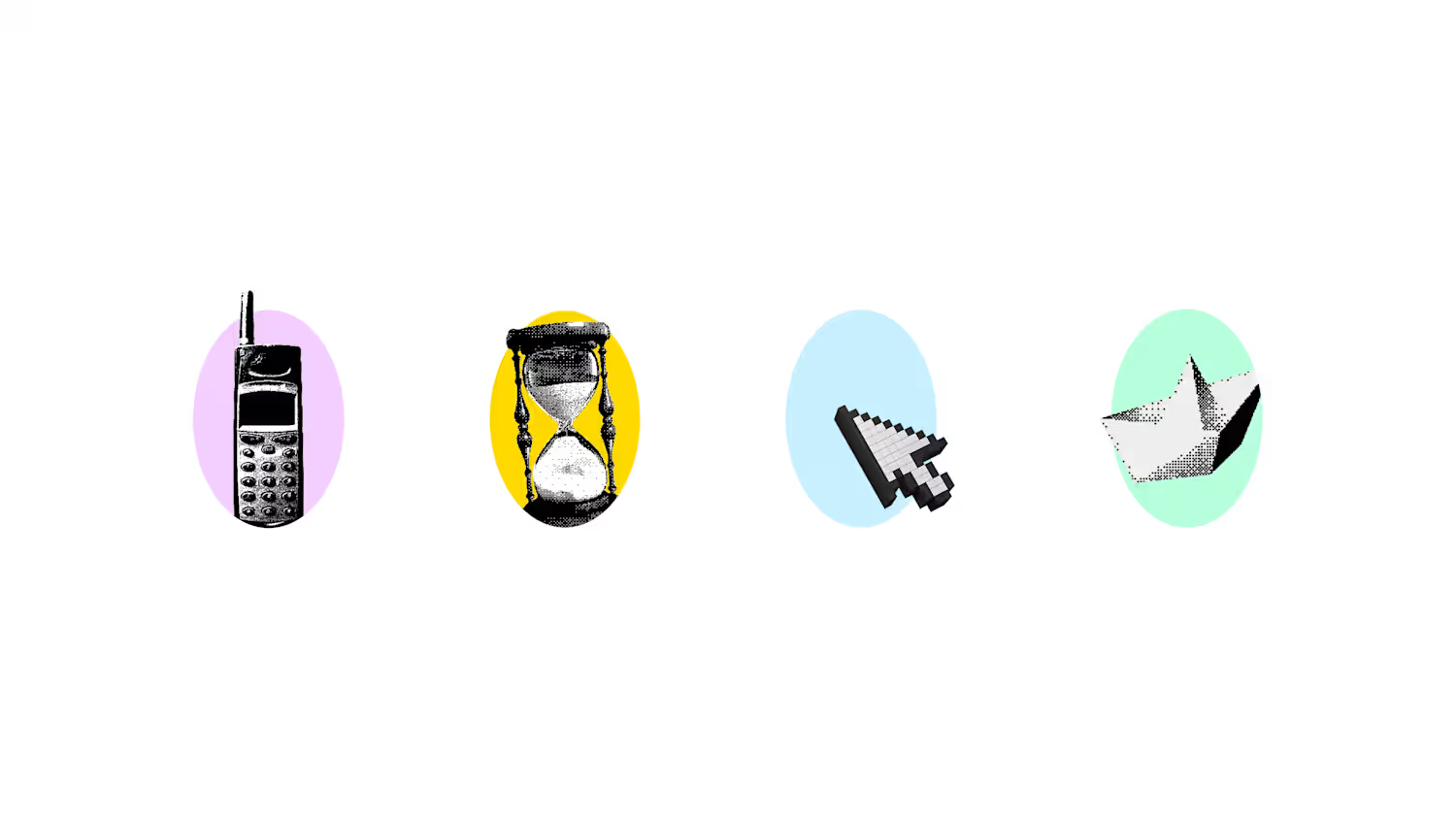
The @kukuruku.farm (http://kukuruku.farm) visual identity draws from themes of warmth, freshness, and trust.
Every colour, mark, and typographic choice was made to earn confidence from families who’ve been let down by the food supply chain before.
Scroll through to see the full brand system. 👇
Enjoy the full use case on our website
marchagency.co (http://marchagency.co)
1
20
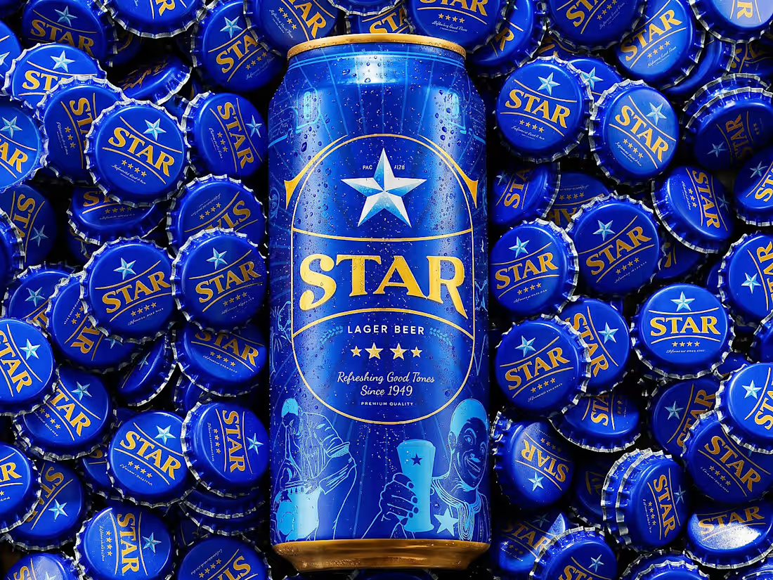
Rebranding Star Lager Beer Nigeria was one of my most challenging projects in 2024.
I knew I needed to create a label that will not be overlooked when placed side by side with other beer brand.
The big idea was revisiting decades of STAR’s advertising history and visual heritage. The concept centered on transforming some of the brand’s most memorable historical advertisements into contemporary illustrations.
The rebrand helped reposition STAR as a premium heritage brand during a period when much of the beer category was experiencing decline.
Markets where the refreshed identity gained traction demonstrated notable growth, with Lagos South recording a 23.4% increase year-over-year, while Uyo, Ibadan, and Onitsha also reported positive growth. Rather than relying solely on nostalgia, the redesign transformed heritage into a competitive advantage, strengthening consumer affinity and helping STAR stand apart in a challenging market.
The result was a visual identity system that celebrated the brand’s past while giving it renewed relevance for the future.
0
24
The gold trade runs on trust.
Most of the artisanal and small-scale mining ecosystem doesn't have it, fragmented supply chains, no transparency, no clear line between miners and institutional markets.
blockdor is building the infrastructure to fix that.
Our job was to give it a brand equal to the ambition.
Visit marchagency.co (http://marchagency.co) for full Case study.:
8
71
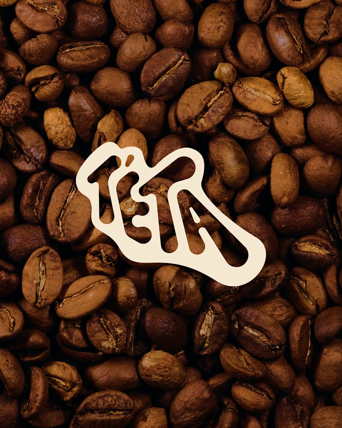
@teta.london (http://teta.london) is a coffee brand whose name literally means “wake up,” in the Igbo land.
Built for a culture that’s forgotten how to slow down.
Most coffee brands sell energy. We asked a different question: what if the real product isn’t the caffeine, it’s the fifteen minutes someone finally gives themselves?
So we didn’t design around coffee.
We designed around what coffee makes room for the long conversation, the idea that shows up uninvited, the pause before the next thing.
The result feels less like a menu and more like an exhale. Warm, contemporary, quietly optimistic built to work as a bag on a shelf or a room full of people who came in for coffee and stayed for the quiet.
Some of our favorite work doesn’t try to be loud. It just gives people somewhere to land.
1
8
74