
pro
David Danciu
Design engineer building polished platforms for startups.



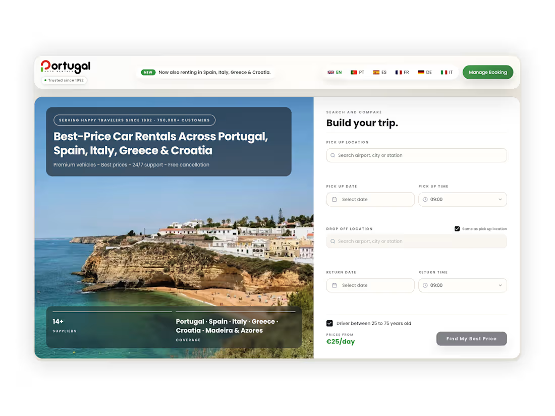
Portugal Auto Rentals came to us as the oldest car rental company in the country, a business with decades of trust behind it, but a website that didn't reflect any of that. The site was cluttered, outdated, and doing more to push visitors away than convince them to book. For a business built on reliability, that gap between reputation and digital presence was costing real customers.
The rebuild started with a simple question: what actually needs to happen for a visitor to trust this business enough to hand over their money and their trip? Everything followed from there. The structure was stripped down and rebuilt around clarity, an easier, more intuitive booking flow, cleaner navigation, and a visual identity that felt modern without losing the sense of an established, dependable company. Nothing about the redesign was decorative for its own sake, every change was made with conversion in mind, not just aesthetics.
The result speaks for itself. Since launch, both conversion rates and sales have seen a real, measurable jump. It's a good reminder that for a business like this, a website isn't just a digital business card, it's often the first real interaction a customer has with the brand, and it needs to earn that trust in seconds.
1
95
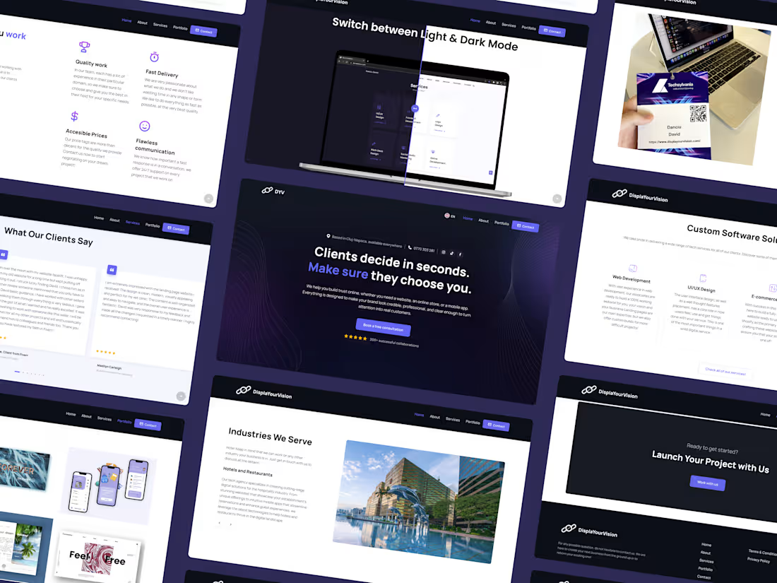
Every agency eventually faces the challenge of building its own platform, and it's rarely as straightforward as it sounds. There's no external brief to follow, no client vision to interpret, only the discipline of applying the same standard internally that's promised to every client: clarity, trust, and conversion, built in from the first second a visitor lands.
The site was structured around a simple reality: visitors decide almost instantly whether a business is credible enough to pursue further. Messaging was built to communicate the agency's full scope, web development, e-commerce, applications, video, and brand strategy, without dilution or delay. Real client work, testimonials, and results were positioned prominently, replacing abstract claims with tangible proof. Every section was designed to anticipate a visitor's next question before they needed to ask it.
The outcome is a platform that reflects the same principle applied across every DisplaYourVision project: a digital presence built not merely to be seen, but to be trusted, and to convert that trust into genuine business opportunity.
0
94
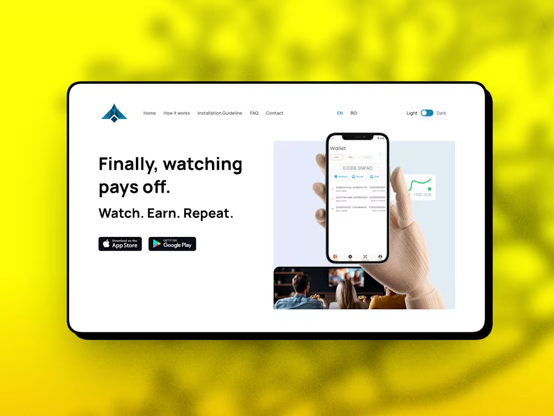
SNPad needed a landing page that could do one job well: turn casual visitors into app downloads. The product lets people earn rewards for ad-supported TV viewing, so the page had to explain a slightly unconventional concept (watch TV, get paid) quickly and clearly, without losing anyone before they reached the install buttons.
We built the site with a strong, benefit-driven structure: a clear headline, three simple value points, and a short "how it works" walkthrough before ever asking for a download. Every section was designed to answer the visitor's next question before they had to ask it, which matters most for a product people haven't seen before and need to trust fast.
The result is a clean, conversion-focused landing page that turns an unfamiliar concept into something visitors can understand and act on in seconds, with clear paths to both the App Store and Google Play.
1
119
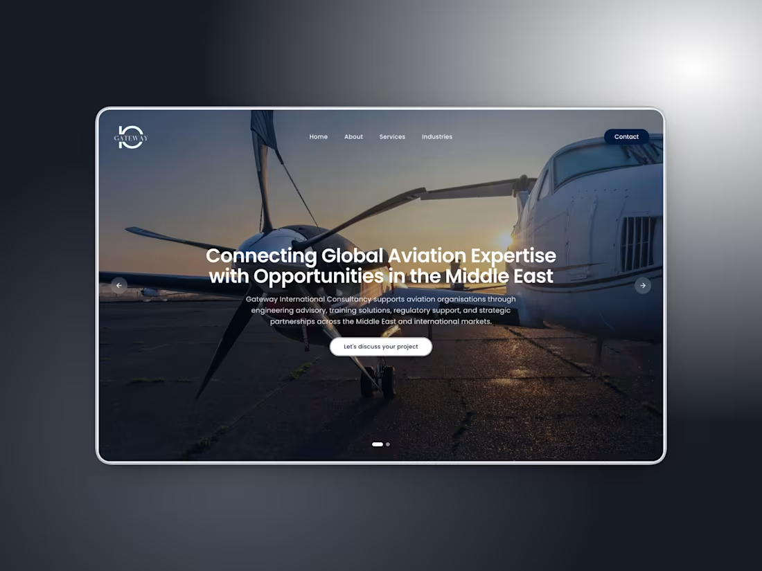
Gateway International Consultancy came to us with a different kind of challenge. They're an aviation advisory firm founded by professionals with decades of experience across engineering, airworthiness, and regulatory compliance, and their audience isn't casual visitors. It's airlines, MRO organizations, OEMs, and investors evaluating whether this is a firm they can trust with serious decisions.
That meant the site had to carry authority, not just look good. We built the landing page in Next.js with Tailwind CSS and deployed it on Vercel, focusing on a clean, editorial structure that walks visitors through who Gateway is, their five service areas, and the regions they operate in, without overwhelming someone scanning the site in under a minute.
The result is a site that matches the seriousness of the industry it's built for: fast, clean, and built to earn trust from decision-makers in aviation, not just impress casual browsers.
1
130