
BOOK FORMATTING ||BOOK LAYOUT DESIGN|| KDP COMPLIANCES
- 10
- Followers
BOOK FORMATTING ||BOOK LAYOUT DESIGN|| KDP COMPLIANCES

The cover of Navigating the Waves is thoughtfully designed to reflect the emotional, physical, and transformative journey of pregnancy, childbirth, and motherhood. The imagery symbolizes the waves of challenges, uncertainties, and triumphs that mothers experience as they prepare to welcome a new life into the world.
The design conveys strength, resilience, hope, and maternal love, capturing both the struggles and the beauty of the childbirth experience. Soft yet empowering visual elements create a sense of comfort and encouragement, reassuring readers that they are not alone in their journey.
The typography is elegant and approachable, while the overall composition evokes feelings of support, courage, and perseverance. This cover is intended to resonate with expectant mothers, new parents, and anyone seeking guidance through the realities of pregnancy and childbirth.
The cover effectively communicates the book's central message: embracing the challenges of childbirth with confidence, grace, and the knowledge that every wave faced is part of a remarkable journey toward new beginnings.
1
177
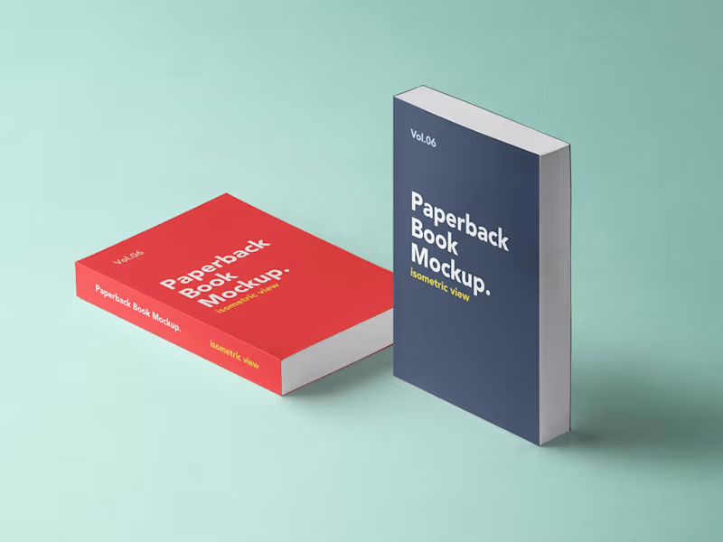
Bring Your Book Cover to Life with a Professional 3D Mockup.
Showcase your book with a realistic, eye-catching 3D mockup designed to make your cover stand out. Perfect for authors, publishers, marketers, and self-published writers.
Design Features:
Realistic 3D book presentation
Professional lighting and shadows
High-quality front cover display
Paperback and hardcover mockups
Attractive perspective and depth
Make Your Book Look Ready for the Bestseller Shelf!.
0
15
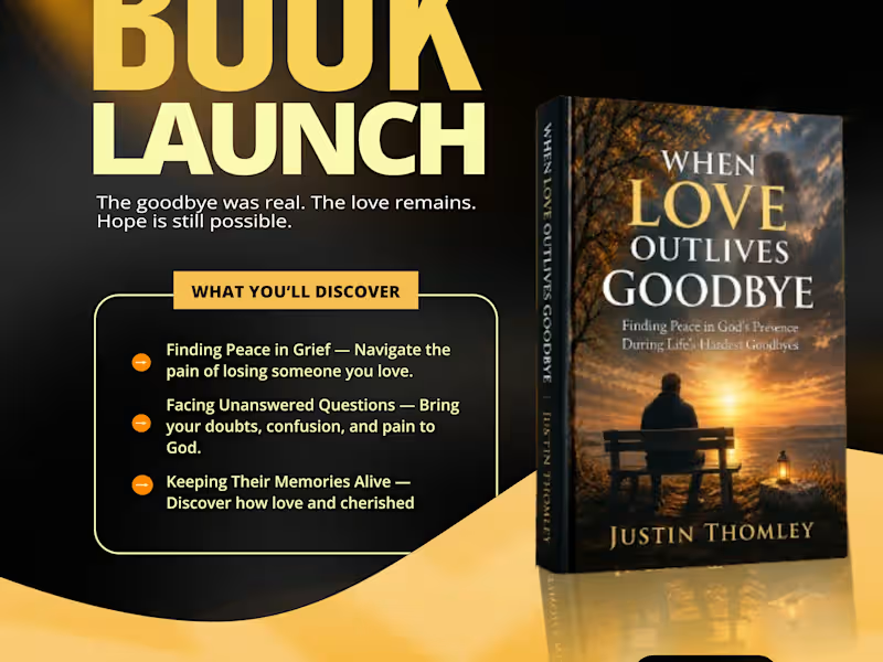
When Love Outlives Goodbye | Book Launch Flyer Design
A warm, high-contrast launch flyer that turns a grief-support book into a scroll-stopping social media promo.
I designed the official book launch flyer for When Love Outlives Goodbye: Finding Peace in God’s Presence During Life’s Hardest Goodbyes by Justin Thomley.
The book deals with grief, faith, and healing. The flyer had to feel hopeful and comforting, not heavy, while still standing out in a crowded social media feed and driving readers to buy.
1_ Color palette: Deep black with glowing gold and cream tones. This mirrors the sunset on the book cover, symbolizes hope after loss, and makes the headline pop.
2_ Typography: A bold, oversized “BOOK LAUNCH” headline paired with an elegant handwritten “Official” script, balancing impact with a personal touch.
3_ Hierarchy: The tagline “The goodbye was real. The love remains. Hope is still possible.” sits right under the headline for an instant emotional hook.
4_ Content block: A framed “What You’ll Discover” section highlights the book’s three key themes so readers understand its value at a glance.
5_ Book mockup: A 3D mockup of the cover, placed on the right to balance the text and give the book a premium feel.
Clear call to action: An “Now Available on Amazon” badge, a Kindle and Paperback note, and a scannable QR code lead straight to the purchase page.
A cohesive, emotionally resonant promo design ready for Instagram, Facebook, WhatsApp Status, and LinkedIn, giving the author a professional launch presence.
Deliverables
Book launch flyer (portrait, social media format)
Skills / Tags
Graphic Design, Flyer Design, Book Launch Design, Social Media Design, Book Marketing, Branding, Print & Digital Design, Typography
Tools Used (edit to match yours)
Adobe Photoshop, Adobe Illustrator, Canva
Your Role
Graphic Designer
Client
Justin Thomley (Author)
Project Type
Marketing / Promotional Design
1
145
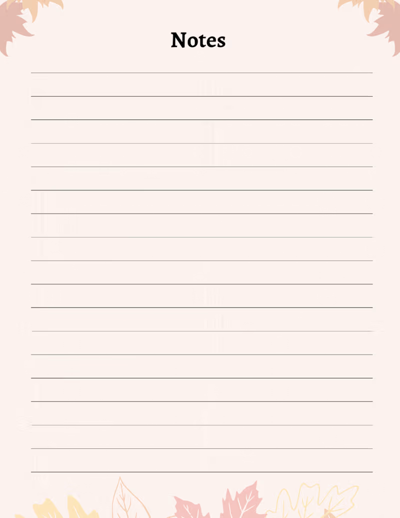
🍂 Gratitude Journal | Book Cover & Interior Design
A simple journal designed to turn everyday moments into meaningful reflections.
For this Gratitude Journal, I focused on creating a warm, calming, and inviting visual experience. The autumn-inspired palette, clean composition, botanical elements, and handwritten typography work together to create a peaceful atmosphere that encourages reflection and intentional journaling.
What I focused on:
📖 Journal cover design
🎨 Color palette & visual direction
✍️ Typography selection
🍁 Botanical/seasonal elements
📐 Clean and balanced composition
📝 Print-ready journal presentation
The goal was to create something that feels personal, peaceful, and easy to engage with a journal readers would actually want to pick up and use.
Looking for a professional book, journal, or planner design?
I help authors and creators transform their ideas into polished, publication-ready books.
Services: Book Cover Design • Journal Design • KDP Formatting • Interior Layout • Book Publishing
#BookDesign #JournalDesign #BookCoverDesign #KDP #SelfPublishing #GraphicDesign #PublishingDesign #ContraPortfolio #Journal #GratitudeJournal
0
94


Research Assistant, Proofreader & Writer | Chemistry Backgro


UI/UX Designer crafting intuitive, modern digital experience
New to Contra
UI/UX Designer crafting intuitive, modern digital experience
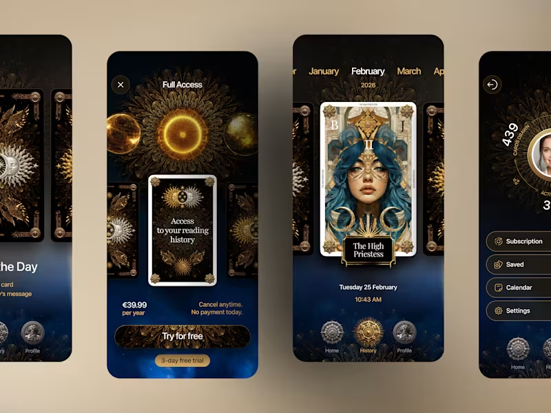
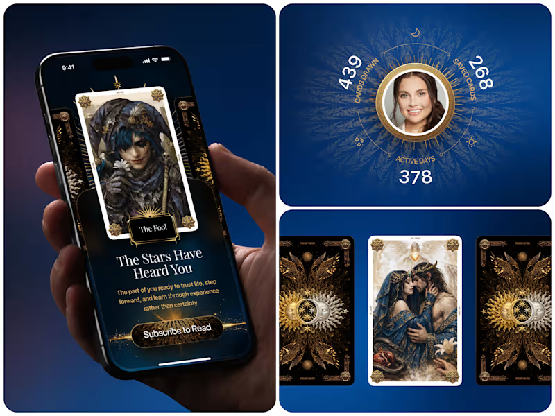
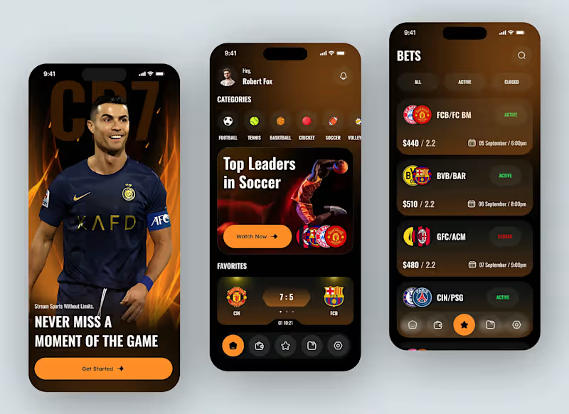
We design MVP apps that help startups move fast, validate ideas, and launch with confidence. Our focus is on building only what matters—clear user flows, essential features, and a product experience that’s easy to understand and test.
0
63
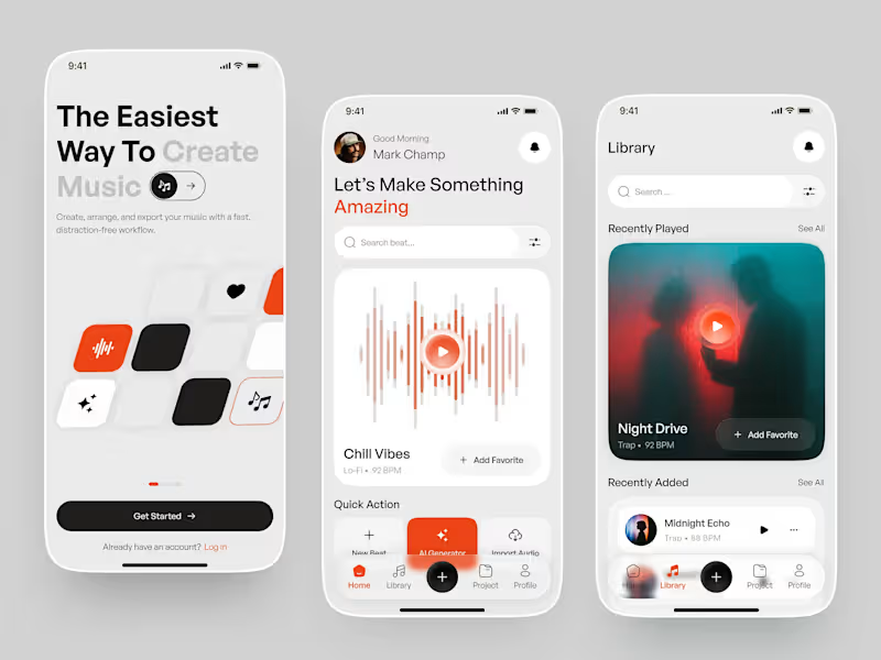
Music creation experience designed to make producing music feel simple, fast, and distraction-free.
The concept explores a smooth workflow for creating beats, generating music with AI, discovering sounds, and managing projects—all within a minimal and intuitive interface.
The visual direction combines soft neutrals, bold orange accents, rounded cards, and spacious layouts to create a friendly yet premium music-production experience.
Designed with a focus on simplicity, discoverability, and effortless music creation.
0
73

Logo .Brand identity. social media. Graphics designer


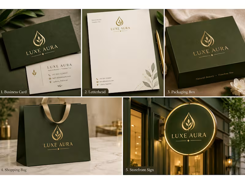
✨ Luxury Brand Identity Design | LUXE AURA ✨A timeless blend of elegance, sophistication, and minimalism. 💚✨
This luxury brand identity features a refined gold emblem, elegant typography, and a premium olive-green and gold color palette — designed to create a memorable and cohesive brand experience.
🎨 Designed with creativity. Crafted with elegance.
3
3
188

Available on any time



Creative Graphic Designer | Flyers, Logos & Social Media Des
New to Contra
Creative Graphic Designer | Flyers, Logos & Social Media Des


Hi,
I can create a high-converting Meta (Facebook & Instagram) ad video that grabs attention within the first few seconds and is optimized for conversions. The video will include engaging visuals, smooth transitions, captions, brand colors, and a strong call-to-action designed for social media advertising.
I will deliver a professional, high-quality video in the correct format for Meta Ads, and I'm happy to make revisions to ensure it meets your expectations. I can start immediately and deliver within the agreed timeline.
0
45

My logo represents creativity, professionalism, and attention to detail. The clean "BS" monogram reflects my personal brand while the modern typography and premium color palette communicate trust, quality, and innovation. Every element is designed with simplicity and versatility in mind, making it suitable for digital and print applications.
As a graphic designer, I believe strong visual identity helps businesses stand out and connect with their audience. My design approach focuses on creating memorable, functional, and high-impact branding that delivers real results.
2
1
128

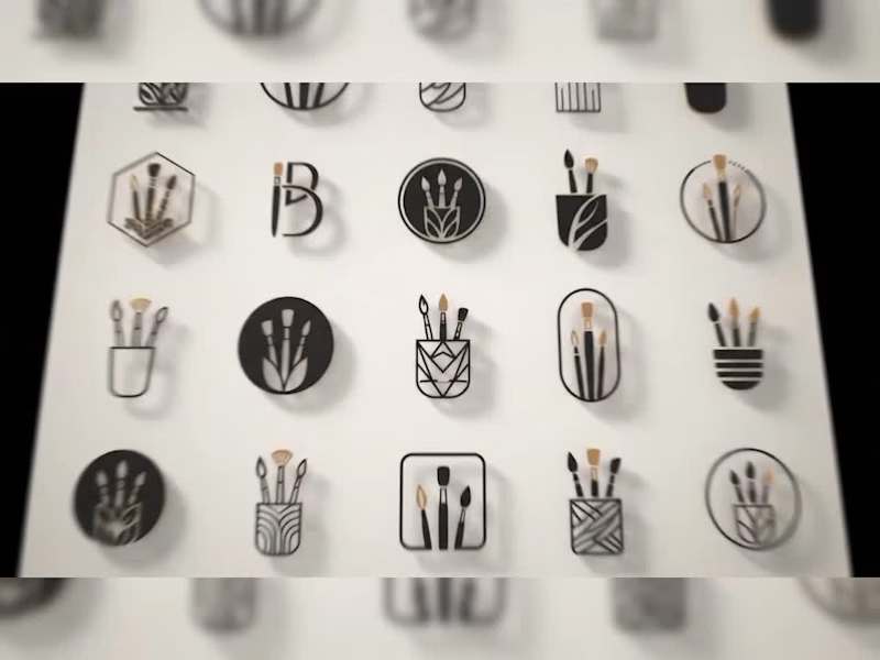
A collection of five distinct, custom logo concepts showcasing versatility across different industries. The set includes a rugged outdoor brand concept (Summit Adventures), a clean eco-wellness mark (Natura Wellness), a powerful corporate crest (Astra Group), a minimalist abstract emblem (Nexus Collaborative), and a playful, modern mascot design (Stellar Designs). Each logo was designed with strong typography, careful color theory, and high scalability in mind.
0
61


Expert in CNC Programming & CAD Design
Expert in CNC Programming & CAD Design


View more →