Expert UI UX Designer, SaaS, Web App, Product Design
- 1x
- Hired
- 13
- Followers
Expert UI UX Designer, SaaS, Web App, Product Design


Framer Expert


Product UX/UI Designer for SaaS & Web Platforms
Product UX/UI Designer for SaaS & Web Platforms

Recently designed the first sections of a landing page for an AI workflow automation platform targeting enterprise teams.
Client’s goal:
Position the product as a reliable, enterprise-grade solution and drive demo requests from CTOs and operations leaders. The key challenge was simplifying a technically complex product without diluting credibility.
My approach:
1. Structured, desktop-first layout
2. Clear value proposition above the fold
3. Strong problem framing to build relevance
4. Enterprise visual tone (minimal, confident, no hype)
5. Conversion-focused hierarchy
The objective was clarity and trust. Not visual noise.
0
94


UX/UI Product design | Mobile & Web Developer
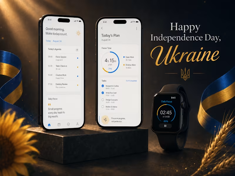
🇺🇦 Today we celebrate the 35th Independence Day of Ukraine.
In this portfolio concept, I used a blue-and-yellow palette and a clean focus app theme to reflect something meaningful to me: daily progress, inner strength, and steady movement forward 🇺🇦
2
5
222
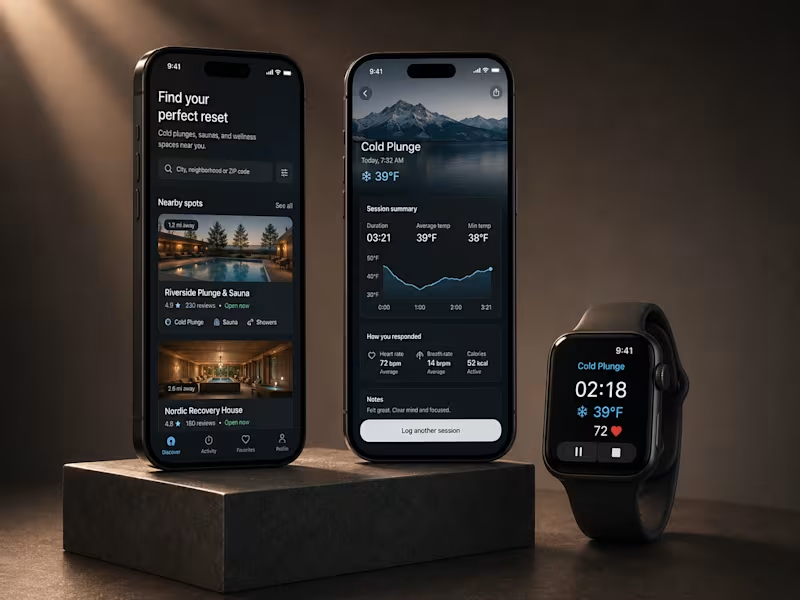
I wanted this portfolio showcase to feel like a real product ecosystem, not just another row of mobile screens.
So instead of showing the app in isolation, I built the visual around the full experience discovering cold plunge and sauna locations on mobile, tracking a session in real time, and continuing that experience on a smartwatch.
The interesting part for me was making three very different screens still feel like one product: same visual language, same hierarchy, same sense of calm and focus.
I’m especially interested in products where mobile and wearable experiences work together rather than feeling like two separate apps.
What’s one feature you think becomes much better when it moves from phone to smartwatch?
2
2
197

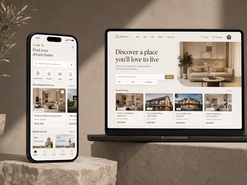

Framer designer, Framer developer
Framer designer, Framer developer


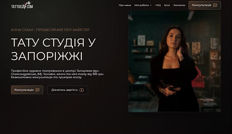

Webflow Developer & Designer
Webflow Developer & Designer