
Recently, I worked on a logo refresh for Kellers Beer.
A little background: Kellers is brewed at the Sevan Brewery in Armenia, so one of the key goals was to preserve the connection between the brand and its origin.
The client wanted the identity to reflect Sevan itself. Instead of simply adding the lake as a separate graphic element, I looked for a way to merge two existing logos into a single visual mark. The outline of Lake Sevan became part of the logo composition, helping tell the brand’s story while maintaining a refined, premium feel.
The result is a design with subtle old-money aesthetics that celebrates both the heritage of the brewery and its Armenian roots.
What do you think of this approach? 🍺
4
5
1.1K



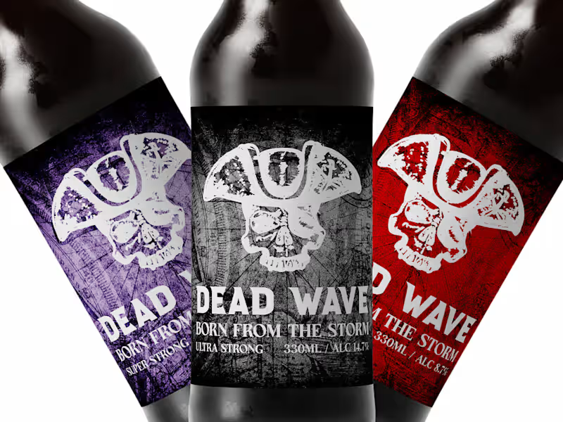
This beer is inspired by the lives of pirates, their dangerous adventures, and stormy seas. At the heart of the idea is the feeling that every time a person opens a bottle, they seem to begin their own voyage, leaving everyday life behind and entering an unknown, dangerous, and free world.
Death and stormy seas in one bottle. Feel all the pleasure during your adventurous voyage.
0
131