Creative Direction Projects in Western CapeCreative Direction Projects in Western CapeSOUTH AFRICAN AIRWAYS
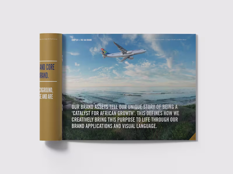
A catalyst for African growth: the SAA corporate identity guide
Strategic planning, creative direction and copywriting for the corporate identity guide of a national airline and a national symbol.
THE STORY
There are brands that carry weight in the literal sense. And then there are brands that carry weight in every other sense.
South African Airways is both. As the national carrier of South Africa and one of the continent's longest-running airlines, SAA represents something beyond its routes and its fleet. It represents a country, a continent, an idea of what Africa is becoming and what it deserves to be. When I took this brief I understood that the stakes were not just creative. They were cultural.
The CI guide I developed for SAA had to hold all of that without buckling under it. It needed to give every person who touched the brand, from cabin crew to marketing managers to external agencies across the world, a clear and inspiring sense of what SAA stood for and how that should show up in everything they did.
The platform we built was "A Catalyst for African Growth." Vibrant, cosmopolitan, contemporary. A carrier that didn't just fly people to destinations but believed in the destinations themselves. The guide covered brand assets, tone of voice, photographic style, colour, typography and the full brand narrative. Every word was written to inspire as much as to instruct.
The simplest line in the whole document took the longest to write. It always does.
WHAT IT TAUGHT ME
That the most important reader of a brand guide is not the designer. It's the person who has never thought about brand before and needs to understand, in plain and beautiful language, why any of this matters at all. Filmmaking with AI can get overwhelming fast. Not because the tools are difficult to use. But because the blank page is brutal.
You have a feeling.
A theme.
A visual world.
Maybe even a character.
But turning that into an actual story, scene by scene, is where a lot of creative filmmakers get stuck (myself included).
I’ve wanted to tell stories around the idea of escapism for a long time.
And the thing I keep running into is creative block around one simple question:
Where do I start?
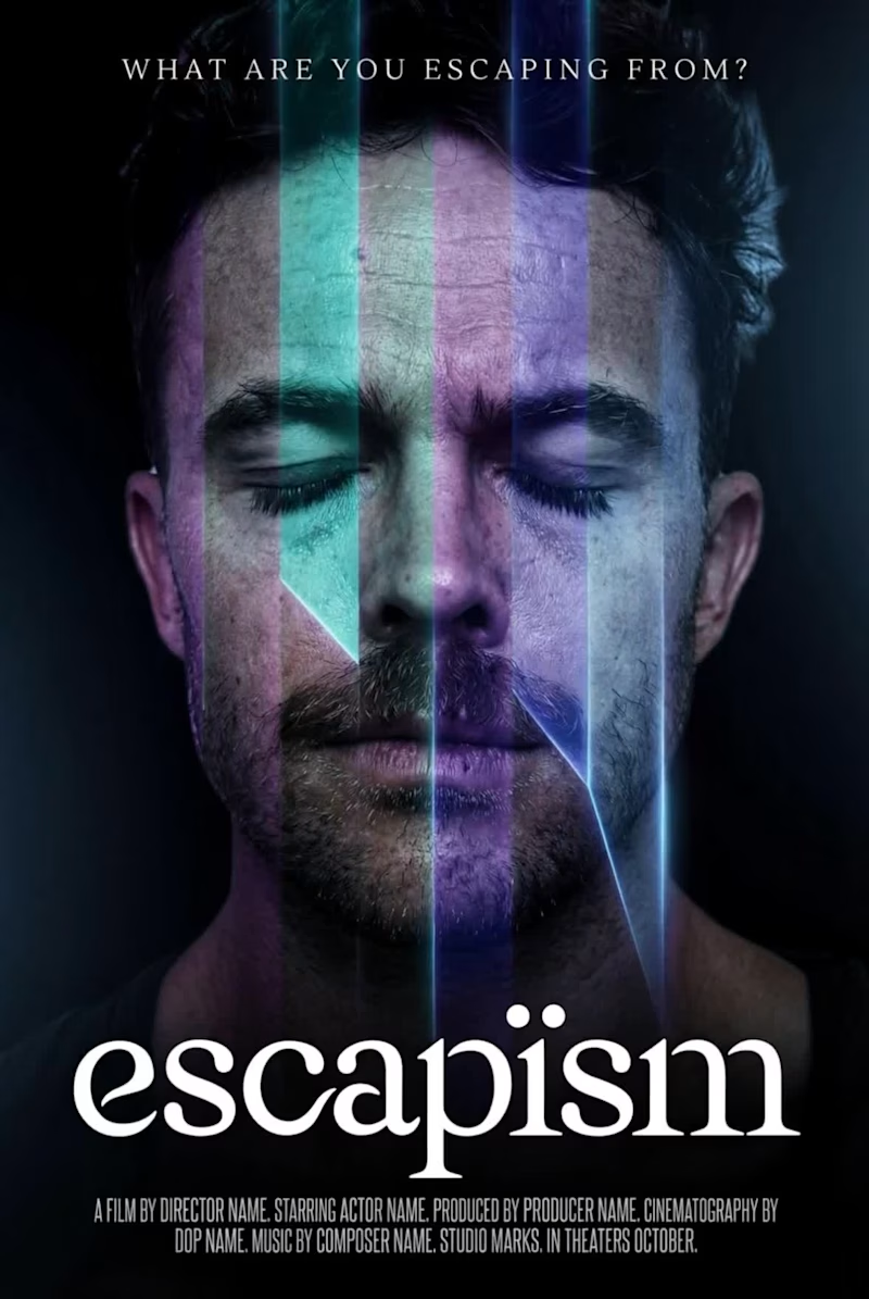
Lately, I’ve been experimenting with a much simpler entry point:
Start with the movie poster.
Not the whole film.
Not the full script.
Not the shot list.
Just the poster.
Because the moment you can visualize your film as if it’s already going into cinemas, something shifts.
The title becomes real.
The premise becomes clearer.
The mood sharpens.
The character starts to exist.
And suddenly the story feels less abstract and more buildable.
I used FLORA Techniques to templatize the process so it’s reusable, which means I’m not rebuilding the workflow from scratch every time. I can lock the core visual idea, drop in the character, movie title, refine the tone, and generate a poster that feels like the beginning of a real film world.
From there, I animated it in a very simple way:
Subtle lighting movement, a blink, just enough to make the image feel alive (using Kling AI 3.0 Pro).
And that’s the point.
Not to pretend the film is finished.
But to create a starting point that’s emotionally strong enough to pull me into making the rest of it.
I think this can be useful for a lot of filmmakers and gen AI creators.
Especially the ones who already have a story they feel…
…but don’t yet know how to begin shaping it.
A poster won’t write the film for you.
But it can give your vision a face.
A title.
A tone.
A reason to build the full story.
Sometimes that’s all you need to get the filmmaking process moving.
My submission for the FLORA x Contra Techniques challenge. You can give it a run yourself here: https://app.flora.ai/techniques/movie-promo-poster-animation
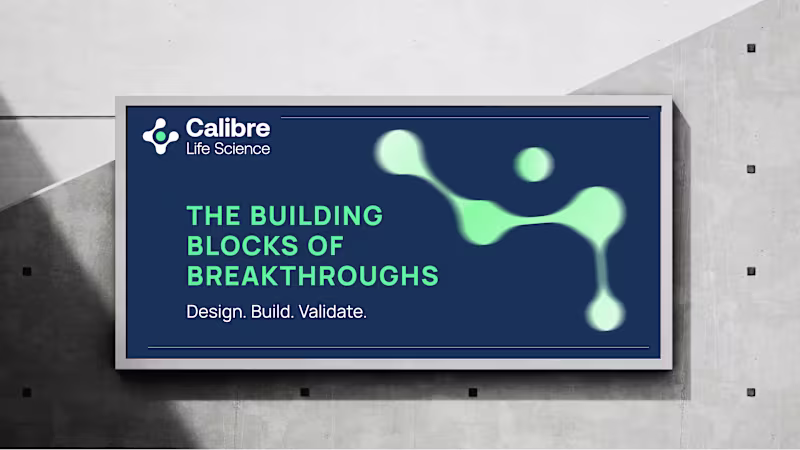
#FLORATechnique CALIBRE LIFE SCIENCE
Creating immunity for Africa, from Africa: brand strategy, creative direction and copywriting for a life science engineering firm
Brand strategy, manifesto, creative direction, content strategy and ongoing copywriting for a pharmaceutical and biotech facility engineering company.
THE STORY
There are industries where the stakes are abstract. And then there are industries where the stakes are people's lives.
Calibre Life Science designs, builds and validates the facilities where medicine is made. Sterile pharmaceutical environments, biosafety laboratories, large-scale production facilities across the continent. The work is technical, precise, and unforgiving in ways most people never see.
The challenge wasn't understanding what they did. It was finding language that could carry the weight of it without collapsing under the gravity.
The platform I built centres on a single idea: the line. Every facility begins with a line of intention. A line that has to hold through design, through build, through validation, all the way to the moment production comes online and the system either proves itself or it doesn't. Design. Build. Validate. Not three separate phases. One continuous commitment.
The manifesto came first and set the temperature for everything that followed. The content strategy extended the voice across thirteen LinkedIn posts in the first calendar, each anchored to a pillar and written to sound like people who knew exactly what they were doing and felt no need to shout about it. Precise. Direct. Quietly certain.
Writing for this industry taught me something I didn't expect. The engineers building these facilities will never meet the patients whose medicine is made inside them. But they think about them anyway. That's what the writing had to hold.
WHAT IT TAUGHT ME
That gravity is a gift. When the work genuinely matters, you don't have to manufacture meaning. You just have to get out of the way and let it speak.