
SaaS Product Designer | UI/UX, Webflow & B2B Websites
- $1k+
- Earned
- 4x
- Hired
- 5.0
- Rating
- 437
- Followers
SaaS Product Designer | UI/UX, Webflow & B2B Websites

LUMIXA — Gaming Controller Product Landing Page 🎮⚡
LUMIXA is a futuristic product landing page concept created for a premium gaming controller built around precision, performance, and immersive play.
The goal was to make the product itself the center of the experience while giving the interface a clean, high-tech character. A minimal white canvas, electric blue accents, oversized typography, and detailed 3D product visuals create a strong gaming aesthetic without making the page feel overloaded.
Special attention was given to:
• a product-first hero section with the controller as the main visual focus;
• bold typography and asymmetric composition to create a sense of movement;
• key product information like pricing, control level, and social proof placed directly within the buying journey;
• interactive-style product hotspots that emphasize the controller’s technology and features;
• gaming imagery integrated into the interface without distracting from the product;
• a clear Buy Now CTA designed to stay visually prominent;
• a responsive mobile experience that keeps the same futuristic identity on smaller screens 📱;
• a simplified mobile navigation for quick access to technology, experience, and pricing.
The result is a sharp, product-focused eCommerce experience that combines gaming energy with premium product presentation — designed to make the controller feel as advanced as the technology behind it. ✨
Looking to launch a gaming or tech product with a digital experience that actually feels like the product? Let’s build it. 🚀
84
219
40.3K

Multi-Sport Training Platform — Sports Landing Page 🎾⚡
This concept was created for a modern sports facility that brings training, coaching, professional equipment, and indoor & outdoor courts into one clear digital experience.
The goal was to make the platform feel energetic and performance-driven while keeping the information easy to scan. The visual direction combines bright sky imagery, dynamic sports photography, technical interface details, and lime accents to create a strong sense of movement from the first screen.
Special attention was given to:
• a high-impact hero section focused on movement, training, and performance;
• clear communication of key benefits like professional equipment, clean facilities, expert coaching, and comfortable training zones;
• strong CTAs that guide users toward joining the sports community;
• responsive desktop and mobile layouts built for quick browsing 📱;
• visual cues that highlight indoor and outdoor court options;
• offer-focused sections that support conversion without making the page feel overly promotional;
• a bold visual system that can scale across tennis, padel, fitness, and other sports services.
The result is a modern sports experience that feels active, clear, and motivating — helping users understand the offer quickly and take the next step with confidence. 🟢
Looking to create a stronger digital presence for your sports, fitness, or wellness brand? Let’s build something that moves. 🚀
8
31
1.6K

Full Stack Developer | Mobile Developer | AI Expert


We are studio that create dynamic premium sites and webapps
New to Contra
We are studio that create dynamic premium sites and webapps

Symbolic Rocks
Format
Full-featured SPA built with React 18, comprising 11+ pages and optimized for production deployment.
Architecture and Stack
Functional components with advanced rendering logic and performance optimizations.
Centralized state management for cart, user, chats, language, and theme implemented via modern React hooks and context patterns.
Responsive product grids, custom routing, and client-side caching for snappy UX.
Modular component library designed for reuse across product and admin interfaces.
Localization and Themes
Automatic browser language detection plus manual switching between RU, UZ, and EN.
Full light and dark themes with a signature purple-blue palette and tokenized design tokens for easy theming.
Core Features
Shopping cart with persisted state and checkout flows.
Authorization system and user profile management.
Admin panel with CRUD operations for products, users, and content.
Admin chat for internal support and moderation.
Advanced product mechanics: filters, sorting, variant support, and conversion-focused interactions.
Release Update and Enhancements
Chat authorization requirement — creating persistent chats now requires user authentication; authenticated chats are saved to user history and support extended features.
Guest chat support — ephemeral chat mode allows unregistered users to start conversations with limited lifetime and reduced functionality.
Updated product cards — redesigned card layout with improved interactive states, quick actions (buy, wishlist, preview), variant selectors, and analytics hooks for conversion tracking.
Admin panel modernization — enhanced CRUD workflows, role-based access control, bulk actions, improved analytics and activity logging, and streamlined chat/content management tools.
Implementation Notes
Chat flows: token-based authentication for persistent chats; guest mode creates temporary contexts that expire and are not persisted to the main database.
UX considerations: clear guest limitations and prompts to register for history and advanced features; progressive disclosure for admin bulk operations.
Handoff: component library and Figma assets, API specs for chat, auth, roles, and bulk endpoints, plus test cases for chat persistence and guest expiry.
1
103

Symbolic Rocks Premium Landing
Client Story
The artist initially sold unique paintings through Telegram. However, to reach a wider audience and test demand outside of the messenger, he needed a website.
Emerald Empire Solution
We developed a premium prototype landing page that became a tool for market validation and artwork presentation. The design was tailored to the client’s vision: highlighting the visual aesthetics and ensuring easy navigation.
Results
The landing page allowed testing demand beyond Telegram.
While the main online store is still under development, the landing serves as a showcase and sales point.
The paintings impressed the Emerald Empire team so much that we purchased 50% of his business, becoming partners in its growth.
Key Features of the Landing Page
Premium design emphasizing the artistic works.
Simple structure for quick navigation.
Future integration with the upcoming online store.
Conclusion
This case demonstrates how a premium prototype can serve not only as a market validation tool but also as the beginning of a strategic partnership between the studio and the client.
2
108

Case Study: Zarafet Shop — A Modern Multilingual E‑Commerce Platform
Challenge
The client needed an online store that would:
Present products clearly and elegantly.
Ensure a smooth and intuitive shopping experience.
Work seamlessly across devices.
Support multiple languages to reach a diverse audience in Uzbekistan.
Solution
We built Zarafet Shop, a sleek e‑commerce website focused on usability and aesthetics:
🛒 Product cards — clean layout with optimized images and clear structure.
📱 Responsive design — equally convenient on mobile, tablet, and desktop.
⚡ Streamlined checkout flow — minimal steps for maximum convenience.
🎨 Minimalist visual style — premium look that keeps the focus on products.
🌍 Multilingual support — the site is available in four languages: Russian, Uzbek, English, and Chinese, reflecting the most popular languages in Uzbekistan.
🔍 Performance optimization — fast loading times for a smooth shopping experience.
Result
Zarafet Shop demonstrates how an online store can be:
functional,
visually refined,
user‑friendly,
and accessible to a multilingual audience.
This project reflects Emerald Empire’s philosophy: minimalist design, premium aesthetics, and attention to detail — tailored to both local and international users.
1
121

Emerald Empire — a premium website
emerald-empire.uz (http://emerald-empire.uz) is not just a web resource, but a fully-fledged next-level platform.
Every page is designed to impress, from minimalist design to thoughtful architecture.
Site Features
Elegant branding with an emerald accent.
Support for light and dark themes, as well as custom themes for maximum comfort.
Interactive sections: personal account, forum, tournaments, store.
Smart navigation: user-friendly menu, quick access to essential functions.
High performance and reliable data protection.
Currently undergoing refactoring.
3
176

Web Designer | Copywriter | UX-Focused Problem Solver
Web Designer | Copywriter | UX-Focused Problem Solver


Senior Webflow Developer, Certified Partner Webflow

Senior Webflow Developer, Certified Partner Webflow


Product Leader | 13+ yrs in design, dev, analytics & startup

Product Leader | 13+ yrs in design, dev, analytics & startup
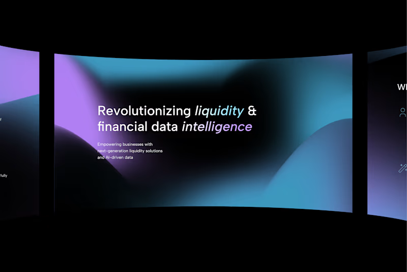
A bold, cinematic hero for Rivium AI — fluid gradients, refined typography, and subtle curvature evoke depth and innovation in fintech and data intelligence.
1
23
239


Senior Web Developer, Webflow Expert


it started with an Upwork profile in 2021.
since then: full-time roles, agency white-label work, and now back on my own doing both.
today I'm sharing my new portfolio: copperflow.dev (http://copperflow.dev)
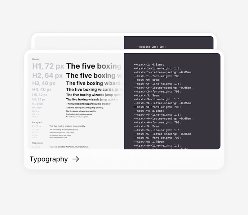
it's a collection of the Webflow projects I'm most proud of, plus a look at how I work and who I work with.
if you need a Webflow developer who ships clean, scalable, SEO-ready sites for SaaS and B2B, let's talk.
🔗 www.copperflow.dev (http://www.copperflow.dev)
1
276


View more →

Programmer | DevOps
Programmer | DevOps


