Freelance Platform Engineers in Warsaw
Freelance Platform Engineers in Warsaw
Sign Up
Post a job
Sign Up
Log In
Filters
2
Projects
People
Yurii Lysyshak
pro
Warsaw, Poland
Senior Mobile Developer & UX UI Designer
62
Followers
Follow
Message
Senior Mobile Developer & UX UI Designer
25
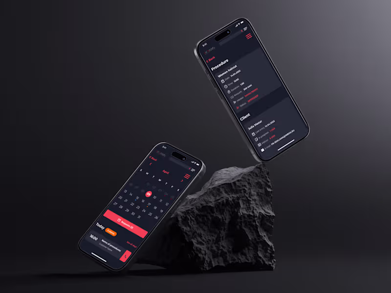
Ditch the messy notebooks and endless scheduling chaos holding your salon back. Handling appointments, staff timetables, and monthly profits manually wastes hours that belong to your clients. Alvi Beauty handles studio administration through one organized digital dashboard. • View daily sessions instantly to prevent double-booking mistakes. • Update worker availability and block off specific hours smoothly. • Separate income from expenses for real-time accounting tracking. • Monitor customer history and review feedback to improve quality. Automating routine booking tasks gives you an instant picture of business health. Make data-driven choices regarding bonuses while providing a highly personalized experience for every guest.
10
25
439
8
Salon Management Platform: Appointment Calendar & Ledger Concept
8
2
26
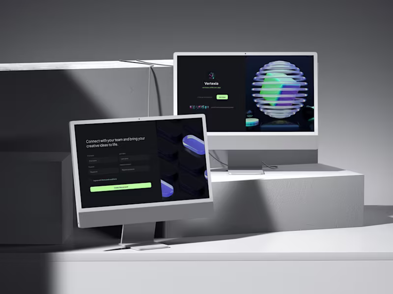
Bring your entire creative workflow under one roof. Modern campaigns, software updates, and branding projects usually stall when your team must jump between isolated software tools to get things done. Artificium fixes this fragmentation by merging intelligent automation with real-time group collaboration. Fast entry, shortcut panels, live channels, shared permissions, structured catalogs and much more... Accelerate production speeds while maintaining strict safety over intellectual designs. Structured media storage keeps files clear, helping businesses evaluate assets instantly and finish projects without disruption.
11
26
250
2
Modern AI Tool Desktop Interface
2
1
Platform Engineer
(2)
Follow
Message
Dima Strizhak
pro
Warsaw, Poland
Web design & clean dev for brands that value aesthetics.
22
Followers
Follow
Message
Web design & clean dev for brands that value aesthetics.
0
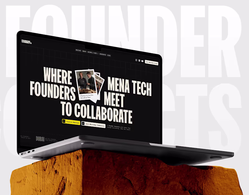
Founder Connects
0
4
0
When it comes to premium e-commerce, less is always more. Clean layout discipline and sharp typography hierarchy are what make a brand look effortlessly expensive. I’m currently opening a few spots for Branding, Digital Design and Development. If you want your product to do the talking without corporate fluff, send over a DM.
0
46
2
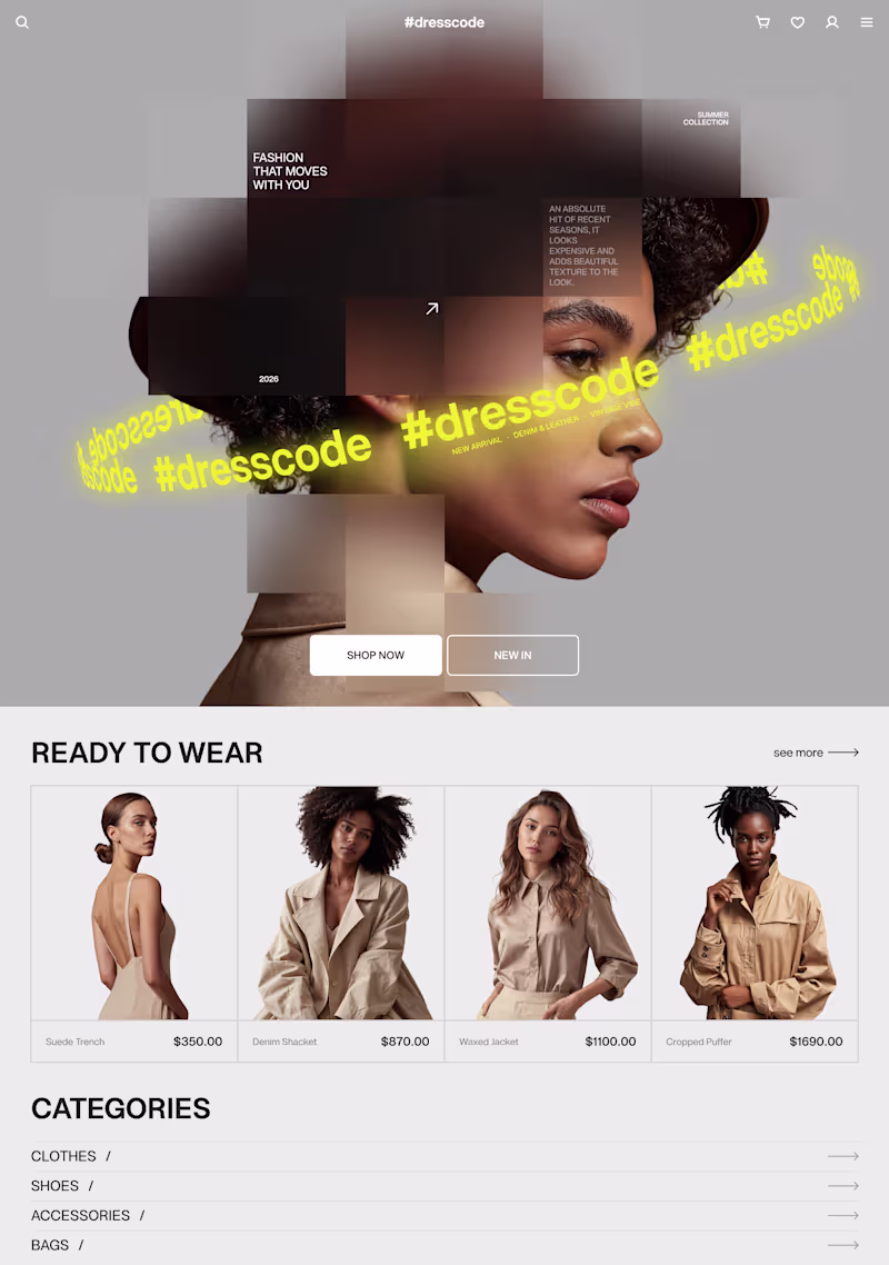
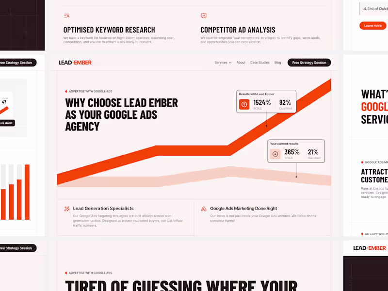
If your website is loud, it looks desperate. Look at most digital marketing or Google Ads agencies today, their sites are usually packed with generic stock photos, flashy badges, and visual noise that you completely lose track of their expertise. It’s a common mistake to think that to look successful, a B2B website needs to be chaotic, when in reality, serious corporate clients care much more about clarity than visual glitter. This layout on the screen is a quick look at how I design for high-ticket service businesses, using a different approach: More focus on your results: I clean up the layout and remove useless decorations so your actual track record, numbers, and case studies stand out instantly. Easy to scan for busy clients: I use clean typography and sharp contrast so future corporate partners can understand your core expertise and positioning in less than five seconds. Built properly for Webflow & Framer: A premium design is useless if it lags or breaks on phones. I build clean, structured layouts that look flawless on mobile and transfer perfectly to code. Your website is the mirror of your operations, and if it looks like a cheap template, you are simply turning away clients who are ready to pay for a premium service.
2
246
5
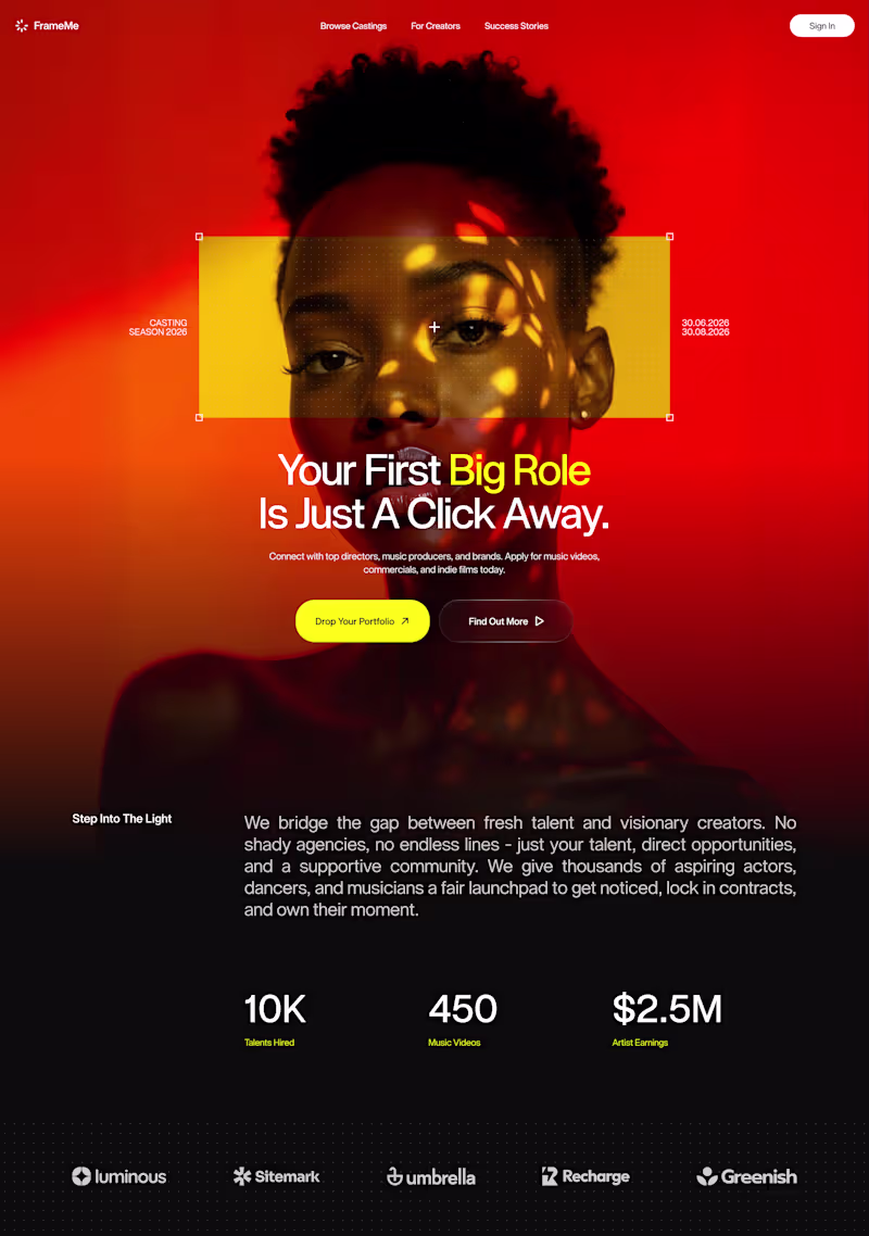
The results are in! 🔴 First of all, thank you all for voting on my previous post! The engagement was wild! The red version took a decisive lead, and it’s easy to see why. While the blue direction felt the high-contrast and mysterious, red represents a perfect balance between expressive, confidence-inducing visuals and a strict, professional layout. My goal here was to command immediate attention and give the product a strong, premium visual authority right from the first second. I focused on strict vertical grid discipline and a tight typography layout to keep the interface structured, while the yellow framing acts as a strategic focal point that instantly captures the eye. By balancing the intense, hot gradients at the top with a grounded, rich black base for the metrics, the hero section feels incredibly impactful without sacrificing readability. For those who voted: what specific element made the red version stand out the most for you?
2
5
222
Platform Engineer
(3)
Follow
Message
Explore people