
Two seasons, one brand. Here's how that works.
So Ustukių Malūnas came to me twice: once for spring, once for the holidays. Two completely different vibes. Spring is all lightness and fresh starts. Holiday is cozy, warm, gingerbread-scented everything.
The fun part? Making both feel like them while telling two very different stories.
Here's what I leaned on:
The brand's bones stayed the same (layout, type, core elements)
Color and illustration carried the seasonal mood
I love this kind of problem. How do you keep a brand recognizable when the energy shifts completely? That tension between consistency and surprise is where the good stuff happens.
Which packaging do you like more?
12
52
540


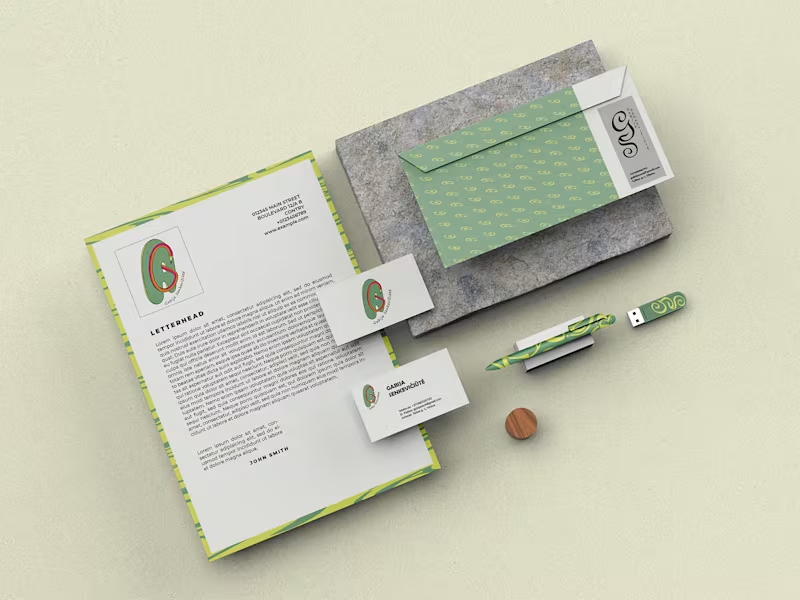
Personal Monogram & Brand Identity System
An academic brand identity project developed around my initials. I created a custom monogram, symbol logo, repeating patterns, color and typography systems, logo variations, clear-space and minimum-size guidelines, and stationery mockups. The visual direction combines organic shapes with a warm, playful pastel palette.
0
96