Freelance Pitch Deck Designers in Ukraine
Sign Up
Post a job
Sign Up
Log In
Filters
2
Projects
People
Heed Collective
pro
Ukraine
Building cultures through Brand Systems
$50k+
Earned
13x
Hired
5.0
Rating
629
Followers
Top
Follow
Message
Building cultures through Brand Systems
32
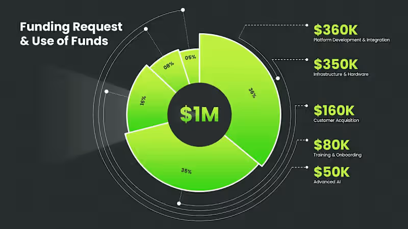
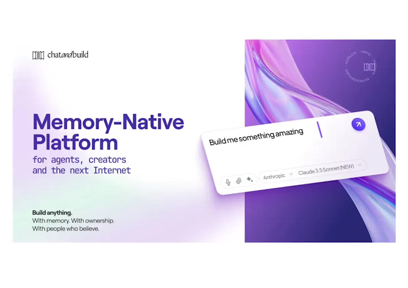
Sharing a deck design for ChatAndBuild. AI solutions were in the spotlight this year — and at Heed Collective, we’ve been working with teams building in this space. Good data visualization always starts with understanding the data first — only then can the visuals truly support the story.
7
32
2.1K
114
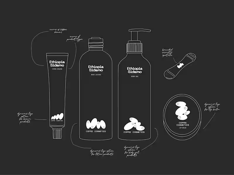
What if minimalism isn’t less — but more intentional? This is COCO — a finished packaging system built on restraint. Clean hierarchy, deliberate typography, purposeful whitespace,reduced elements. But the key shift is here: → material becomes the design. → The aluminum isn’t just a container it defines the color, the light, the presence. A few intentional decisions: 1. Removing everything that didn’t carry meaning 2. letting hierarchy guide instead of decorate 3. treating material as the primary visual layer For me, minimalism is not less design — it’s more attention to every detail.
42
114
10.3K
125
Curious: What’s missing in most brand systems, in your opinion? For me, the brand guidelines system we develop at Heed Collective (https://www.instagram.com/heedcollective_/) must be a living document — one that supports the brand in real decision-making, across teams, contexts, and moments of growth. Building structures that guide how a brand behaves, adapts, and scales across every touchpoint. What makes it work: — decision-making logic, not just rules — flexible systems, not static files — consistency with room to evolve We don’t launch brands — we build culture for humans, ethically. And one thing we always add: → Brand Culture Layer — translating strategy into how the brand speaks, acts, and shows up in the world.
1
37
125
10.4K
47
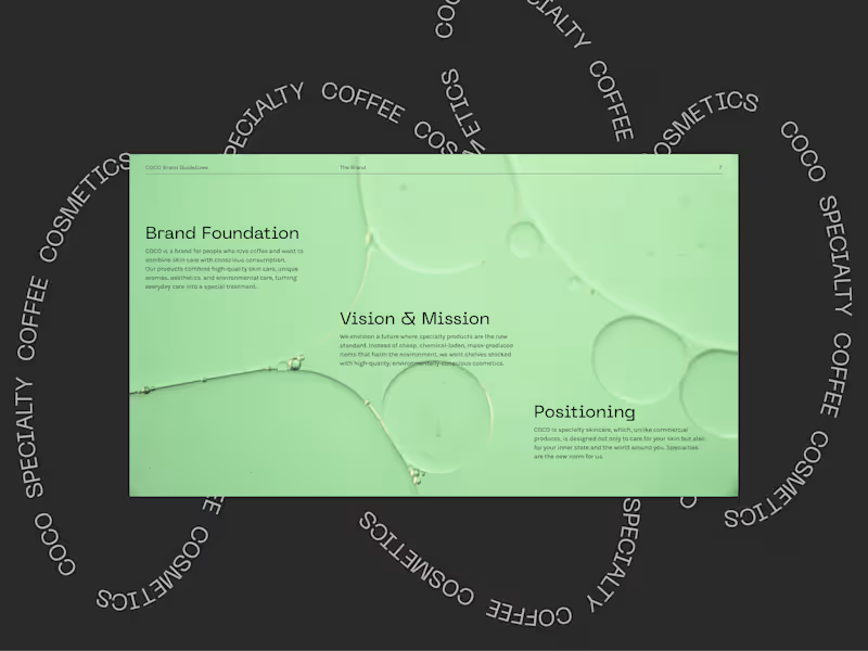
It all starts with strategy — and grows into a visual system. Our work for Specialty Coffee Cosmetics COCO began with clarity: defining positioning, tone, and the deeper narrative behind the brand. From there, the visual language emerged — not as decoration, but as a natural extension of meaning. Brand is not what you design first. It’s what you understand first. Then you build.
8
47
8.7K
Pitch Deck Designer
(1)
Follow
Message
Vladyslav Stadnyk
Ukraine
Presentation Design | Investor Pitch Decks & PowerPoint
New to Contra
Follow
Message
Presentation Design | Investor Pitch Decks & PowerPoint
1
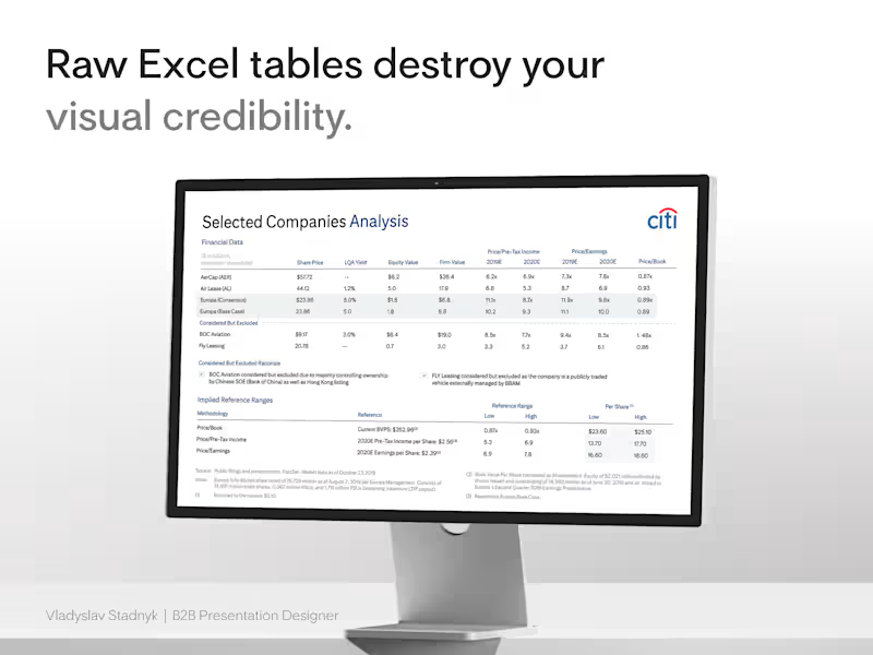
I recently watched a founder defend a $15M valuation using a raw Excel screenshot as his main slide. He assumed the dense grid proved his analytical rigor. It actually proved he did not know what his core metrics were. When you paste an unformatted spreadsheet into your pitch deck, you force the investor to do the analysis for you. Excel is a tool for calculation. PowerPoint is a tool for communication. They require completely different approaches. I handled a similar problem when designing a selected companies analysis for Citi. The initial draft was a wall of default borders and tiny numbers. The data was accurate, but the narrative was completely buried. We threw out the screenshot and used The Frictionless Data Method. First, we killed the gridlines. Heavy borders add unnecessary visual noise. We let whitespace separate the columns naturally 📐 Then we fixed the alignment. Left-align the text categories. Right-align the financial numbers. This creates a sharp visual edge the human eye processes instantly ⚡ Finally, we anchored the insight. We applied a subtle background fill to the one specific column that justified the valuation. We made the conclusion impossible to miss 🎯 Start here: open your deck and find your densest financial table. Delete the lazy image import. Rebuild it natively, strip away the borders, and highlight the single number that drives your deal.
1
140
1
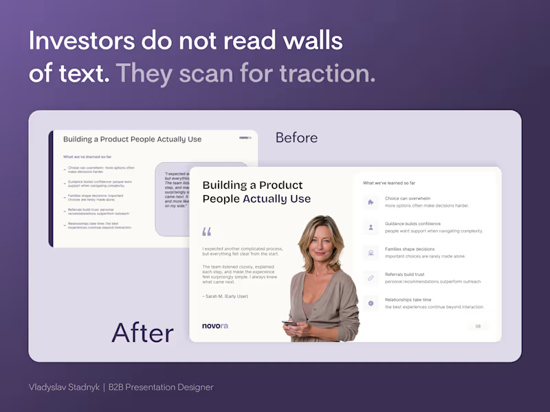
Founders cram every customer quote onto one slide to prove they did the research. But a wall of text does not prove traction. It proves you lack focus. Investors do not read paragraphs during a pitch. They scan layouts. Look at the "Before" slide in the image. It has a massive grey box of text sitting next to five dense bullet points. If an investor has to squint to read your user feedback, they will simply tune out. A founder brought me a deck full of slides exactly like this. We completely rebuilt the hierarchy. The Visual Anchor Framework: 📍 The Human Element - Replace generic text boxes with a real face. A photo anchors the quote and builds instant empathy. 📍 Iconographic Scannability - Turn dense bullet points into spaced items with clean icons. The eye processes shapes faster than sentences. 📍 Ruthless Whitespace - Give the content room to breathe. Cramped slides signal a cluttered business model. Start here: open your current deck and find the slide with the most text. Force yourself to cut the word count in half. Build the new layout around one single focal point. When I design these layouts in Figma, I lock the grid structure. Then I export the file to PowerPoint so the founder can update the quotes later without breaking the aesthetic.
1
140
3
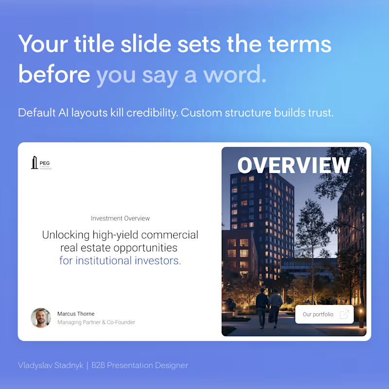
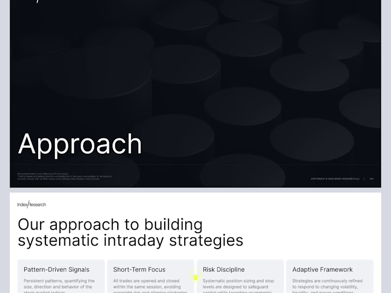
Your title slide decides if investors keep reading. Right now, it looks like an AI generated it in 2 minutes. Investors open dozens of files a week. Every second deck starts with the exact same AI-generated layout... same default fonts... same generic "Company Update 2026"... 🤖 When you ask for millions to fund commercial properties, aesthetics equal trust. A lazy title slide sends a clear message. It says you cut corners. It shows a massive lack of attention to detail. You burn your credibility before the investors even see your financial models. I recently redesigned a deck for a real estate investment group. They used a basic AI template with a low-quality stock photo of a skyline. We scrapped it entirely. We built a custom grid, added a single high contrast architectural shot, and wrote a one-sentence value proposition. That simple shift instantly framed them as top-tier institutional players. What is the biggest red flag you see on a pitch deck title slide? 🚩
1
3
416
5
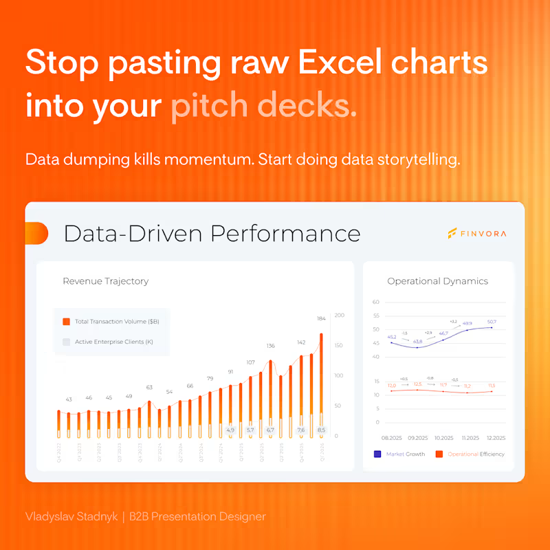
If an investor needs more than five seconds to understand your chart, you have already lost their attention... Founders often assume raw data speaks for itself. They drop a massive spreadsheet on a slide and expect the audience to find the insight. Data dumping just kills your momentum. The room goes quiet. People start squinting at the screen instead of listening to your pitch. I recently reworked a B2B fundraising deck. The original traction slide had four different metrics layered together under heavy gridlines. We stripped away the noise, split the metrics into 2 clean blocks, and used color strictly to highlight the revenue trend ⚡ The new slide looked expensive. More importantly, it made their core argument impossible to miss 📊
2
5
585
Pitch Deck Designer
(9)
Follow
Message
Karina K
Ukraine
Graphic + Motion design
1x
Hired
6
Followers
Follow
Message
Graphic + Motion design
5
Root Reality | Branding + Website design
5
73
0
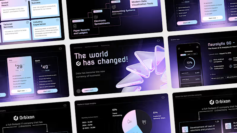
Orbixon | Pitch Deck
0
37
0
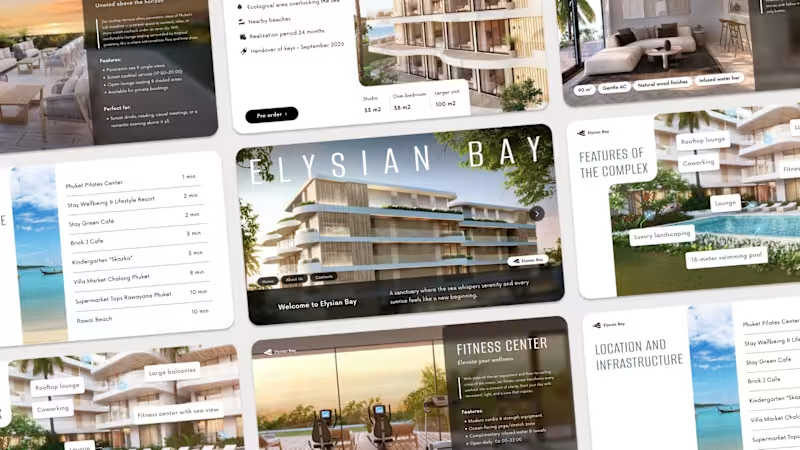
Elysiym Bay | Hotel Presentation
0
58
0
Pure exhibitionism | Poster Series
0
6
Pitch Deck Designer
(3)
Follow
Message
Ditych
max
Ukraine
Framer Pro Experts | Design & Development Studio
$250k+
Earned
31x
Hired
5.0
Rating
421
Followers
Top
expert
+3
Follow
Message
Framer Pro Experts | Design & Development Studio

3
Investor Pitch Deck Presentation
3
8
9
Brand Identity. Logo & packaging design. Merch.
9
78
10
Geoship Website Migration to Framer
10
162
13
Brand identity. Logo & packaging design.
13
77
Pitch Deck Designer
(1)
Follow
Message
Oleksii K.
pro
Ukraine
I help build trust in your product [through digital design]
$1k+
Earned
6x
Hired
5.0
Rating
110
Followers
expert
expert
+2
Follow
Message
I help build trust in your product [through digital design]
1
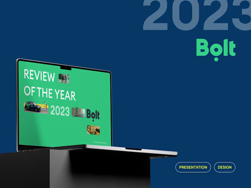
Bolt's Presentation: Review of the year 2023
1
192
1
Animations for Talkpush Homepage
1
20
24
😩we're all tired of empty phrases we all want to be heard 🤝so, how do you build true loyalty? 🙌start a one-to-one conversation and personalised presentations can help with this these are not boring slides; they are a short, human way of saying, 'I hear your pain. here's (https://www.figma.com/proto/Wuxc3YrHrrTIdK7D40Oc6U/prz---okaiukov?page-id=465%3A10&node-id=465-14&viewport=217%2C451%2C0.04&t=PlnBh19vNl9kW9uk-1&scaling=contain&content-scaling=fixed)the solution for you.' 🏃♂️➡️and yes, it takes effort but in a world where everyone is chasing automation, genuine attention is the most valuable currency it builds trust, turning one-time buyers into loyal customers. 🙌I've put together a short guide on how it works → book a call (https://cal.link/okay)I'll be happy to help you find a voice for your brand, company or startup
5
24
1K
2
Framer's Websites
2
328
Pitch Deck Designer
(1)
Follow
Message
Alexandr Korshykov
Kyiv, 02000
Web Design | Mobile App Design | SaaS | CRM | Figma Expert
$1k+
Earned
3x
Hired
5.0
Rating
17
Followers
Follow
Message
Web Design | Mobile App Design | SaaS | CRM | Figma Expert
0
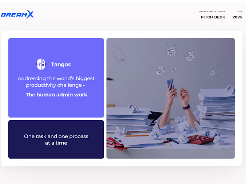
Pitch Deck Design - Tangos
0
10
6
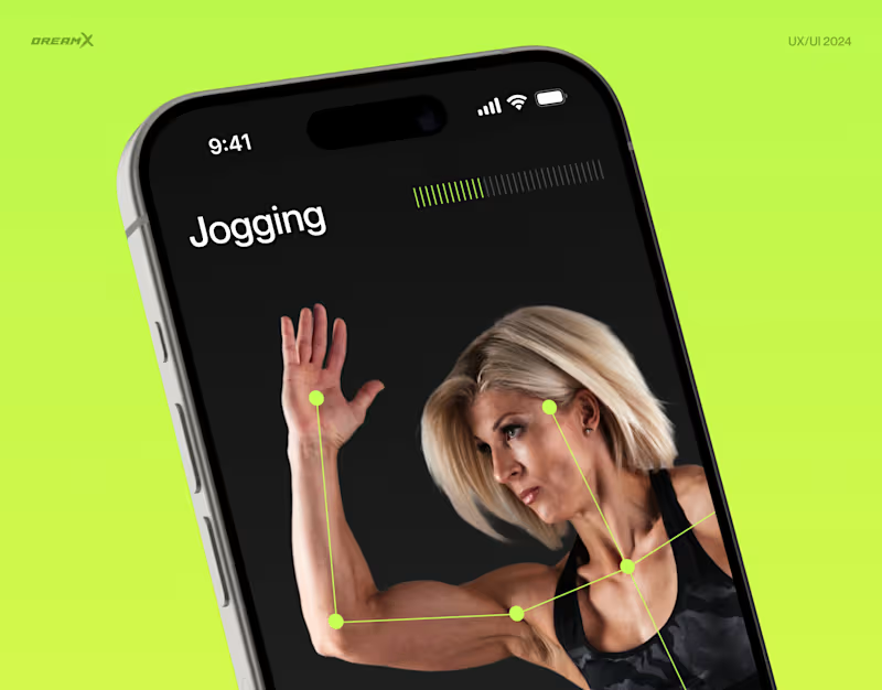
Workout Mobile App - Fitty
6
31
12
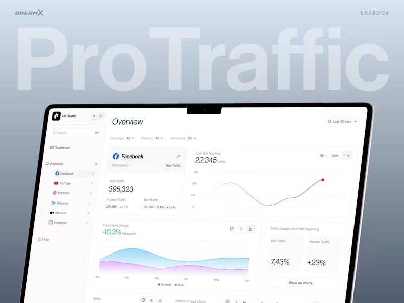
Bot Detection Platform - ProTraffic
12
131
4
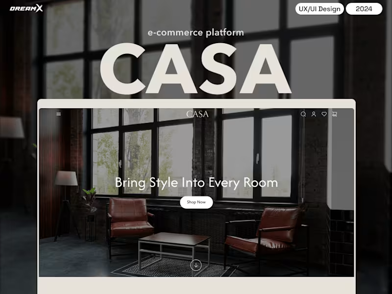
Furniture E-commerce Website Design - CASA
4
10
Pitch Deck Designer
(1)
Follow
Message
Emiliya Smuzhanytsia
Mukachevo, 89611
Pitch deck design expert
Follow
Message
Pitch deck design expert
0
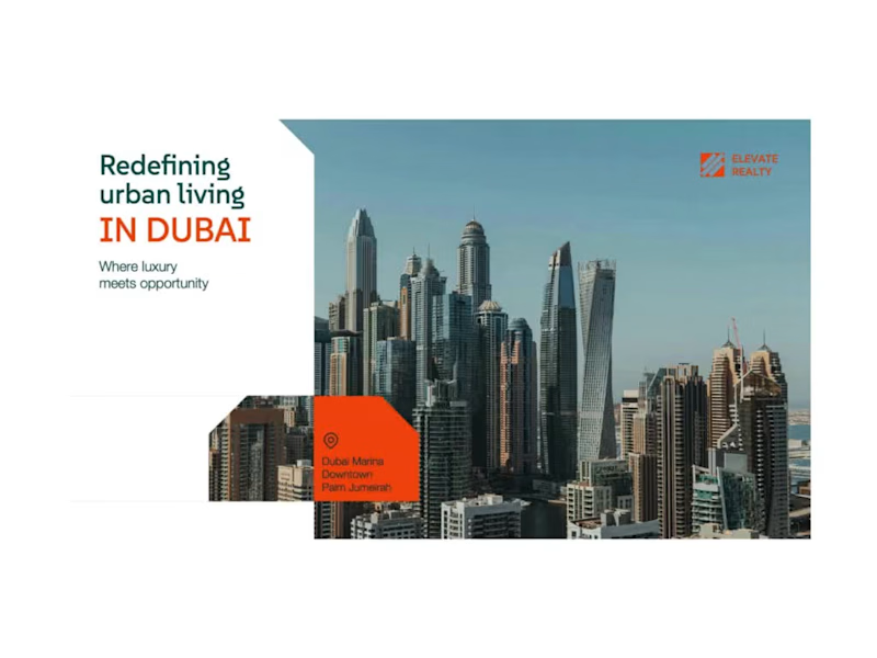
Real Estate Pitch Deck - PowerPoint Presentation Design
0
11
0
Pitch Deck Powerpoint Presentation Template
0
11
0
PowerPoint Presentation Design for Marketing Agency
0
4
0
Investor Pitch Deck Presentation Design
0
43
Pitch Deck Designer
(1)
Follow
Message
Oleksandr Neborachko
Kyiv, 02000
Architectural Designer | BIM Specialist | 3D Viz
$5k+
Earned
4x
Hired
5.0
Rating
26
Followers
Follow
Message
Architectural Designer | BIM Specialist | 3D Viz
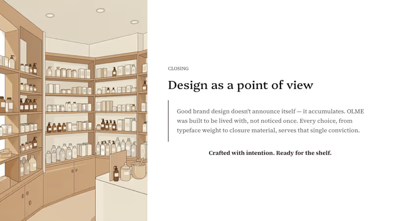
2
Pitch Deck Design & Branding-Focused Presentation
2
253
3
Branding & Packaging Showcase Deck
3
257
5
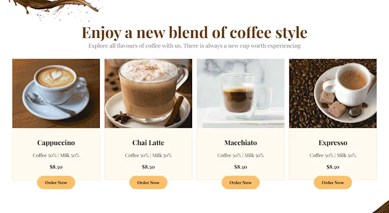
Coffee Restaurant - Website Design, Website Development The objective of this project is to design and develop a modern, pixel-perfect, and fully responsive coffee shop website based on the client's Figma design. The website will deliver a visually engaging and intuitive user experience across all devices. With a clean layout, contemporary aesthetics, and optimized user flow, the design aims to enhance brand identity, attract customers, and ultimately boost sales.
2
5
371
2
High-Traffic Pop-Up Store Design | Flow Optimization
2
12
Pitch Deck Designer
(2)
Follow
Message
Explore people