Projects in Tundla Rly. ColonyProjects in Tundla Rly. ColonyProject: SkinGlow
Prototype link: SkinGlow on Stitch (https://stitch.withgoogle.com/projects/9256027226045462713)
What I built
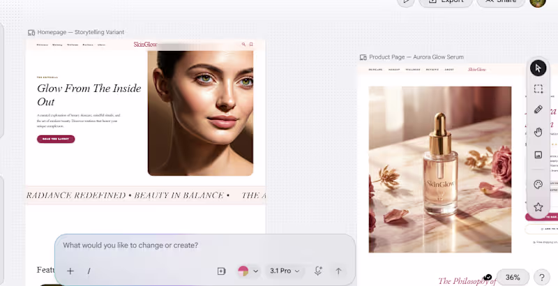
SkinGlow is a luxury skincare and beauty editorial prototype designed as a modern content + commerce experience. It includes seven key pages: Home, Blog Archive, Blog Single Post, Shop, Skincare Category, Product Page, and About Us.
How I used Stitch
I used Stitch as a core part of my design workflow to move from concept
to prototype through multiple rounds of iteration. I first explored
direct prompt-based generation, then used the redesign workflow to
create a stronger visual direction, and finally refined the prototype
using a more structured prompt and visual references to improve clarity,
consistency, and brand cohesion.
Workflow and process
My goal was to create an interface that feels alive, editorial, and
polished while maintaining a strong beauty-brand identity across every
screen. In the early prompt-generated versions, I was able to get decent
typography and color consistency, but spacing between sections and
components often felt uneven, and some layouts did not fully follow the
intended structure.
To improve the overall quality, I switched to the redesign approach and
generated a visual reference for the website. That step produced a much
more refined and professional-looking result, with stronger brand
consistency, better visual balance, and a clearer art direction.
However, when translating that visual direction back into a prototype,
some of the color and theme consistency became less reliable.
I then combined both approaches: detailed prompt writing, image-based reference guidance, and repeated refinement inside Stitch. That process helped me push the project further and arrive at a result that better represents the intended brand, layout system, and editorial feel.
What this project demonstrates
This submission shows Stitch as part of a real creative workflow rather than a one-step output. I used it to explore visual directions, iterate on
layouts, compare generation methods, and refine a multi-page prototype into a more polished experience.
Feedback on using Stitch
One of the strongest parts of Stitch for me was how quickly it helped
generate ideas and visual directions. The redesign workflow was
especially useful for producing high-quality references with stronger
aesthetic polish and brand identity.
The main challenge was consistency between stages of the workflow.
Prompt-based generation gave me better control over typography and color systems, but spacing and layout consistency still needed work. Redesign produced more visually polished outputs, but converting those into a prototype could sometimes reduce consistency in theme and visual system. Overall, Stitch was most effective when used iteratively, with structured prompts, reference images, and multiple refinement passes rather than relying on a single generation.
LinkedIn post https://www.linkedin.com/posts/asifraeen_googlestitch-uidesign-uxdesign-ugcPost-7468190556339412992-03IE/
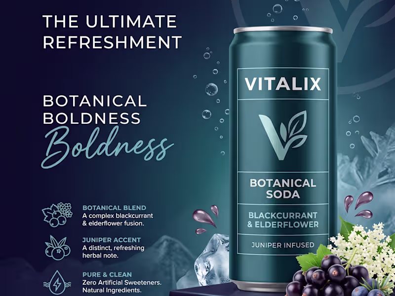
X post https://x.com/asifraeen_/status/2062422333135147161?s=20 VITALIX: Premium Botanical Soda | Brand Identity & Packaging Concept 🌿✨
The Concept
Meet VITALIX—a conceptual high-end beverage brand designed for the modern palate. The goal was to step away from traditional, cluttered soda packaging and create a visual identity that feels sophisticated, refreshing, and unapologetically premium.
The Visual Direction
To capture the essence of a "Botanical Soda," the design system relies on a modern, minimal, and highly refined aesthetic. I focused on luminous, punchy color palettes that instantly communicate the flavor profiles, paired with crisp, elegant typography. The metallic accents and moody, cinematic lighting in the mockups elevate the product, positioning it as a top-tier lifestyle beverage.
The Flavor Lineup & Color Story:
🫐 Blackcurrant & Elderflower (Juniper Infused): Deep, oceanic blues and teals to evoke a crisp, sophisticated midnight vibe.
🌸 Pink Grapefruit & Rose (Cardamom Infused): Soft, luminous pinks and rose golds for an elegant, warm, and inviting feel.
🍊 Blood Orange & Thyme (Ginger Infused): Rich, earthy oranges and coppers to highlight a bold, spicy, and grounded flavor profile.
The Takeaway
Packaging isn't just a container; it's the first taste of the product. This project explores how lighting, typography, and clean layouts can completely transform consumer perception.
Open to new freelance projects and collaborations! Let's build something beautiful together. 🚀
— Design & Concept by Ishant