
Project Title
Cosmos Diamonds — Celestial Luxury | Visual Brand Concept
Description
The Story Behind the Concept
I came across Cosmos Diamonds and was inspired by its connection to diamonds, modern luxury, and the idea of the cosmos.
As a brand identity designer, I wanted to explore how the feeling of the infinite universe could be translated into a refined and cohesive visual direction for a jewellery brand.
I reached out to Cosmos Diamonds and shared my idea of creating a quick concept inspired by their brand. After receiving a response, I developed this self-initiated visual brand concept.
Creative Direction
The concept is built around four key ideas:
Orbit — representing infinity and continuity.
Stars — symbolising diamond brilliance.
Celestial Curves — representing movement and cosmic energy.
Diamond Brilliance — reflecting the beauty and refinement of jewellery.
Visual Identity Exploration
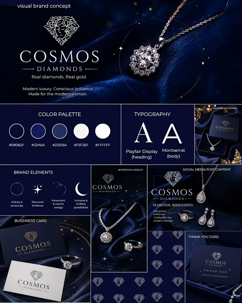
The concept explores:
Colour palette
Typography
Logo presentation
Celestial graphic elements
Brand pattern
Social media content
Advertising creative
Packaging concept
Business card
Thank-you card
The visual direction uses deep navy, blue and white tones to create a dark, elegant and celestial atmosphere while keeping the overall identity modern and premium.
Design Approach
My goal was not to completely redesign the existing brand, but to explore how its current visual language could be extended into a more cohesive visual system across different brand touchpoints.
Note
The Cosmos Diamonds logo shown in this concept belongs to the original brand and was not designed by me. I used it only for brand context and visual exploration. The logo was sourced from a publicly available profile image, so its resolution may appear lower in some parts of the presentation.
This is a self-initiated visual brand concept, not an official Cosmos Diamonds rebrand or commissioned client project.
1
115


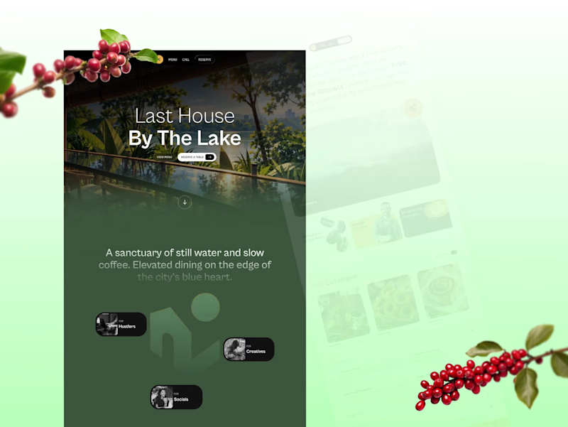
A digital experience designed around slow coffee, nature, and the feeling of escaping the city.
I wanted the website to feel less like a restaurant website and more like a destination — combining editorial typography, earthy tones, immersive imagery and a calm visual rhythm.
Designed with a focus on art direction, composition, typography and storytelling.
#WebDesign #Figma
0
16


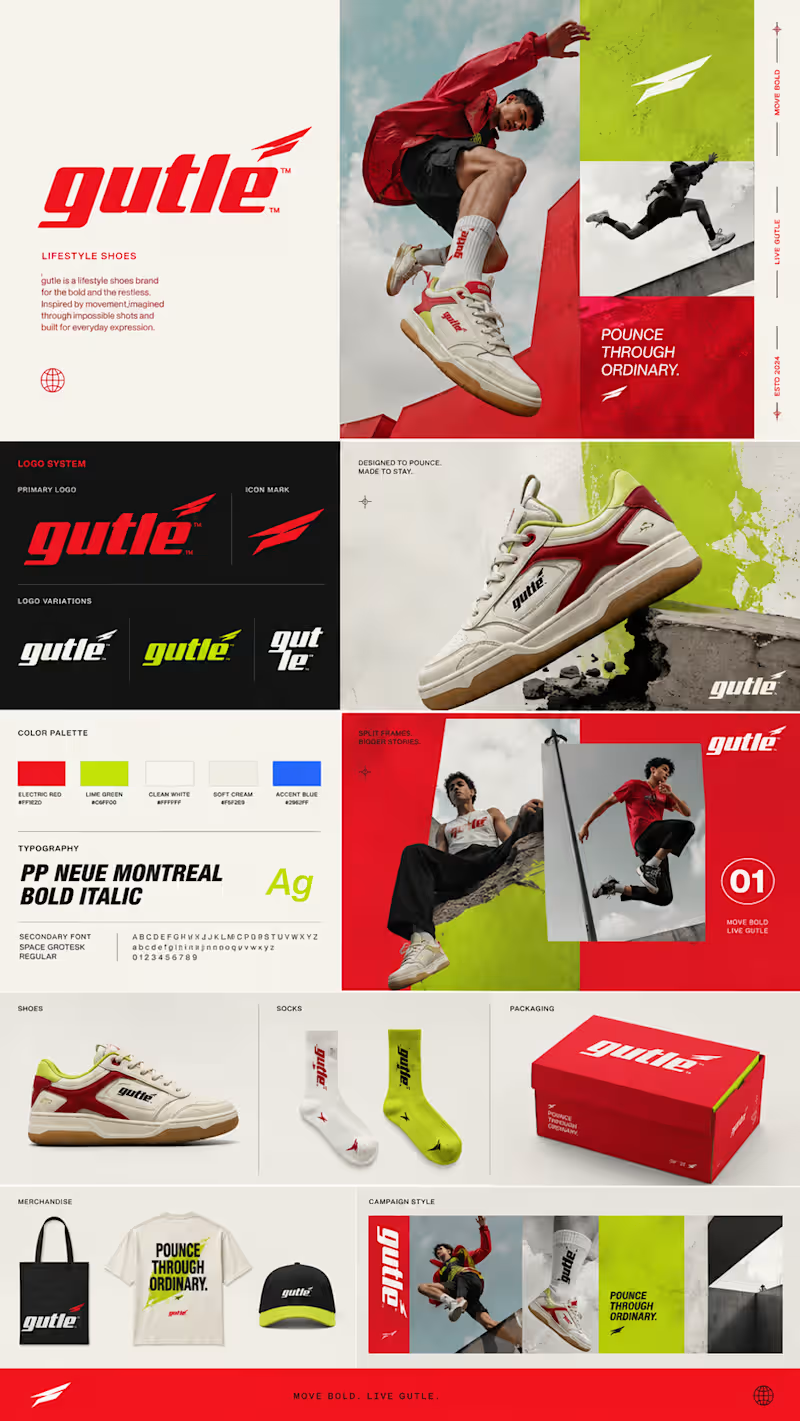
Created two distinct brand identity directions—one for a smart finance brand and another for a lifestyle sneaker label. I focused on making each one feel like a complete brand, not just a logo: from colors and typography to visual style, campaign messaging, packaging, and product mockups.
For Taxnext, I went with a clean, trustworthy fintech look with a bit of energy. For Gutle, I explored a more bold, fast-moving streetwear vibe. Really enjoyed bringing both brands to life across different touchpoints and showing how the identity could work in the real world.
0
65


A 25-second UGC-style skincare ad built around a simple morning routine. The concept follows a creator through her three essential steps — cleanse, hydrate, and moisturize — using natural, relatable storytelling and product-focused visuals. Designed to feel authentic and social-first while maintaining LUMÉA’s clean, premium aesthetic.
Concept project · UGC Content Creation
0
65
