Projects in Suceava
Projects in Suceava
Sign Up
Post a job
Sign Up
Log In
Filters
1
Projects
People
Message
1
Martin Stoleru
Gatenor: Brand Identity, Website Design & Webflow Development
1
40
Message
1
Catalin D.
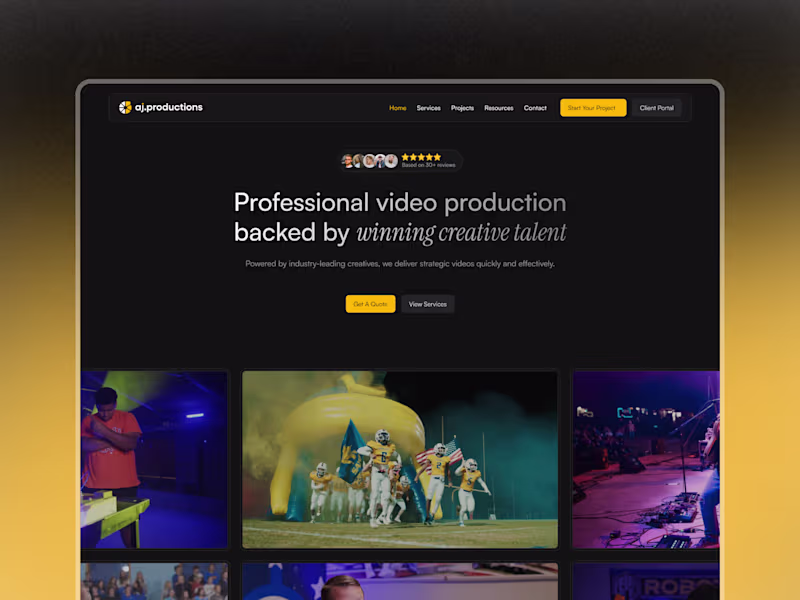
AJ Productions | Webflow Template Customization
1
20
Message
2
Razvan (Alex) Grigoriciuc
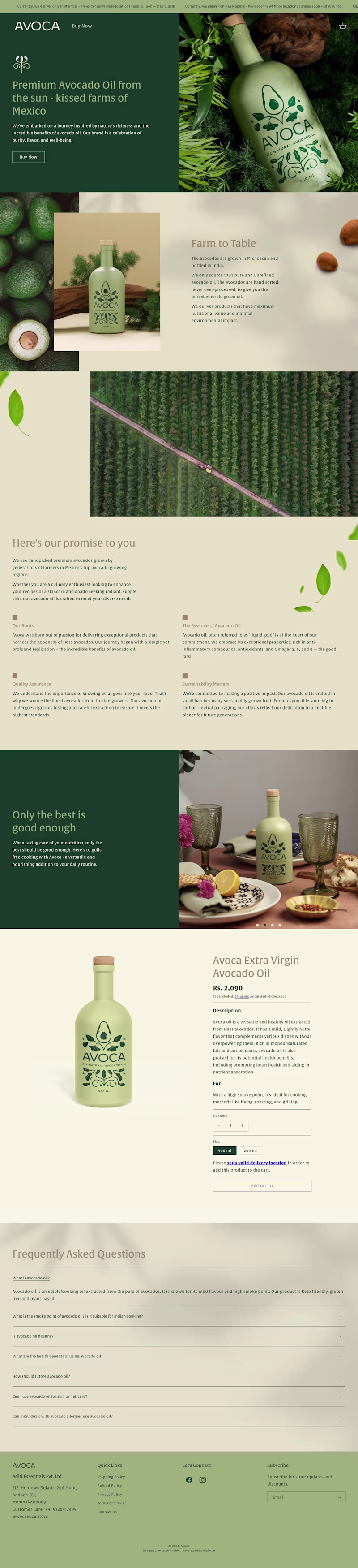
AVŌCA — Shopify Store Development This project involved the end-to-end development of a Shopify storefront for AVŌCA, a premium avocado oil brand focused on a clean, natural, and high-quality presentation. My role was strictly on the store development side, translating an existing design direction into a fully functional, responsive, and conversion-ready Shopify store. The focus was on structure, layout implementation, and ensuring a smooth user experience across all key pages. Key development work included: Building and configuring the Shopify store structure Implementing homepage and product page layouts Ensuring responsive behavior across desktop and mobile Optimizing page flow for clarity and ease of navigation Setting up product sections, FAQs, and essential store components
1
2
221
Message
1
Radu Sferlic
pro
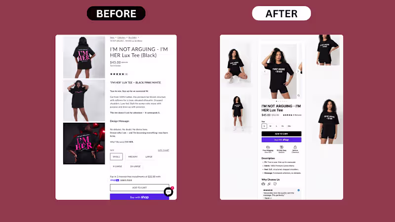
Something simple but efficient. Mobile PDP rebuild for a Shopify apparel brand: What was wrong with the original: 1. Images stacked vertically, eating mobile real estate 3 lifestyle shots stacked on top of each other forced buyers to scroll 4+ times before reaching the buy section. Mobile attention dies fast. 2. Title in all caps, hard to scan "I'M NOT ARGUING - I'M HER LUX TEE (BLACK)" on one line in caps. Caps look loud but read slower. Buyers skim, they don't decode. 3. Description wall before the buy decision 5 paragraphs of brand voice — "This tee doesn't ask for attention," "Design Message," "Why? Because I'M HER." — placed between the price and the size selector. Cold buyers stopped reading. 4. Size buttons cramped, no visual hierarchy Size options shown as plain rectangles with no spacing logic. Felt secondary. 5. Add to Cart was an outlined button Looked passive. The "Buy with Shop" button below it was more prominent than the primary CTA. 6. Reviews buried 5 reviews shown only as stars near the top. The actual review text was nowhere to be found on mobile. 7. No trust signals near the buy decision No shipping. No returns. No security. Buyers had to scroll the footer to find any reassurance. What we shipped: – Rebuilt the image gallery into a horizontal carousel with thumbnails (less scroll, more product) – Restructured the title into proper case for faster scanning – Moved the description into a clean bullet block: Fit, Fabric, Feel, Message – Surfaced reviews directly on the PDP with a real customer quote + name + verified badge – Redesigned size selector with clear spacing and proper touch targets – Made Add to Cart the dominant CTA (solid black, full width) – Kept Shop Pay button as a clear secondary option – Added a horizontal trust row right under the buy section: Free Shipping Over $75, 30-Day Easy Returns, Secure Checkout – Built a "Why Choose Us" section to handle objections before the buyer leaves Sometimes a PDP doesn't need a redesign. It needs the same content, restructured for how buyers actually scan on mobile. Is your Shopify PDP built for the way buyers read, or just the way you wrote it? DM if your mobile PDP needs a sharper layout.
1
53
Message
0
Cosmin Giurca
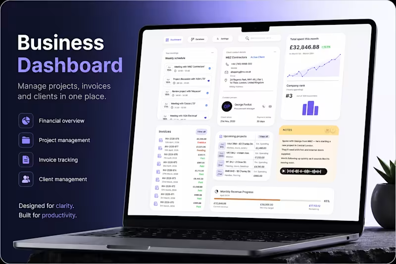
Introduction Running projects, managing invoices, tracking clients, and staying on top of meetings can quickly become overwhelming for small businesses and contractors. Important information often ends up scattered across spreadsheets, notes, emails, and multiple tools - creating unnecessary friction in everyday operations. This project explores a centralized dashboard experience designed to simplify business management. A workspace where users can monitor projects, track payments, manage client relationships, and stay organized from a single interface. At its core, the product is built around one idea: bring business operations into one clear, actionable system. Problem Many business management platforms focus heavily on functionality but fail to create a truly usable experience. Users are often faced with: Too much fragmented information across different sections Poor visibility of priorities, deadlines, and financial progress Interfaces that feel dense and difficult to navigate quickly Administrative workflows that interrupt productivity instead of supporting it What this creates: Instead of staying focused on their work, users spend time searching, checking, and manually organizing information. Simple daily actions become mentally exhausting, especially for contractors and small business owners juggling multiple projects at once. Over time, the experience feels reactive rather than controlled. Goal The goal was to design a business dashboard that feels structured, intuitive, and easy to manage at a glance. Rather than overwhelming users with complexity, the interface was designed to surface the most important information first while keeping actions accessible and predictable. The experience was designed to: Centralize projects, invoices, meetings, and client information Improve visibility of business performance and financial progress Reduce friction in day-to-day administrative workflows Create a cleaner and calmer workspace that supports productivity Every design decision followed one guiding principle: “Can users quickly understand what matters and act without interruption?” My role I led the product design process from concept to final UI, defining both the user experience and the visual direction of the platform. The focus was placed on creating a scalable dashboard system with strong information hierarchy, clear spacing, and fast scannability across different types of business data. I designed workflows for project tracking, invoice management, client communication, scheduling, and revenue monitoring while ensuring the interface remained visually simple and easy to navigate. The final result is a modern SaaS dashboard experience tailored for contractors and small businesses - balancing functionality, usability, and clarity in a way that supports real everyday workflows.
0
8
Message
0
Andy Condurache
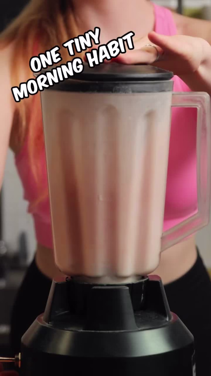
One tiny morning habit can change your whole day! 😮 🥛
0
21
Message
0
Diana Cernisov
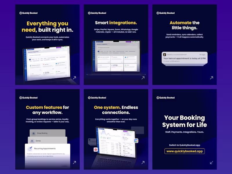
Just finished creating a new carousel for Quickly Booked, designed to be clean, clear, and easy to navigate. Focused on delivering information in a fast, engaging way while keeping everything aligned with the brand’s visual identity.
0
124
Message
0
Navarro
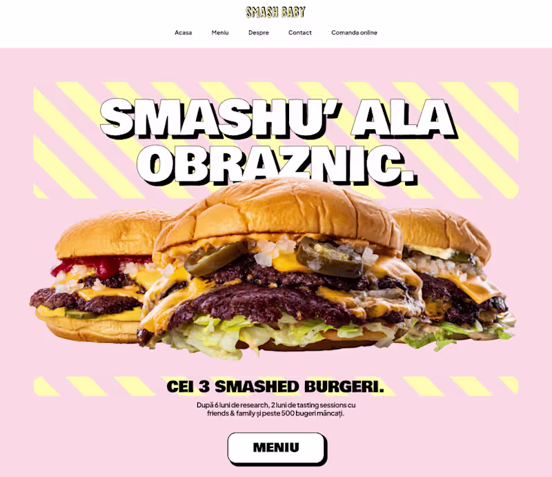
Smashbaby
0
2
Message
0
Adrian Grigore
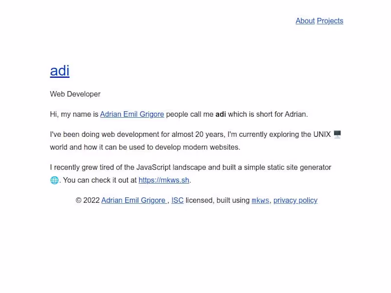
adi.onl
0
6
Message
0
Atanasoaie Alexandru Constantin
🔥150K FOLLOWERS in 3 MONTHS on Instagram
0
12
Message
1
Andrusca 0742
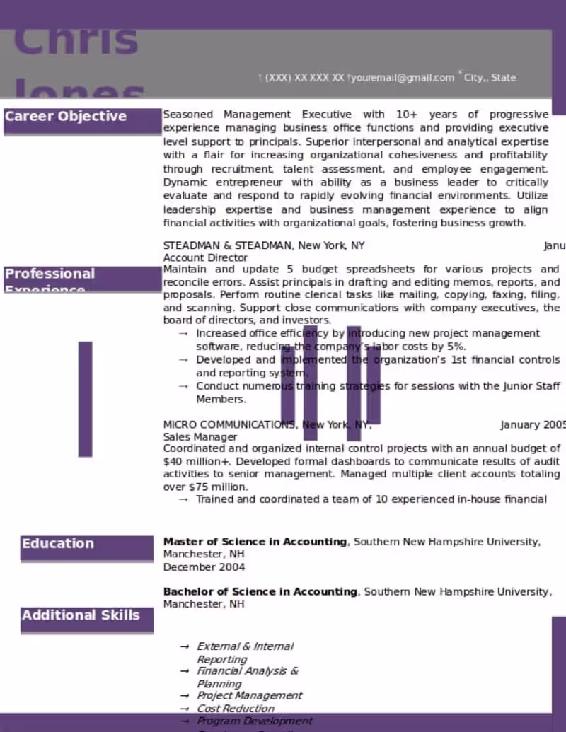
CV Idea
1
2
Message
0
Razvan Grigoriciuc
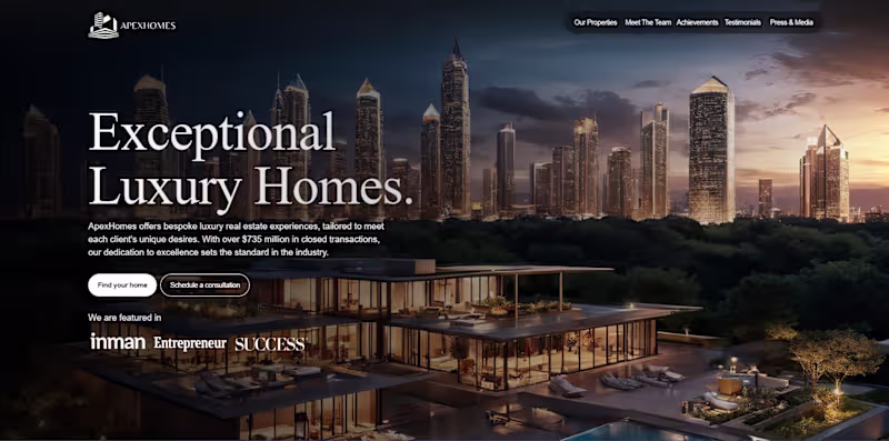
Luxury Real Estate Agency Website
0
3
Message
0
Luigi Bursuc
Credixo
0
0
Message
0
Martin Stoleru
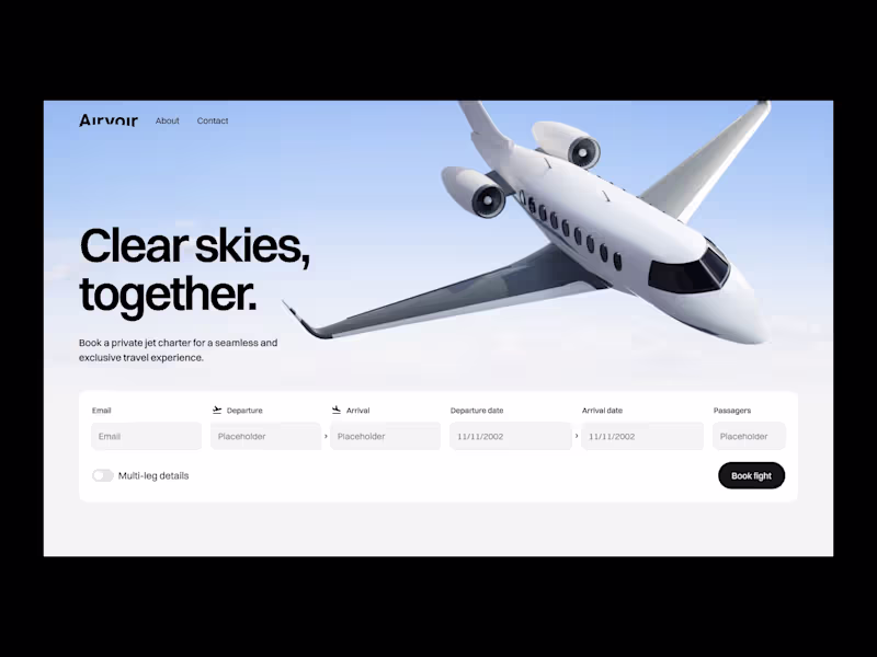
Airvoir: Website Design & Webflow Development
0
7
Message
4
Razvan (Alex) Grigoriciuc
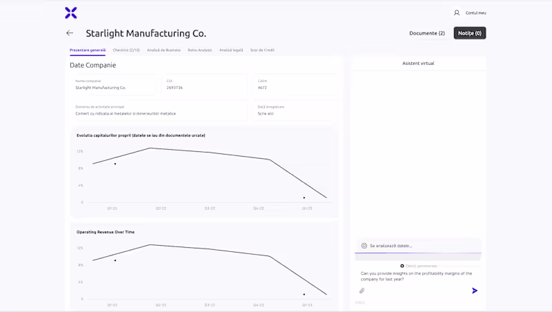
AI Website Creation
4
30
Message
0
Catalin D.
Webflow Design & Development - Video Creating Subscription Site
0
38
Explore projects