Design Systems Projects in State of São PauloDesign Systems Projects in State of São PauloFGV’s Design System
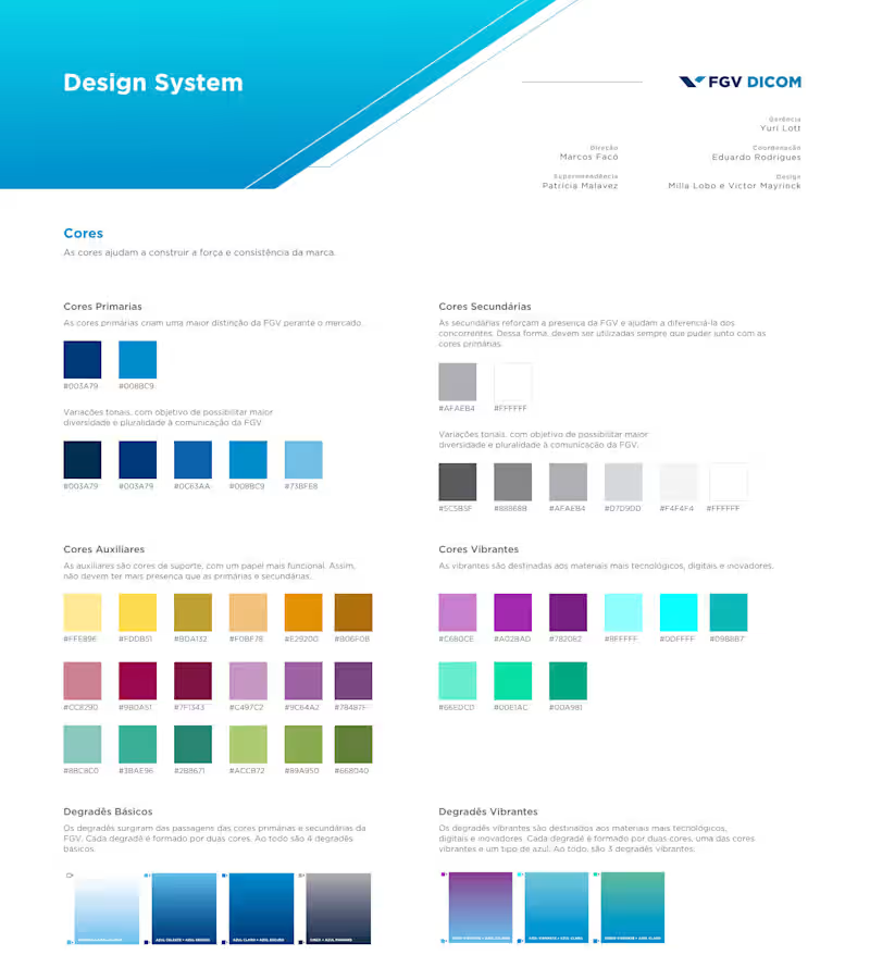
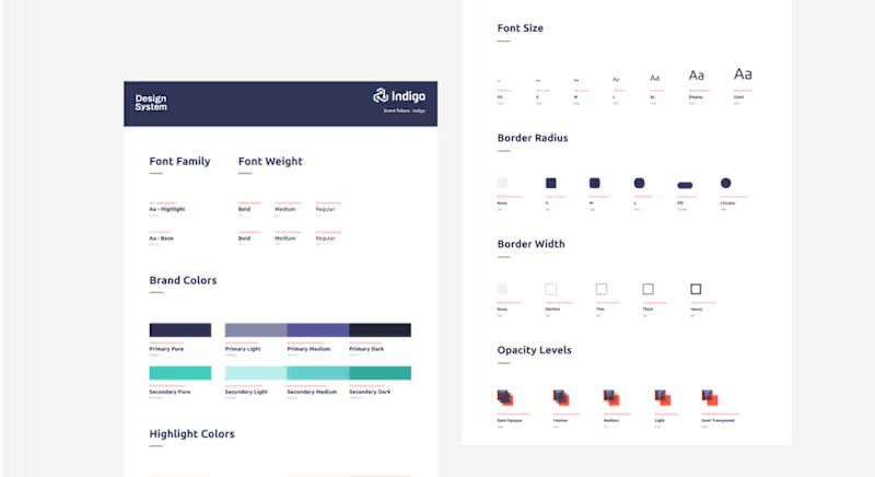
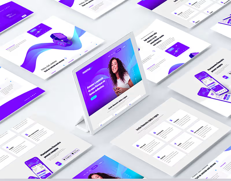
When I joined FGV, the institution’s websites were developed independently, each with its own visual style, without alignment to the official brand guidelines and with limited mobile responsiveness. This lack of consistency resulted in a fragmented user experience, weakened visual unity, and ultimately devalued the brand perception. The creation of a centralized Design System was essential to address these issues, establishing a cohesive, modular, and scalable visual language across all digital properties. As a result, FGV’s websites gained visual consistency, improved usability, and seamless navigation between platforms, strengthening brand recognition and delivering a more intuitive and reliable experience for users. BR Partners — MIDAS Design System: Building Scalability & Accessibility
Project Overview
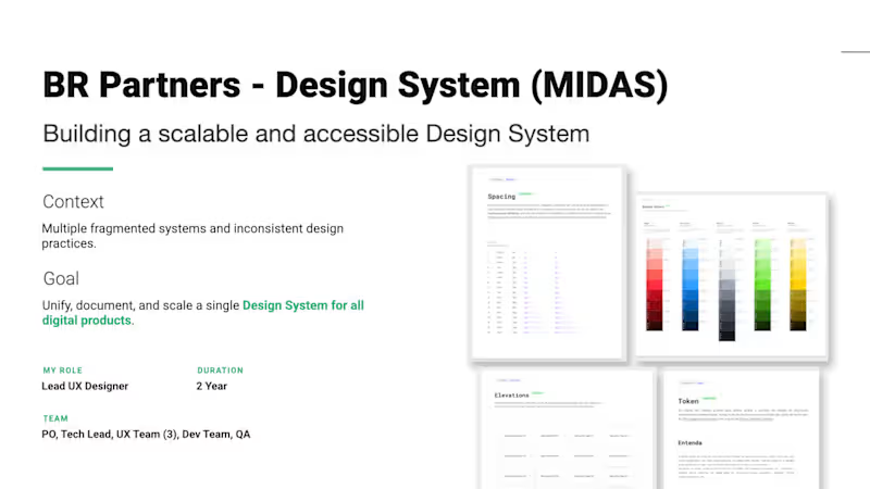
At BR Partners, a leading Brazilian investment bank, the digital product ecosystem faced a critical challenge: design and development teams were operating across multiple fragmented systems with inconsistent practices. As the Lead UX Designer on a 2-year transformation journey, I led a cross-functional team comprising a PO, Tech Lead, three UX Designers, Developers, and QA to build, document, and scale a single, unified source of truth: the MIDAS Design System.
- Role: Lead UX Designer
- Duration: 2 Years
- Team: PO, Tech Lead, 3 UX Designers, Dev Team, QA
The Challenge & Discovery Phase
Before writing code or drawing a component, we had to map the chaos. We initiated a deep Research, Audit, and Architecture phase to uncover cross-team friction points.
- Research Activities: Conducted a comprehensive audit of three or more existing design libraries and ran qualitative interviews with design, product, and engineering teams to map workflows.
- Component Duplication: Siloed teams were rebuilding the same elements differently.
- Lack of Accessibility: Products lacked inclusive design standards.
- Outdated Tokens: Color and styling variables were hardcoded or obsolete.
- No Documentation: Zero centralized guidance on how or why components should be used.
- Strategy: Accessibility and documentation were defined from day one as our non-negotiable foundations for true scalability.
Implementation & Architecture
We shifted the cultural and technical paradigm from a chaotic setup into a unified system of truth by designing an advanced, token-based architecture from the ground up.
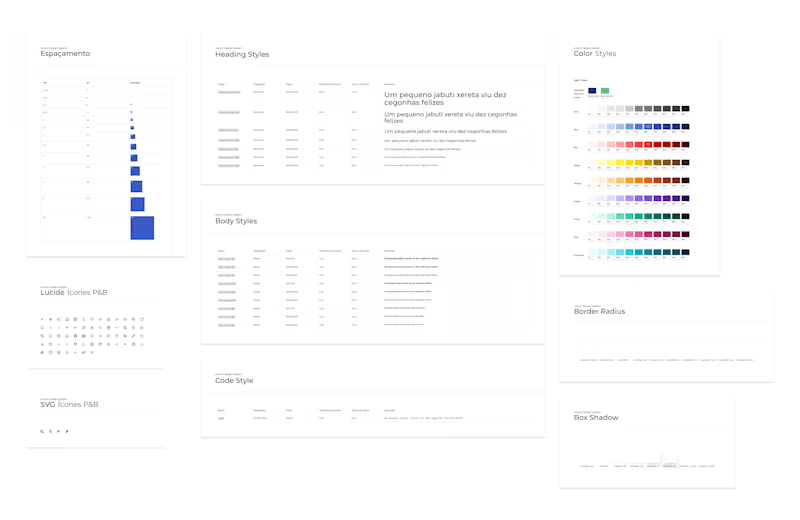
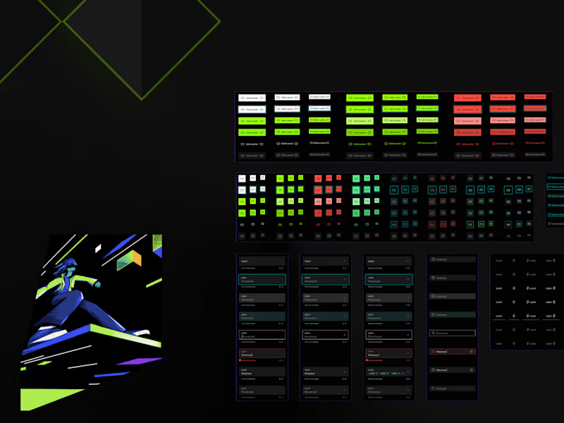
- Token-Based Architecture: Built a strict hierarchical token system covering colors, typography, spacing, and elevations to allow seamless mode switching, such as Light and Dark modes.
- Enterprise Tooling & Documentation: Centralized the entire system using Figma, Backstage, and Storybook, ensuring absolute alignment between design files and live code.
- Mandatory Accessibility: Integrated strict WCAG 2.1 accessibility standards directly into foundations and components.
- Design-Led Delivery: Structured our workflow to operate two sprints ahead of development, clearing roadblocks and refining component specifications before implementation.
- Real-World Validation: Successfully piloted the new system on high-complexity products, including the bank's core CRM and intensive investment dashboards.
Measurable Impact
The MIDAS Design System completely overhauled how digital products are built at BR Partners, proving that design systems are cultural and operational investments, not just visual ones:
- 60% Faster Design-to-Dev Handoff: Drastically reduced friction, alignment meetings, and redlines.
- 40% Fewer Inconsistencies: Eradicated visual and functional regressions across separate platforms.
- 100% Team Alignment & Shared Ownership: Established a collaborative product culture across designers, product managers, and engineers.
Reflection & Growth
Managing a project of this scale reinforced several core product principles that define my leadership style today:
- Deep User Understanding Drives Meaningful Solutions: Internal teams, including designers and developers, are users too. Their workflows dictate the product's success.
- Scalable Design Systems Empower Teams: Efficiency unlocks creative space for teams to focus on solving complex user problems rather than arguing over button paddings.
- Cross-Functional Teamwork Creates Better Products: True impact happens when design, engineering, and data insights blend seamlessly together.