
Strategic Brand Identity & Logo Studio ↴

Senior Video Editor & Motion Graphics Designer
- 1x
- Hired
- 4.2
- Rating
- 4
- Followers
Senior Video Editor & Motion Graphics Designer


Brand Design / Art Direction / Visual Systems / Illustration




Creating unique brand universes 🌟
Creating unique brand universes 🌟


Let your reputation catch up with your work

Let your reputation catch up with your work



Multidisciplinary Graphic Designer / Creative Director

Emperor Malt Whiskey - Concept FMCG
Goal
To create a premium visual identity for Emperor Single Malt Rome Whisky that communicates its bold character, Roman heritage, and handcrafted positioning. The goal was to move beyond conventional whisky aesthetics and establish a distinctive, cinematic direction that feels modern, luxurious, and powerful.
Target
Affluent whisky enthusiasts, premium spirits consumers, collectors, and a design-conscious audience seeking distinctive and sophisticated alcoholic beverages. The visual language is aimed at consumers who value craftsmanship, heritage, exclusivity, and strong brand storytelling.
Result
The final visual direction combines deep red tones, dramatic studio lighting, rich glass reflections, and a strong editorial composition to create a bold premium presence. The result positions Emperor as a contemporary luxury whisky brand with a distinctive Roman character, giving the product a memorable and visually powerful identity.
2
6
713
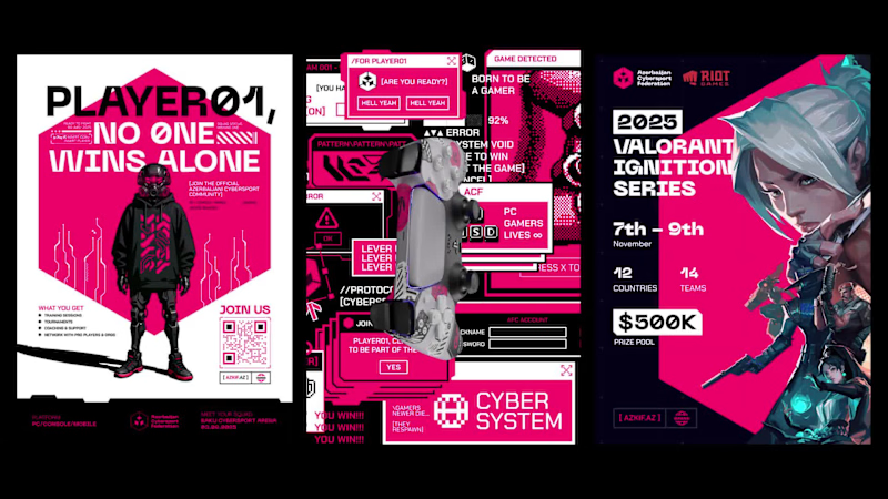
Level Up: Azerbaijan Cybersport Federation
This is where e-sports meets design. From the logo to the mobile app, every element of the Azerbaijan Cybersport Federation branding was crafted to feel fast, futuristic, and alive.
As a concept project, the goal was to explore how a national cybersport federation could stand out with a cohesive, tech-driven identity — combining bold graphics, dynamic layouts, and a futuristic aesthetic to connect gamers, teams, and fans across events, screens, and cities.
It’s not just branding. It’s the next level of e-sports identity.
Colobrator: Mirsadig Aghazade
3
272
Goal:
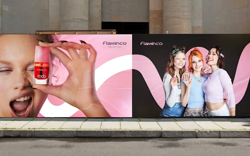
Our goal for Flaminco was to shape the cosmetic product not only as a functional FMCG category, but as a part of everyday self-expression. The main approach of the brand was based on creating a flexible and emotional visual world that adapts to the dynamic lifestyle of a young audience.
The open “M” shape used in the visual system symbolizes the free, changeable and adaptive character of Flaminco. This approach ensures that the brand is distinguished not only through color and aesthetics, but also through behavior and energy.
Target:
The main target audience of the brand is the young generation aged 16–25, who are sensitive to visual trends, value self-expression and seek aesthetic value in the products they use daily. Flaminco was formed with a more open and contemporary approach, aimed not only at a female audience, but also at everyone who cares about their appearance and style. The goal was to create a premium brand experience that is more interactive, flexible and able to build an emotional connection in the FMCG and retail market.
Result:
The result was a unified and flexible visual identity system for Flaminco that stood out in retail environments and could be easily expanded across digital platforms. The resulting visual language more strongly reflected the brand’s energy, flexibility and emotional connection with a young audience. The system was developed to serve as a sustainable and adaptive foundation not only for the current product line, but also for future campaigns, new product categories and communication directions.
53
95
4.7K

Branding · Web designer · Developer


Graphic designer and researcher

Working with Letters by Hand
Typography is often associated with digital tools, but my creative process begins with physical materials.
Through transfer lettering, lead type and handmade compositions, I explore typography as something that can be touched, arranged and photographed before it reaches the screen.
These analogue experiments are not an alternative to digital design—they are an essential part of it. They help me discover unexpected forms, compositions and visual relationships that later inform branding, editorial design and visual identities.
This ongoing practice sits at the intersection of design, artistic experimentation and research, demonstrating how traditional techniques can continue to shape contemporary graphic design.
5
3
97


