

CMO | Top 1% Content that Performs


CMO | Top 1% Content that Performs



Webflow Expert: Memorable Sites That Convert

Webflow Expert: Memorable Sites That Convert



UI/UX & Visual Designer for Web3, AI & Fintech

When the number hits 100K, a regular announcement just won't do.
100,000+ on-chain check-ins. One milestone worth turning into a visual moment.
For JoinCare, I created a motion poster celebrating this community milestone, using oversized typography, cinematic lighting, neon green accents, and futuristic 3D textures.
The goal was simple: make the number impossible to miss and the achievement impossible to overlook.
Design focus:
Web3 Campaign Visuals
Motion Poster & Motion Graphics
Typography & Visual Hierarchy
Social Media Campaign Design
Big milestones deserve bold visuals.
Need a motion poster for your next product launch or campaign? Let's make it count.
#MotionDesign #Web3Design #VisualCommunication #DigitalCampaign
3
3
134

JoinCare | Weekly Recap Motion Poster Design
A motion poster for JoinCare’s weekly recap.
The goal was to turn a simple weekly update into a visually engaging social media post while keeping the message clear and easy to read.
I used bold serif typography, monochrome 3D cellular forms, neon green highlights and subtle motion to create a futuristic healthcare-inspired visual.
Designed for social media campaigns, weekly updates and brand content.
Available for motion posters, social media visuals, Web3 campaigns and ongoing visual design.
0
69

JoinCare | Web3 Motion Poster Design
A motion poster for JoinCare celebrating 20,000+ on-chain check-ins.
The goal was to make the milestone stand out in the social feed while keeping the key message easy to read.
I used bold typography, neon green accents and 3D elements to put the number at the center of the design. Motion and lighting add energy without distracting from the announcement.
Designed for social media campaigns and community updates.
Available for Web3 campaign visuals, motion posters and ongoing social media design.
0
81

Versatile Motion & Graphic Designer
Versatile Motion & Graphic Designer


Motion Designer (Jitter) • AI • Low code • Product Designer
Motion Designer (Jitter) • AI • Low code • Product Designer

I set out to bridge the gap between high-end culinary aesthetics and functional food-tech UI. For kulilinari.com (http://kulilinari.com), the mission was to create a digital experience as appetising as the food itself.
As it's a one-pager and long-scrolling, I strategically mapped the user journey to place primary CTAs within natural thumb-reach zones, reducing cognitive load and friction during the selection process.
5
4
329

🚀
1 year.
Countless iterations.
One course page finally live.
Higher-ed UX hits differently, you’re not just organising content, you’re helping someone make one of their first big life decisions.
Shaped by student feedback, built through real collaboration, and designed for clarity over complexity.
Quietly proud of this one.
3
2
301


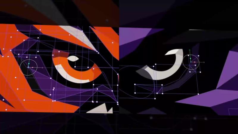
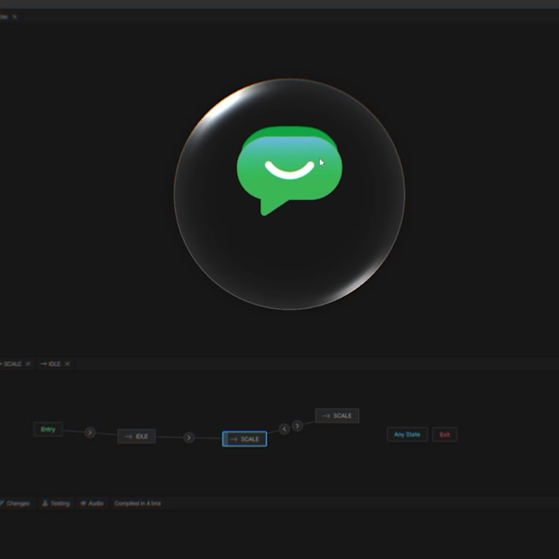
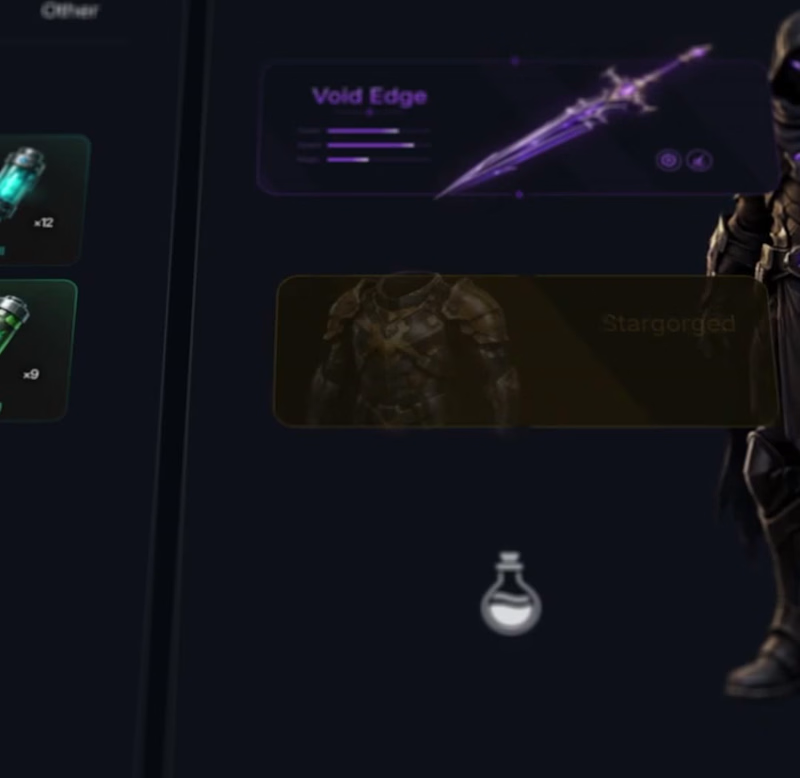




Natasha x John | 2D/3D Motion Graphics Duo
Natasha x John | 2D/3D Motion Graphics Duo


