UX Design Projects in SindhUX Design Projects in SindhExcited to submit ScopeBridge for the Config Makeathon.
Live Prototype:
https://orchid-array-71734735.figma.site/
Figma Community File:
https://www.figma.com/community/file/1649353646419325324
Why this idea
Every freelance project starts with a conversation.
Before pricing is discussed, clients and freelancers usually define requirements, priorities, expectations, assumptions, budget, and timelines through chat.
But in many cases, quotes are shared before both sides fully understand what the work actually includes. This can create confusion for clients, uncertainty for freelancers, and project scopes that shift after the work has already started.
ScopeBridge explores the step before proposal writing: scope alignment.
Instead of helping freelancers simply generate faster proposals, ScopeBridge focuses on helping both sides understand the project better before the proposal or quote exists.
The Solution
ScopeBridge is a chat-side AI scope alignment assistant for freelance platforms.
It sits beside a project conversation and turns early chat messages into quote-ready clarity by identifying:
- What is already defined
- What still needs alignment
- Key assumptions
- Important clarification questions
- Suggested milestones
- A structured scope packet both sides can review
In the prototype, a client shares an early dashboard project idea. ScopeBridge analyzes the conversation, suggests alignment questions, updates the readiness score as more details are provided, and generates a structured scope packet before pricing begins.
How I designed this
I designed ScopeBridge using Figma Make as an interactive concept prototype.
The workflow included:
Framing the problem around freelance project communication
Designing a simulated freelance chat interface
Creating a ScopeBridge assistant panel inside the conversation
Mapping the flow from early chat to alignment questions to quote-ready scope
Adding a demo mode to show how scope clarity improves as the client provides more details
Publishing both the live prototype and Figma Community file
Impact
ScopeBridge helps freelancers scope faster, clients communicate more clearly, and projects start with shared understanding instead of uncertainty.
The goal is not to replace human judgment or negotiation. The goal is to create a clearer bridge between the first project conversation and the final quote. No-Face Studio Website Design and Webflow Development
Project Overview
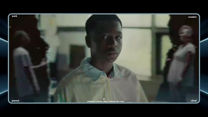
No-Face Studio is a NYC-based content creation and video production agency, and their website needed to reflect that identity from the first second a visitor landed on it. Rather than a standard agency site built around static text and image blocks, the goal was a bold, video-first experience that felt like a piece of the studio's own creative output, while still clearly presenting their roster of creators, their work and a path into their portfolio.
The project covered the complete website workflow, from UI/UX design in Figma to full responsive development in Webflow, including a full-screen video hero, an interactive creator roster and horizontally scrolling visual sections.
My Role
I worked as the website designer and Webflow developer for the project, responsible for the site from initial concept through to final build.
My responsibilities included:
Designing the website UI/UX in Figma
Defining the bold, video-led visual identity for the homepage
Designing the creator roster and individual creator profile layout
Planning the horizontal, gallery-style visual sections
Building the complete website in Webflow
Implementing the full-screen video hero
Building the interactive creator grid with individual creator pages
Creating the scrolling image and work-preview sections
Setting up navigation across work, journal and about sections
Testing and refining the site across desktop, tablet and mobile
The Challenge
A content and video production studio's website has to prove its creative credibility immediately, since visitors are effectively evaluating the studio's taste before they ever read a word of copy. That meant the homepage needed to lead with motion and imagery rather than text, without feeling cluttered or slow to load.
The site also needed to represent multiple creators, each with their own title and specialty, in a way that felt like a curated roster rather than a plain staff list, and needed horizontally scrolling visual sections that stayed smooth and usable on both desktop and touch devices. On top of that, the whole experience had to stay lightweight despite being built almost entirely around video and imagery.
Design in Figma
The design phase centered on giving the studio's creative work room to speak for itself.
I designed a full-bleed video hero with minimal navigation overlaying it, keeping the first impression entirely visual. For the creators section, I designed a grid-based roster where each name, title and photo could sit cleanly together, with a clear path into individual creator pages. I also designed the horizontal scrolling galleries used to preview the studio's work, along with the navigation structure connecting the work, journal and about sections.
Webflow Development
Once the design was finalized, I built the site fully in Webflow.
Video Hero
I implemented the full-screen looping video hero, optimized so it loaded quickly without compromising visual quality.
Creator Roster
I built the interactive grid of creators, linking each entry through to its own dedicated creator profile page.
Horizontal Scroll Sections
I developed the horizontally scrolling image and work-preview sections, tuning them to feel smooth on both mouse and touch input.
Navigation and Structure
I set up the site-wide navigation connecting the homepage to the work, journal and about pages, keeping it minimal and out of the way of the visual content.
Responsive Development and QA
Every section was tested and adjusted across desktop, tablet and mobile, with particular attention paid to video performance and how the scrolling sections behaved on smaller screens.
Project Outcome
The finished website gives No-Face Studio a site that behaves like an extension of their own creative work: bold, video-first and built to showcase both the studio and its roster of creators without getting in the way of the content.
The final website is:
Fully responsive across desktop, tablet and mobile
Built around a full-screen, video-led visual identity
Structured around a clear, browsable creator roster
Home to smooth, horizontally scrolling visual sections
Optimized to keep video-heavy pages performant
Consistent in design language from hero to footer
Tools and Skills
Figma
Webflow
UI/UX Design
Responsive Web Design
Interaction and Motion Design
Video Optimization
Cross-Device Testing Fresh Vegetable Store Mobile UI/UX — Figma, Webflow & Framer
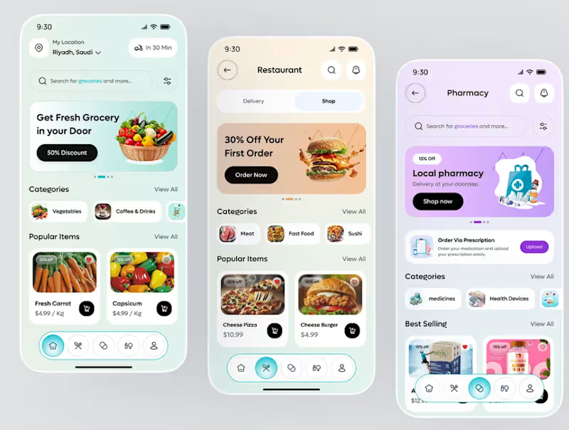
A modern and polished fresh vegetable grocery e-commerce UI/UX concept designed to make everyday grocery shopping fast, simple, and visually engaging. The experience focuses on fresh products, easy discovery, promotional offers, and a smooth mobile shopping journey.
The design includes a location-based home screen, delivery-time indicator, product search, category browsing, promotional banners, popular products, discounts, product cards, ratings, pricing, and quick add-to-cart actions. The navigation also provides dedicated access to grocery, restaurant, pharmacy, and account experiences, creating a scalable multi-service commerce concept.
The interface was designed in Figma with a clean, modern visual system, responsive layouts, reusable components, consistent spacing, typography, and mobile-first UX principles. The design was structured for practical implementation and adaptation using Webflow and Framer, with reusable sections and scalable component patterns.
Tools Used: Figma, Webflow, Framer, UI/UX Design, Mobile UI Design, Responsive Design, E-commerce Design, Design Systems.
Key Features: Fresh grocery discovery, vegetable categories, search, delivery location, delivery-time indicators, promotional offers, discounts, popular products, product cards, ratings, pricing, add-to-cart interactions, bottom navigation, responsive layouts, reusable components, and conversion-focused shopping UX.
Keywords: Figma, Webflow, Framer, Figma UI/UX Designer, Webflow Designer, Framer Designer, Grocery Store UI, Vegetable Store UI, Fresh Grocery E-commerce, Grocery App Design, Mobile E-commerce UI, Responsive Web Design, Figma Web Design, Webflow Development, Framer Website Design.