
🚀 Atlas AI – AI-Powered Travel Planner
Experience the future of intelligent travel planning with Atlas AI. From personalized itineraries and smart budgeting to bookings, real-time updates, and AI-powered recommendations, Atlas AI brings every part of your journey into one seamless experience.
🔗 Project: https://app.flowstep.ai/file?activeFileId=3ecb0631-f46a-4f43-b815-fee70fe8329d�
(https://app.flowstep.ai/file?activeFileId=3ecb0631-f46a-4f43-b815-fee70fe8329d�)#Flowstep #FlowstepChallenge #AI #TravelTech #ProductDesign #UIDesign #UXDesign #TravelPlanner #Innovation #BuildInPublic
0
168



Scoope Ice Cream Brand Landing Page with Scroll Animation
A colorful, premium landing page for a small-batch ice cream brand. Built with a playful pink and purple aesthetic, scroll-triggered splash animation, flavor grid, brand story, testimonials and full footer.
Sections: Hero animation, Marquee, Flavor grid, Process timeline, Brand story, Testimonials, FAQ, CTA, Footer
Built with: React, Tailwind CSS, Bun,GSAP
Project URL: https://scoope.munain605.workers.dev/
1
219


Sproutes | Parenting Community & Affiliate Platform Website
I designed the website for Sproutes, a platform built for parents and parents to be to connect, share advice, and discover products for their little ones. The site combines a social community feel with an affiliate marketing angle, so the design needed to feel warm and approachable while still clearly showing off the platform's features.
The homepage opens with a friendly headline and a photo of a parent and child playing, framed with a bold orange border and playful illustrated elements. a rocket, a teddy bear in a Santa hat to keep the tone light and family oriented rather than corporate. Below that, I laid out a set of feature cards covering the core parts of the platform: social networking with other parents, community size (25K+ members), customer ratings, and an affiliate dashboard card showing how users can track earnings from product recommendations. Each card uses a different shade from the same orange, cream, and mauve palette, which keeps the page feeling cohesive without being flat.
For the footer section, I used a bold orange banner with a phone mockup showing the social feed in action, surrounded by floating icons (hearts, comments, reactions) to visually reinforce the community side of the platform. It leads into a simple newsletter signup, then closes with the logo, navigation links, and social icons in a clean, minimal footer.
Overall, the goal was to make a platform about parenting products and affiliate income feel personal and community driven rather than like a typical e-commerce or marketing site.
0
243
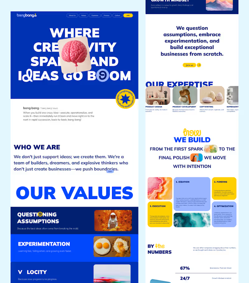
Checkout live: HERE
(https://www.bangbanglabs.io/)What if your website could feel as creative as the brand behind it?
For this project, I focused on building a bold, energetic web experience with strong typography, vibrant colors, and a layout that keeps the content engaging from section to section.
The goal was simple: make the brand feel creative, confident, and memorable — without sacrificing usability.
From the hero section to the values, expertise, process, and stats, every section was designed to feel connected while still having its own visual identity.
Designed in Figma. Built for the web.
1
66
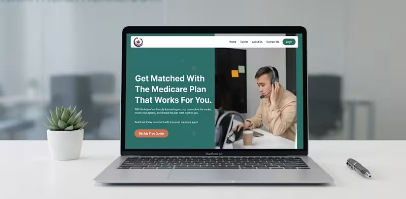
I designed and developed a modern, user-friendly healthcare website inspired by Rethink My Healthcare, focusing on accessibility, trust, and seamless user experience. The platform enables easy access to virtual services like doctor consultations, mental health support, and subscription plans. The design emphasizes clarity, strong CTAs, and intuitive navigation, delivering a professional interface that simplifies healthcare interactions and enhances user engagement.
1
4
301

VaultPay — FinTech Mobile App UI/UX 💳✨
Designed a modern, dark-themed FinTech app for seamless 24/7 money transfers, multi-currency balance tracking, and interactive onboarding flows. Built fully interactive in Figma.
🚀 Click here for Live Interactive Prototype: Click here (https://www.figma.com/proto/fiRbRn5Ik4R9drIjdplVSA/VaultPay-%E2%80%94-Mobile-App-UI-Case-Study?node-id=1001-812&p=f&t=4tsmnsR23IdTqfWl-1&scaling=min-zoom&content-scaling=fixed&page-id=1001%3A811&starting-point-node-id=1001%3A812)
0
142
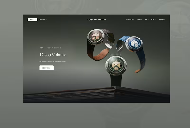
One word: Timeless.
This is what I was told the day I had my first meeting. And from that point onwards, it was all I could think of. In this case, color and font mattered the most. And so, within a week and a half, I was able to come up with something that didn't slap you in the face. The whole point of this was to make sure users were taken through a journey that seamlessly took them through the website while emphasizing the watches. I didn't want the font or color to compete with the product, instead I wanted the two to blend in.
1
73

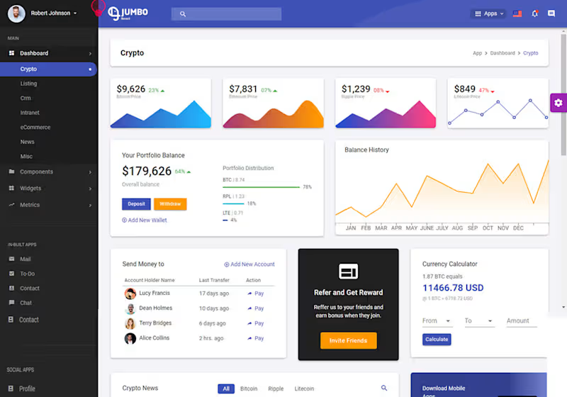

Finject is an all-in-one CRM for MCA brokers to automate underwriting, match deals to lenders with 98% accuracy, and manage the entire funding pipeline.
It handles everything from adding leads and collecting docs to AI scrubbing, secure lender submissions, and tracking to Funded. So you can focus on closing contracts.
0
124