Projects in Setif
Projects in Setif
Sign Up
Post a job
Sign Up
Log In
Filters
1
Projects
People
Message
1
Creatvnest Studio
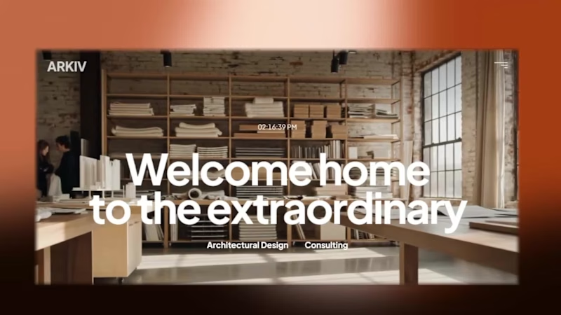
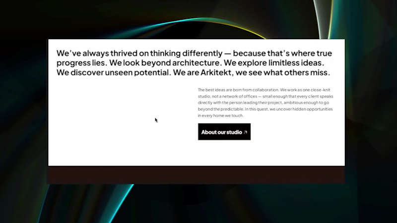
Introducing ARKIV — A Premium Framer Template for Design Practices Hi everyone! Excited to share my latest project: ARKIV, an editorial Framer website template designed for architecture and interior design studios. When pitching high-ticket spatial and architectural projects, a studio’s website needs to project authority and quiet sophistication. ARKIV was built to solve that exact problem. Check it out here https://www.framer.com/community/marketplace/templates/arkiv/
1
1
82
Message
1
Taha Azzoug
Thunder Landing page
1
13
Message
0
pas_swo _rd
DM me ‘BRAND’ if you’re launching or rebranding
0
20
Message
0
Louhab Aymen
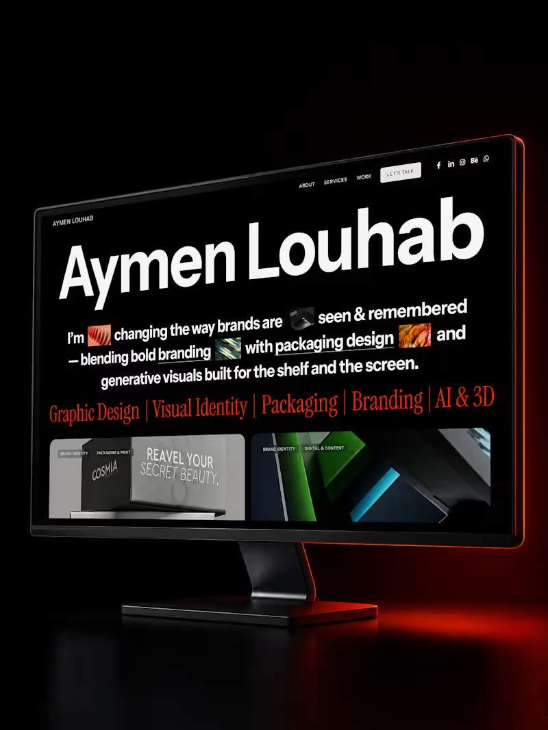
After days of building, my new portfolio is live. Branding · Packaging · Generative AI. Take a look — and if your brand needs its next chapter, my form is open. https://aymenlouhab.com
0
23
Message
0
Youcef Moulla
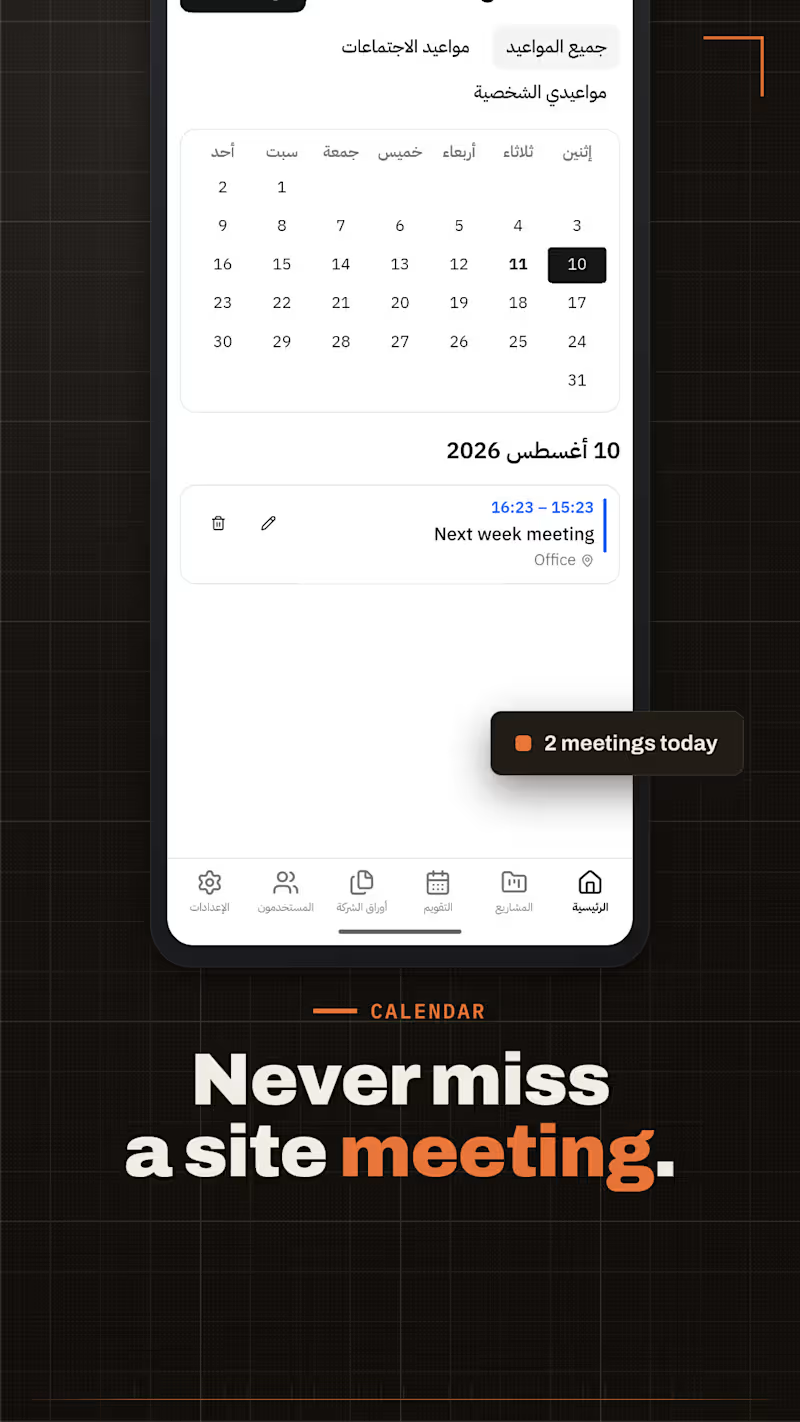
SOIL — Construction & Fitout Project Management Platform
0
6
Message
0
aymen merad
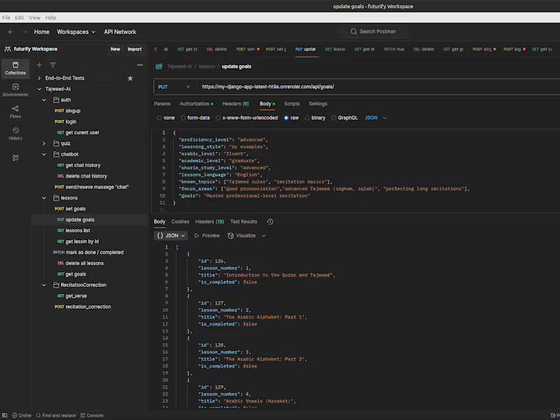
aymenm9/Tajweed-AI
0
12
Message
4
Creatvnest Studio
Projects section and the project detail page for the upcoming template are ready,@framer (https://x.com/framer) marketplace, get ready!!
2
4
123
Message
0
Taha Azzoug
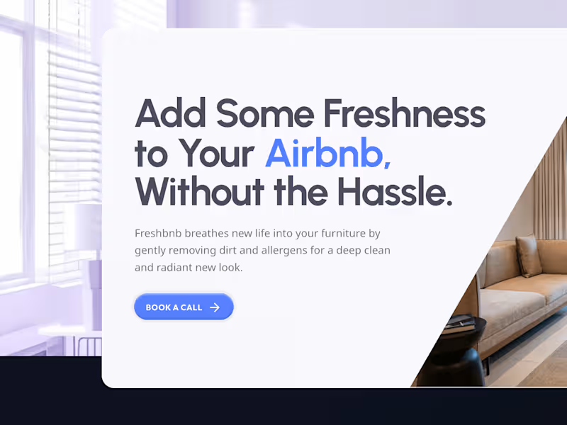
Freshbnb landing page
0
9
Message
0
Louhab Aymen
Spectra is a cosmetic brand with a simple belief: beauty isn't uniform — it's unique. The brand had to look as bold as that belief. On the shelf, and in the mirror.
0
87
Message
0
pas_swo _rd
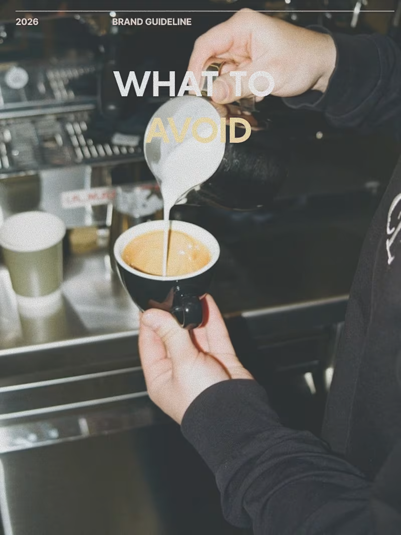
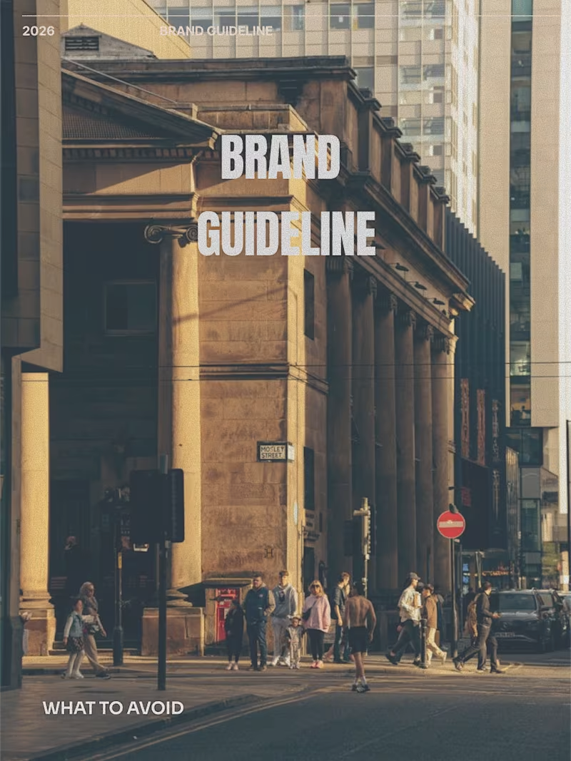
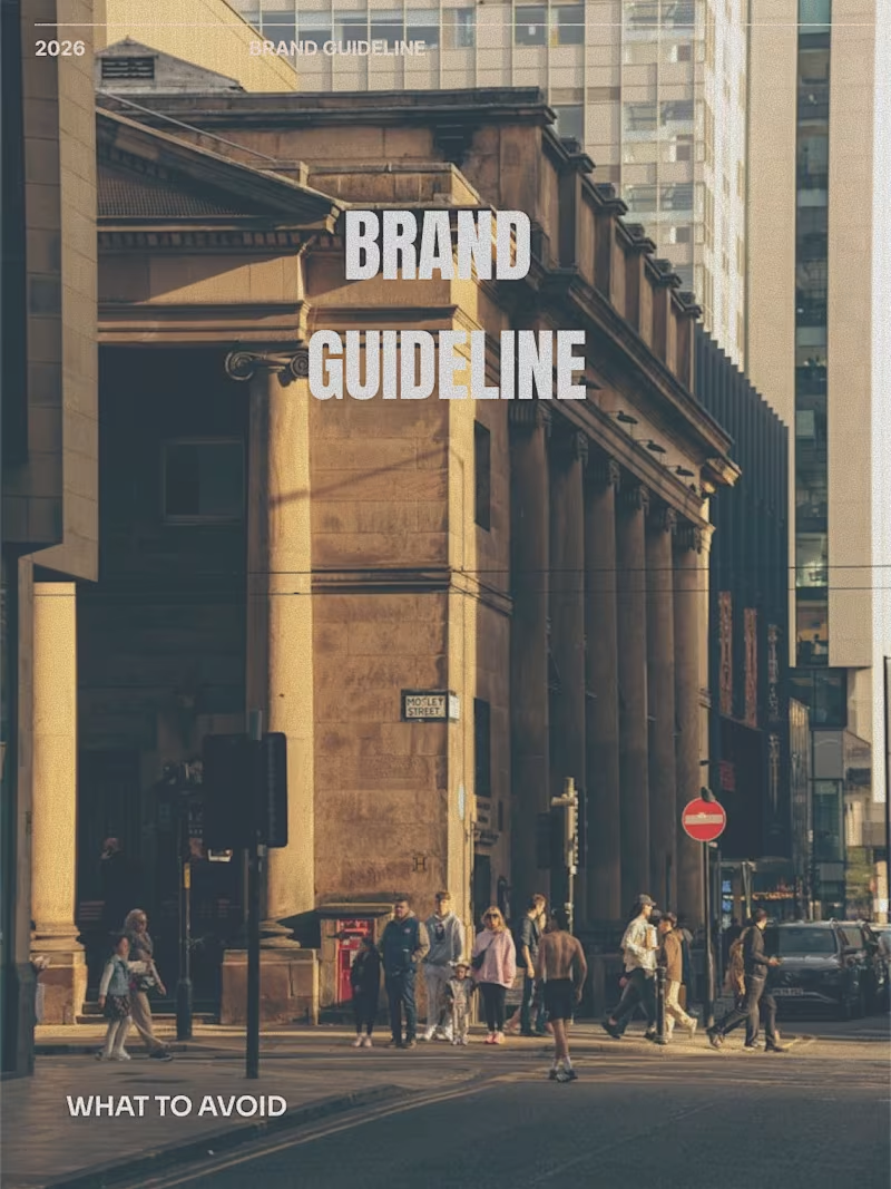
Here is a tailored LinkedIn post designed to showcase your brand system guidelines and demonstrate your expertise in typography and design systems. Headline Options Defining the details: Why negative examples belong in every brand identity system. Typography is 10% font selection and 90% spatial control. Post Body Creating a strong visual identity isn’t just about defining the rules—it’s about defining the boundaries. When building brand guidelines, explicitly documenting what to avoid is often what saves a system from being diluted in real-world application. Spacing, hierarchy, and weight distribution can completely alter how a brand is perceived. Here are four common typography pitfalls I always document in brand systems to keep visual communication sharp and legible: Leading Extremes: Overly loose leading disconnects lines of text, while overly tight leading causes ascenders and descenders to collide. Both ruin readability. Mixed Weights in Headlines: Injecting random bold or medium weights within a single line creates unnecessary visual noise and weakens message hierarchy. Tracking & Letter-Spacing: Forcing characters together causes glyphs to crash while stretching tracking too wide breaks paragraph cohesion. Case Misuse: Setting entire paragraphs or headlines in ALL CAPS creates unnecessary visual friction—sticking to standard Sentence Case maintains clean, accessible reading flow. A visual system should empower teams to execute consistently without guesswork. Clear guardrails guarantee the brand looks as intended across every touchpoint. Would you like me to adapt this with a specific call-to-action or tailor it to highlight a specific project case study?
0
46
Message
3
Youcef Moulla
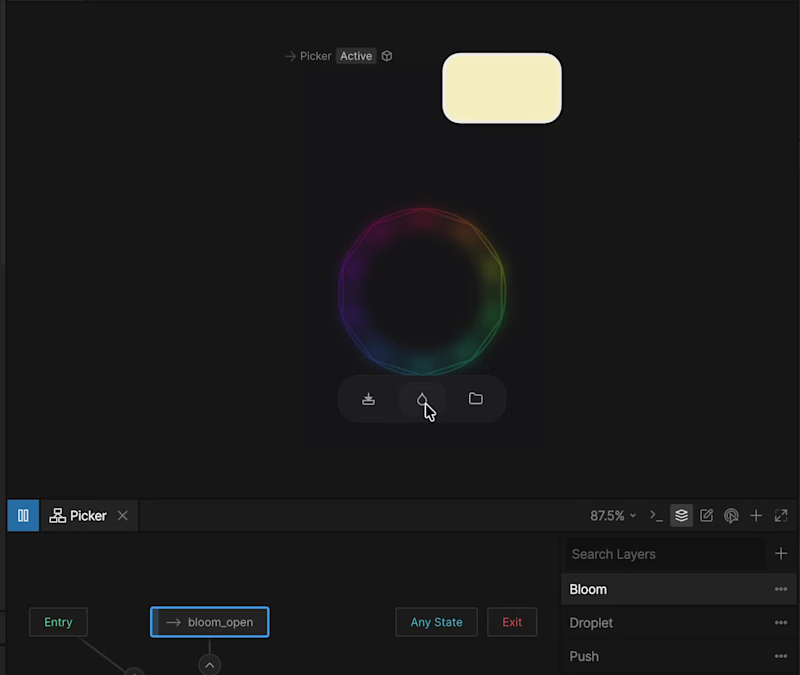
Color picker on #rive
2
3
231
Message
0
aymen merad
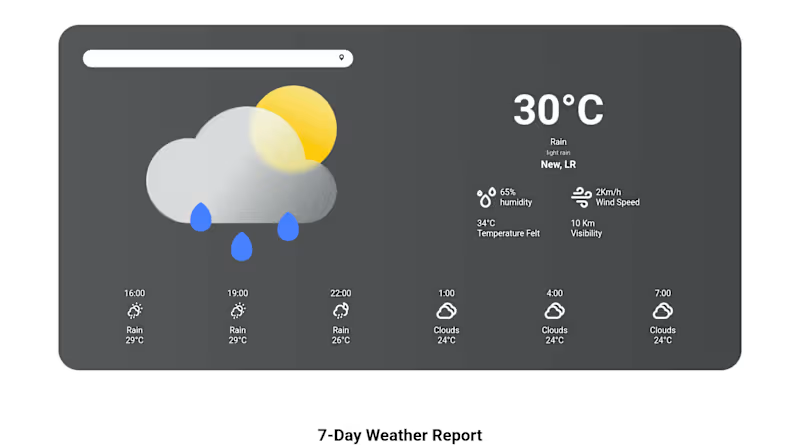
weatherWebApp
0
4
Message
0
Creatvnest Studio
Built this circular navigation menu component in @framer (https://x.com/framer) entirely native. No custom code, just clean layer architecture and hover transforms.
0
60
Message
0
Taha Azzoug
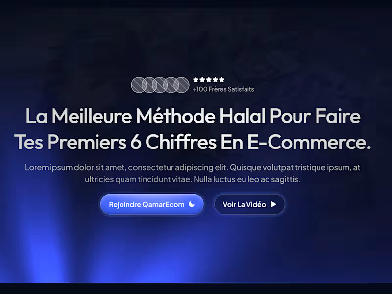
landing page
0
9
Message
3
pas_swo _rd
A great visual identity isn’t just about what to build—it’s about knowing what not to touch. When creating brand guidelines, the "What to Avoid" section is just as vital as the core identity rules. Custom typography, unique ligatures, and distinctive retro wordmarks easily lose their impact the moment consistency breaks. Key principles to keep a visual identity sharp across all touchpoints: Maintain strict contrast: Avoid color combinations that compromise legibility or distort the primary visual hierarchy. Protect the proportions: Never stretch, skew, or alter custom letterforms. Stylistic modifications weaken brand recognition. Keep backgrounds clean: Avoid placing wordmarks directly over busy images or low-contrast textures without proper treatment. Eliminate unnecessary effects: Skip outlines, dropshadows, bevels, or unapproved gradients that aren't defined in the visual system. Brand equity is built through repetition and clarity. Setting firm boundaries ensures the visual system stays strong across every execution. How do you approach defining brand misuse guidelines for your identity projects? Let's connect in the comments.
1
3
61
Message
0
Louhab Aymen
Recent ad Video for VIEWSHARK brand Identity
0
111
Explore projects