Projects using Figma in Santo Domingo ProvinceProjects using Figma in Santo Domingo ProvinceMost people notice the logo.
Few notice the grid behind it.
A strong branding project is not built on aesthetics alone. Behind every balanced logo, every editorial layout, and every consistent visual system, there is structure.
Grid systems create alignment, rhythm, hierarchy, and scalability. They allow brands to grow without losing clarity, ensuring that every application — from digital platforms to printed materials — feels connected and intentional.
Without a system, design becomes decoration.
With a system, design becomes communication.
The difference between a logo and a brand often lies in the invisible decisions that hold everything together.
If you're building a new brand or looking to elevate an existing one, I help businesses create strategic visual identities designed for consistency, recognition, and long-term growth.
Available for Brand Identity Design, Logo Design, and Creative Direction.
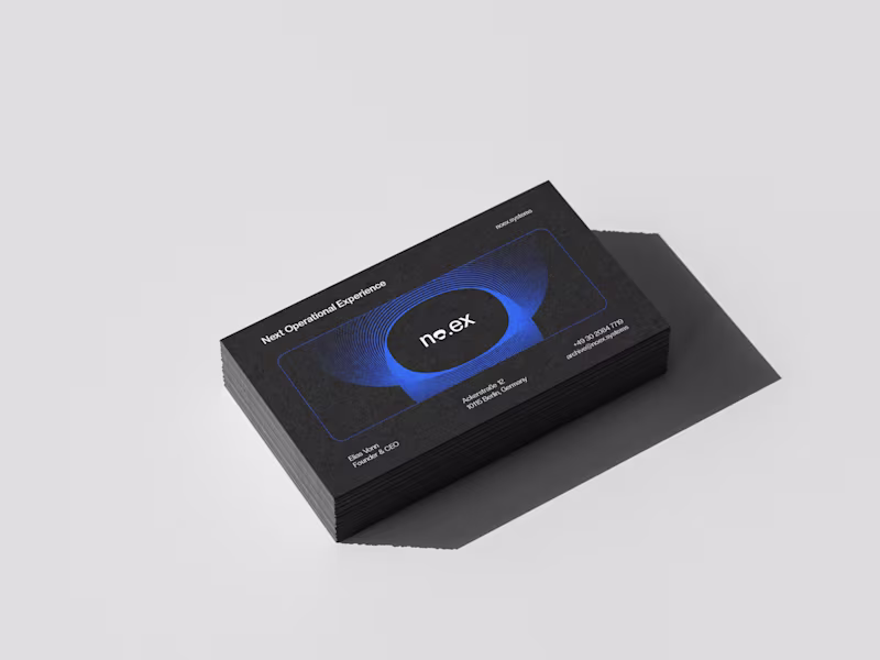
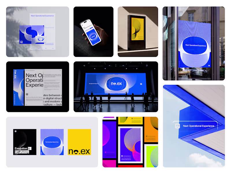
Let's build something meaningful. No.ex — Next Operational Experience
No.ex is a conceptual visual identity exploring how modern systems behave, evolve, and communicate through design.
Positioned between digital experimentation and physical presence, No.ex combines editorial structure, immersive visual direction, and future-oriented aesthetics to create a dynamic and adaptive identity language.
The project investigates movement, signal, structure, and interaction through posters, large-scale applications, environmental graphics, and visual systems designed for both digital and real-world spaces.
Rather than functioning as a traditional brand, No.ex exists as a visual framework — one that reflects contemporary culture, technological progression, and the constant evolution of modern communication.
2026© AMNE Studio.
(https://www.instagram.com/amne.std/)Enmanuel Jimenez V.
(https://www.instagram.com/enma.jv/)Jv® Studio. (https://www.instagram.com/jv.std_/) —
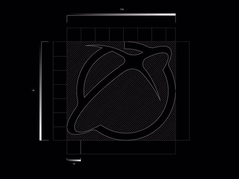
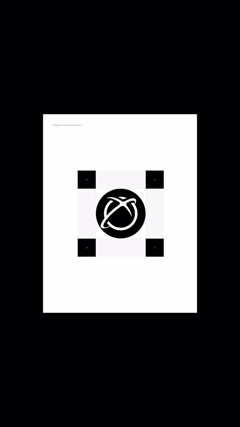
All rights reserved. MARKS & FORMS — 25 BLACK EDITION
A refined exploration of marks in their purest state.
Is a curated exploration of identity through reduction, contrast, and intentional restraint. This project brings together a selection of logos and marks developed throughout the year, reimagined under a single visual principle: black as the final form.
Black Edition is not a colorway — it is a statement. By removing distraction, color, and excess, each mark is reduced to its essential structure, allowing form, balance, and negative space to take center stage. Every symbol exists in silence, where meaning is communicated through proportion, rhythm, and precision rather than ornament.
2025© - Jv® Studio. — Enmanuel Jimenez V. All rights reserved.
Featured project in Graphic Design - Logo by @behance (https://www.behance.net/gallery/240569689/MARKS-FORMS-25-BLACK-EDITION)