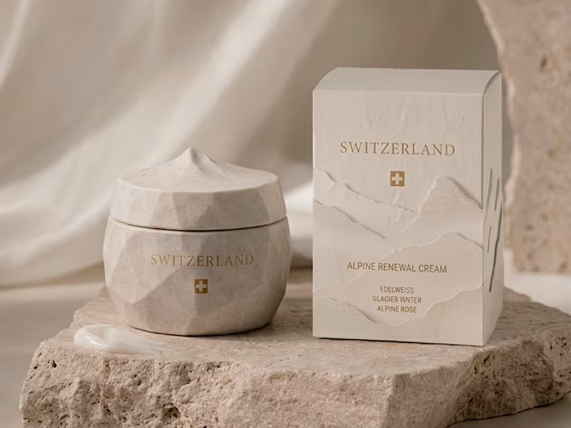
Projects using Adobe Illustrator in SalernoProjects using Adobe Illustrator in SalernoSwitzerland - Alpine Renewal Cream
Inspired by the purity and serenity of the Swiss Alps.
The formula combines edelweiss, glacier water, and alpine rose, ingredients chosen for their association with resilience, freshness, and high-altitude botanicals.
The palette is bright and understated, blending soft whites, cool blues, and delicate floral tones.
The bottle design is minimal and refined, reflecting precision, luxury, and timeless elegance.
A concept rooted in purity, performance, and Alpine beauty.
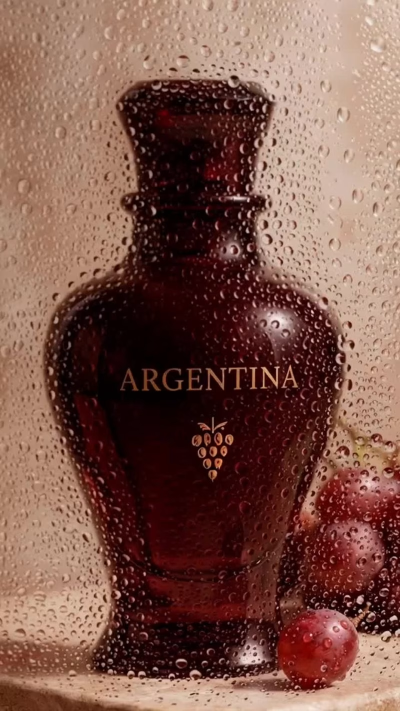
#beautybranding #packagingdesign #brandingdesign #luxurybeauty #switzerland #WorldCupDesign Argentina - Lip Tint
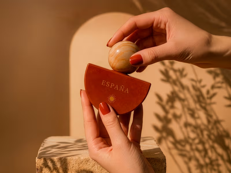
Inspired by Argentina's richness, elegance, and expressive character.
The formula combines Malbec grape, rosehip, and Patagonian berry, celebrating ingredients deeply connected to the country's landscapes and traditions.
The palette explores rich berry tones and soft neutrals, inspired by vineyards, sunsets, and Patagonia's natural beauty.
The bottle design is sleek and refined, balancing sophistication with a bold, contemporary identity.
A concept rooted in color, culture, and confidence.
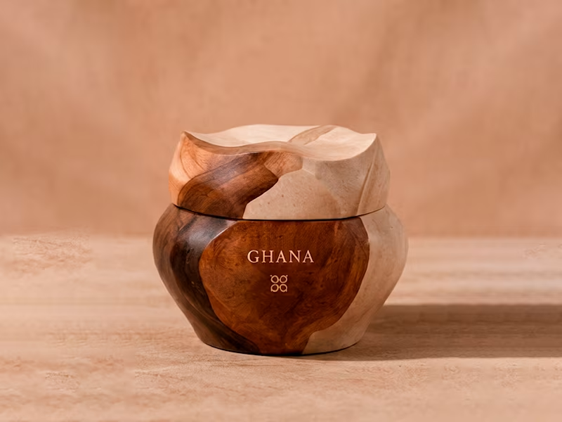
#beautybranding #packagingdesign #brandingdesign #makeupdesign #argentina #WorldCupDesign Ghana - Shea Body Butter Cream
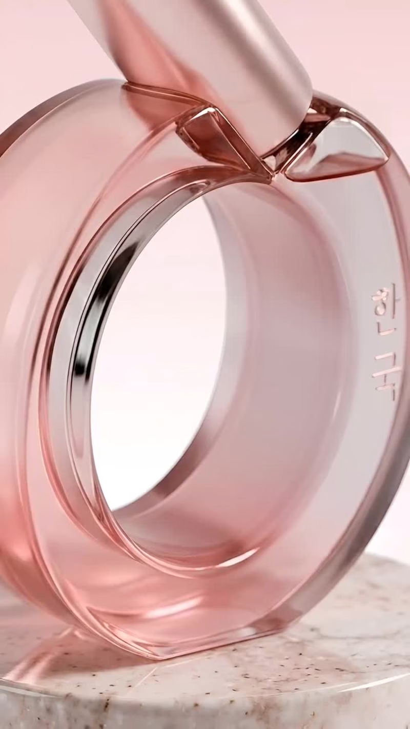
Inspired by Ghana's rich natural resources and centuries of skincare tradition.
The formula blends shea butter, baobab, and cocoa, ingredients celebrated for their nourishing benefits and deep cultural heritage.
The palette is warm and earthy, reflecting cocoa tones, golden shea, and the richness of African landscapes.
The packaging is bold yet elegant, designed to communicate comfort, authenticity, and premium care.
A concept built around nourishment, heritage, and natural beauty.
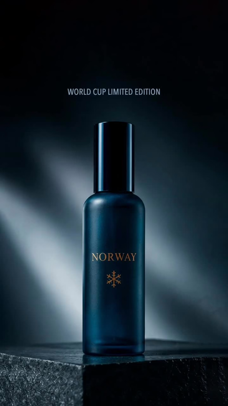
#beautybranding #packagingdesign #brandingdesign #ghana #bodycare #WorldCupDesign Norway - Nordic Hair Elixir
Inspired by the purity and resilience of the Nordic landscape.
The formula combines cloudberry, sea kelp, and Arctic birch, selected for their nourishing properties and connection to Norway's rugged coastline and forests.
The palette is cool and understated, drawing from icy blues, soft neutrals, and deep ocean tones.
The bottle design is clean and sculptural, reflecting Scandinavian minimalism with a refined, contemporary silhouette.
A concept rooted in nature, simplicity, and quiet strength. Brazil - Hair Elixir
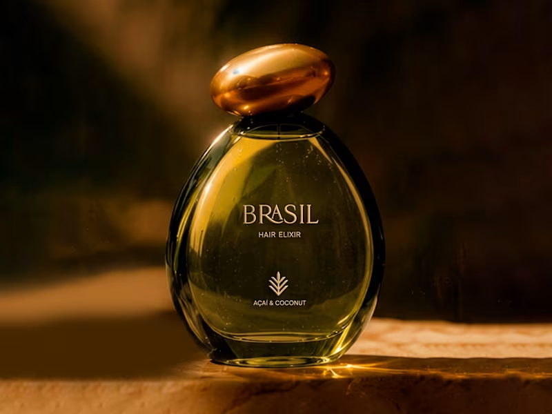
A vibrant expression of Brazilian nature and vitality.
The formula combines açaí and coconut, chosen for their richness, nourishment, and deep connection to tropical ecosystems.
The color palette is bold and alive, inspired by rainforest tones, fruit richness, and natural energy.
The bottle shape is fluid and dynamic, designed to feel soft, expressive, and organic in motion.
A concept rooted in strength, texture, and natural abundance. What if CapCut entered the skincare industry? ✨
Would you add it to your routine?
I explored how CapCut could evolve beyond content creation and become a premium skincare brand.
CONCEPT
CapCut Skin translates CapCut's core values of simplicity, efficiency, and creativity into a modern skincare experience. Inspired by the idea of editing and enhancing content, the brand applies the same philosophy to skincare through streamlined routines, multifunctional products, and visible results.
VISUAL IDENTITY
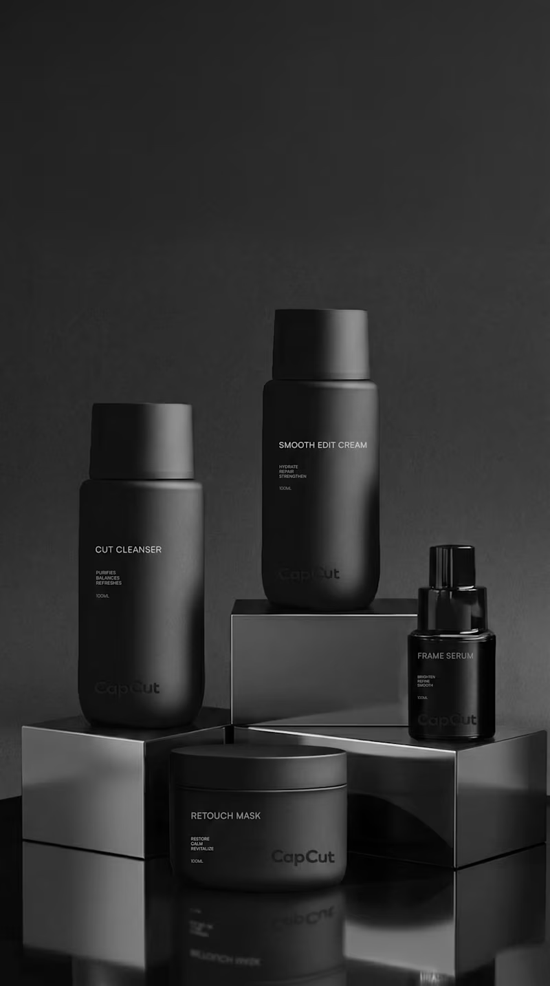
The identity combines minimalist packaging, clean typography, and fresh mint-green accents inspired by digital interfaces. The goal was to create a brand that feels modern, approachable, and technology-driven while maintaining a premium aesthetic.
PRODUCTS
The collection includes Cut Cleanser, Frame Serum, and Smooth Edit Cream, a simplified routine designed to cleanse, refine, and hydrate the skin. Product names are inspired by the language of content creation, creating a direct connection to the CapCut universe.
POSITIONING
Designed for people who want effective skincare without complicated routines. Smart formulas, clean design, and results-focused products for modern lifestyles.