Freelancers using Dart in RawalpindiFreelancers using Dart in Rawalpindi
πŸš€ Flutter Expert for Android Apps πŸš€
πŸš€ AI & Fullstack Developer | MERN Expert πŸš€
$10k+
Earned
5x
Hired
5.0
Rating
30
Followers
πŸš€ AI & Fullstack Developer | MERN Expert πŸš€
Versatile Copywriter | Web Developer | Content Writer

AI & Fullstack Developer Making Ideas Reality
Placeholder project card media
View more β†’
Flutter Developer || Building innovation mobile application

Flutter Developer | AI & Web Solution | AD Designer
6
Followers
Flutter Developer | AI & Web Solution | AD Designer
Cover image for πŸ“ BRAND STRATEGY β€” CASE
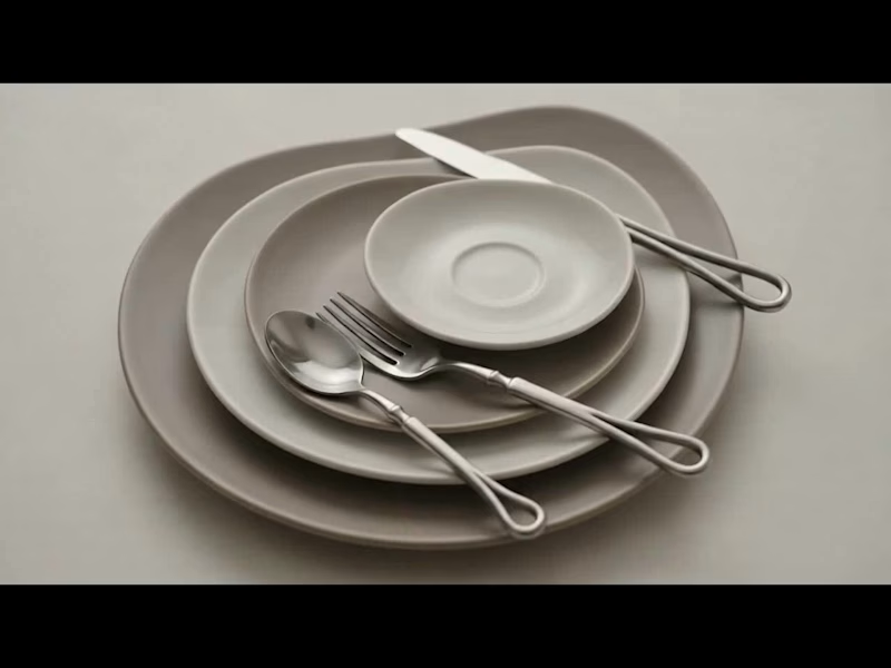
πŸ“ BRAND STRATEGY β€” CASE STUDY βš™οΈ Koia Objects: Making the Photography Match the Positioning Goal: Closing the gap between what Koia Objects makes and how it is seen β€” using photography as the proving ground for the brand's design logic. πŸ“Έβœ¨ 1. 🎯 The Brief Koia Objects is a Swedish stainless steel tableware and serving brand, two years in, with a design sensibility that sits deliberately between two traditions: πŸ›οΈ Bauhaus Rationalism (Mies van der Rohe): Form follows function & industrial precision. 🌿 Nordic Warmth (Alvar Aalto): Human-centric design that keeps precision warm rather than cold. πŸ’° The Positioning: Accessible Premium β€” not luxury, not budget, but a fair price for genuine material quality and craftsmanship. ⚑ The Challenge: This positioning has to be felt, not stated. It must be built into every decision the brand makes, starting with how the product is photographed. 2. πŸ” The Diagnosis Most young premium tableware brands drift into one of two failure modes: 🚫 The Catalog Trap (Current State): Flat white backgrounds, even front-on lighting, centered objects. It looks like a cheap e-commerce listing and flattens the way light moves across brushed steel. 🚫 The Overcorrection (To Avoid): Dark moody backdrops, heavy gold rim-lighting, and fake luxury marble. It looks like an imitation of luxury watch ads and ignores both Bauhaus and Nordic roots. πŸ’‘ The Fix: Build a third direction grounded in Koia’s true design lineage rather than borrowed conventions. 3. βš–οΈ The Design Logic Translating "Bauhaus Rationalism + Nordic Warmth" into 5 concrete photographic principles: 🏷️ PrincipleπŸ–ΌοΈ, What It Means in a PhotographπŸ› οΈ Function, Visible Show the object doing its job (pouring, serving, being held). Function is the whole premise.✨ Material Honesty Real ,directional light on real steel. Let reflections show weight and precision without over-retouching.πŸͺ΅ Restraint in Styling Few, purposeful props (raw wood, linen, stone). Nothing on set unless it earns its place.β˜€οΈ Warm Directional Light .Soft daylight or a single warm key light instead of flat, cold studio flashes.🏑 Grounded Negative Space, Generous breathing room on a real surface (table, hand, counter) β€” never a void. 4. 🎬 The Direction, Made Concrete πŸ“‹ Shot List πŸ–ΌοΈ Hero Shot: The object alone on a real surface (oiled wood, honed stone) with soft single-direction daylight. πŸ’§ In-Use Shot: The object mid-function (pouring water, serving food, lifted by a hand). πŸ” Material Macro: A tight crop on an edge, weld line, or brushed surface to prove craftsmanship. 🍽️ Grounded Flat Lay: The product with 2–3 purposeful props (linen, raw ceramic, cut citrus) and generous breathing room. 5. πŸ”„ Before / After β€” Case Study 🏺 Object: Stainless Steel Serving Pitcher ❌ BEFORE (Catalog Default): Shot dead-on against a white seamless background with flat lighting. The steel looks flat, generic, and cheap. βœ… AFTER (Koia Direction): Shot at a slight angle on an oiled walnut counter, lit by soft side daylight. Highlights catch the spout, shadows add depth, and water is captured mid-pour into a glass. 🌟 Why It Works: Highlights prove the metalwork quality, the pour proves function, and the warm wood adds Nordic cozy vibes without clutter! 6. πŸ“ˆ Why This Matters Commercially 🏷️ Shifts Value Perception: Replaces price comparison with craftsmanship appreciation ("This is clearly better made"). πŸ“¦ Scalable Framework: The 5 principles extend directly to packaging, website UI, and social content as the brand scales. Prepared as an example project β€” Koia Objects Brand Strategy Engagement. πŸš€
0
13
Cover image for Synapse β€” Designing an AI
Synapse β€” Designing an AI Assistant People Actually Want to Open A personal case study on building an AI-powered product, from idea to interface What This Project Is Synapse is a concept landing page for an AI-powered assistant app β€” the kind of tool that can chat with you, write content, help with code, generate images, and even listen through voice mode. Think of it as one AI brain that switches roles depending on what you need that day: writer, designer, developer, or thinking partner. I didn't build the actual AI behind it (that needs a real backend and a language model). What I built is the front door β€” the website that would greet a new user, explain what the product does, and convince them to try it. It's coded by hand using HTML, CSS, and JavaScript, and it's designed to feel like a real, funded, 2026-era AI startup β€” not a template. Why I Made It AI products are one of the most in-demand niches for designers and developers right now. Every week, a new AI tool launches, and every one of them needs the same three things: a website that explains it, an interface that's easy to trust, and a visual identity that doesn't look like everyone else's chatbot page. I built Synapse for three reasons: To learn by doing. Reading about animations and 3D CSS is one thing β€” actually building a rotating 3D orb, scroll reveals, and a typewriter chat demo forced me to understand how these effects really work under the hood. To build a strong portfolio piece. Clients hiring for AI-product design want to see that you can design for AI β€” chat interfaces, live-typing states, "thinking" animations β€” not just static pages. To practice going from brief to finished product, the same way a real freelance or agency project would run: picking a name, a color story, a tone of voice, and carrying it consistently across every section. What's Inside Section Purpose Hero Introduces Synapse in one glance β€” headline, floating 3D orb, live chat bubbles Marquee strip Builds trust by showing "who uses it" Stats Numbers that count up on scroll, for quick credibility Features grid Explains the 6 things Synapse can do How it works A simple 3-step flow: ask β†’ Synapse reasons β†’ get result Live demo A fake but realistic chat window that types out an answer, showing how the product feels in use Voices (testimonials) Social proof from "users," scrolling infinitely CTA band The final push to get someone to try the product Footer Quick links and closing brand mark Skills I Practiced UI/UX design thinking β€” deciding what a first-time visitor needs to see first, second, and last Visual design & branding β€” building a color palette (violet, cyan, magenta, amber) and pairing three fonts (Space Grotesk, Inter, JetBrains Mono) that feel techy but warm Responsive layout β€” making sure the page holds up on mobile, tablet, and desktop Motion & interaction design β€” deciding where animation adds meaning (a "thinking" AI deserves movement) instead of adding effects just because I could Front-end development β€” writing real, working HTML/CSS/JS instead of just designing static mockups Copywriting β€” writing headlines and feature text that sound like a real product, not placeholder "Lorem ipsum" text Problem-solving / debugging β€” like the navigation bug we just fixed, which taught me how a small JavaScript mistake can break a whole page's usability Tools Used HTML5 / CSS3 β€” structure and all visual styling, including 3D transforms and keyframe animations Vanilla JavaScript β€” scroll reveals, cursor glow, orb parallax, counters, typewriter effect, mobile menu Google Fonts β€” Space Grotesk, Inter, JetBrains Mono Unsplash β€” free stock photography for avatars and testimonial faces What I'll Build On Next (Future Contributions) This version is the front door only. Here's where it can grow: A working chat interface β€” connect it to a real AI API so the "demo" becomes a real conversation A pricing page β€” since every SaaS/AI product needs a clear plan comparison A dashboard / product screens β€” the inside of the app, not just the marketing page Dark/light mode toggle β€” a common expectation in 2026 products Accessibility pass β€” screen reader labels, better color contrast checks, keyboard navigation testing Case study presentation β€” turning this into a polished Behance/Dribbble post with before/after and process shots Closing Thoughts Synapse started as a way to practice one skill β€” building an AI-product landing page β€” but it ended up teaching me design decisions, real front-end code, and debugging, all in one project. Link to see my whole project: https://saifullah-ai-assistant.netlify.app
2
1
48