Freelancers using CSS3 in RawalpindiFreelancers using CSS3 in Rawalpindi
Web Developer | UI/UX| 3D Product Animation |

9
Followers
Web Developer | UI/UX| 3D Product Animation |

Cover image for StreamPro — Brand Website for
StreamPro — Brand Website for a Live Event Broadcasting Studio Live Website: saif-stream-pro-website.netlify.app (http://saif-stream-pro-website.netlify.app) What I built😍 A fully responsive, mobile and web based single-page marketing website for StreamPro, a Brisbane-based live-streaming production studio that broadcasts memorial services, weddings, sports events, and community occasions. The site was designed and developed from scratch to establish a premium, trustworthy brand presence and convert visitors into booking inquiries — working seamlessly whether accessed from a phone, tablet, or desktop. What it does🙌 The website guides visitors through a structured narrative — introducing the brand, building credibility, showcasing services, explaining the booking process, displaying social proof, and closing with a direct contact/quote form. It's built to load fast, adapt fluidly across mobile and web based environments, and feel as polished and reliable as the broadcast service it's selling. Core concepts & techniques applied💯 Semantic document structure — content organized into meaningful, accessible sections rather than generic divs, improving both SEO and screen-reader usability. Design system / design tokens — a centralized set of reusable variables (colors, gradients, typography, spacing) so the entire visual identity stays consistent and can be updated globally from one place. Responsive, mobile-first layout design — fluid grids and breakpoints so the layout adapts smoothly across mobile and web based screens without needing separate versions. Scroll-based interactivity — dynamic navbar states, scrollspy navigation (highlighting the active section as the user scrolls), and progressive scroll-reveal animations for content. DOM manipulation & event handling — mobile menu toggling, animated statistic counters, and form interaction logic, all built with vanilla JavaScript (no frameworks). Accessibility considerations — visible focus states, reduced-motion support for users sensitive to animation, and descriptive alt text on all imagery. Brand identity integration — a custom 3D gradient logo mark and supporting visual graphics applied consistently across the navigation, hero section, and footer to reinforce brand recognition. Conversion-focused UX — strategic placement of trust signals (stats, testimonials, direct phone contact) and a structured lead-capture form to turn visitors into inquiries. Outcome🚀 A performant, framework-free static website that's lightweight, cheap to host, easy to maintain, fully mobile and web based responsive, and built entirely around fundamental web development principles — structure, styling systems, interactivity, accessibility, and conversion design.
0
99
Cover image for Synapse — Designing an AI
Synapse — Designing an AI Assistant People Actually Want to Open A personal case study on building an AI-powered product, from idea to interface What This Project Is Synapse is a concept landing page for an AI-powered assistant app — the kind of tool that can chat with you, write content, help with code, generate images, and even listen through voice mode. Think of it as one AI brain that switches roles depending on what you need that day: writer, designer, developer, or thinking partner. I didn't build the actual AI behind it (that needs a real backend and a language model). What I built is the front door — the website that would greet a new user, explain what the product does, and convince them to try it. It's coded by hand using HTML, CSS, and JavaScript, and it's designed to feel like a real, funded, 2026-era AI startup — not a template. Why I Made It AI products are one of the most in-demand niches for designers and developers right now. Every week, a new AI tool launches, and every one of them needs the same three things: a website that explains it, an interface that's easy to trust, and a visual identity that doesn't look like everyone else's chatbot page. I built Synapse for three reasons: To learn by doing. Reading about animations and 3D CSS is one thing — actually building a rotating 3D orb, scroll reveals, and a typewriter chat demo forced me to understand how these effects really work under the hood. To build a strong portfolio piece. Clients hiring for AI-product design want to see that you can design for AI — chat interfaces, live-typing states, "thinking" animations — not just static pages. To practice going from brief to finished product, the same way a real freelance or agency project would run: picking a name, a color story, a tone of voice, and carrying it consistently across every section. What's Inside Section Purpose Hero Introduces Synapse in one glance — headline, floating 3D orb, live chat bubbles Marquee strip Builds trust by showing "who uses it" Stats Numbers that count up on scroll, for quick credibility Features grid Explains the 6 things Synapse can do How it works A simple 3-step flow: ask → Synapse reasons → get result Live demo A fake but realistic chat window that types out an answer, showing how the product feels in use Voices (testimonials) Social proof from "users," scrolling infinitely CTA band The final push to get someone to try the product Footer Quick links and closing brand mark Skills I Practiced UI/UX design thinking — deciding what a first-time visitor needs to see first, second, and last Visual design & branding — building a color palette (violet, cyan, magenta, amber) and pairing three fonts (Space Grotesk, Inter, JetBrains Mono) that feel techy but warm Responsive layout — making sure the page holds up on mobile, tablet, and desktop Motion & interaction design — deciding where animation adds meaning (a "thinking" AI deserves movement) instead of adding effects just because I could Front-end development — writing real, working HTML/CSS/JS instead of just designing static mockups Copywriting — writing headlines and feature text that sound like a real product, not placeholder "Lorem ipsum" text Problem-solving / debugging — like the navigation bug we just fixed, which taught me how a small JavaScript mistake can break a whole page's usability Tools Used HTML5 / CSS3 — structure and all visual styling, including 3D transforms and keyframe animations Vanilla JavaScript — scroll reveals, cursor glow, orb parallax, counters, typewriter effect, mobile menu Google Fonts — Space Grotesk, Inter, JetBrains Mono Unsplash — free stock photography for avatars and testimonial faces What I'll Build On Next (Future Contributions) This version is the front door only. Here's where it can grow: A working chat interface — connect it to a real AI API so the "demo" becomes a real conversation A pricing page — since every SaaS/AI product needs a clear plan comparison A dashboard / product screens — the inside of the app, not just the marketing page Dark/light mode toggle — a common expectation in 2026 products Accessibility pass — screen reader labels, better color contrast checks, keyboard navigation testing Case study presentation — turning this into a polished Behance/Dribbble post with before/after and process shots Closing Thoughts Synapse started as a way to practice one skill — building an AI-product landing page — but it ended up teaching me design decisions, real front-end code, and debugging, all in one project. Link to see my whole project: https://saifullah-ai-assistant.netlify.app
2
1
129
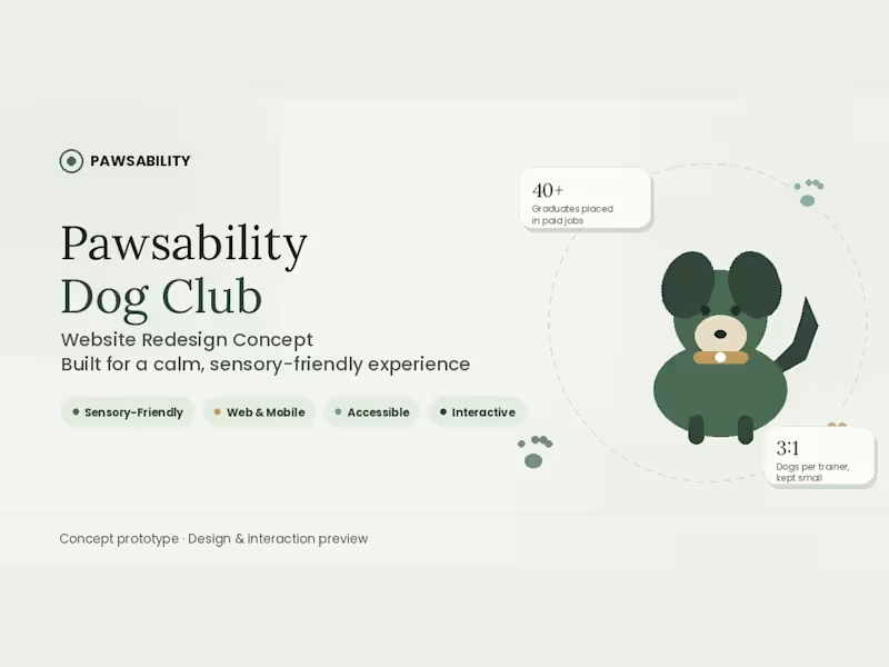
Cover image for Title: Pawsability Web & Mobile
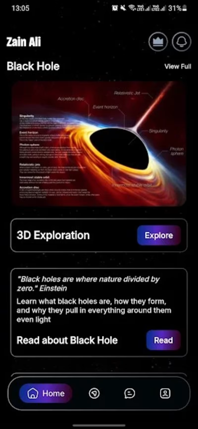
Title: Pawsability Web & Mobile Based Redesign Concept 🐾📱✨ Complete Project Description 🚀 Pawsability is a modern, high-converting web and mobile platform designed as a UI/UX case study and interactive digital experience for a Bushwick, Brooklyn-based social enterprise 🏙️🐶. The platform seamlessly bridges two powerful missions: delivering top-tier professional dog training services to pet owners while providing structured vocational training and career pathways for neurodivergent and autistic adults 💡💙. The site is engineered with a sensory-friendly, highly accessible design architecture 🎨, featuring soft color palettes, smooth micro-interactions, clean visual hierarchy, and full support for reduced-motion preferences ⚡. Core Sections & Features Breakdown 🛠️ Hero & Impact Metrics 🎯 Bold Value Proposition: "Every leash has two ends" — instantly engaging both target audiences 🐕. Dual-Path Navigation: Clear CTAs for dog owners booking services & individuals seeking vocational training 🚀. Trust-Building Stats: Highlighting key performance metrics like 01:1 graduate job placement focus and a calm 3:1 dog-to-trainer ratio 📊. Our Story (Dual-Purpose Model) 🤝 Visual storytelling showing how pet care and workplace skill training intersect naturally. Transparent model explaining how dog service bookings directly fund participant paychecks 💰✨. Vocational Training Roadmap 📌 Interactive 4-stage progression guide: 01. Meet & Assess ➔ 02. Hands-On Training ➔ 03. Supervised Shifts ➔ 04. Job Placement 🏆 Dog Services Hub 🐕‍🦺 Structured, high-converting service cards detailing 1:1 Private Training, Small Group Classes, and Structured Daycare & Boarding 🎾. Get Involved & Call to Action 📩 Multiple conversion touchpoints allowing visitors to book services, sponsor a trainee, or hire graduates 🤝✨. Skills Applied 🧠💎 UI/UX Design & Spatial Architecture: Crafting intuitive user flows, conversion-focused wireframes, and sensory-friendly layout systems 📐. Fully Responsive Design: Building fluid desktop grid systems and flexible layouts optimized seamlessly for mobile, tablet, and widescreen displays 📱💻. Accessibility (a11y) Standards: Implementing high-contrast text, clear focus states, and reduced-motion options for an inclusive user experience ♿✨. Brand Strategy & Visual Identity: Curating muted color palettes, cohesive visual tone, and modern typography 🎨. Interactive Prototyping & Motion: Designing subtle scroll-triggered effects, micro-animations, and fluid state changes ✨. Tools & Tech Stack ⚙️🧰 Framer: Used as the primary design canvas and interactive visual production engine to build fluid, fully responsive web layouts without manual backend overhead 🚀. Framer Motion Logic: Powers smooth transitions, custom keyframe animations, and adaptive micro-interactions 🔥. Auto-Layout & Dynamic Components: Guarantees pixel-perfect layout responsiveness across all screen resolutions 📐. Semantic Web Principles: Structured with high-performance CSS/HTML visual principles for fast loading speeds and smooth responsiveness ⚡. 🚀 To see my project click on this link https://pawsability-redesign.netlify.app
0
109
Expert Custom Website Developer
1x
Hired
5.0
Rating
1
Followers
Expert Custom Website Developer
Code the stack. Add the intelligence
5.0
Rating
6
Followers
Code the stack. Add the intelligence
Frontend Developer / React / Vue / Next / Angualr / HTML&CSS
New to Contra
Frontend Developer / React / Vue / Next / Angualr / HTML&CSS
Cover image for LuxeCart — Premium E-commerce Website
LuxeCart
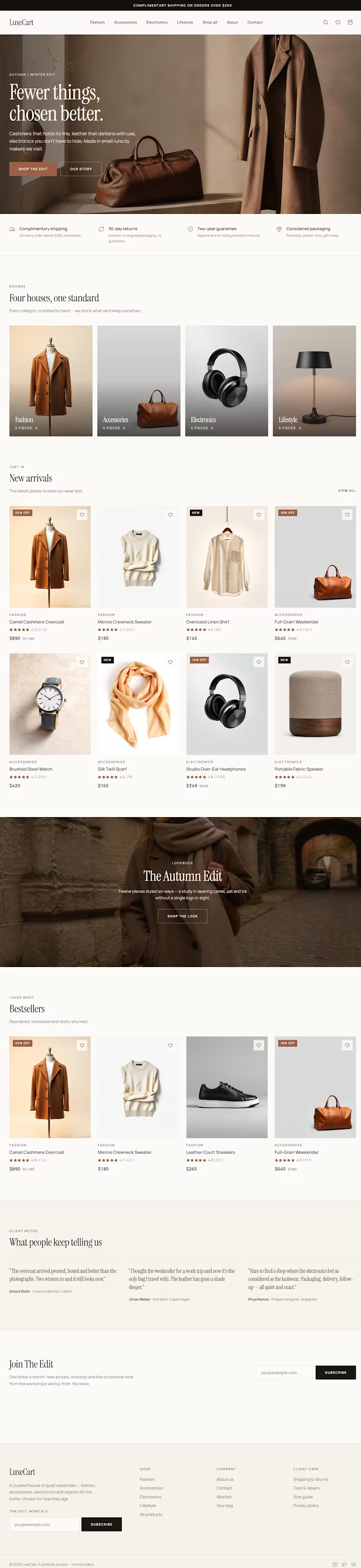
LuxeCart — Premium E-commerce Website LuxeCart is a modern, premium e-commerce website built to create a polished online shopping experience for fashion, accessories, electronics, and lifestyle brands. I designed and developed the frontend with a focus on premium UI/UX, responsive design, product discovery, conversion-focused layouts, and a smooth shopping journey across desktop and mobile. What I Built Modern e-commerce homepage designed for product discovery Responsive product listing and category pages Product cards with pricing, ratings, discounts, and wishlist actions Category-based browsing and filtering Interactive shopping cart with quantity controls Responsive cart drawer for a seamless shopping experience Dedicated checkout page with shipping selection Dynamic order summary and total calculations Mobile-first responsive layouts Clean, modern typography and premium visual design Demo checkout/payment interaction for portfolio purposes The Experience The shopping flow was designed around a simple conversion-focused journey: Discover products → Browse categories → View products → Add to cart → Checkout The goal was to make the interface feel luxurious and minimal while keeping the shopping experience intuitive and easy to use. Why This Project LuxeCart demonstrates how I turn an e-commerce concept into a production-style frontend experience with reusable components, responsive layouts, modern UI patterns, and a complete customer journey. It showcases my experience with e-commerce website development, React frontend development, responsive web design, UI implementation, and modern shopping experiences. Tech Stack React · TypeScript · Tailwind CSS · Responsive Web Design · Modern UI/UX · E-commerce Development · AI-Assisted Development Project Type E-commerce Website · Frontend Development · UI/UX Design · Responsive Web Development Looking for a Similar Website? I can build modern, responsive e-commerce websites and online stores for startups, businesses, brands, and product-based companies — from product browsing and cart experiences to polished checkout flows. Portfolio / Demo Project: This is a concept project created for demonstration purposes. No real orders or payment transactions are processed.
0
50
Frontend Web Developer | Clean websites & JS apps 💻🚀
New to Contra
Frontend Web Developer | Clean websites & JS apps 💻🚀

AI Agents, RAG, Automation & Full-Stack Web/Mobile Apps
Automating workflows & AI tools to grow your business