Projects using Adobe Photoshop in Rajshahi Division
Projects using Adobe Photoshop in Rajshahi Division
Sign Up
Post a job
Sign Up
Log In
Filters
2
Projects
People
Message
0
Md Toufic Ahmed Khan Badhon
pro
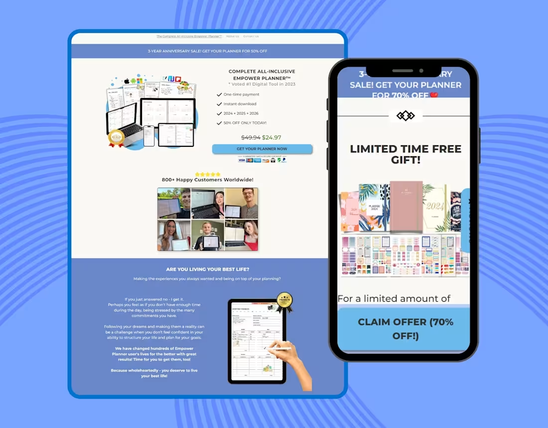
Planner Website Clone Using Pagefly on Shopify
0
12
Message
1
Humaun Atelier
pro
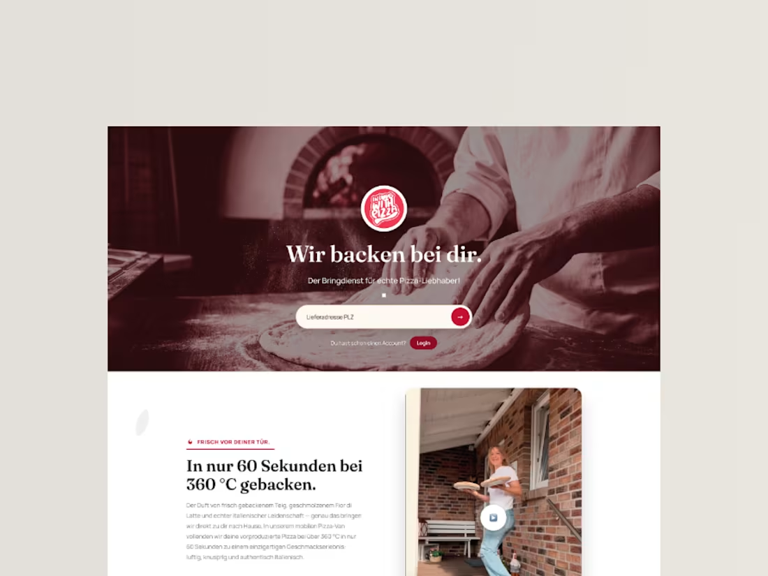
InLoveWithPizza Premium Landing Page Redesign
1
4
Message
1
Md Zahid Hasan Khan
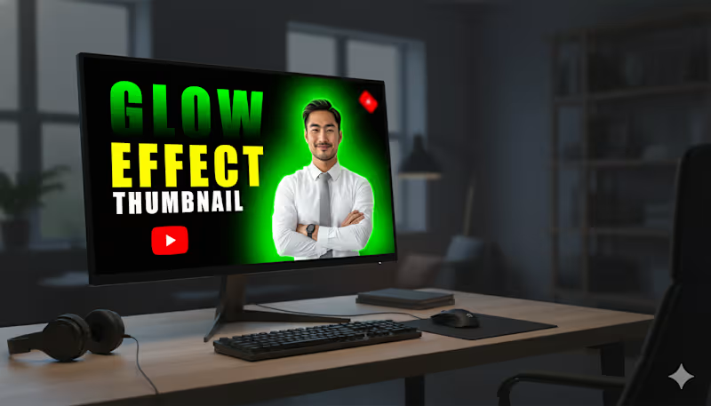
This YouTube thumbnail is designed to be highly eye-catching and is focused on demonstrating a "Glow Effect. Subject: A smiling, professionally dressed man (in a white shirt and grey tie) is positioned prominently on the right side. Glow Effect: A vibrant, bright green glow radiates from behind the man, creating a strong contrast against the black background. This immediately draws attention and illustrates the "Glow Effect" mentioned in the text. Background: The background is a solid black, which maximizes the impact and visibility of the glow and the text. Text Hierarchy: The text is large and uses high-contrast colors to stand out: "GLOW" is in a neon green/yellow-green gradient, directly matching the glow effect. "EFFECT" is in a bold, solid yellow. "THUMBNAIL" is in white text, slightly smaller, defining the subject matter.
1
72
Message
4
Md. Abdur Rahman
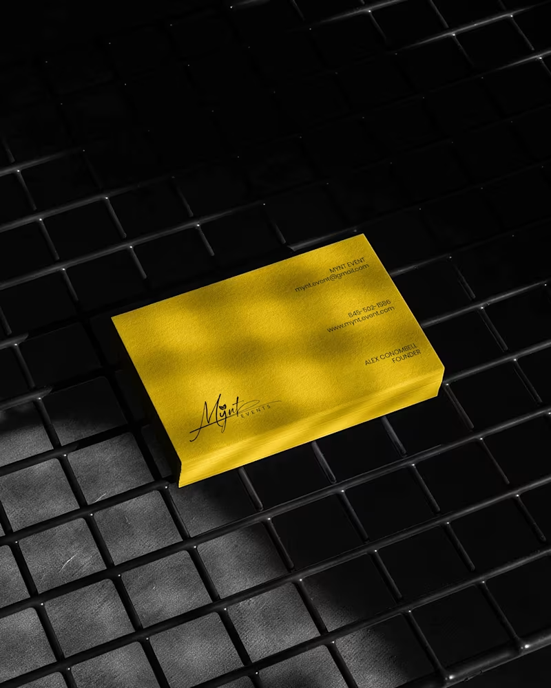
Luxury Brand Identity System for a Premium Event Planning Business PROJECT DESCRIPTION: Mynt Events is a premium event planning business built around moments that matter — proposals, curated celebrations, and experiences where every detail is considered and nothing is left to chance. The founder came to me with a business that had already outgrown its brand. The work was operating at a premium level. The identity wasn't communicating that yet. The brief was clear: build a complete brand identity system that positions Mynt Events as the obvious choice for clients who already know what they want and are deciding who to trust with it. The Strategic Starting Point Every decision in this project started with a single question: what does a client need to feel the moment they encounter this brand for the first time? For Mynt Events, that feeling needed to be confidence. Trust. The quiet certainty that this is a business that handles things properly — that the moment they're planning will be in the right hands. That emotional target shaped every mark, every color choice, and every surface application that followed. The Logo The primary mark is a signature script logo with a leaf detail structurally embedded within the letterforms. The script was chosen deliberately — in the events industry, clients are trusting you with moments that cannot be redone. A signature communicates personal commitment. It feels authored, not assembled. The leaf element does secondary brand work quietly. It signals organic intention, care, and attention to detail without requiring explanation or a separate icon. The underline sweep grounds the composition and gives it the horizontal confidence it needs to hold across wide-format surfaces — packaging lids, signage panels, and environmental applications where a floating mark would lose presence. A monogram M was developed as a secondary mark for applications where the full signature loses legibility at small scale — product labels, cap patches, and interior packaging details. The Palette Gold and black. Not chosen for trend. Chosen for emotional function. Gold carries warmth, occasion, and perceived value — the feeling of something worth celebrating. Black carries authority, precision, and restraint — the feeling of a business that delivers without drama. Together they position Mynt Events exactly where it needs to sit: celebratory but controlled, personal but professional. The palette was tested across matte, gloss, foil, backlit, and fabric applications to confirm it held integrity across every surface in the system without compensation or adjustment. The Full Identity System Every deliverable was designed as part of a single coherent brand expression — not a collection of individual design tasks, but a system where every piece reinforces every other piece: — Primary signature logo and monogram secondary mark — Full brand palette and typography hierarchy — Premium gold foil business card — Luxury magnetic gift box with full interior branding — Ring box and product packaging application — Branded tote bag — Apparel — t-shirt and structured cap with patch application — Backlit environmental signage panel — Digital UI and mobile wallpaper application The Result A brand identity system that closes the gap between what Mynt Events delivers and what a client sees before they ever make contact. The brand now works at a proposal ring box and a storefront signage panel simultaneously — with the same presence, the same authority, and the same unmistakable identity at every scale. That's not styling. That's positioning. And positioning is what turns a great business into the obvious choice. SERVICES INCLUDED IN THIS PROJECT: Brand Strategy, Logo Design, Visual Identity System, Monogram Design, Business Card Design, Luxury Packaging Design, Gift Box Design, Apparel Design, Environmental Signage Design, Digital UI Application, Brand Collateral Design, Full Brand System KEYWORDS: Luxury Event Brand Identity, Signature Logo Design, Event Planner Branding, Gold Brand Identity, Script Logo Design, Visual Identity System, Custom Logo Design, Brand Identity Designer, Luxury Logo Design, Event Brand Design, Handcrafted Logo Design, Premium Brand Identity, Calligraphy Logo Design, Brand Mockup Design, Logo Design Concept, Black And Gold Branding, Event Planner Logo, Signature Brand Identity, Full Brand System, Brand Strategy Design
2
4
101
Message
2
md zakiul haque
pro
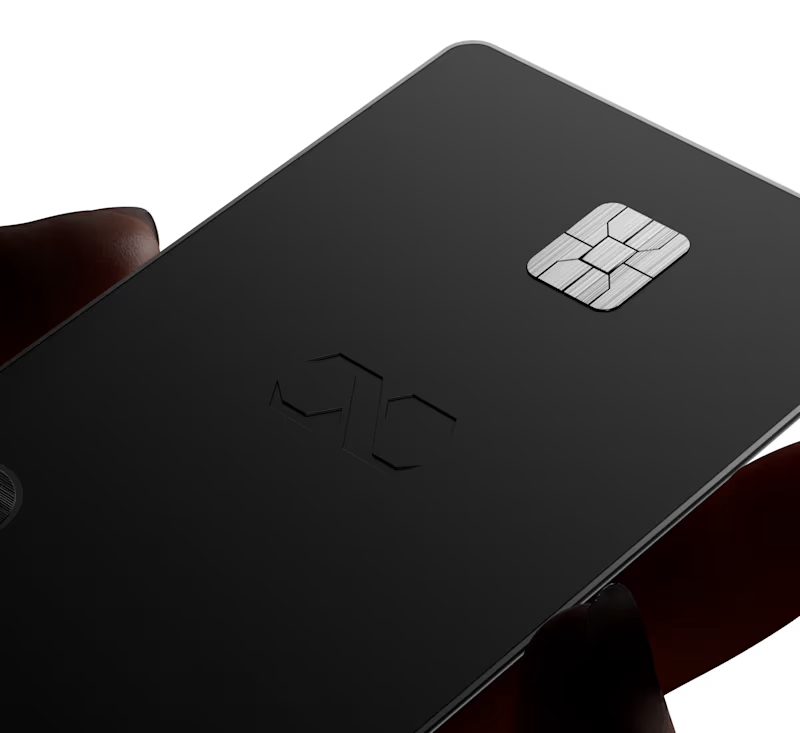
3D visualisation for premium luxury card.
2
154
Message
3
HD Design
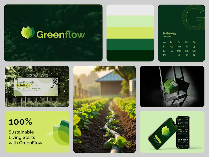
Sustainable Branding Design for a Greener Future Sustainable Design for a Greener Future. Brand Identity & UI for GreenFlow – an eco-conscious energy management system.
3
90
Message
1
Towhid Hosen
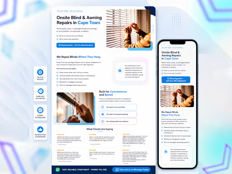
This modern landing page design for onsite blind & awning repair services is fully built using WordPress & Elementor.💯 🚀
1
177
Message
0
Flickpie
pro
Handled the full process for this video, edit, thumbnail, and title.
0
77
Message
1
Mehreen Hasan
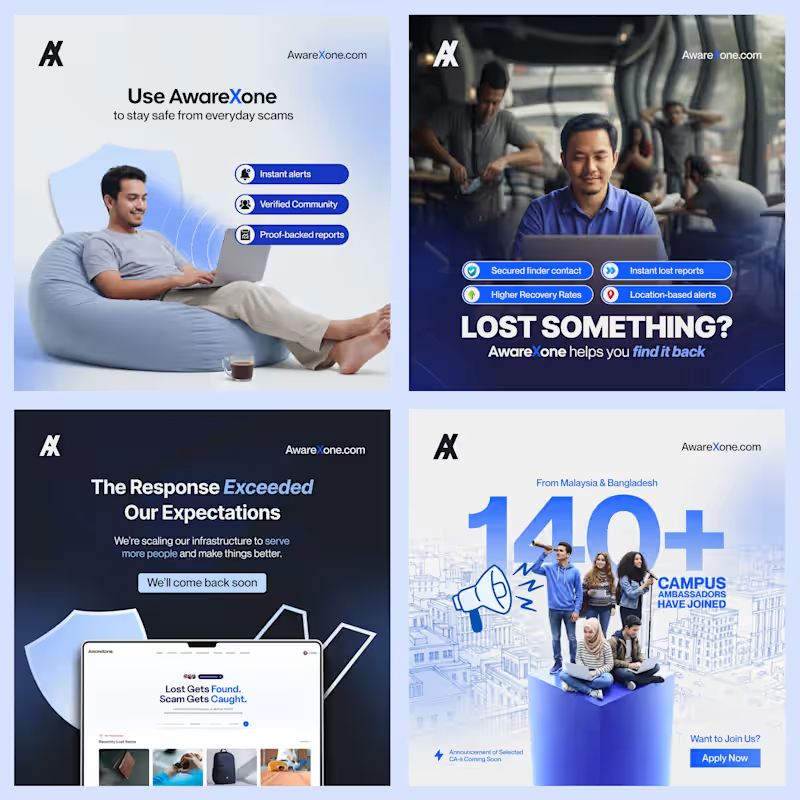
I've designed 2,450+ social media posts. Built visual identities for 13+ brands. Created 45+ client presentations and 24+ brochures. And I'm just getting started on Contra. I'm Mehreen - Creative Director & Brand Strategist. I help brands look like they mean it. Want graphics that stop the scroll? Hire me!
1
57
Message
0
Sohanur Rahman
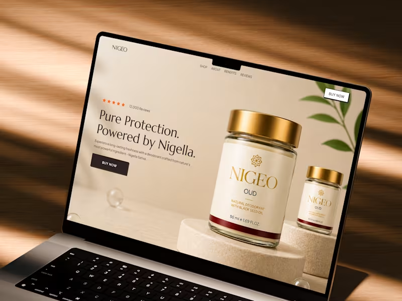
NIGEO - Beauty Product Landing Page | CRO Driven UI/UX Design in Figma
0
132
Message
0
Suvas Bin Monir
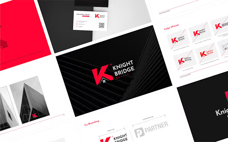
Logo & Brand Style Guide
0
85
Message
2
Md Suman Ali
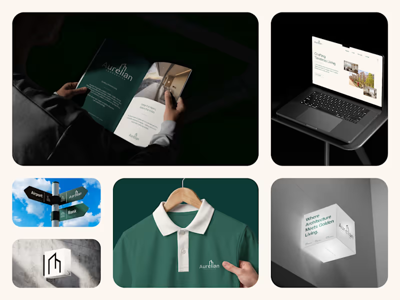
Aurelian Properties, Brand Identity Design Aurelian Properties is a luxury residential concept designed for Canary Wharf, London. The goal was to create a refined brand identity that reflects modern architecture, timeless design, and the confidence of an asset-grade property. Inspired by clean architectural forms, the identity combines a minimalist logo, elegant typography, and a premium visual system that carries seamlessly across print, digital, and environmental applications. Every element was designed to position Aurelian as more than a residence—it's a brand built around quality, precision, and long-term value. Services: Brand Strategy, Brand Identity, Logo Design, Visual Identity, Brand Guidelines, Marketing Collateral, UI/UX Design, Website Design
2
2
103
Message
0
Md.Shamim Ahamed
Bold Logo Design for Trucking & Transport Services
0
9
Message
0
S. M. Abu Seyam
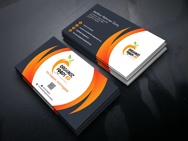
Business Card Design
0
9
Message
0
Md Ashraful Islam
Splendor Comporta - Logo Project
0
9
Message
0
Golam Rabbi
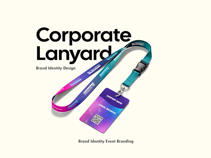
Corporate Custom Lanyard Design For a Event
0
172
Explore projects