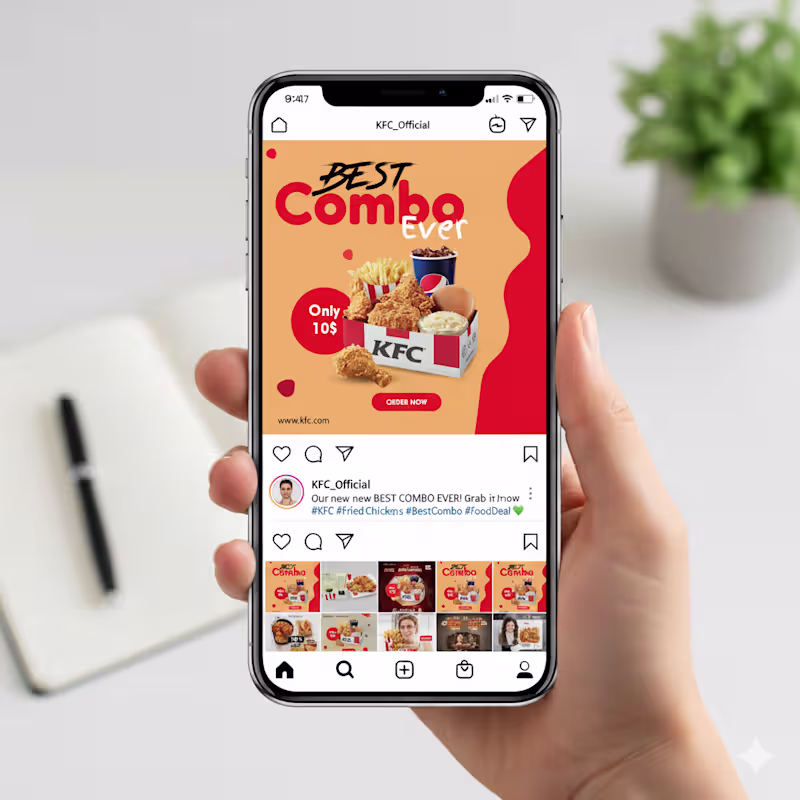
I am a professional Brand Designer, I do all kind of Design
- 14
- Followers
I am a professional Brand Designer, I do all kind of Design

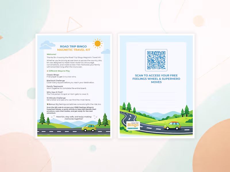
Brand & UI Designer | Print, Packaging & Sticker Specialist
New to Contra
Brand & UI Designer | Print, Packaging & Sticker Specialist


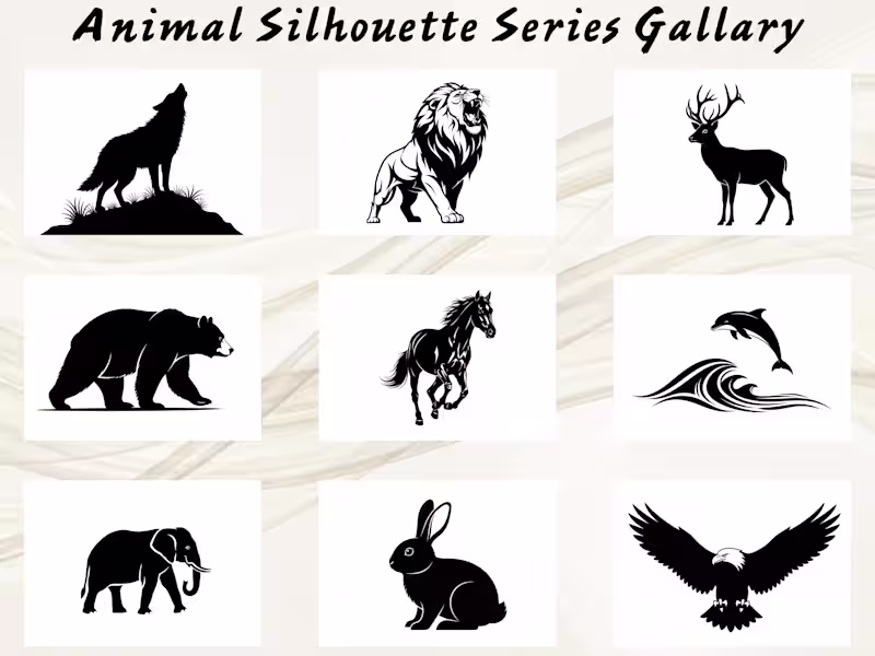
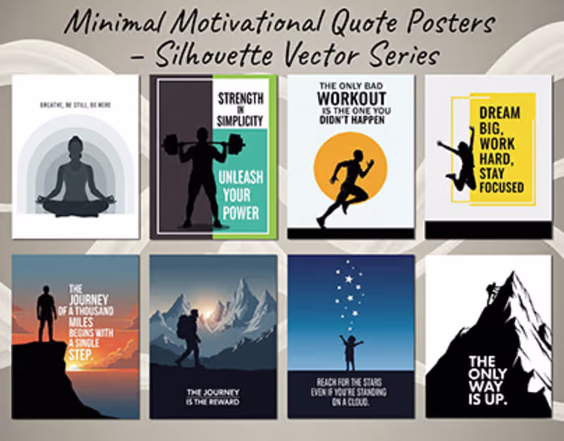
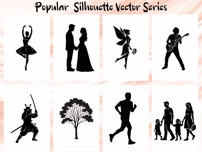
Professional Vector Illustrator And Silhouette Designer
Professional Vector Illustrator And Silhouette Designer
Visual/Graphic Designer
Visual/Graphic Designer


Graphic Designer
Graphic Designer