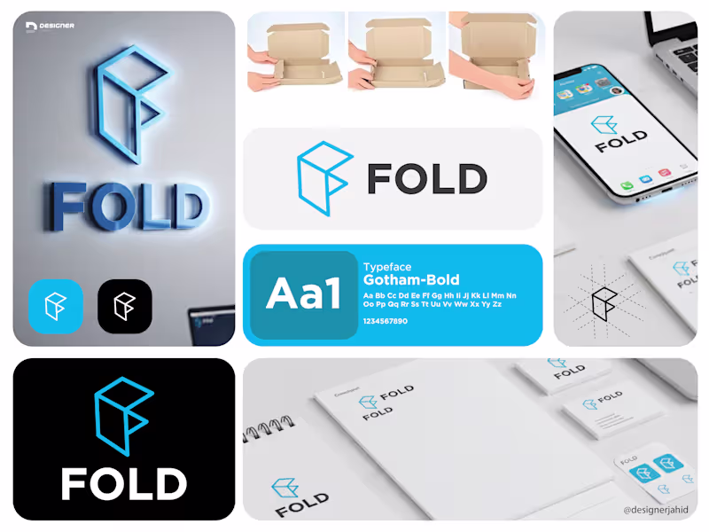
Brand Strategy Projects in Rajshahi DivisionBrand Strategy Projects in Rajshahi DivisionLogo Explanation: FOLD
The FOLD logo is built around the idea of structure, simplicity, and transformation.
The symbol is a geometric mark derived from folded planes, forming an abstract “F”. Its shape is inspired by the physical act of folding, referencing efficiency, organization, and smart use of space. This directly aligns with the brand’s focus on productivity and clarity.
Sharp edges and clean angles give the mark a modern, tech-forward feel, while the balanced proportions keep it simple and memorable. The design avoids unnecessary detail, allowing the logo to remain strong and recognizable at any size.
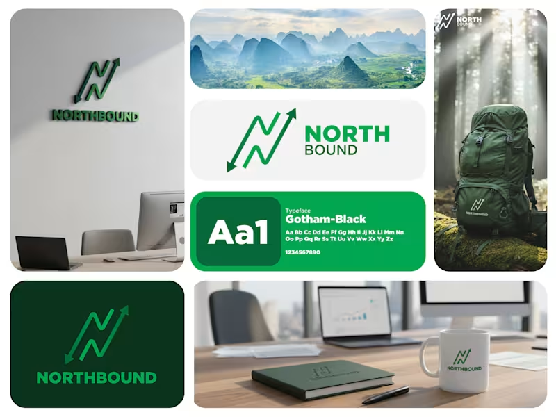
The typography is bold and minimal, chosen for clarity and confidence. The wordmark complements the icon without competing with it, reinforcing a sense of stability and focus. At the center is a custom symbol shaped like the letter “N”, created from a continuous, trail-like line. This form mirrors a hiking path that rises and dips, subtly reflecting terrain, elevation changes, and the natural rhythm of outdoor journeys.
The arrowheads at each end reinforce navigation and purpose. The upward arrow clearly points north, symbolizing progress, discovery, and the drive to move forward into new landscapes. The opposing arrow suggests awareness, preparedness, and respect for the journey, values that are essential in hiking and adventure culture.
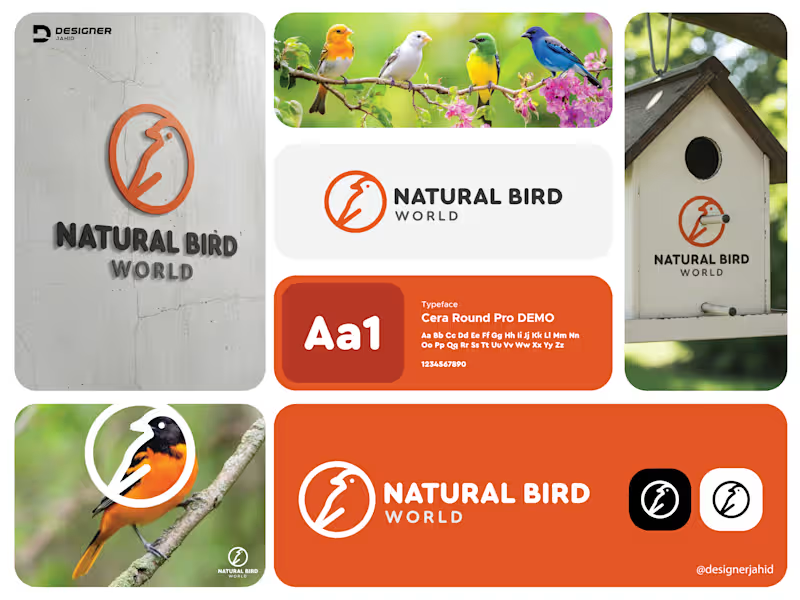
The sharp, angular flow of the mark echoes mountain ridges and switchback trails without using literal mountain icons. This keeps the logo clean, modern, and versatile while still feeling rooted in the outdoors. #letternlogo #travellogo This logo represents Natural Bird World, and my goal was to create something simple, modern, and friendly. I designed a minimal bird symbol using clean lines inside a circular frame. The circle represents harmony, nature, and protection, while the continuous line style gives the bird a soft, natural feel.
The warm orange color brings energy and makes the icon stand out, while the dark grey typography keeps the overall look balanced and professional. The typeface is rounded and smooth, which matches the approachable style of the icon.
Overall, this logo reflects nature, calmness, and trust. It’s easy to recognize, works well at any size, and can be used across branding, packaging, or digital platforms.
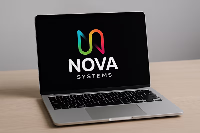
#LogoDesign #BrandDesign #BirdLogo #MinimalLogo #LineArtLogo #ModernLogo #GraphicDesigner #DesignerJahid #BrandIdentity Letter N and S Combine Nova System Technology logo design 2025.
🔹 Concept Overview
The logo combines creativity and logic — perfect for a tech or innovation-based company like Nova Systems. It uses a custom monogram where the letters “N” and “S” are merged into one continuous, flowing shape.
🔹 Symbol Meaning
The main shape forms the letter “N”, which represents Nova.
With a subtle curve and gradient flow, it also hints at an “S”, connecting to Systems.
Together, it forms a single symbol that shows unity, innovation, and forward movement — key traits for a modern tech brand.
🔹 Hidden Detail
At the bottom, the designer has highlighted how:
N = the main symbol, and
S = the same symbol rotated or adapted, showing how both letters are cleverly built from the same base form — a smart, consistent design system.