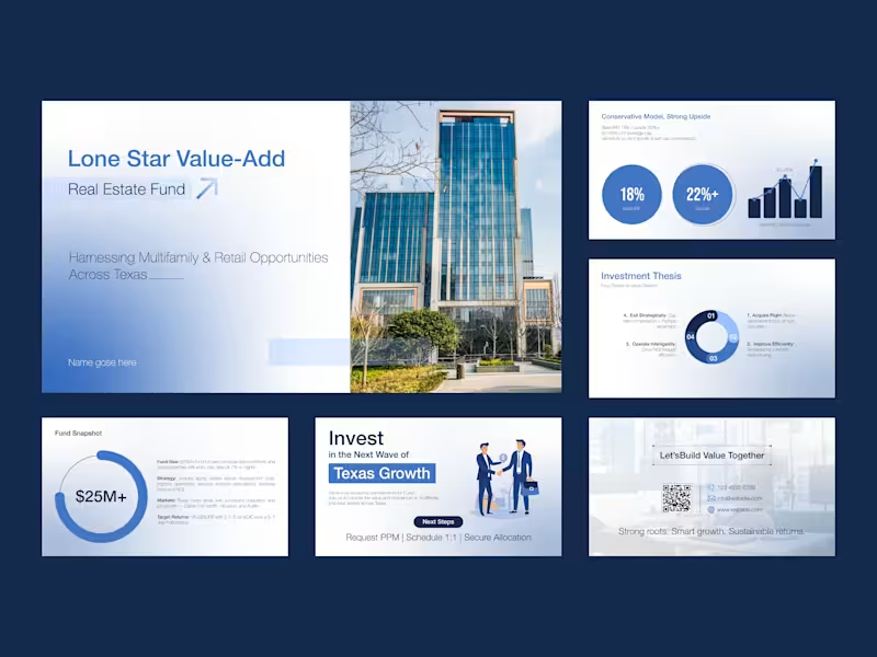
I am a professional Brand Designer, I do all kind of Design
- 13
- Followers
I am a professional Brand Designer, I do all kind of Design

Co-Founder at GraphicsGround | Client Success
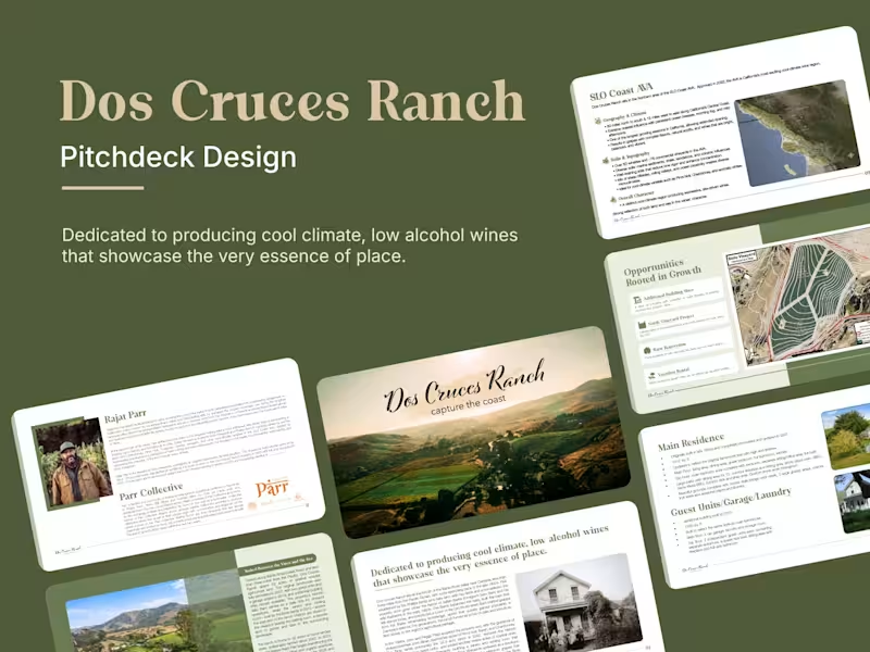
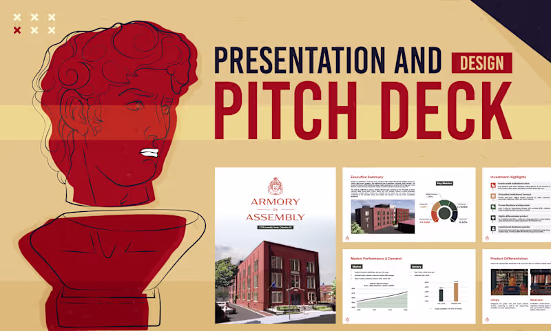
I am Md Rasedul Jamal. a creative logo and brand designer.
- 14
- Followers
I am Md Rasedul Jamal. a creative logo and brand designer.


View more →