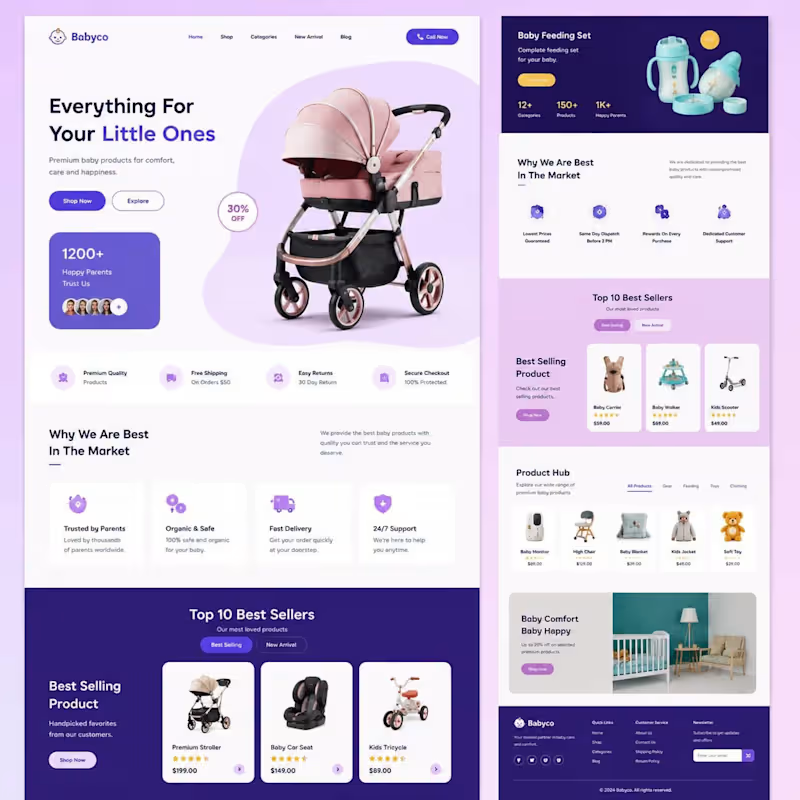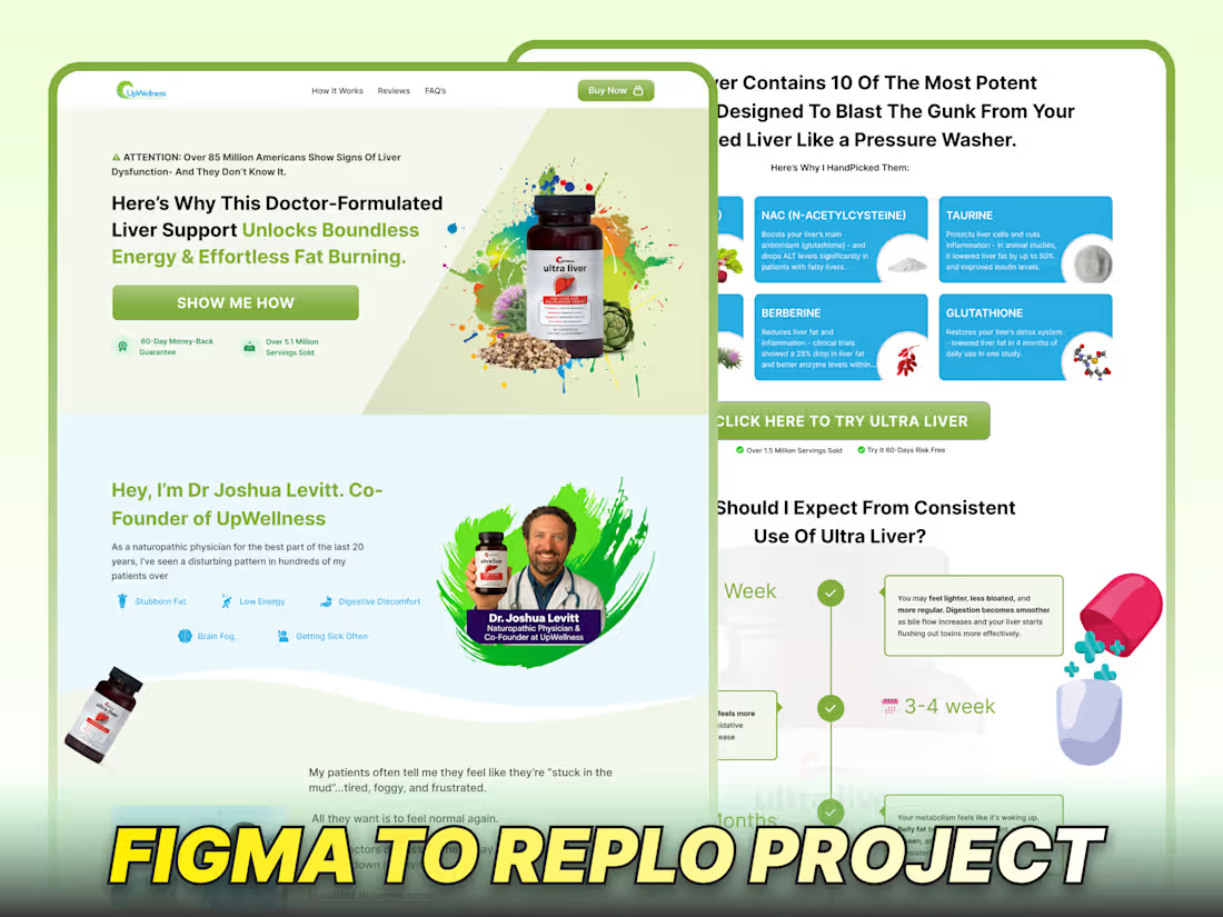
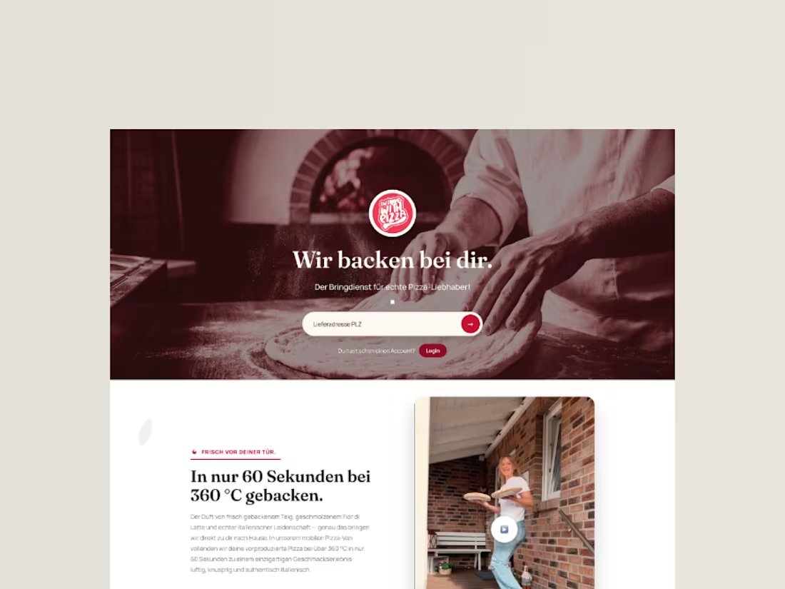
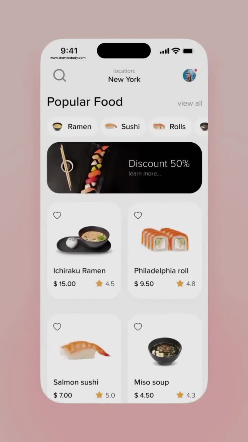
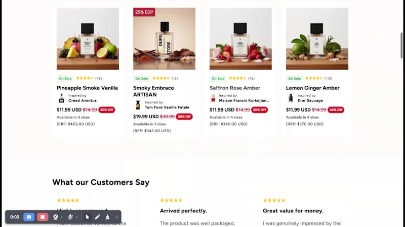
Shopify Store Development for TryScent
Role: Senior Web Developer
TryScent is a multi-currency online fragrance store designed to serve customers across different regions with a seamless shopping experience.
As the Senior Web Developer, I was responsible for developing and structuring the store to ensure smooth international purchasing, high performance, and a premium brand presentation aligned with the fragrance industry.
Key Contributions
Full Shopify store setup and development
Multi-currency configuration for international customers
Custom theme customization for a premium scent brand aesthetic
Optimized product page structure for conversion
Streamlined cart and checkout experience
Performance optimization for fast loading times
Mobile-first responsive implementation
Payment gateway integration for global transactions
1
0
112

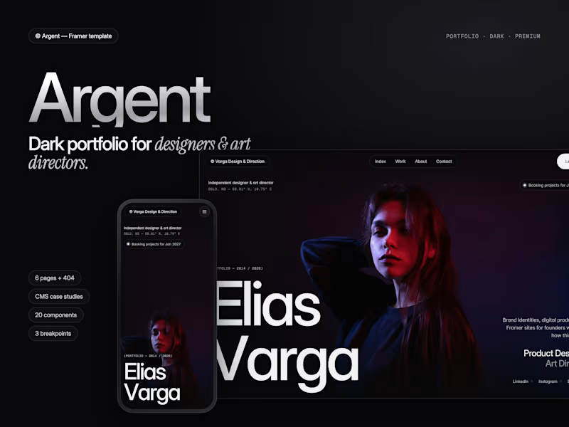
Argent is live on the Framer Marketplace: a dark, silver portfolio template for designers and art directors.
6 pages plus a 404, a 14-field Projects CMS with next-project links, 20 editable components, desktop/tablet/phone layouts and calm motion throughout, including smooth scrolling and buttons that fill from the centre.
https://www.framer.com/marketplace/templates/argent/
Preview: https://argent-portfolio.framer.website
2
2
43


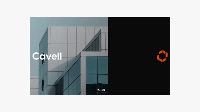
Cavell | Brand Identity Design for UK Property Development
Modern, confident, and built for what’s next.
Cavell is a UK-based real estate and property development company focused on creating high-quality commercial spaces for businesses and organisations.
At Dizift Studio, we developed a modern visual identity that reflects Cavell’s focus on architecture, business growth, and long-term value.
The identity combines a distinctive geometric brandmark, clean typography, and a bold orange-and-black color palette to create a professional and recognisable presence.
What We Designed:
→ Custom geometric logo and brandmark
→ Primary and secondary color palette
→ Typography system
→ Brand identity guidelines
→ Business stationery
→ Signage and environmental branding
→ Marketing and promotional applications
Every element was designed to work together, creating a consistent identity across digital and physical touchpoints.
Brand Message: Built for What Next.
Creative Direction: Modern, Minimal, Architectural, Professional.
2
1
26
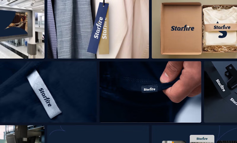

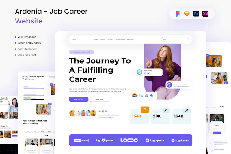
Premium Fintech & SaaS UI/UX Design | Modern Core Banking Web Design
Welcome to my latest UI/UX design showcase. This project features a modern, intuitive, and high-converting web interface crafted specifically for Fintech platforms, SaaS products, and Core Banking solutions.
As a digital designer committed to crafting exceptional user experiences, my goal with this project was to combine sleek aesthetics with a conversion-focused layout. The design emphasizes clarity, security, and seamless navigation to ensure users enjoy a frictionless banking and financial management journey.
Key Features of this UI/UX Project:
Conversion-Driven Layout: Optimized CTA placements, structured content hierarchy, and intuitive navigation flows designed to drive user engagement.
Modern & Clean Visual Aesthetic: A sophisticated color palette and modern typography tailored to build trust and authority for financial brands.
Interactive Showcase: Dynamic visual elements and smooth transitions that bring complex banking workflows to life.
Developer-Ready Assets: Clean Figma component architecture, flexible auto-layouts, and responsive design systems ready for seamless implementation.
Whether you are launching a new Fintech startup, revamping an existing SaaS application, or building custom web UI/UX solutions, I am here to help transform your vision into an impactful digital reality.
1
92
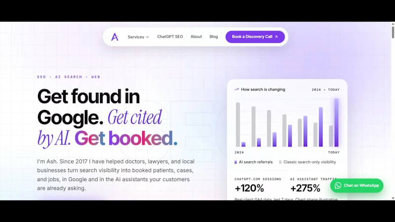
I built my entire portfolio site with 10 Lovable credits. Here's the exact workflow.
Most people burn through Lovable credits fast because they try to build the whole thing inside Lovable, prompt after prompt after prompt. I don't. Here's how I kept it to 10.
The workflow: Lovable + Claude Code + GitHub
1. Lovable for the scaffold only. One clean generation to get the project skeleton, routing, and a starting design. That is where the ~10 credits went, and that is the last time I spent any.
2. Claude Code does the real building. Every page, the whole design system, the content, the SEO, the performance work, all of it happens in Claude Code on my machine. No per-prompt credit meter running.
3. GitHub is the bridge. Claude Code commits and pushes straight to the repo.
4. Lovable auto-syncs from GitHub. The changes land back in Lovable with zero extra credits burned.
So Lovable stays the front door and the deploy target, but the heavy lifting lives in Claude Code, where I am not paying by the prompt.
What that actually produced (in the video):
- A 15-page site where every page is an original design, not a template reskin
- 100 PageSpeed on desktop, every category green
- Built for AI search, not just Google. llms.txt, clean structured data, the full AEO setup
- Self-hosted fonts, accessibility at 100, real Core Web Vitals work
Live at hey-ash.com (http://hey-ash.com).
Loveable Link: hey-ash.lovable.app
If you are spending real money on Lovable credits, this is the unlock. Scaffold in Lovable, build in Claude Code, sync through GitHub. Happy to break down any part of it.
0
114