Logo Design Projects in RajkotLogo Design Projects in RajkotSÓLUM — Mineral Skincare Brand Identity
SÓLUM is a premium mineral skincare brand built around a simple belief: some of the most powerful ingredients for skin already exist in the earth.
I developed this brand identity around the intersection of earth science and skin science, creating a visual language that feels precise, refined, and deeply connected to natural materials. Instead of following the typical organic skincare aesthetic, the direction takes inspiration from volcanic ash, geological formations, fractured stone, and mineral textures.
The SÓLUM logomark is built from a structured square divided by irregular, crack-like forms — a visual reference to fractured volcanic rock and cooling ash. The contrast between the controlled outer structure and organic internal fractures gives the mark a balance of precision and geological permanence.
The typography is clean and restrained, allowing the natural textures and imagery to carry the emotional character of the brand. A mineral-inspired visual system, paired with raw geological imagery and refined layouts, creates a sense of quiet luxury without feeling overly decorative.
The goal was to position SÓLUM as a skincare brand that feels scientific yet human, natural yet sophisticated, and rigorous without losing its connection to the earth.
Services
Brand Identity
Logo Design
Art Direction
Typography
Visual System
Brand Strategy
Packaging Direction
Tools
Adobe Illustrator
Adobe Photoshop
Adobe InDesign
Project Type
Branding / Visual Identity
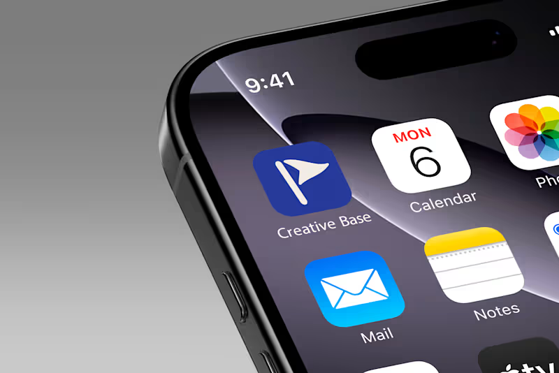
FULL PROJECT : https://www.behance.net/gallery/254419423/SOLUM-Brand-Identity Creative Base - Making business management software feel less like software.
Creative Base is a management platform built by creatives, for creatives, primarily photographers - helping them manage their clients, invoices, projects, and the business side of their work.
The challenge was that the client didn't want it to feel like another generic business management tool.
They wanted something fun, approachable, and genuinely enjoyable to use.
So instead of leaning into the usual SaaS aesthetic, I explored a more expressive visual direction, including a custom mascot that could give the product more personality and make the experience feel more human.
What started as a branding and visual exploration gradually grew alongside the product itself. New features, screens, and ideas kept being added as Creative Base evolved.
And honestly, that's also why I never ended up putting together a proper case study for this project.
Every time I thought I had enough to document it, the product had grown a little more.
So rather than waiting until it's perfectly finished, I wanted to finally share some of the work from the project here.
Creative Base is probably one of my favourite examples of how branding can make even something as functional as business management feel more personal, engaging, and fun.